
Spring 2018
Looking at magazines looking at themselves
Five enormous, lavish books celebrate the achievements of five legendary titles: Harper’s Bazaar, Rolling Stone, New York, The Face and Octavo
Just when it seemed the printed word was no longer the cauldron of opinion and argument it had been in the era of massive circulations, magazines are having their moment in America – as the voice of the opposition in the era of Donald Trump.
The New Yorker, Esquire, Vanity Fair and Time are showing that brilliant writing and graphics can still be powerful tools in dynamically shaping national debate.
And into that moment come five magnum opuses, lavish books that focus on individual magazines in all their glory, encompassing a business, a city, a counterculture, a generation and a tradition. So it is a pertinent time to look back at the birth of three magazines that are still vibrant today, one that caught its time perfectly and then struggled to keep up, and a small, limited-run publication that had an influence far beyond its distribution.
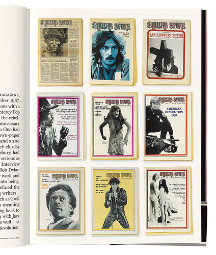
‘Forty Pages Full Of Dope, Sex & Cheap Thrills’. A page from 50 Years of Rolling Stone shows the title’s early years as a two-colour, folded broadsheet, ‘part magazine, part newspaper’.
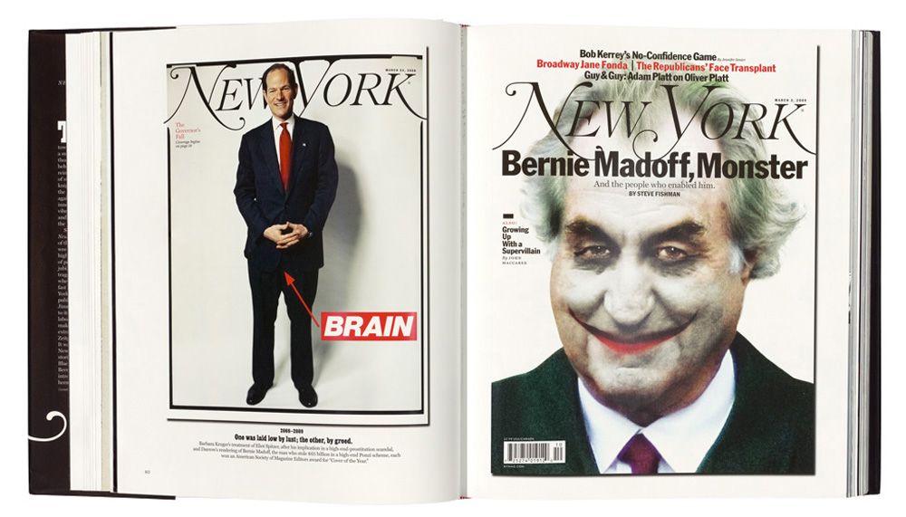
Top. New York covers showing disgraced politician Eliot Spitzer (left), in 2008, and fraudster Bernie Madoff, 2009.
A couple of years ago, however, when these books were in their planning stages, and the magazines they celebrate were struggling to retain their footholds in a dwindling market, it must have been tempting for publishers to look back and cherry-pick from their histories, partly to solidify their legacies and show just how brilliant and important their work was – and partly to monetise their archives.
And in many ways they were brilliant. The magic that happens when a group of intelligent, witty and visionary people all pool their talents to make a magazine is something to behold. Without exception, these five books are filled with inspirational photography, brilliant conceptualising, sharp writing and outstanding typography. And they refute the theory that the ‘Golden Age of Magazines’ has long gone – a lot of fantastic work is from the past few years.
A grand Bazaar
‘When I am flying my little plane, I usually wear a sports costume with a rather full skirt and a close-fitting hat.’ Amelia Earhart, in an article entitled ‘Plane Clothes’, 1929.
So, starting with America’s first fashion magazine, we look back to the founding of Harper’s Bazar in 1867 (it added the extra ‘a’ in 1929) by Harper & Brothers, a New York publishing firm. Its founding editor was 36-year-old Mary Louise Booth, a suffragette who spoke seven languages, and her desire was to instruct America’s women about the pleasures of life, and especially fashion. This handsome book encompasses the following 150 years in a cleverly conceived look at ‘moments’ in Bazaar’s, and fashion’s, history (which are often one and the same thing).
Covers from the late 1950s with photographs by Hiro, Ben Rose, Gleb Derujinsky and Richard Avedon.

Through the lens of a magazine that defined itself by the astonishing roll call of contributors it attracted, the book progresses from the dazzling array in its first eight decades (a literary list that includes Woolf, Dickens, Steinbeck, Highsmith and Capote, and a visual one that takes in Dalí, Warhol, Cartier-Bresson, Brassaï, Toni Frissell, Arbus and Avedon) to the superstars of the quarter century.
Legends of magazine design, editing and styling come and go – Carmel Snow, Alexey Brodovitch, Henry Wolf, Marvin Israel, Diana Vreeland, Ruth Ansel and Bea Feitler weave through pages filled with 150 years of history chosen so assuredly that the reader is not aware of anything missing. Henry Wolf’s late 1950s covers still stun with their mix of elegance and graphic playfulness.
November 2010 cover by Hedi Slimane and profile photographed by David Bailey, January 2012.

Although every decade is a treasure trove of outstanding images, the 1970s and 1980s now look too glossy and bland. It took the arrival of Liz Tilberis as editor in 1992, along with creative director Fabien Baron (see Eye 18), to give the magazine new life as a dramatic, dashing monthly that harked back to the Brodovitch / Wolf innovations – white space and the sheer beauty of typeforms, text and image in perfect sync.
The essential ludicrousness of fashion notwithstanding, this is a well written and stylishly delivered history. Beautifully designed by the magazine’s own Elizabeth Hummer, it was compiled by Glenda Bailey, the Englishwoman who has been editor-in-chief since 2001.
Harper’s Bazaar: 150 Years, The Greatest Moments. Edited by Glenda Bailey. Creative director: Elizabeth BHummer, Abrams, £40, $65 (400pp)

Rolling, rolling, rolling …
‘If rock and roll was the common tongue, maybe Rolling Stone could be a translation device.’ Joe Hagan, in Sticky Fingers: The Life & Times of Jann Wenner and Rolling Stone.
Founded in the midst of San Francisco’s Summer of Love, Rolling Stone Zeitgeist-surfed from the Hippie era through the paranoia of the early 1970s, into the self-obsession of the 1980s and the celebrity-obsessed 2000s. The title often foreshadowed the upcoming decade – and cleverly manoeuvred its way through each to ensure its commercial survival. It has not been shy in using that history – possibly only Vogue can compete in such a complete archival repackaging. Now, for its 50th anniversary, another weighty tome arrives, attempting to sum up the magazine since its founding by an arts student with few prospects (Jann S. Wenner) and a pipe-smoking jazz critic (Ralph J. Gleason) in 1967.
Wenner was inspired by London’s Times when he started his bi-weekly, two-colour folded broadsheet. Graphically, he took a traditional newspaper layout (thin columns, staid typography, Oxford rules) to bestow a more formal look than was usual in the counterculture. Editorially, he aspired to The Times’ position as the ‘Paper of Record’, read and respected by the establishment. Wenner, then in his early twenties, wanted the same for Rolling Stone, except that his establishment was The Beatles, the Stones and Bob Dylan. He felt that ‘rock & roll needed a voice – a journalistic voice, a critical voice, an insider’s voice’ – and that he was the one to provide it.
It didn’t hurt that Wenner had a certain arrogance. He defined a new kind of editor, one who took music and its makers seriously, and strove to make others understand its import. And, as the only serious rock & roll publication, it had the most important thing: access. This is most obvious in the visuals – Rolling Stone’s use of photography was groundbreaking, getting good work from photographers such as Baron Wolman, Annie Leibovitz and Richard Avedon, and giving their portfolios as much weight as the words.
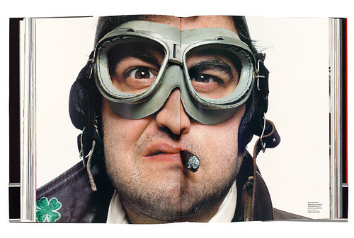
Bonnie Schiffman’s portrait of actor John Belushi, 1980, dressed for Steven Spielberg’s disastrous epic 1941.
 Taking on the straight mass-market newspapers and magazines at one of their core functions, reporting on current events, Rolling Stone became the conduit for stories emerging from the youthquake at the end of the Vietnam War. It wrote (from the inside) on the Patty Hearst kidnapping and tenaciously investigated the nuclear accident at Three Mile Island. Wenner also hired the greatest proponents of the ‘New Journalism’, Tom Wolfe and Hunter S. Thompson, writers who filed dense and innovative long-form narratives.
By 1977, Wenner’s generation, the Baby Boomers, were revelling in a newfound influence, and once far-out rockers found themselves in the mainstream press, which had suddenly become interested in the private lives of such outré figures as Sly Stone and Gregg Allman.
Wenner sensed that the power base of this new movement was on the opposite coast and moved the magazine from cool, alternative San Francisco to brash and gilded Manhattan. He was accused of ‘selling out’, but his finger was on the pulse – he helped usher in a new fascination with celebrity, paving the way for a reborn Vanity Fair (which coaxed his premier photographer, Annie Leibovitz, to leave, with the promise of bigger budgets). We are still feeling the effects of Wenner’s obsession with stardom today.
Fitting a representative selection into a single book is a tough ask, one that the finished article fails to answer. It is understandably keen to laud its journalistic triumphs, such as Eric Schlosser’s Fast Food Nation, but these sit uneasily in such a visually driven book. (For a less varnished version, read Robert Draper’s Rolling Stone Magazine: The Uncensored History, or Joe Hagan’s book mentioned above).
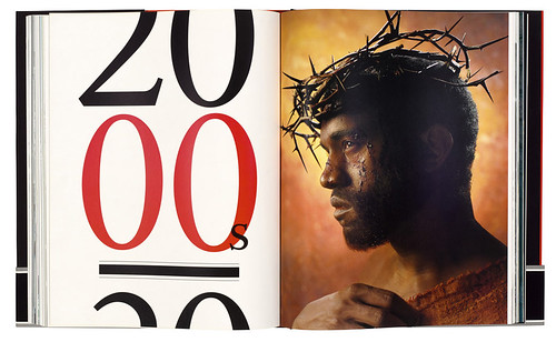
Opening spread for the decade showing David LaChapelle’s portrait of Kanye West in a crown of thorns.
There is much to irritate the serious student of magazines. Each decade is given just a 250-word introduction next to a block of nine covers, followed by about 50 full bleed portrait photos, with several one-page summations of key stories and a couple of interviews per section with ‘icons’ (Michael Jackson, Bono, Madonna, Kurt Cobain).
So much is left out, and so many of the images are over-familiar that you wonder about the selection process. It is annoying that the photographers’ names are missing from the spreads themselves – you end up trying to hold the huge book open as you attempt to locate the credits next to the endpapers.
The subjects covered – groupies, political protests, Woodstock, David Foster Wallace – are fascinating, but feel shoehorned into a format that gives equal weight to Ozzy Osbourne’s family and Goldman Sachs’ role in the 2008 financial crash. Mixing high politics and low culture is part of the Rolling Stone brand, but it is delivered too starkly.
While the images are beautifully printed, no attempt is made to explain the technical and aesthetic changes that happened between Annie Leibovitz’s early black-and-white photojournalism, Richard Avedon’s groundbreaking series of portraits of America’s leaders in 1976 and David LaChappelle’s absurdly high-key styling of Kanye West, as Jesus, in 2006.
There is also scant room for illustration – a nod to Ralph Steadman, a Robert Risko, a few editorial spots – but where is Philip Burke, the extraordinary artist whose brilliant portraits of stars graced the RS contents page for so many years?
50 Years of Rolling Stone. Edited by Jodi Peckman and Joe Levy. Design director: Joseph Hutchinson. Abrams, £21.99, $65 (288pp)

It may be an impossible task to satisfyingly condense 1300 issues of a magazine into a book that captures the qualities that made Rolling Stone such a runaway success. As a celebration, 50 Years of Rolling Stone does its job tolerably well but it will leave many readers wanting more.
Still spreading the news
‘It’s a kind of heart attack … everything coming together at a fever point of inefficiency.’ Gloria Steinem, feminist and Ms. magazine co-founder, on the launch issue of New York.
Come with us back to a time when Donald Trump was a bankrupt property developer and New York fashion week was a small trade show. New York was a magazine designed for one city, in its darkest days of high crime and low morale. It was launched by Clay Felker when the magazine supplement he edited for The New York Herald Tribune closed with the paper.
Chapter one includes a substantial extract from Tom Wolfe’s 24,000-word essay ‘Radical Chic’, 1970, and the cover of the issue in which it appeared.
 Many designers would agree that a magazine launch is one of the most enjoyable things ever to be involved in. It is a process that mixes the bunker mentality of an infantry troop, the improvisational qualities of jazz music and the devil-may-care attitude of alpine climbers. That is how those involved see it, anyway. Outsiders may view it more as a mixture of headless chickens with an overwhelming sense of their own importance and a poor grasp of business, making a product for an, as yet, imagined audience.
Spread with cuttings about New York property prices from 1970 to 2005.

As Milton Glaser, design director for New York’s launch, puts it, he and his cohorts knew very little ‘about what a magazine should be. But in some cases that kind of innocence is a benefit. You don’t know what to do, so you invent something.’ What they invented was a magazine that was smarter than smart, arrogant and funny as only a New York denizen can be. Stephen Sondheim set the cryptic crossword for a year, Tom Wolfe invented ‘Radical Chic’ and the ‘Me Generation’ and contributors Jimmy Breslin and Norman Mailer ran for Mayor.
New York spotted youth cults, and in the case of Saturday Night Fever more or less invented them. It chronicled the lives of the rich and famous, gave us the term ‘foodie’, and a platform for Brooklyn to become hip, all laid out in a kind of designer-y, high-tabloid style that imparted a fantastic energy to the layouts and infographics. In news terms, recently it ended the career of Fox News’s Roger Ailes and convinced Bill Cosby’s victims to talk (see page 20).
Brooklyn food entrepreneurs with their products in 2012.
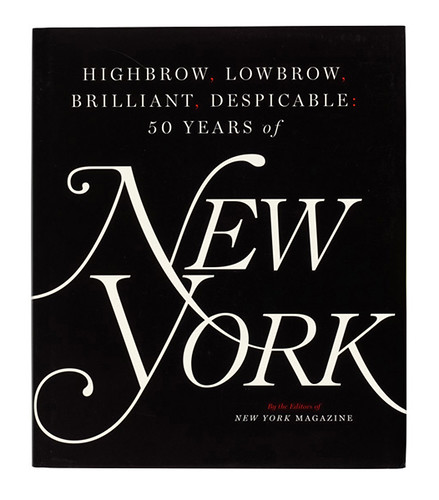
 There is nothing stuffy about New York, and this beautifully printed and designed book (several gatefolds, a dust jacket that unfolds to give a giant ‘Approval matrix’, a regular ‘who’s hot / who’s not’ feature originally designed by Luke Hayman) gives a riveting portrait of New York City’s journey from squalor and bankruptcy to the manicured and powerful city of today. And the magazine continues to power on and live up to the book’s eye-grabbing title – Highbrow, Lowbrow, Brilliant, Despicable. Anyone even vaguely interested in the nuts and bolts of magazines should buy it immediately.
Highbrow, Lowbrow, Brilliant, Despicable: 50 Years of New York By The Editors of New York Magazine. Design director: Thomas Alberty. Simon & Schuster, £50, $65 (432pp)
 The Face fits
‘The Face was to be my escape from a career where I struggled to explain myself to publishers or committees. No focus groups here: I was purely and wholeheartedly following instinct.’ Nick Logan, editor
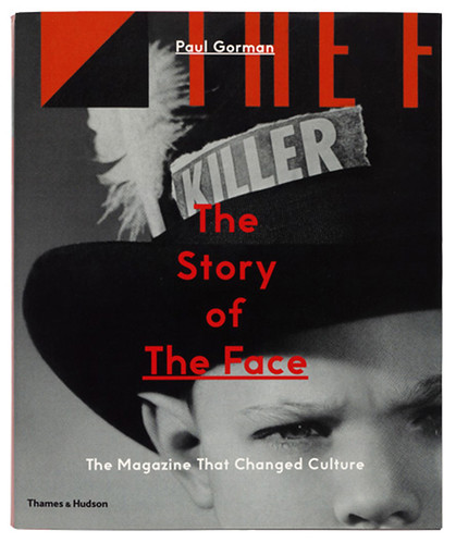
If The Face appeared in the early days of your own career in design you will experience a Proustian rush as you look through Paul Gorman’s biography of the magazine. After visiting the V&A’s ‘British Design since 1948: Innovation in the Modern Age’ and seeing an inaccurately credited display of a few copies, Gorman was inspired to tell the untold story of The Face, a magazine entirely entwined with the life story of its singular founder, Nick Logan.
Cover and spread from no. 39, July 1983, and a spread about Joseph Beuys from no. 40, August 1983. Art director: Neville Brody. Photos: Kevin Cummins. Editor Nick Logan: ‘There wasn’t anything which struck us as being worthy of the cover. I … suggested we crop the guy’s face out apart from the top left-hand side.’

‘Fashion Heroes’ from The Face, vol. 2 no. 13, October 1989. Art director: Phil Bicker.
 Launched by Logan when his growing success as an editor and publisher (NME, Smash Hits) was not enough to find anyone to back his latest idea, it filled a gap that only Logan knew existed.
Compared to the expensive journalism at the heart of Rolling Stone and New York, and the marquee names that Harper’s Bazaar could hire, The Face is a particularly thrifty and English beast. However its influence on British fashion and culture for at least two major shifts over two decades – in music terms, New Romantics and Britpop – was huge. It showcased the country’s emerging fashion designers and musicians and created a groundswell that launched a whole sector – men’s fashion magazines.
The self-styled ‘Attractively Collectable First Issue’ of The Face, 1980. Design: Feet First Graphics and Steve Bush Inc. Editor: Nick Logan. Cover portrait of Jerry Dammers by Chalkie Davies.

Catherine McDermott, professor of design at Kingston University, locates Logan’s standpoint as ‘essentially non-conformist and slightly eccentric … It has its origins in a working-class way of life, which has always expressed itself by using irony, dissidence and poking fun at the establishment.’ His interest was conveying ideas and information, not opinions – fashion editor Ashley Heath says that it ‘was like Wikipedia to me, every month I‘d understand two things but come across two hundred more which I would investigate and then join the dots between them’.
Logan had a great journalistic eye for detail, and a keen appreciation of what independence could bring to the non-text parts of the package – The Face provided both a playground and a launch pad for the careers of designer Neville Brody, photographers Nick Knight and Corinne Day, and model Kate Moss, among others.
The Story of The Face: The Magazine that Changed Culture
By Paul Gorman. Designed by Therese Vandling. Thames and Hudson, £34.95, $50 (352pp).
Paul Gorman’s text is so in-depth that you live through all the back-biting and the financial ups and downs, possibly in too much detail. There is little cherry-picking and in design terms, the narrow subject matter leads to a slight lack of dynamism. But if you were there or are wondering what post-teenage life was like in Britain in the 1980s and 90s, this is for you.
Pieces of eight
‘Pantone Paper. These sheets were available in the full range of colours. Frustrating as art stores had often run out of the very colour you were looking for. Expensive too.’ From the glossary in Octavo Redux 1:1.
The world of magazines is, of course, wider than fashion, arts, current affairs and gossip. Today, with the boom in niche, small-press magazines, there is a greater choice of arcane subject matter than ever before. In 1986, there were few independent graphic design publications specialising in typography. The members of 8vo (Hamish Muir, Mark Holt and Simon Johnston) together with a few like-minded colleagues, created Octavo, a journal that ran for eight issues over the course of six years. Its final issue was in CD-Rom form only, reproduced in the book as a series of defiantly low-res images.
Spread from Octavo Redux showing a marked-up proof of Bridget Wilkins’ article ‘Type and image‘, Octavo no. 7, 1990. This is one of nine spreads documenting successive type specs, proof corrections and film output for this famously complex layout. The authors write that they used a Mac only once during design and production – for visualising the grids.

Octavo’s circulation was small, yet its influence on British designers was huge. As Eye’s Simon Esterson has written: ‘Early pieces by 8vo … alluded to work coming out of Switzerland or America and a different design history. Sans serif fonts, ranged-left typesetting, dynamic asymmetric page compositions. Photographs not illustrations.’
Octavo, International Journal of Typography, was their self-published, self-financed, essentially hand-made flag planted in the soil of British commercial design. Set in one font (Unica, a variant mix of Univers and Helvetica), it set out to be a ‘rallying cry intended to wake up England in some way to the possibilities of a modern typography’ – quite a mission statement for something pasted-up and put together in weekends and evenings in a cold garret in Covent Garden. In a time before the Apple Macintosh and page make-up software, the labour involved in each issue was enormous.
It differs from the other books here, not only in subject matter, but in the fact that there is no cherry-picking – this is a reproduction of all eight issues of Octavo. It also includes a mass of extra material generated by the project. Beautifully preserved, these rough designs and printers’ mark-ups are in additional sections after the facsimile issues. As the publishers drily state: ‘These often resulted in long “discussions” with the typesetters, conducted via bike messengers, red pen, highlight markers and Tipp-Ex.’
The business, more a workshop than a slick design group, collaborated with a range of clients who appreciated their modern, non-centred, non-serif approach, and the work still looks fantastic. Having found the design scene in London a place of tired (un)thinking, with centred serif type – often in capital letters – as the mainstream, they felt the need to elevate typographic design to the same level as the content. This is what they achieved in Octavo, which remains a thing of spectacular inspiration and beauty in this republished form.
Octavo Redux 1:1, A Record of Octavo, Journal of Typography 1986-1992. Ed. Hamish Muir and Mark Holt. Designed by Hamish Muir and Mark Holt. Unit Editions, Edition of 740, £75 (384pp).

Magazines make great stories
If there is one issue with all of these books, it is a sense of insider-ness, a preaching to the choir, an insular world of name-dropping and one-upmanship. They are probably too intimidatingly sized and specific to be impulse purchases, so it would be fair to assume that the intended audience has a good general knowledge of the territory. Although the books show their subjects in a flattering light, they never shy away from the hardscrabble realities of making magazines work. I learned an enormous amount from each of them – and possibly more than I ever wanted to about New York City’s deli options in the 1990s.
That quibble aside, the one thing that great magazines specialise in is stories, whether they are marquee pieces of writing from literary giants, the capturing of some whisper of the Zeitgeist, or the visual pinning of a style to the wall. All of that is celebrated in these books, along with the bonus of some hair-raising tales from behind the scenes; we are the lucky beneficiaries of a huge amount of dedicated work on show.
Martin Colyer, writer, designer, judge on the V&A Illustration Awards 2018, London
First published in Eye no. 96 vol. 24, 2018
Eye is the world’s most beautiful and collectable graphic design journal, published quarterly for professional designers, students and anyone interested in critical, informed writing about graphic design and visual culture. It is available from all good design bookshops and online at the Eye shop, where you can buy subscriptions and single issues. You can see what Eye 96 looks like at Eye Before You Buy on Vimeo.