Winter 2010
Love of lexicons
Philip Thompson
Peter Davenport
Adrian Shaughnessey
Sara De Bondt
Milton Glaser
Erik Kessels
Gilles Gavillet
David Rust
Nicolas Eigenheer
Kim Abeles
The dictionary framework allows readers to find random nuggets of information, forging connections that reflect the arbitrary nature of life.

In October 1973, Katherine and Michael McCoy and thirteen of their students at Cranbrook Academy of Art climbed into a Winnebago motor home and set out on a road trip to visit design and architecture schools and professional organisations. They started in Detroit and travelled via Ithaca, Hartford, New Haven and Boston to Providence, Rhode Island. Back at Cranbrook, they made a concise ‘dictionary’ recording the opinions and impressions they had formed during their eight-day excursion.
Katherine McCoy gave me a copy of this poster-sized folding sheet some time in the 1990s. I kept it because it conveys such a vivid impression of the academy’s ethos and preoccupations during those post-1960s, ‘hippie modernist’ years. The glossary’s 69 entries begin with ‘Adhocism’ and proceed via such topics as ‘Design, politics of’ and ‘Mobile life-style’ to ‘Yale Graphic Design’. The definition of ‘Design freaks’ is particularly appealing: ‘People who operate at a primarily intuitive level in the area of design. They are mainly concerned with formal considerations as opposed to functional or structural. antonym: HEAD DUDES see: HARDWARE’.
We might conclude from these and other entries that some of the concerns we like to think of as belonging uniquely to our time have been the subject of debate for decades, even if the terminology changes – a ‘head dude’ might prefer to be called a conceptualist now. Another way that the Cranbrook poster still seems right up to the mark is in its use of an A-Z structure to express many disparate ideas as briefly and engagingly as possible. The alphabetical organisation of the dictionary has become a popular device in recent art and design publications. At a time when our attention is fractured by a plethora of media and inputs, and people find it hard to concentrate for long bouts of linear reading, dictionaries offer an alternative way of assimilating information. A dictionary, like an encyclopedia, is intended for dipping into and you can read as much or as little in a session as you like and still feel you are getting somewhere. Not for nothing is Wikipedia one of the world’s most visited websites.
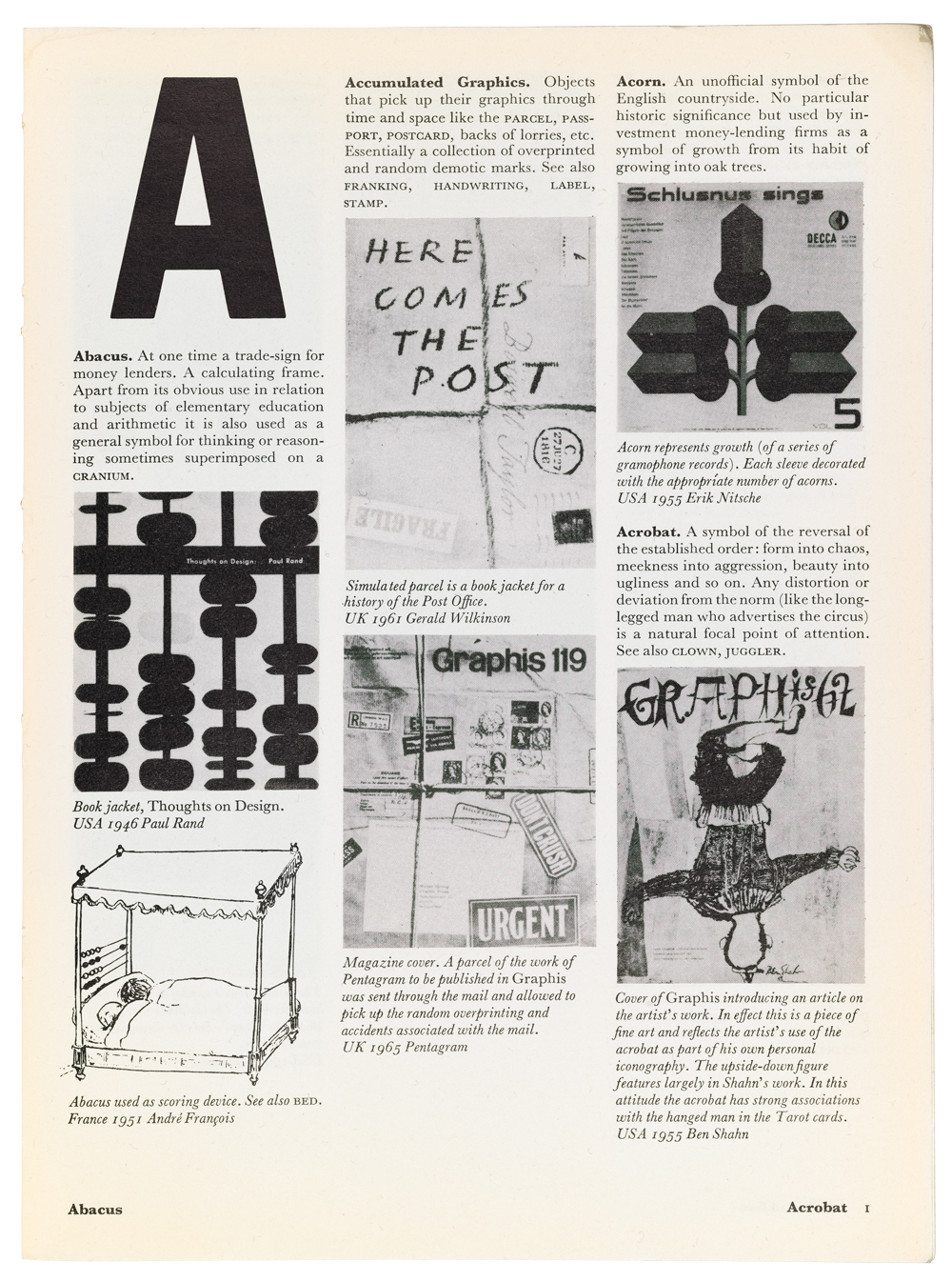
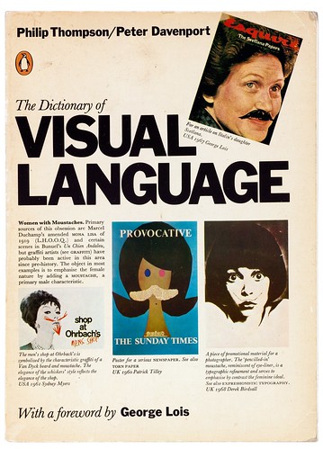
Top and below: The Dictionary of Visual Language compiled, written and designed by Philip Thompson and Peter Davenport (Penguin edition, 1982, first published 1980). The book sets out to gather ‘graphic objects, devices, clichés, stereotypes and symbols that constitute an international and trans-cultural visual language’. Words take second place to images.
I have always loved reading specialised dictionaries because they are a perfect way to obtain a grounding in a subject. My introduction to art history, as a teenager, came from Peter and Linda Murray’s A Dictionary of Art & Artists (third edition, 1972), published by Penguin, and David Thomson’s A Biographical Dictionary of the Cinema (1975) provided the same service for film. In my early 20s, when I wanted to find out more about psychoanalysis, I turned to Charles Rycroft’s A Critical Dictionary of Psychoanalysis (1972), also a Penguin. As a fledgling writer, I pored over The Oxford Dictionary for Writers and Editors (1981). Brewer’s Dictionary of Phrase & Fable, A Dictionary of Literary Terms, The Fontana Dictionary of Modern Thought, Raymond Williams’ Keywords, New Dictionary of American Slang, The Trouser Press Guide to New Wave Records, Richard Kostelanetz’s Dictionary of the Avant-Gardes – I have scores of dictionaries now and I haven’t begun to mention the design-related volumes. I could compile a little dictionary of all my dictionaries.
This kind of lexicon has a clear and literal intent. Its editorial purpose is to set out the essential facts and information about a subject. Only occasionally does a writer stretch the walls of the basic container to accommodate more personal styles of reflection (Thomson’s entries are eloquent critical essays on film-making).
There is another type of dictionary, though, that takes idiosyncrasy as a point of departure, exploiting the genre’s framework for more whimsical literary and critical purposes. An early example of this kind of playfulness is Flaubert’s Dictionary of Accepted Ideas, largely completed by 1850 and sometimes appended to the unfinished novel Bouvard and Pécuchet (1881), where it is thought he intended to place it. Flaubert’s deceptively straightforward definitions gather the received wisdom – or as he saw it, the intolerable clichés and stupidities – of his day. Their irony should be obvious; critics, for example, are ‘thought to know everything, be aware of everything’. The ostensibly similar The Devil’s Dictionary (1911) by Ambrose Bierce offers acerbically phrased, sometimes shockingly cynical and still remarkably potent re-definitions of everyday words such as archbishop, hypocrite, litigant, reporter, redemption, and Wall Street. A corporation, according to Bierce, is ‘An ingenious device for obtaining individual profit without individual responsibility’.
Both of these dictionaries provide subversive alternatives to the standard meanings found in an ordinary lexicon. It is possible to use the dictionary’s foundations for even more elaborate artistic conceits. In Jorge Luis Borges’ The Book of Imaginary Beings (1957-67), the A-Z becomes an enclosure for exhibiting a collection of weird and wonderful entities discovered in the world’s literature and folklore: Animals in the Form of Spheres, the Chinese Phoenix, the Monkey of the Inkpot, the Nasnas, the Odradek, the Simurgh and the Lamed Wufniks – 36 righteous men ‘whose mission is to justify the world before God’, although they are unaware that this is their purpose and will die if they find out.
There is nothing to stop someone from starting at A and reading any of these books sequentially. In 2008, an American man, a former furniture remover, was in the news for having spent a year toiling through 21,000 pages and 59 million words of the twenty-volume Oxford English Dictionary, giving himself headaches and damaging his eyesight in the process. But there is something perverse, joyless and much too rigidly linear about imposing a conventional reading path on a book that is constructed not to need one. The whole idea of a dictionary is ease and speed of access. The pages can be entered (and exited) at any point. The visual connections between the entries are purely coincidental, determined by nothing stronger than their first few letters. These random juxtapositions provide countless opportunities for chance encounter and serendipitous discovery. Before you know it you have moved on from the entry you started with, the subject you thought you wanted to know about, to other equally fascinating entries you had no intention of looking up. Most specialised dictionaries facilitate this by highlighting related subjects that you might care to pursue. Hours can pass bouncing around inside a well sprung dictionary. Or you can zip in and out.
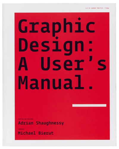
Graphic Design: A User’s Manual written and designed by Adrian Shaughnessy (Laurence King, 2009). Shaughnessy gives his dictionary-based overview a writerly informality by using the Fedra typeface family along with bold section intros and pull-quotes to break up the page.
The look of the page is a crucial aspect of a specialised dictionary’s appeal. The most engagingly written book still presents page after page of grey type, unless it happens to be illustrated. The short entries in dictionaries automatically break up the page into more rapidly digestible units of information. Keywords can be highlighted with capital letters, bold type, a second colour, or a change of typeface, and words pointing to other entries can be indicated typographically. Other kinds of editorial material, such as suggested further reading, provide an opportunity for typographic colouring. Air can be introduced into the page by adding space between the entries. Even without pictures and captions to provide another layer of interest and alternative points of entry, a dictionary page will have an invitingly animated typographic texture.
A dictionary still needs to be editorially and visually balanced, though, if it is not to seem peculiar. In his essay ‘Think / Classify’ (1985), the French writer Georges Perec complains about a 588-page ‘Concise Historical Dictionary of Great Men’ he owned that devoted 288 pages to the first five letters of the alphabet and 300 pages to the remaining 21 letters. This disproportionate allocation of space led to Anne Boleyn receiving 31 lines, while Henry VIII, her husband and executioner, was given only nineteen.
Because the dictionary format can resolve problems of editorial structure, while making a book more interesting to look at and use, it has lately become common to see design-led dictionaries that engage in skiilful play with the genre’s conventions. Adrian Shaughnessy’s decision to compose Graphic Design: A User’s Manual (2009) as an A-Z guide was prompted, he explains, by reading the alphabetically organised Economist Style Guide (first published in 1986): ‘It struck me that here was a format that would allow me to travel semi-randomly over the entire subject, while also automatically imparting a coherency that the book wouldn’t otherwise have.’ This is an advantage of the lexicon. While an individual entry might advance a coherent argument, the format bypasses the need to construct the entire book as an architecturally seamless sequence of chapter-based propositions and themes. The structural glue comes from the simple inevitability with which B follows A, though the partitions remain elastic. One could add new entries, revise existing entries, or even remove them entirely without changing the edifice’s essential character or form.
In Anna Gerber and Anja Lutz’s Influences: A Lexicon of Contemporary Graphic Design (2006), the randomising principle is pushed to the limit. The authors asked a cast of international designers to make lists of their influences and these items became the book’s entries. Thus a single spread brings together: Photographs of Neil Armstrong, Photographing naked women, Photography, Physiological Architecture, Francis Picabia, Pablo Picasso, Pif, Pioneering vision, Pioneers of Modern Typography, Pixels, and Michael Place. Gerber and Lutz provide a brief definition followed by a quotation from the designer or group who nominated the influence.
This elegantly designed book is diverting to browse, even though its editorial premise seems flawed. Is there really an audience of graphic designers hungry to learn about other designers’ private influences, no matter how thin or tangential? Can anyone ever have turned to this lexicon hoping that it might offer an entry on gold jewellery and shoes? (It does.) For anyone seeking a basic introduction to Picabia or Picasso, an art dictionary would be a much better bet. A book that presents a designer’s children or the word ‘goods’ – no mention of what they are – as an ‘influence’ could never achieve the density of improbable adjacencies that would make it truly revelatory. If the aim is to be illuminated by the unfamiliar, catapulted into fresh ways of thinking and seeing, then a lexicon compiling the influences of surgeons, chess grandmasters, air traffic controllers, or for that matter dictionary compilers might bear stranger-looking fruit.
It is in recent art-world projects with an inventive design dimension that the dictionary format has most fully come into its own. There is an occasional line of idiosyncratic art lexicons (as opposed to more conventional dictionaries of art) stretching from Georges Bataille’s Critical Dictionary published in Documents (1929-30) and André Breton and Paul Eluard’s Dictionnaire abrégé du surréalisme (1938) to Koen Brams’ The Encyclopedia of Fictional Artists, first published in Dutch and now issued in an English translation. A team of contributors composed more than 280 biographies for artists invented by writers of literary fiction, among them Balzac, Zola, Poe, Perec, Wilde, Proust, Borges, Salman Rushdie, W. G. Sebald, Hemingway and David Foster Wallace.
Utopics: Systems and Landmarks edited by Simon Lamunière (JRP Ringier, 2009). Design by Gilles Gavillet, David Rust and Nicolas Eigenheer. The title, a contradiction of ‘utopia’, ‘topics’ and ‘pics’, broadens the usual meaning of utopia ‘to tease out on one hand the new forms that utopias are taking and occupying in today’s society and, on the other hand, to extend this notion to the way artists or other communities stake out a territory or realm’.

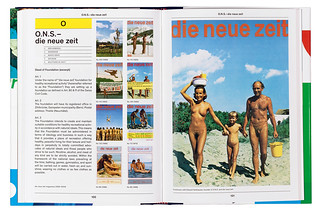
In other projects, such as Encyclopedia Persona A-Z (1993), a catalogue for the American artist Kim Abeles in the style of a 1960s World Book Encyclopedia, visual form plays a more crucial role (see Eye no. 18 vol. 5). A similarly deft and convincing appropriation of the visual conventions of old encyclopedias can be seen in the Martian Encyclopaedia of Terrestrial Life Volume VIII (2008), designed by Sara De Bondt for the exhibition ‘Martian Museum of Terrestrial Art’ at the Barbican gallery in London. The presentation of contemporary art works as though they were being deciphered and classified by an extraterrestrial investigator has the same deadpan scientific precision as Encyclopedia Persona, though the book’s division into ethnographic categories – Kinship and Descent, Magic and Belief, and so on – stops short of embracing the full lexicon structure.
Since the organising principle of the lexicon is borrowed from regular dictionaries in these art projects, it makes sense that their bindings and page design should also refer to specific contexts and sources. The Mythologies catalogue (2009), designed by Spin for the Haunch of Venison gallery, resembles the round-cornered, black-covered Moleskine notebooks long favoured by stylish but practical travellers and now fashionable with every kind of note-taker and sketch-maker. The gallery is located in the former Museum of Mankind in Burlington Gardens, London, and the ‘Mythologies’ survey of contemporary art referenced the building’s earlier use as an anthropological display space, to address themes explored in Museum of Mankind exhibitions – Beginnings and Endings, Belief, Memento Mori, and History and Magic.
If the pleasingly tactile binding suggests a notebook in which an anthropologist might make a record of an ethnographic field trip, the book sustains this academic mood by offering a quietly authoritative lexicon of significant figures and themes, with entries on collecting, gifts, masks, ritual, voodoo and other subjects. An impeccably subdued green serves as second colour for the introductory texts and lexicon keywords, where short rules convey the energetic emphasis of a writer’s pen. The book’s one graphic flourish is the clever re-purposing of Milton Glaser’s Baby Teeth for the title. Leaving behind the typeface’s origins in 1960s Pop, its block-like letterforms transected by narrow slits bring to mind heavy wooden carvings and the eye holes in tribal masks.
The ultimate kind of dictionary, for those in search of random possibilities and chance associations never previously considered, is the lexicon that largely dispenses with words. In the picture dictionary, everything remains tantalisingly open and unfixed. Graphic design has a classic of the genre in the shape of Philip Thompson and Peter Davenport’s The Dictionary of Visual Language (1980, see Eye no. 11 vol. 3), a book that might well be the most condensed but suggestive summary of the subject ever published. In the Point It picture dictionary for travellers, first published in 1992, the utilitarian photos of food, vehicles, clothes and recreational activities, meant to help tourists communicate in faraway places, become acutely mysterious in their total matter-of-factness – like a spin-off from Erik Kessels’ Useful Photography series.
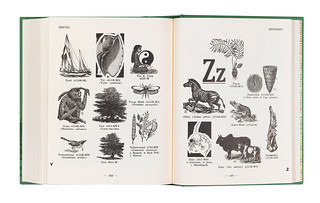
The mysteries run even deeper in John M. Carrera’s Pictorial Webster’s: A Visual Dictionary of Curiosities (2009). Carrera, a letterpress printer, bookbinder and artist based in Massachusetts, has restored and assembled more than 1500 engravings from nineteenth-century editions of Webster’s dictionaries to form a single volume. His visual dictionary is a rewarding illustration of the Surrealists’ conviction that a kind of beauty they termed ‘the marvellous’ might be found in the chance encounter of a sewing machine and an umbrella on a dissecting table. On a typical spread in Pictorial Webster’s, we find ourselves contemplating the chance encounter of a stereoscope, a stethoscope, two men on stilts, a spooky cave, a stiletto knife and a stickleback.
‘I believe a person instinctively tries to find the connection between things when they are grouped together,’ writes Carrera, ‘and so when confronted by combinations of two or more images the mind looks for a link to give their grouping meaning. My hope is readers will “read the text” by relaxing their minds in studying the pages to allow their subconscious-ness to supply the connective meaning between images. The keywords at the tops of the pages might supply a theme to a reader, or merely be worked into one’s own narrative.’
Here, then, is the essence of this dictionary’s – or indeed any dictionary’s – appeal. The lexicon’s open framework enables readers to pursue their own paths, forge their own connections and weave personal narratives. The dictionary’s randomness reflects life itself. Everything is in there, potentially available and knowable, though it is perfectly acceptable to take away only as much as you need. With a dictionary, there is no guilt in partial reading, as there is when you leave an ordinary book unfinished. This may also be true of the internet but Web browsing is sequential, with screen following screen, whereas the dictionary’s fortuitous proximities are apprehended simultaneously. If anything, the internet should foster our appreciation of dictionaries since this is how many people now prefer to read. A good dictionary will be pulled from the bookshelf again and again; slowly becoming acquainted with its labyrinth of possibilities is a special kind of pleasure.
Pictorial Webster’s: A Visual Dictionary of Curiosities by John M. Carrera (Chronicle Books, 2009). The ‘text’ here is made up of the illustrations – ‘each illustration can be a word, a sentence, a paragraph, or in some cases, an entire chapter,’ writes Carrera.
Rick Poynor, design writer, Eye founding editor, London
First published in Eye no. 78 vol. 20 2010
Eye is the world’s most beautiful and collectable graphic design journal, published quarterly for professional designers, students and anyone interested in critical, informed writing about graphic design and visual culture. It is available from all good design bookshops and online at the Eye shop, where you can buy subscriptions and single issues.

