Summer 1995
Lucille Tenazas: Layers of language

The work of San Francisco designer Lucille Tenazas lies somewhere between the rigour of design and the freedom of art. Tenazas believes it is possible to solve the client’s communication problems, while also addressing her own

The inherent tension between art and design is an issue that designers since the Bauhaus have sought to address in one way or another. Like their predecessors, contemporary graphic designers use well-tried problem-solving methods in their work, but few are able to reconcile these with self-expression. One designer who has succeeded in establishing a union between the two is Lucille Tenazas, whose work achieves an effective symbiosis of rationality and creativity. Tenazas herself is adamant: ‘You can have both in the work. Design is the only field in which science and art are merged.’
By suggesting that art and design are compatible, Tenazas takes a controversial stance within current debates on graphic design. The ‘art of self-expression’ has long been shunned by certain sections of the design community, who fear that subjectivity detracts from the effective communication of the client’s message. According to some Modernist-inspired designers, breaches of so-called ‘neutral’ objectivity lead to pure narcissism, and those who dare to cross this boundary stray dangerously into the domain of ‘fine artists’. But it is the designer’s subjective voice that lends the work distinction, and design that suppresses that voice becomes merely a dry exercise in problem-solving. Tenazas acknowledges the conflict: ‘You should never lose sight of the fact that you are solving somebody’s problems.’ But she quickly adds: ‘At the same time, you should solve your own as well.’
Tenazas was born and raised in the Philippines and learned at an early age to accommodate both eastern and western ways of looking at the world. ‘My feet were anchored in the Philippines but my head was mired in colonial thinking.’ The strong American military presence familiarised her with western culture and language as she learned English alongside her native Tagalog. Like many language students, she amassed a host of idiomatic phrases such as ‘gilding the lily’ and ‘beating around the bush’ which she found out were out of place in everyday speech once she arrived in America. This experience led her to want to ‘master the language and learn to use words in subtle ways’, and it is this interest in language that gives her work its distinction. Tenazas uses language to ‘track’ the world around her. ‘It is through language that I feel I have some grasp of that culture,’ she says.
Education was encouraged within Tenazas’ family. Her mother taught in Manila and her father was instrumental in putting his own siblings through college, including a sister who later provided financial assistance to enable Tenazas to attend graduate school. Tenazas’ studies in the Philippines focused on fine and liberal arts, which broadened her understanding of the contexts in which culture and design are produced. This, coupled with design work experience at the pharmaceutical companies Bristol-Myers and Smith Kline Corporation, led her to investigate the possibility of postgraduate study in design in the US.
Tenazas applied to Cranbrook Academy of Art on the strength of its reputation as the training ground in the 1950s for Jose Joya and Napoleon Abueva, both established Filipino ‘national artists’ with highly visible public commissions to their names. At that stage, she knew more about ‘Cranbrook, the school’ than about the design department. In 1979, after an initial rejection, she arrived in California, where she studied for two semesters with ‘Pacific Wave’ designer Michael Vanderbyl at California College of Arts and Crafts (CCAC). After replenishing her portfolio and developing her skills in drawing and painting, she found to her amazement that a second visit to Cranbrook brought immediate success.
Tenazas entered Cranbrook in its heyday – a time when linguistic and post-structuralist theory was being examined and challenged directly. But the impact on the way she approached her work was not immediate. ‘It was only later that I appreciated the connection I had with Cranbrook,’ she says. She was nicknamed ‘the California one’, and from the outset her work was different from that of the other students. She had brought with her the visual language of California’s New Wave – bright colors, geometric shapes and a rich textural surface. She also preferred drawing and cut-and-paste techniques to the mechanical stat cameras favoured by many of her contemporaries.
In time, Tenazas was exposed to new theoretical ideas and new elements for her visual lexicon, which she blended with the ideologies of pioneer European Modernists and the vernacular of America’s cultural landscape. She believes it would have been ‘artificial’ for her to have adopted the tenets of French structuralism embraced by other graduates. Tenazas took from Cranbrook its way of thinking about design rather than an established visual style. ‘I saw at Cranbrook a natural base to start from – the teachings of Wolfgang Weingart, Swiss Modernist design, and so on.’ She moved away from her colleagues’ ‘type ’n’ stripe aesthetic’ to one which displayed an elegance and formal resolution.
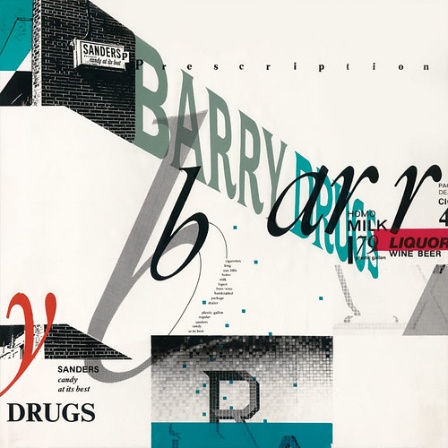
The Barry Drugs street sign project (1981) is an early example of Tenazas’ exploitation of formal design considerations and simultaneous use of ‘neutral’ and ‘expressive’ means of communication. The brief required the designer to present ‘an interpretive graphic essay’ based on a single block of a commercial main street using combinations of photographic imagery and typography. Tenazas’ submission demonstrated her understanding of conventional design principles – hierarchy, balance, colour – together with an exploration of linguistic concepts through a playful interweaving of different weights and sizes of type to form poetic juxtapositions and engaging interpretations of space. The project reveals an empathy for the visual language of European Modernism alongside West Coast vitality, colour and form.
Design: Lucille Tenazas. Barry Drugs street sign project, 1981. Completed by Tenazas while at Cranbrook, interpreting the urban and consumer visual landscapes by combining image and type as graphic narratives.
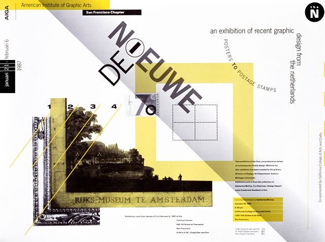
Top. Poster for an AIGA exhibition of Dutch graphic design, 1987.

During the mid-1980s Tenazas was able to continue her visual explorations at the New York corporate communication consultancy Harmon Kemp. In what was an unusual situation for a recent graduate, she was encouraged by the company’s principal, Marshall Harmon, to develop her aesthetic without any interference. ‘It was a gift, a happy coincidence, that the company didn’t have a strong identity,’ she says. Her work for the International Paper Corporation provided her with the opportunity to pursue her interests in content and typography and to invent a new approach to promoting commodity-grade papers. By focusing on content (the message) rather than the material itself, Tenazas ‘elevated’ the perceived quality of this type of stock – a method since adopted successfully by other designers.
Tenazas Design – Tenazas and two assistants – occupies three small rooms in San Francisco, an arrangement of space that like the work combines private and public. The walls of Tenazas’ own office are lined with carefully ordered artefacts and images that reveal her personal perspective on design. ‘I am very conscious of the kinds of people I would allow to see this aspect of myself,’ she explains. ‘If I wasn’t sure about their inclinations I would probably meet them in my conference room.’ The studio’s projects are mostly for organisations in the cultural sector – the San Francisco Museum of Modern Art, 2AES, California College of Arts and Crafts, the Center for the Arts at Yerba Buena Gardens, Chronicle Books, Esprit and the Pacific Film Archive. The work examines the formal concepts of graphic design and the processes of interpretation and meaning through manipulations of language, imagery, texture, form and space that go beyond a mere account of the client’s message.
Tenazas eschews overt displays of post-modernist trickery such as the complex layering and vernacular parody associated, rightly or wrongly, with the ‘Cranbrook style’. ‘I can’t be like Ed Fella, who is spontaneous. My design is a more controlled extension of the way I am.’ Instead, she offers a reductivist aesthetic, which she describes as a ‘language of clarity’, based on the compositional principles promoted by Johannes Itten in his basic design course at Bauhaus – contrast, tension, hierarchy. She strives to maintain a consistent balance between her own concerns and those of the client, between subjective and objective messages. She is aware of the difficulty for the reader of ‘sifting through a lot of elements on the page’ and tries ‘to discipline myself to use just one element’. But she asks, ‘How does this element become interesting if it is not manipulated?’
A promotional mailer for the photographic book The Body illustrates one way of negotiating this conflict. Tenazas has created a visual and verbal narrative using photographs from the book combined with single words. The story unfolds across the panels through a series of body fragments and slogans: ‘mind’, ‘flesh’, ‘idols’, and so on. The images are faceless, but take on unexpected values when juxtaposed with the text.
Another intriguing combination of words and images occurs in a spread for Photometro magazine, for which Tenazas was asked to arrange a set of supplied photographs into a single composition. She chose a formal approach, adopting Modernist compositional elements: bars, rules and hierarchical structuring. Layering is introduced by overlapping images and the typography allows subtle linguistic readings, creating an ambiguity between form and content. ‘Sometimes I wonder whether the layers obscure or enhance the image,’ says Tenazas.
For an exhibition at the University of Akron in 1990 which aimed to provide ‘designers’ with an opportunity to act as ‘artists’ and reflect on their work and approach, Tenazas rejected the conventional method of framed images on walls and produced an installation. ‘This provided flexibility and allowed me to show how I think instead of showing the final product’. Frosted Mylar and double-glass panels suspended from the ceiling created a playground in which typographic and spatial experimentation unfolded around the viewer. As in Tenazas’ other work, the installation used transparency to reveal meanings hidden beneath layers of type and image, inviting the viewer to investigate and interact.
When asked which of her projects best sums up her career to date, Tenazas replies without hesitation: ‘The two posters depicting the shroud and the desert.’ These announcements for a student architectural competition sponsored by the renegade San Francisco architectural organisation 2AES – a client that has allowed Tenazas to respond to each brief in a personal and experimental manner – continue her search for a balance between objectivity and subjectivity in design.
The posters use images ‘found’ at home – photographs of an excavation site and a shrouded body taken by her husband, photographer Richard Barnes, on trips to Egypt – which are given ‘another life beyond the photograph’. Barnes uses a minimum of compositional elements to convey meanings and associations, and his excavation site image has a reductive simplicity. ‘For me this is architecture in its most basic form, or in its very primaeval state,’ says Tenazas. She shows a similar sensibility in her treatment of the typography. To ‘elicit a response from the students’, she plays typographic word games, hiding part of the word ‘displacement’ behind the image, removing some of the letters from ‘replacement’ and positioning the ‘r’ in ‘revolution’ outside the frame. Her voice speaks through both the typography and the selection of words, which she describes as ‘quietly powerful’. The words do not intrude on our understanding of the images; rather, Tenazas aims to ‘evoke meanings through mental associations’, coaxing the reader through a subtle ‘mental layering’ of interpretations.
‘I always hoped that when people saw these posters, they would see me finally, and would have no idea that I am from the Philippines,’ she says. Tenazas does not deny her heritage, but feels that ‘cultural baggage’ should not be obvious in her work except when the brief demands it, as in a spread for Emigre’s issue on ‘Redesigning Stereotypes’. This belief also informs her teaching. Tenazas’ project briefs for her experimental typography students at CCAC are often devised to reach beyond cultural differences, while at the same time encouraging solutions that demonstrate how language may be interpreted differently by different cultures.
Tenazas provides her students with a well balanced perspective on culture and design ideologies and sets projects that balance artistic and scientific approaches to design. She requires her students to use objects of personal significance in order to bring to the fore their ‘personal emotional voice’ as well as using ‘problem-solving and rational thought’. In her teaching and commercial practice, Tenazas has found a way to marry personal expression and practical requirements, successfully reconciling her own private world with the demands of the public arena.
Teal Triggs, Senior lecturer, Ravensbourne College of Design and Communication
First published in Eye no. 17 vol. 5, 1995
Eye is the world’s most beautiful and collectable graphic design journal, published quarterly for professional designers, students and anyone interested in critical, informed writing about graphic design and visual culture. It is available from all good design bookshops and online at the Eye shop, where you can buy subscriptions and single issues.

