Spring 2010
Make each letter speak out loud
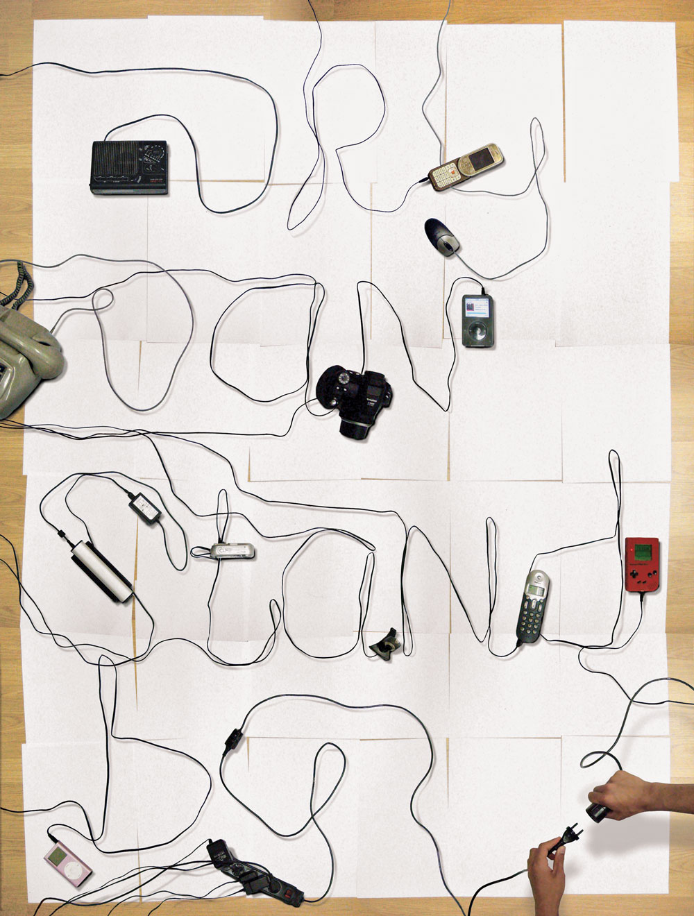
Luke Lucas / Lifelounge
Volumeone
Mario Hugo
Happypets
Jessica Hische
Yomar Augusto
Marcus Eriksson
Richard Sarson
Grandarmy
Autobahn
Job Wouters / Letman
Brett Macfadden
Illustrative typography is rewiring the way we read art, design and communication

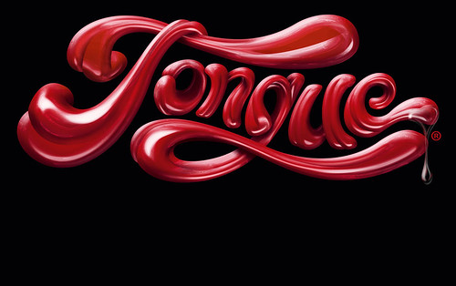
Take a look around; typography is making pictures, illustration is saying something, the boundaries are blurring. Whether it’s Alex Trochut’s print campaign for Estrella beer, bringing surreal colour to wintry British streets; Marian Bantjes’ sophisticated re-writing of Saks Fifth Avenue’s identity; The New York Times Magazine commissioning custom headlines for every feature; or Uniqlo’s UT slogan T-shirts; illustrative typography is everywhere. We see it, we read it – scrolling across our screens, selling anything from cars to butter.
Where once an illustrator drew the pictures, or a director shot footage, and then a typographer or a graphic designer generated the type, these days it is likely that one individual, or studio, will do it all.
‘Traditionally, a graphic work is built from two main elements: images and words. The images create a certain atmosphere, feeling or metaphor – in other words, emotion. And then words are used to put across information,’ says Jeroen Breen of the Dutch studio Autobahn, which mixes technical expertise with creative solutions. ‘We don’t split the emotion and the information, it works simultaneously.
‘It’s not that we’ve consciously thought about how to make something evolutionary. Our illustrative typographic work communicates, in a special way, though.’
Computer technology may be at the root of this new integration, but experimentation is key. Breen again: ‘Alongside our commercial work we make experimental projects, which aren’t prompted by commissions, and which cost us time and money. But … almost all of our experiments have produced benefits, through publicity, awards, and generating well paid jobs.’
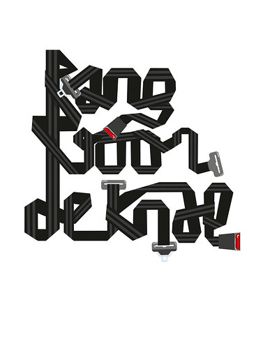
For Dutch style magazine NRC Next, for example, the Utrecht-based studio has made headlines using seat belts, computer cabling and puppet limbs. Letters cut from growing turf, for a feature about neighbour-envy, were later developed into a font, Evergreen, now available to play with in the ‘fullcolour fontwriter’ on the Autobahn website. Evergreen won a silver European Design Award for editorial illustration in 2009. And grass was only the beginning, leading on to a series of ‘freshfonts’ concocted from other unlikely means, including toothpaste and tomato ketchup.
What he calls ‘endless doodling and experimenting’ – with paint, print, installations – feeds Job Wouters’ commercial projects with clients such as Audi, Nike, Tommy Hilfiger, but it’s not a one-way street. ‘It works in both directions’, explains Wouters, aka Letman. ‘Sometimes I find a solution for an assignment while going through my investigations, and other times a new direction for an assignment leads to more investigations.’
Wouters is aware of the trend. ‘Brands are always on the look-out for what’s in fashion. Because illustrated typography has been hyped, it has brought me well paid commercial jobs, and the freedom to deepen my interests and take on cultural projects with limited budgets.’
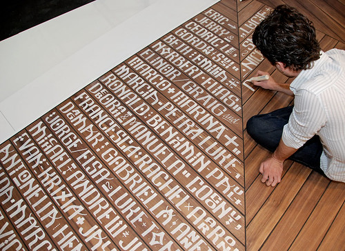
Meanwhile, alongside their commercial work in print and moving image, Brooklyn-based GrandArmy mostly experiment with wood type and found paper, over-printing vintage comics and magazines. They are happy mixing media and using an array of less likely computer programs too: for a Nike SB poster project, GrandArmy drew letterforms that approximate isometric architectural renderings of skate-park elements. Eric Collins explains the studio’s eclecticism: ‘You can lean too hard towards the hand-done and come off “crafty”, or too hard into digital, and come off “sterile”. We always strive to find a balance.’
‘Hand work’ is at the heart of much of this integrated type-image. However, that impulse has moved on radically from the naïve pencil and felt-tip aesthetic of Mike Perry’s Hand Job: A Catalog of Type (Princeton Architectural Press, 2007). By contrast, New Ornamental Type (Thames and Hudson, 2010) by Steven Heller and Gail Anderson is refreshingly slick. But then Anderson did cut her teeth on ‘theatrical typography’ for Rolling Stone magazine. However a sophisticated finish doesn’t preclude ‘hand work’.
For Jessica Hische, for example, hand-mark-making is not an end in itself. Even if she intends to letterpress the final piece, or embroider it, the process starts by ‘drawing on a computer’. She begins with general decisions – ‘Is it script, retro, condensed, gothic?’ – drawing on ‘an unconscious library of type’ built up from her time at Louise Fili’s New York studio (a hot-house of innovative food packaging). ‘Then, I draw a very basic skeleton and add details, until it feels right,’ she says.
Hische thinks the current interest in hand lettering is partly due to dissatisfaction with off-the-shelf digital options. ‘[Art directors] are receptive to hand lettering if they’ve worked with sub-par fonts,’ she says. ‘Display typefaces can be difficult, or only look good at certain sizes. If you hire a hand-letterer, you won’t worry about weird connections or a scaling difference in weight.’
There’s an extra social media element to Hische’s work: her Daily Drop Cap project makes free illustrative letters available for amateur bloggers to use (just copy a few lines of code to your blog) under a Creative Commons license. Her website also lists type and lettering ‘compatriots’ such as Bantjes (see Eye 72), Alejandro Paul, Mario Hugo, Seb Lester, Niels Shoe Meulman and Matt Owens.
While designers are creating bespoke logos, lettering and entire fonts for clients, they are also supplying ‘palettes’ of illustrative type elements that can be mixed and matched.
Swiss studio Happypets, for example, consider themselves illustrators rather than type designers, but they will build clients an integrated identity from various elements. ‘We’re attracted to the hand-drawn, hand-made, carved-out, taped-up; anything with texture, volume and three dimensions,’ explains Patrick ‘Patch’ Monnier. ‘For each project we create a sign; something strong and simple, and the type is part of it, completing the image.’ Over a series of posters for the Théâtre du Moulin-Neuf, Lausanne, the logo and informative text appear in a mix of hand-drawn lettering and more traditional fonts.
Mixing elements appears to be central to this practice of illustrative typography. Marcus Eriksson, of Vancouver-based studio Academy, describes his process: ‘I start with a sort of toolkit, a set of rules that I use to piece together an illustration, typeface or logo. These symbols make a pattern that works in different combinations, to create meaning.’ He thinks big brands are becoming ‘less conservative with the way they use typography and design’.
Volumeone (with offices in Brooklyn and Los Angeles) also takes an ‘elements-based’ approach. For the Seattle State Lottery, partner Matt Owens explains, ‘We created all the letters, “A” to “Z”, and then set each headline by hand. As the letters were individually illustrated we didn’t convert it into a typeface.’ Another modular system, this time in script, completed the identity.
Like Eriksson, Hische, Wouters and GrandArmy, Owens’ work featured in ‘Lubalin Now’, the inaugural exhibition at the Herb Lubalin Study Center of Design and Typography, in New York (see pp.70-73). ‘Lubalin characterised his approach to design as Graphic Expressionism’, explains Mike Essl, who co-curated the show with his ME / AT partner, Alexander Tochilovsky. ‘The show came together because so many designers are working in a similar vein, in ads, on television, and in work we saw on sites like ffffound, Flickr and Behance.net.’
Talking about influences, Owens says: ‘The level of skill and execution required to develop sophisticated illustrated typography is akin to that of a commercial artist, the work of Herb Lubalin, and the type-driven artwork of Ed Ruscha. That precision and sophistication is also found in graffiti. My impulse is to create type that feels rendered, precise, complex and elegant, but also human.’
For London-based designer Richard Sarson, influences also abound. ‘Reference points are so diverse now; I can access anything online to feed off.’ He thinks that working without clients has prompted the breakdown of barriers between word and image. And he credits David Carson and Tomato with pushing graphics towards the ‘art world’, to the extent that what he calls ‘base communication and problem-solving’ are no longer the issue.
Sarson’s version of this type-image mix verges on pure reduction. His black, white and red word-images may reference Modernism but, he says, ‘One of the reasons I like to draw is because the lines I draw are totally mine; I own them.’ After a number of moves, they ‘happen to evolve into typography’.
Faced with the need to stand out in a talent-saturated industry, he asks: ‘Why use type straight from the machine; why create work from someone else’s template?’
Diversity – of aesthetic, of media, of method – is the key to this blossoming of type-illustration hybrids, as visual experiments spill over from personal work to lucrative commissions. At the same time that digital innovations are making it easier to import, layer and customise existing fonts and found text, studios are investing in screen-printing and letterpress equipment and inviting their wider circle to come and collaborate. The proliferation of text in time-based media and the ever-increasing speed of communication is making us better prepared for this stretching of legibility.
The result is a new complexity that revels in the art and craft of drawing and letterforms. It is unlikely that this type-illustration hybrid is simply a trend; it may be closer to an evolutionary reinvention. Watch as the written word becomes the visual word.
First published in Eye no. 75 vol. 19.

