Winter 2008
Make it real

Forget fancy effects – ‘authenticity’ may be the most effective way to capture an audience

‘Do It For Real.’ This, according to Flo Heiss, partner and creative director at the London-based interactive marketing agency Dare Digital, is one of the seven crucial ways ‘To Make Digital Your Bestest Friend’. (The others are: ‘Be Useful. Be Engaging. Be Entertaining. Make It Unfinished. Be Honest. Give Up Control.’) This is not, however, a call to throw away computers and start from scratch, but a realisation that engaging with real things and real people is more satisfying than being chained to a screen and keyboard.
‘Doing it for real,’ Heiss tells me, ‘was more about the fact that dealing with digital and computers doesn’t have to mean that special effects is the answer, just because you can. What gets people buzzing is the real things. Especially online. The “How the hell did they do that?” factor intrigues people; it’s one of the many reasons Sony Bravia’s “Balls” worked so well. There’s a real hunger for real things, especially with all the CG effects in mainstream movies. People want real emotions. This is why Michel Gondry’s work gets people talking.’ (The director of The Science of Sleep has a gift for quasi-computer-generated effects that are all composed in camera.)
‘Getting people talking is what you want,’ Heiss says. ‘Some people call this viral. I call it creating something akin to pop culture. None of our ideas are conceived using the computer. We use a hell of a lot of felt-tips and paper.’
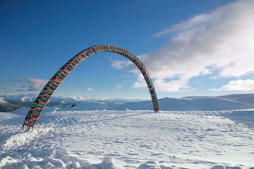
An arch of plastic chairs built in the Antarctic by Glue Society, for a 42 Below Vodka film (gluesociety.com). The real-time effort put into the project is the key to its popularity on the internet seeded via YouTube. ‘We could have made them in Photoshop, but this pointlessness actually became the point,’ says Jonathan Kneebone, co-founder of the Sydney studio. ‘We went to the trouble of making these things because we can. This in itself is a very 42 Below thing to do.’
Top: Still from Fallon’s ‘Balls’ for Sony Bravia television. The agency bounced 250,000 coloured balls down a hill in San Francisco. (50 students on rollerskates had to pick them all up).
Model clients
The big agencies have latched on to this approach with vigour: Fallon’s extravagant campaigns for Sony Bravia – incorporating animated Play-Doh rabbits, or thousands of bouncing balls – or the full-size Skoda cake, for example. Model-makers are suddenly in demand. Chrissie Macdonald has been working with Praline on their imaginative brochures and ads for Central Saint Martins, and with Fallon on the highly visible (and often risible) ‘I am’ campaign for Orange. Dan McPharlin’s meticulous models of electronic equipment have attracted designers: Chris Bigg used some of the Australian artist’s structures to illustrate Steve Jansen’s album Slope (Samadhisound, 2007); and the May 2008 cover of Wallpaper* magazine featured an elaborate McPharlin machine that churned out 3D letters.
McPharlin describes his process as an ‘interesting experiment to render hi-tech objects in a low-tech medium such as paper or cardboard’. He was, he says, inspired by Japanese gashapon (capsule toys). ‘In Japan everything is miniaturised and fetishised, and the attention to detail really interested me. The only material that was readily available was off-cuts of picture framing matt-boards, which turned out to be perfect for creating the small details required.’
The models depend on skilful photography for their impact. ‘I try to keep the photos as real as possible,’ says McPharlin. ‘As soon as you start manipulating images in Photoshop you’re lying to the viewer, so I avoid that. When people understand that they are looking at something real and tangible, it is exciting to them. I’ve read about some of the new digital fabrication techniques and the ability to “print” 3D computer models, but my work is about turning that idea on its head – taking something technological and then presenting it in a hand-crafted form.’
Hand-drawn representation and hand-writing are also returning to popularity, according to Michael Trudgeon, architect and principal designer of Crowd Productions, Melbourne, and creator of digital environments for Hoyts cinema complexes. ‘I think with the under-25s, text and image are more organically linked, like illustrated manuscripts,’ he says. ‘The irony may be that the absolute distinction between text and image underpinned by printing has been eroded by the computer, which tends to ignore this distinction in Photoshop and graphic design tools.’
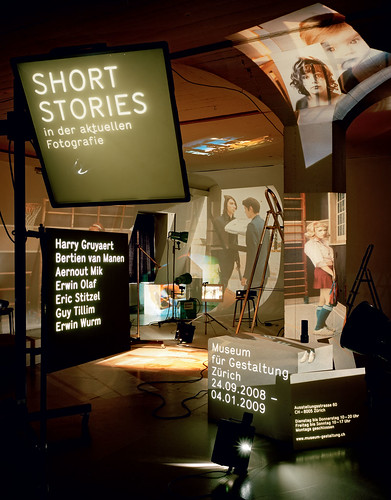
Poster (2008) for Zurich’s Museum für Gestaltung by Elektrosmog and photographer Oliver Lang. They used twelve slide projectors, with an image by each photographer in the show, to create a 3D ‘collage’.
He adds: ‘The intellectual property in architectural thinking is in the drawing. This has moved to the computer, because it is considered more mathematical and even less physical. In our own work, where we are drawing ideas from our clients to push the possibilities for architectural design, there is a role for hand drawing as a communication and collective design development tool. I like the idea of drawing as a social activity, a kind of open source idea and design development tool.’
Pure, natural, healthy
The most important concern for commercial brands, when communicating with their users and buyers, is authenticity. ‘You can’t really tell consumers what they want any more,’ says Alex West, founder of creative collaborative network the Future Department. ‘You have to provide what the market needs. Brands like Innocent [the smoothies company] are entirely authentic; their marketing is relevant to their audience, and that is reflected in the packaging of their products, the flavouring of their products, their partnerships.’
In this ‘Fairtrade’ age there is a growing market for natural ingredients that are carefully sourced and processed. Innocent’s method is to explain this, with witty, yet beautifully clear copy that ‘plays the straight card’, reassuring customers about the contents, which are presented in an appealing and attractive way, without artifice or coyness – an influential example of advertising†/ marketing copywriting that ‘keeps it real’. Here is an example from the company’s website: ‘Our first and most important step in creating a sustainable business is to only use 100% natural, healthy renewable ingredients for our drinks … This focus on keeping things pure, natural and healthy is why we called ourselves Innocent.’
Monolithic global ad agency networks are only slowly getting to grips with this new model. For West, the solution is: ‘Small and clever. The great ad agencies doing brilliant innovative work tend to be small groups of clever people working in partnership.’ Above all, the solution is not in endless research and testing and focus groups.
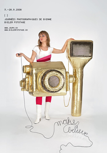
Poster for the Make Believe photography festival in Bienne, Switzerland, by Barbara Ehrbar’s Swiss studio Superbüro, 2008. Two young women wearing giant camera costumes walked around the major Swiss cities distributing flyers to promote the festival.
‘All the great work flies in the face of research,’ he argues. ‘People are now talking about insights. Insights are what you get before you do something; research is what you get after. You should be brave enough to develop your brand, your designs, and everything should develop from there.’
‘The Web doesn’t work with asterisks,’ says Simon Waterfall of digital marketing agency Poke London. ‘With a campaign, anything trying to sell something, if it has any fine print, any asterisks that exempt people, if it’s not true, then that’s the only thing the Web will talk about. Recent adverts from Microsoft to join the Mac vs PC battle were made on a Mac; it’s in the source file. Far from battling the Mac, it has thrown petrol on the fire.’
Reality check
Most of the television ads that still provide topics of conversation around water coolers have one thing in common: a hefty dose of ‘reality’. Fallon made sure that real coloured balls and real paint were tossed around in the cause of Sony Bravia; and Wieden & Kennedy went to enormous lengths not just to create real events for Honda but also to distribute a ‘making of’ DVD to prove it. The 2003 ‘Cog’ campaign appeared to be inspired in part by Peter Fischli and David Weiss’s 1987 film The Way Things Go, recreating its essence in car parts.
‘We wanted to do it for real, because there’d be no magic if we did it any other way,’ explains Wieden copywriter Ben Walker. ‘If we’d used computer graphics it would simply demonstrate that Honda is a company that uses computer graphics firms.’
It is generally accepted that the ad break in television schedules cannot last much longer; the traditional idea, of shouting product names and benefits, is certainly dead (even if it refuses to admit it). Taking well publicised risks is the only way to ensure a decent-sized and receptive audience. Honda – again – achieved this with a recent live commercial featuring sky-divers.
‘The Web works well with truth, with honest paranoia and conspiracy,’ says Poke’s Simon Waterfall. ‘There’s no such thing as a free lunch on the Web as everything is free. What brands and agencies need to do is pay with acceptance, flexibility and a modicum of understanding to the culture online.’
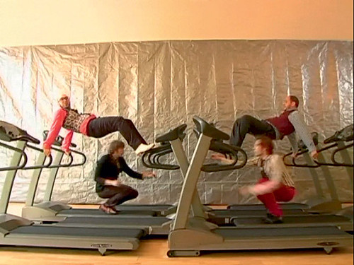
For brands looking to get people talking about their products without the inconvenience of multi-million production and media budgets, the internet is tempting: when it all comes together perfectly your audience provides the distribution medium, and you chalk up viewing figures that broadcast channels would find impossible to match. (The band OK Go clocked up 41†million hits on YouTube with their rather wonderful gym treadmill video.) Given the speed and depth of this change it is hardly surprising that enterprising brands are cutting out the ad agency, and broadcast media altogether, and working with small independent companies to produce virals that exist only online.
‘We’ve been obsessed with real from the beginning,’ says producer Ed Robinson of the Viral Factory, which has used Samsung mobiles to shoot hugely popular online films for the brand, such as ‘How we met’, the tale of two lovers. ‘It’s our single trick, and that’s because we work in the online world. The audience’s aesthetic, and what genuinely grips and excites them has changed.’
Robinson runs through the history of broadcast in a few dismissive sentences: a 50-year monopoly of ‘dramas based on a pretty theatrical aesthetic’, then reality TV, ‘which felt like a breath of fresh air, but was still heavily edited and manipulated’. Now there is the internet: ‘A direct window on the world. There’s no real filter between the audience and what’s on screen. So they trust it more; it’s how the world really is.
‘We ignore the possibility of “doing it post” unless we absolutely have to, because we’d be doing something our audience couldn’t do themselves. That’s the YouTube aesthetic; if you can do it for real, do it for real, and they’ll love you for it. We work directly with Samsung, and it’s a very simple process. We have an idea, they commission it, and four weeks later we deliver the film. That’s a really new way that people interact with brands; don’t tell me what you are; show me what you are. The heavy internet user is anti advertising. We represent the audience who don’t like being advertised to; but there is room for the advertisers’ money to make content we like. And if you consistently make content that the advertising-resistant audience enjoys, and they recognise it’s from you, then you’ll become a brand which is favoured by them.’
The Glue Society in Australia concocted an extraordinarily elaborate campaign for 42 Below vodka, building giant sculptures of chairs in the Antarctic. This resulted in some arresting high-resolution images, but half the fun comes from watching how it was done, in the YouTube videos.
The simple message may be that the audience appreciates effort, skill and hard work. People have always made and used tools; part of the skill is in knowing, and using, the right tool. Take the paper models and animated lettering that Montreal-based designer Julien Vallee constructs for clients such as MTV and The New York Times. Or, with a completely different process and aesthetic, the elaborate long-exposure, in-camera poster that Swiss studio Elektrosmog made for a current show at the Museum fur Gestaltung in Zurich.
21st-century craft
Richard Sennett’s recent book The Craftsman argues that there is a craftsman in all of us, and this can be motivating and inspiring. In much the same way, rediscovering paper models, etching, linocuts, letterpress, casting from the street, and preferring in-camera effects to post-production is either symptomatic of a genuine trend, or, more simply and probably more likely, evidence of the natural ebb and flow of change. Creativity just cannot stand still.
Perhaps a different, maybe older, technology, can bridge the gaps that computer technology inevitably creates; gaps that specifically need to be addressed as part of the education process. Steve Rigley argued (Eye no. 57 vol. 15) that the ‘computer presents a new and artificial arrangement of distances: between the hand and the eye; the screen and the object; the object and the means of production’. This was said in the context of praising the value of letterpress, particularly in an educational environment.
This is also partly what Catherine Dixon proposed with the ‘letterpress celebration day’ at the St Bride Library in London in November 2008. Dixon, who notes a ‘genuine excitement and growing interest in letterpress’, has always insisted on teaching its fundamentals to first-year students: ‘Its physicality and modularity inform the digital designer; space becomes a positive presence and takes on a slightly different meaning.’ In other words, it ‘stops type floating around on the screen’.
As far as Alex West is concerned, advertising is now almost a by-product, as more and more is put into the innovation of a brand, and its overall communication. ‘It’s the most basic thing that happens at the end of a brand chain,’ he says. ‘There are many other interesting things for a brand to do in that space while it develops; online, offline, events, sponsorships, partnerships – all these other things that create the brand.’
Frame from the Grammy-winning ‘Treadmill’ video for OK Go’s song ‘Here It Goes Again’, choreographed by Trish Sie, directed by Sie and the band, and released via YouTube in 2006. Seventeen attempts were needed to film it in one unedited take.
Steve Hare, freelance journalist, author, Wiltshire, UK
First published in Eye no. 70 vol. 18 2008
Eye is the world’s most beautiful and collectable graphic design journal, published quarterly for professional designers, students and anyone interested in critical, informed writing about graphic design and visual culture. It is available from all good design bookshops and online at the Eye shop, where you can buy subscriptions and single issues.

