Summer 2020
Malika Favre: Gridlocked

A love of mathematics and geometry underpins the immaculate illustrations of Malika Favre

The illustrations of Malika Favre have become familiar over the decade since she left UK studio Airside to become an independent illustrator. Her clients include Penguin Random House, The New Yorker and BAFTA (British Association of Film and Television), and she is known for personal projects such as the sensual ‘Crazy Horse’ print series, exhibited at the Outline Editions gallery in London in 2017.
Her new book Malika Favre, published by Counter-Print, divides her work into seven categories: Women, Travel, Patterns, Geometry, Pop & Culture, Society and Erotica. At the UK launch of the book (now re-printing after the first edition sold out) she talked candidly about the mathematical, systematic approach that lies behind the geometric precision of her work. ‘I was always torn between art and science,’ says Favre. After studying maths and physics, she thought for a while of studying engineering, but eventually opted for art school instead. When Favre studied graphic design in Paris, she was fascinated to learn about grid structures. As she established her career, grids became a crucial part of her illustration work, particularly in series such as ‘The Kama Sutra Alphabet’ and ‘Fields’.
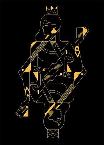
‘Lucky Hands’ (2018) playing cards for fashion brand Alice Balas Paris.
Top. New Horizons (2014), artwork and grid for Brummell magazine. Favre’s cover image uses a ‘pure perspective’ grid to create depth. ‘Creating volume with a flat, coloured pattern is always a challenge,’ she notes, ‘and the hot air balloon was the perfect object for it.’

‘Most of my work has a geometrical aspect to it,’ says Favre, who now lives in Barcelona. ‘It could be as simple as playing with symmetry or bringing depth into illustrations by following nature’s rules. Geometry is everywhere around us. Every single being, plant, object, even landscape can be deconstructed into basic shapes. It is almost like an encrypted language that nature, as the ultimate designer, used to build the world we live in.’
For Favre, the grids act as a uniting principle: the single line of the ‘Fuerteventura’ series; the complex structures of her Vertigo posters or ‘Lucky Hands’ playing cards.
‘Not everything has to imitate the world as we see it,’ she says, noting that the beauty of illustration is its ability to ‘cheat reality’ and create a new one, sometimes making an impossible grid that tricks the mind of the viewer. She points out that ‘illustration, unlike photography, is limitless.’
Final artwork for Favre’s contribution to GraphicDesign&’s book Golden Meaning (2014), which featured 55 designers and image-makers who explored the idea of the ‘golden mean’ first defined by Euclid, the ratio 1:1.618. In the book, the illustration was printed in gold ink. Favre says: ‘This is much stricter – I first created the underlying grid without knowing what the final drawings would depict. I let the lines guide me until I saw this silhouette coming out.’
Favre sometimes talks of geometry as a ‘guilty pleasure’, an invisible secret behind her immaculate images. In common with many creative people, she recognises a certain obsessive ‘madness’ in working on details that few will see or care about. For Favre, the process is almost meditative; she can spend hours working out the logic of an image.
‘Artists have been using these same geometric principles for centuries, from the Egyptians to the Renaissance painters, all the way through to the Bauhaus movement,’ she says, ‘and for good reason: geometry is, in essence, the search for perfection.’ She smiles at a mention of Paul Rand’s aside: ‘Geometry is never wrong.’
Favre rejects the myth that creativity and logic are antithetical. ‘Most people expect illustrators to be unstructured, useless with numbers and unable to apply logical thinking. This can also mean that kids aren’t always pushed to develop both sides of their brains.’ Would she like to see a geometrical approach incorporated within illustration education? ‘We see more and more artists combining art and science today, through the means of technology and digitisation, so I am sure there are more illustrators like me out there, holding on to their secret.’
John L. Walters, editor of Eye, London
First published in Eye no. 100 vol. 25, 2020
Eye is the world’s most beautiful and collectable graphic design journal, published quarterly for professional designers, students and anyone interested in critical, informed writing about graphic design and visual culture. It is available from all good design bookshops and online at the Eye shop, where you can buy subscriptions and single issues.


