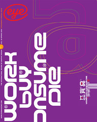
Spring 2009
Mark Thomson

‘The variations of nuance and voice are endless’
Mark Thomson is a British designer and typographer. Formerly art director of Taschen (1993-97) and Collins (2003-08), he has run International Design UK since 1998.
One characteristic of now is the apparent superabundance of types, which may lead one to think that we must be seeing the same thing again and again. But the opposite is the case: the variations of nuance and voice in type turn out to be endless, just like a lot of people speaking in a very large room. Of course, some are clearer than others, some more mellifluous, some spikier. Then there is the occasional voice that speaks through the words it delivers.
In type, such distinctive voices can make words seem both warm and cool, and the really distinguished typefaces are those in which the contrasts of feeling and form in language are sublimated in the word images. Seria and Nexus by Martin Majoor are numbered among these (as was Scala); so is Arnhem by Fred Smeijers.
Peter Verheul’s Versa (1993-) has the quality of being both formal in its vocal presence and almost cartoon-like in its details. I recently worked with it in a new Bible, where its human qualities really come through – like the grain in a piece of wood, or breath in music. Versa’s latest development is Rijksoverheid (2008), to which Verheul has added a sans serif. Each type embraces its contrasts in an eloquent counterpoint – reconciliation of hand and handle point, the rhythmical and the monumental, the intimate and the authoritative, and by extension the individual and the state.
Mark Thomson, designer, London
First published in Eye no. 71 vol. 18 2009
Eye is the world’s most beautiful and collectable graphic design journal, published quarterly for professional designers, students and anyone interested in critical, informed writing about graphic design and visual culture. It is available from all good design bookshops and online at the Eye shop, where you can buy subscriptions and single issues.
