Winter 1994
Marks on paper

Letterpress lovers tend towards nostalgia. For British typographer Alan Kitching, its eclipse by new technology has been a liberation

High up in a converted warehouse in Clerkenwell, London, the sunny, pine-floored rooms of Alan Kitching’s studio seem a tranquil retreat. But what distinguishes them from the environments in which most designers work is the collection of letterpresses on which his purely typographical designs are created: two ornate Victorian Albion presses – there more for decoration than anything else – and a Stephenson Blake proofing press, together with dozens of slim wooden drawers filled with wood and metal type.
Since he did his six-year apprenticeship as a compositor in the 1950s, Kitching has seen letterpress printing shift from being the standard way of working, to an old-fashioned technique, to becoming, in the last five years or so, completely archaic. But unlike many of those who work in the medium today, Kitching is not steeped in nostalgia. For him, the fact that letterpress printing has undergone this transition has been a liberation – particularly when it comes to teaching. No longer obliged to ensure that his students learn the rudiments as a matter of course, Kitching is free to explore whatever aspects of the medium currently interest him, with pupils drawn from disciplines such as photography and fine arts, as well as graphic design, who choose to enrol on his courses.
“The teaching has turned right around,” he says, “It’s not like it used to be 15 years ago, when that was the way you set type. It has become a creative medium. When I first joined the Royal College of Art, you taught ‘graphic design’. But graphic design has changed so much with the Macintosh that I began to realise I’d have to do something different. Slowly, I changed my teaching situation at the college to teaching what I know.”
Kitching spends a lot of his time teaching, either at colleges or in his Clerkenwell studio, where he runs workshops several times a year for anyone who wants to try letterpress printing. An increasing number of people do- many of them designers who take a week’s holiday from their own studios in order to attend. In an age when most design is created using a standard keyboard and mouse, there is something fascinatingly primordial about being able to pick up and touch bits of wood and metal type and use real, liquid, ink-smelling ink to make marks directly on to paper.
Terry Jones, founder of the style magazine i-D, has worked with Kitching on a number of projects. “One of the reasons for working with Alan was that at the point we started to use the Macintosh at i-D I wanted to get back to physical design,” he says. “What Alan has set up brings you down to earth.” Howard Brown, a London-based designer who has also collaborated extensively with Kitching, agrees: “It’s a sensual way to work and the quality of the finished product is so tactile. You’re using real ink, you can get an incredible intensity of colour, and every copy can be different. You have direct contact with the materials, you get your hand dirty.” Referring to Kitching himself, Brown adds: “He’s not precious about it either. Often people in that letterpress set-up are every precious.”
At a recent exhibition of letterpress printing at London’s Craft Council, the contrast between Kitching’s contributions and those of other exhibitors was stark. The priority of most of the work seemed to be to achieve technical perfection, with immaculately spaced type, carefully printed- usually in black ink – on thick, creamy papers. The results, although beautiful, were sterile. By contrast, Kitching’s work was vibrant, using a mixture of grainy wood and sharp metal type and coloured, even luminous inks. The craft technique was there, but the priority was expression. “I’m not interested in the technicalities,” Kitching admits. “I’m more interested in the idea of what you can do.”
In a sense, Kitching can afford to play down the technicalities: he has, after all, mastered them more thoroughly than most. A dapper man, with an almost theatrical moustache, he still has traces of the north-east in his voice, although he has lived in London for 30 years. Brought up in Darlington, he became an apprentice to a printer when he was 14. “Darlington in those days was still steam engines and heavy industry,” he says. “Printing was the nearest thing my parents could think of to commercial are, which is what I wanted to do. As soon as I saw the printing works, I fell in love with it. It was bliss.”
Having completed his apprenticeship, he applied for a job as a technician at the School of Art at Watford College of Technology. It was not the job he wanted, but Watford- then a big printing centre – was enticingly close to London. It was a move which changed his life. “It was the early 1960s, and I met almost every designer in London because they were all teaching there,” he says. “And of course the big guy who turned up was Anthony Froshaug.”
Froshaug, a freelance typographer, designer and printer, is something of a legendary figure. Eccentric, charismatic and perfectionist, he was unlike anyone Kitching had met before. “His whole concept of living was different,” he says. “He had a unique touch in everything he did- the clothes he bought, the food he ate. But he was a tough guy. He didn’t mind upsetting people.” When they met, Froshaug had just received copies of his book, Typographic Norms, published by the Kynoch Press / Designers & Art Directors Association in 1964. “He had a stack of them in his arms, and he gave me one,” says Kitching. “It completely threw me.”
Thirty years later, looking at a well-thumbed copy, it is easy to see why Typographic Norms had such a profound influence. As its title suggests, the book is about typographic standards: point systems, body sizes, leading, spacing. But Froshaug pared down the information to its abstract essence, which, coupled with a minimal design (the title, for instance, is printed in black gloss ink on black card) resulted in a volume whose pages unfold to reveal nothing but patterns of carefully arranged numbers or rectangles- the skeletons of the typographic systems. It is, as Kitching puts it, “almost like a painting” – severely Modernist, yet with overtones of the cabalistic, mystical aura that surrounds the pre-digital craft of typography.
Froshaug set up the Experimental Typography Workshop at Watford College, and Kitching worked as his assistant. The workshop, which was separate from the main college printing department, started with just two typefaces, Bakersville and Univers. Two years later Caslon and Bodoni were added: Froshaug considered this range (old serif; sans serif; transitional and modern serif) to be sufficient.
In 1970, Kitching produced his own book, the Typography Manual, in a sense his reply to Typographic Norms. Less abstract than Froshaug’s work – it does, after all, contain examples of typefaces, – its acute minimalism nevertheless shows how deeply influenced Kitching was by Froshaug’s aesthetic. Yet looking at Kitching’s work today, with its mixtures of typefaces, colours and layered images, any remnants of Froshaug’s rigorous minimalism are far from obvious. Ask about it, however, and the underlying rationale becomes clear.
“One of the things is that you use existing systems. You take things that are well worked out and use them to great effect,” Kitching explains. “It’s trying to discover what the real virtue of something is, to bring out its essential quality. At the Experimental Typography Workshop we had four typefaces – and it was that can we do with these? That was very much Anthony’s credo – you have just a few things and draw out what you can from them.”
Kitching evidently thrives on the discipline of grappling with the limitations of letterpress technology, of getting the best from it while accepting it for what it is. It is an attitude he tries to instil in his students. Looking at a project he set for one of his workshops, he points to a word in which a capital “w” and lower case “i” have been set next to each other, with a gap between which is clearly too large. “That’s as close as you can get it,” he says. “It’s already kerned. If you did the repro, you’d just cut it and move it in, but as it’s printed on metal, I left it. You’ve no alternative.”
“I think that’s the main thing people can learn,” he continues. “You have a restricted system, and that’s the sort of image you get from it. You either have to go with it, or do something else. I design with what I can use and how it fits organically together. In a way you have no control over it.”
But though Kitching may be restricted by the physical limitations of letterpress technology, he does not allow himself to be constrained by the traditions that come with it. The stacks of type drawers in his workshop, for instance, are not arranged according to font, as they would have been in a letterpress compositor’s room, but instead each drawer contains all the examples of one character in a given point size. “This is my palette, if you like,” he says. “The raw material. It’s all the same size regardless of the face. Because sometimes, you are looking for an image. You might be looking for an ‘o’, and they are all in there. And you look, and it gives you an idea.”
“You can’t just think about things all the time, you have to get in touch with it physically,” he adds. “Not just setting type, but cutting up bits of paper. You get to grips with it. What you thought would work doesn’t always work, and so you find better ways of doing it.”
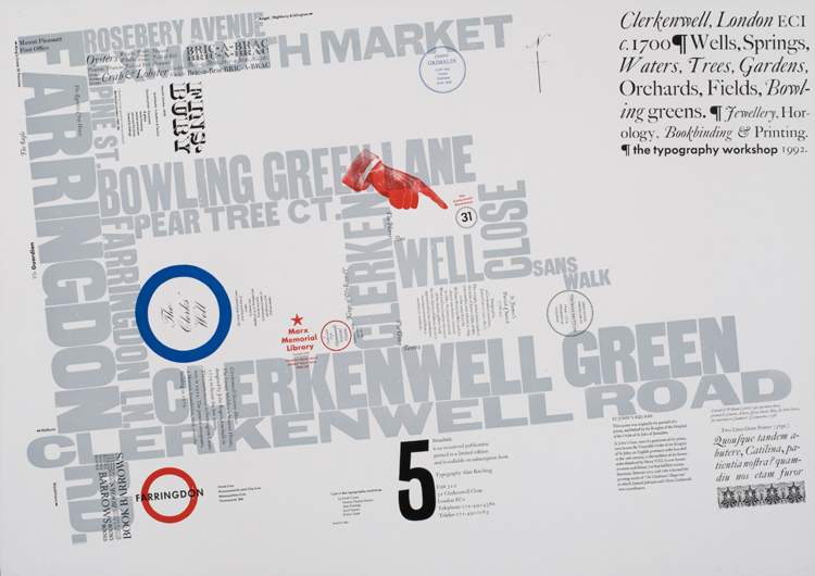
It is this intuitive way of working, allowing serendipity to combine with theory and logic, which inspired the first of Kitching’s typographic maps. Devised as a project to work on with students at Brighton Polytechnic, it is a typographical representation of the town that includes the sea, the piers, the major streets and places of interest. Instead of outlining the streets, Kitching used their names to indicate their size and relationships. The sea is indicated by numbers giving its depth at different points; the fishing boats are represented by their names. As in the later map of Clerkenwell, the choice of font, point size, colour and positioning communicates much of the character of the area.
After leaving Watford in 1970, Kitching worked
as a freelance designer until, in 1978, he went into partnership with
Derek Birdsall and Martin Lee as Omnific Studios (see Eye no. 9 vol.
3). With clients which included Mobil and IBM, they collaborated on
projects ranging from corporate identities to exhibition design. “We
had this idea that we could design anything,’ says Kitching.
Birdsall, along with contemporaries such as Bob Gill and Alan
Fletcher, was another influence on Kitching’s work, drawing him
towards a freer, bolder approach than that of Froshaug. But after
just over ten years as part of Omnific, Kitching decided to set up on
his own. “I couldn’t find my own voice with Omnific,” he says.
“I’ve now been here for five years, but I still feel as though
I’ve just started. I feel as though I’ve a lot more to do yet.”
It is this sense of a personal journey which is, perhaps, the key to Kitching’s work. After 25 years in the profession, many designers have given up pushing the boundaries of their work, taking risks, or experimenting. Kitching, working in the medium he knows best, seems to have only just begun.
Julia Thrift, design journalist, London
First published in Eye no. 15 vol. 4, 1994
Eye is the world’s most beautiful and collectable graphic design journal, published for professional designers, students and anyone interested in critical, informed writing about graphic design and visual culture. It is available from all good design bookshops and online at the Eye shop, where you can buy subscriptions and single issues.

