Autumn 2010
Memory of books
An elaborate, tactile catalogue – and a digital typeface – pay tribute to a golden age of Spanish typography.
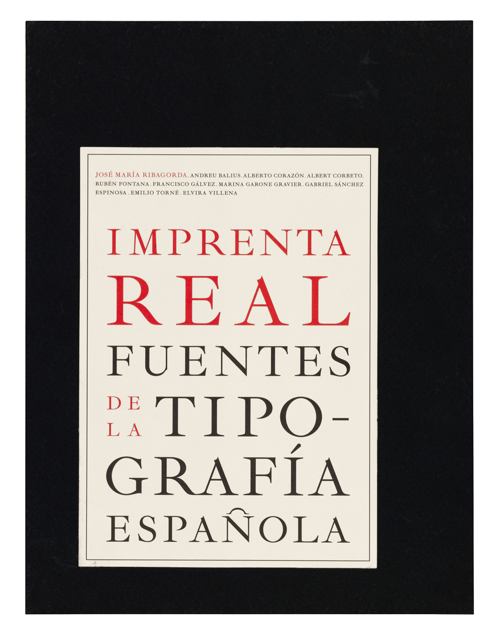
 The Imprenta Real de Madrid, Spain’s royal publishing house, founded in 1761, was the focus for a brief golden age of Spanish typography. This was celebrated in an exhibition, Imprenta Real: Fuentes de la Tipografía Española [Imprenta Real: Fonts of Spanish Typography], curated by the designer and typographer José María Ribagorda, at the National Library of Spain in 2009-10. The catalogue raisonné, designed by Sánchez / Lacasta won a gold at the European Design awards 2010.
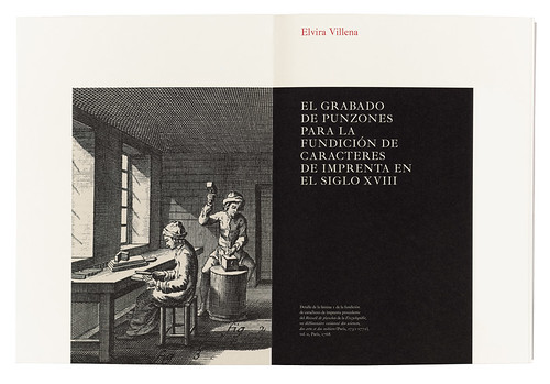
Above: opening spread of Elvira Villen'a essay on punchcutting in the eighteenth century. Illustration from Encyclopédie, the multi-volume product of the French Enlightenment edited by Denis Diderot and Jean le Rond d’Alembert (1751–1772).
Top: poster-sized type specimen for Ibarra Real. Imprenta Real: Fuentes de la Tipografía Española. Edited by José María Ribagorda. Design: Sánchez / Lacasta, 2009.
‘We wanted Imprenta Real – a book on typography, a book on books, on the visual value of lettering – to be perceived as the paradigm of the printed book,’ writes Sonia Sánchez. ‘Book as “perfect” object, conceived to be read, observed and touched.
‘Our aim was not to construct something new but rather to pull together the memory of books, to give expression to the traces of typography. It is not an exercise in tearing down conventions and rules, but rather of experimenting with established customs and literally re-creating them. The book is, after all, an essential expression of our craft: typography, images and materials. It is about maintaining a stable relationship between the historical model and contemporary attitudes and sensitivities.
‘Before starting on the project, we visited the Biblioteca Nacional de España (the National Library of Spain in Madrid) with José María Ribagorda, the curator of the exhibition. Here in the BNE, we were able to see and touch and photograph some of the books that had been selected.
‘What we saw there is what we sought to include in our design. Calligraphic samplers, treatises on the methodology of the geometry of the rendering of letterings, typesetters’ manuals, collections of vignettes and adornments used in the past, eighteenth-century botanical works and travellers’ books with fold-outs … all of these elements inspired us in the creation of the book that we knew was to be produced industrially.
‘We wanted, as faithfully as possible, to capture and reproduce the prints, the marks of stamps, the texture and different hues of papers, the intensity of the ink, the crackle of pages as they turned, the care taken in the typesetting and the skills needed for different crafts three centuries ago.
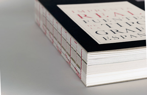
‘Fortunately, some of these skills have survived the passage of time. In our studio we prepared an initial mock-up that allowed the printer [Brizzolis] and the binder [Ramos] to prepare a second dummy, this time with the actual paper to be used and stitched with real thread. The prototype allowed us to correct any flaws and assess potential difficulties to be overcome in the production of the real book, such as the double fold in the dust jacket, the transparency of the jacket paper itself, the application of the glue to the visible spine, and the pressure of the engraving on the cover to ensure that the mark would not damage the paper.’
First published in Eye no. 77 vol. 20.
Eye is the world’s most beautiful and collectable graphic design journal, published quarterly for professional designers, students and anyone interested in critical, informed writing about graphic design and visual culture. It is available from all good design bookshops and online at the Eye shop, where you can buy subscriptions, back issues and single copies of the latest issue. You can also browse visual samples of recent issues at Eye before You Buy.

