Winter 2016
Modernist cottage industry

For more than a decade, Ruth Artmonsky has been publishing modest, readable books about design and illustration from her London flat

Independent publishers such as Hyphen Press, Unit Editions and
B42 are justly celebrated for their contribution to design culture, but a publisher that is equally noteworthy has received much less attention than it merits. In the past decade, Artmonsky Arts has released eighteen titles about advertising, commercial art, fine printing and graphic ephemera. At a time when many graphic design books have become costly mega-productions, perhaps more flipped through than read, Artmonsky’s are models of modesty and readability, lovingly put together and irresistibly priced at £10 or £12.
When I started noticing these under-promoted titles – a trailblazing study of the illustrator, author and curator Barbara Jones was my first – I wondered who was behind them. Ruth Artmonsky, their self-publishing author, seemed highly knowledgeable about byways in British graphic design history that are often overlooked, but the covers rarely give any information about her. The books, designed by the studios of Brian Webb and David Preston and usually in a landscape format based on the size and proportions of the famous Penguin Modern Painters series, project an appealing assurance, informality and wit.
They proved to be an accurate picture of the author. Artmonsky runs Artmonsky Arts from her immaculately Modernist flat in central London. All her books focus on the period 1920 to 1970 because objects and images from 1920s surrounded her as a child and the end of the 1960s marked the ascendancy of photography, which does not interest her. What Artmonsky adores is the handmade image; charming illustrations from a bygone era dance across her carefully researched and readable pages. She does not claim to produce scholarly investigations, but by making all this material about exhibition design, health and safety ads, ‘shipboard style’ and forgotten women designers available to new readers and viewers, she helps to open up neglected areas of visual history for reassessment.
In 2006, Artmonsky published her first visual arts book, about Jack Beddington, 1930s advertising executive and publicity director of Shell. David Pearson (see Eye 77) designed it. Artmonsky was then in her mid-70s. She is 85 now and has been unwell for the past year, but apart from beginning work at 8am rather than 6am this barely seems to have slowed her down. ‘I shall do the books until I go blind or gaga,’ she says. Tuppence Plain, Penny Coloured, about furniture advertising, came out a few months ago and there are two more on the way, one designed by Webb, the other by Preston. We sit side by side in her art gallery-like living room, which houses a huge library of books and old design magazines – Commercial Art, Alphabet & Image, Motif and many others – and she talks with great energy, winning self-deprecation and barely a pause for 90 minutes.
She began collecting books twenty years ago after moving into the flat. ‘I was always in bookshops,’ she says. ‘Bookshops and archives are heaven. I don’t want to see any other place at all.’ Her background is in statistical and occupational psychology. After taking a degree in economics and social work, accompanied by her equally idealistic twin (now a poet in Canada), Artmonsky began her career assisting a psychologist in Wandsworth Prison. She took a second degree in psychology while working at the National Institute of Industrial Psychology and then joined the Greater London Council to set up a careers and testing service for further education colleges in London. In 1977, with her second husband, Roger Holdsworth, she helped to found Saville and Holdsworth Limited (SHL), a consultancy that developed psychometric tests for business. They started in a spare room and a garage, became a roaring success and went on to open offices around the world.
‘It’s really helped being a psychologist,’ she says, ‘because although I wasn’t a lunatic fringe psychologist or a therapist, I’m interested in the human angle.’
The first ‘Artmonsky Arts’ was an art gallery, which she opened after selling her shares in SHL and retiring as associate director. She ran it purely for fun – a word she uses often when telling her story. ‘There was I in my little white cube in St John’s Wood having to bullshit about art, which I didn’t know much about, to St John’s Wood ladies, who wanted a painting to match their curtains. And I lost a lot of money.’ After five years she closed the gallery.
Her collection began with novels and she became interested in covers designed by Barnett Freedman (see Eye 85). ‘Within three months I had got every book for which Freedman had done a jacket or illustration.’ She had written and published as a psychologist and now she wanted to do a book about Freedman, but someone was already writing one. Her introduction to art, in the 1950s, came from admiring lithographs on the walls in Lyons Teashops. After seeing an exhibition about them in Eastbourne, she decided there should be a book and offered to write and fund it. The gallery insisted an art historian undertake the project, although Artmonsky was allowed to contribute an appendix of artist biographies, which she delivered with her customary turn of speed. Jack Beddington had proposed the artists for the Lyons Teashops lithographs so she focused on him instead and then she discovered there had been another lithographic series, the School Prints, in the 1940s. These became the subject of her second publishing venture, also delivered in 2006.
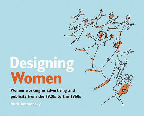
Designing Women: Women working in advertising and publicity from the 1920s to the 1960s, 2012.
Top: Ruth Artmonsky in her London flat, 2016. Photograph: Suki Dhanda.

The book was a hit. ‘I didn’t do any advertising but I sold a thousand in about three months. People had these lithographs in their school halls, in their nurseries.’ Her interest lay in the series’ ‘democratisation of art’ – a phrase she uses several times – but she realised she had ‘hit the nostalgia button without knowing.’ She printed another thousand copies and then sold the publishing rights to the Antique Collectors’ Club. It was through the ACC that she met Brian Webb, who collaborates with the Club on the ‘Design’ series. In addition to her own books, Artmonsky has worked with him on volumes about Lewitt-Him, F. H. K. Henrion and Enid Marx. Everything she knows about writing, designing and getting a book on to the market she says she has learned from Webb.
‘By then I thought, this is a fun thing to do,’ she says. ‘It’s just cut and paste. I’m not original. I’m neat and tidy and orderly and I like making lists. I don’t write any book without knowing the chapters. I get an idea and after about an hour’s Googling I’ve got the chapters. So all I’ve got to do is find wonderful pictures, do a bit of reading and you’ve got a book.’
One project leads to another. After publishing ‘Moving the Hearts and Minds of Men’: Bill Crawford, Ad Man, Artmonsky realised there was a second book to be written about three people who left Crawfords to set up their own business. This became The Best Advertising Course in Town: The Halcyon Days of Colman, Prentis & Varley. Likewise, a chapter in Unashamed Artists: A Celebratory Miscellany of Advertising Art, about the prewar poster designer Tom Purvis grew into Tom Purvis: Art for the Sake of Money, one of Artmonsky’s most enticing productions, although it curiously downplays the subject by lacking any explanatory text on the jacket.
‘I respect my designers,’ says Artmonsky, ‘and not only do I give them a very, very free hand, in all the books I’ve done with either of them I’ve only once each turned something down, or suggested it shouldn’t be like that. But I also let them add bits of their own.’
‘Ruth is very inspiring to work with,’ says Preston. ‘Her enthusiasm for the subjects she has studied is incredibly infectious. Her energy and passion is really remarkable. Perhaps the most satisfying aspect of working with her is the collaborative exchange of ideas and references.’ Artmonsky encouraged him to write a chunk of Tom Purvis, which he designed with great panache. Webb often contributes images to the mix from his private collection.
Artmonsky freely admits she loses money on her publications. She creates books about ‘niche’ subjects, not caring if they sell poorly, and at ‘car boot sales’ in her flat cheerfully disposes of ephemera she has acquired in the course of her research for a fraction of the price she paid. But for her that isn’t the point. What matters is commitment to the subjects and the crusading sense of mission she feels to bring them to wider attention. For my visit, she has dug out a copy of Grayson Perry’s guide to the art world, Playing to the Gallery, to remind her of something she wants to say about the sidelining of design and the applied arts in the cultural pantheon.
She enjoyed Perry’s insights, but laments a blind spot. ‘He is writing about a teeny group of fine artists that came out of art school, chose to bum around and felt they should be recognised. He hasn’t mentioned once the bulk of art school students who, for a living, do creative work within a brief, within a timescale and within a budget and produce wonderful stuff.’ This feeling of injustice is why she titled her ‘celebratory miscellany’ of advertising art Unashamed Artists.
‘The simplest reason I’m doing this – I’m doing it to stay alive,’ she says. ‘But I’m also doing it because I so delight in adverts and graphic design and fantastic typography that I want to say to people: look, isn’t it wonderful? Don’t just go to art galleries. I have seen a lot of graphic design that is far better than fine art.’
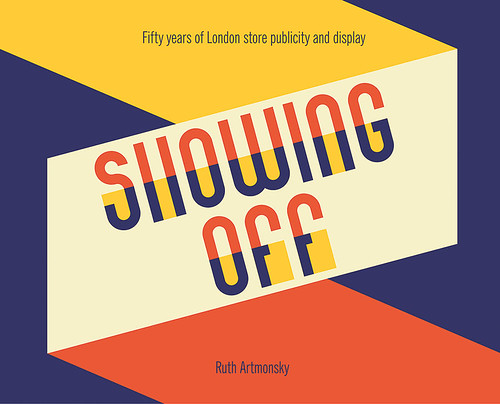
Showing Off: Fifty years of London store publicity and display, 2013. Book design by David Preston Studio.

Rick Poynor, writer, Eye founder, London
First published in Eye no. 93 vol. 24, 2017
Eye is the world’s most beautiful and collectable graphic design journal, published quarterly for professional designers, students and anyone interested in critical, informed writing about graphic design and visual culture. It is available from all good design bookshops and online at the Eye shop, where you can buy subscriptions, back issues and single copies of the latest issue. You can see what Eye 93 looks like at Eye before You Buy on Vimeo.

