Summer 2021
My friend David King

The book David King: Designer, Activist, Visual Historian is a comprehensive account of the work of a unique figure in graphic design history. Here Richard Hollis, witness to King’s development as designer, artist, collector and pioneering author-designer of dazzling books of social and political history, recalls his friend and fellow designer. By Richard Hollis

‘Only mediocrities progress,’ wrote Oscar Wilde. David King (1943-2016) proved him wrong. Knowing David, as I did, first as my student and then as a friend over more than 50 years, it would be hard to deny his progression. Yet his character – curious, eager, generous, excitable, original, obstinate, determined – was unchanging. David’s work developed in a way that looks smooth and predictable, but each stage was marked by lessons learned early in his career.
I first came across David in the late 1950s. It was at the London School of Printing and Graphic Arts (LSPGA). He was a member of the Basic Design class, where I shared the teaching with the illustrator Rolf Brandt. One task we set the students was to choose a one-inch square cut from a magazine and to paint a copy, enlarged as an eight-inch square. Easy to see this as a foretaste of so many aspects of David’s work, and maybe such an exercise helped him focus on the content of an image, and on its boundaries. He memorably claimed that if you can crop any more from an image, you haven’t cropped enough.
The LSPGA Design Department in Clerkenwell held a concentration of graphic design talent remarkable in a trade school. The staff, assembled by the poster designer Tom Eckersley, head of the department, was made up of experienced designers, among them Harry Beck, originator of the London Underground diagram, and the former Bauhaus student George Adams. They were joined by one-day-a-week teachers, some of whom, like me, were barely older than the students. Derek Birdsall, for example, was at the start of his career, as was Robin Fior (see Eye 32). Largely self-taught, Fior said that his learning began there as a teacher of typography. His influence on David was long-lasting.
‘Welcome to Fabulous Las Vegas, Nevada’, a screenprint published as an illustration in ‘1000 Makers of the Twentieth Century’, The Sunday Times Magazine, 20 July 1969.
Top. David King in New York, 1968. Photograph by Roger Law.

Fior was a friend of mine, a left-wing intellectual, well versed in political history, attached to the International Socialist Group. Active in the Campaign for Nuclear Disarmament, he was one of the Committee of 100 opposed to the siting of US nuclear bases in Britain. His best-known poster, ‘Polaris, No!’ has elements that became part of David’s graphic language: exclamation marks, to signal a shouted slogan, and Franklin Gothic Bold, a typeface almost unknown in Europe. He introduced David to the ideas of Trotsky, the object and subject of David’s later research and writing. And Fior pointed him to another focus of David’s veneration: the political photomontages of John Heartfield.
Until the mid-1960s, I saw little of David. He was working at The Sunday Times Magazine. When he came to see me in a tenement flat opposite the LSPGA Design Department, he was uneasy about the magazine’s juxtaposing pages of photojournalistic realism with lifestyle advertising. Should he leave? We must have chatted and I certainly wouldn’t have advised him. This was about 1964. He stayed at the Sunday Times for many more years. The magazine provided David, a great learner, with colleagues whose journalistic skills and generosity opened up new worlds of expertise. They became part of his social and intellectual circle. The novelist Francis Wyndham remained a firm friend and their collaboration on the book Trotsky: A Documentary used a magazine-style layout of text, image and caption, a method that David slowly refined, culminating in his last book Red Star Over Russia so that the text was all caption, all written by David.
‘Stop the Nazi National Front!’, poster for the Anti-Nazi League, offset lithography, 1978, 45 x 64cm.

It was in the street that I next met David, in 1967. Accompanied by his colleague Roger Law, they were both dressed in flowing white, the style introduced by the Maharishi, guru of transcendental meditation. Law made occasional drawings and covers for the weekly New Society, where I was art editor. David made one small collaged illustration for an article on the Catholic church authority, with posterised photographs of Pope Paul, assorted Christian priests and theologians in the public eye put together with newspaper clippings. The style is unmistakably that of one of David’s heroes, the American painter Robert Rauschenberg. Three years earlier, in 1964, a large Rauschenberg show was held at the Whitechapel Gallery. The artist was interviewed by David Sylvester, a prominent art critic and regular contributor to the Sunday Times. Sylvester became a friend and was to call on David to design the René Magritte catalogue raisonné he was preparing.
David had a consuming interest in painting. A pile of art books on the floor at the publisher Thames & Hudson was explained: ‘They’re for David King. He chooses to be paid in books.’ His response to art was passionate. After his return to London from the opening of his ‘Ordinary Citizens’ exhibition in Milan, I asked him how it went. With no mention of the show, he immediately exclaimed, almost shrieking, ‘Bellini. In the Brera. The fucking Bellini. The blue! Fan-tastic!’
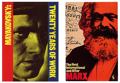
Right. Catalogue cover for ‘Mayakovsky: Twenty Years of Work’, Museum of Modern Art, Oxford, 1982. Far right. Cover design for Karl Marx’s The First International and After, Penguin, 1974.

As a teenager, David saw himself as an artist. In pre-digital days, artwork was made full size, the size it would be printed. A painting, too, begins and ends at its finished size. However, its content is chosen by the artist. Rauschenberg’s assemblages are freeform, found elements, randomly shaped. If they contain images of people and events, their function is aesthetic, allusive, not objective communication. But David’s posters deal with words and images to make a specific meaning. And these are subject to the conventions of printed language. Letters are fitted together to make words in an orthogonal, horizontal-vertical framework, even if the lines are tilted or turned. Although David worked with photographic prints of lettering and images, he rarely left this geometry.
Standing over a plan chest with ruler and set square, with no parallel motion aid, he had precise control of conventional horizontal-vertical arrangements as well as the ‘dynamic’ oblique-angled layouts familiar in some Modernist graphics. And several posters betray a nostalgia for letterpress printing. Photoprints from proofs of wood-letter fonts lend an impression of grassroots activism, on occasion to suggest the past, and more often to add a graphic texture of uneven inking which would have been unacceptable in the work of a professional printer.
Two posters, 26 years apart, both announcing demonstrations, show how the form of a design became detached from the process of reproduction: the first, Robin Fior’s 1961 ‘Call to action!’, printed letterpress directly from type; the second, David’s ‘Sanctions Now!’ from 1987, printed offset. Fior had little control over the choice of type – only what the printer had – its size or spacing (increments of points and picas), fixed in the solid chunks and strips of wood and metal. David had the freedom offered by photographic processes. By this time letterpress was a dying process, slow, and no longer a practical option. The physical, the wood and metal, had given way to the photochemical and the photomechanical. Instead of a type specification and a layout, the designer presented the offset-litho printer with ‘camera-ready artwork’ – a sheet of pasted-up type and images ready for conversion to film for transfer to a printing plate. Making the artwork, with letters, lines of type, photoprints, all to size, and the ability to reposition elements that wax adhesive allowed, David came close to the autonomy of a painter. He was in any case an artist. In a first-floor room above a shop he made a studio. There his art included coloured sculpture and paintings on wood. But wood was one of his chosen materials, as a carpenter making furniture and building a large shed in his garden, called, of course, his ‘dacha’.
Not coming to terms with the computer left David asking for help. When he had to make a CD inlay for The Commissar Vanishes [an audiovisual collaboration between composer Michael Nyman, video artist Chris Kondek and King] he came to me. Christopher Wilson was working with me and had all the necessary skills. Every suggestion we made, David determinedly countered. He had a hunger for complete control, yet – paradoxically – he could be uncertain about some details of a job, and would ask for advice or confirmation of a decision already taken. And he was always supportive. He helped me set up the vertical copying system he used for recording his archive. He once suggested that I should follow a device of his and run the main title of an exhibition poster round the image. I did this, and the result was terrible. He was inimitable. His concept of creating a style for the political left was realised only in the style that was David King’s.
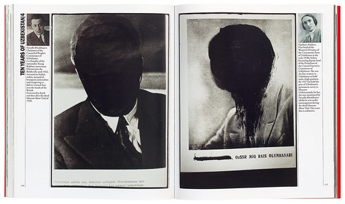
The Commissar Vanishes: The Falsification of Photographs and Art in Stalin’s Russia (Tate, 2014). This spread shows Fayzulla Khodzhayev and Djakhan Abidova defaced by Alexander Rodchenko, designer of Ten Years of Uzbekistan (1934).

The political work established David’s reputation. It was an unusual route for a designer. He chose his own causes to support. Causes were his clients and he was their art director. With this freedom came the growth of his personal style. And he was sought out for his knowledge of Soviet history, its records and artefacts. The young director of the Museum of Modern Art Oxford, David Elliott, one of my regular clients, was keen to show revolutionary Soviet work. I put him in touch with David.
The result was catalogues and posters for exhibitions on Mayakovsky, Rodchenko, Soviet photographers, Mexican photography and the architect Lubetkin. For Elliott, David introduced a Brutalist typographic style that for a time was his stock-in-trade – heavy black or red stripes and rectangles, horizontal and vertical, to form borders or to underline a word or phrase. Halftones printed from the same screen, red and black, dot-on-dot, not duotones. David rarely used four-colour halftone. An exception was a decorative plate on the poster for an exhibition arranged jointly by Elliott and the Crafts Council. This led to work on the Council’s magazine Crafts. His efforts to galvanise its layout – with dramatic double-page spreads, full colour photographs combined with his Brutalist typography – were not welcomed by all subscribers.
David passed on to me some work for the African National Congress. After making five posters for them, their offices were fire-bombed. If demonstrations were sometimes violent, political work was not dangerous, but might attract the attention of the security services.
On the other hand, his activities in Russia were hazardous. Building his archive went far beyond ‘forming a collection’. In the political circumstances of the 1970s it was dangerous. The dramas of the Cuban missile crisis in 1962 were past, but suspicion of foreigners in the Soviet Union persisted. Dealing across borders had often to be carried out with caution. His daughter Josephine went with him to Moscow. At the airport David said quietly to Josephine, ‘If I am stopped boarding, ignore it, just keep going on to the plane.’ His obsessive hunt for material for his archive was often brought to a standstill, his request for an item met with a brusque ‘Not possible’. For David, ‘Not possible’, in a heavy Russian accent, became a catchphrase.
In his progression everything, anything was possible. Except mediocrity. David would have dismissed Oscar Wilde with one word: ‘Tosh’.
Richard Hollis, designer, writer, London
For more about David King, read Christopher Wilson’s Reputations interview in Eye 48 and ‘Exposing the Menace’ by Rick Poynor in Eye 95.
All images from the book David King: Designer, Activist, Visual Historian (Yale, 2020) by Rick Poynor.
First published in Eye no. 101 vol. 26, 2021
Eye is the world’s most beautiful and collectable graphic design journal, published for professional designers, students and anyone interested in critical, informed writing about graphic design and visual culture. It is available from all good design bookshops and online at the Eye shop, where you can buy subscriptions and single issues.

