Winter 2011
Naked words
various designers
Alvin Lustig
Pentagram
Hans Schmoller
Massimo Vignelli
Berthold Wolpe
Edward Young
Derek Birdsall
Jamie Keenan
Willy Fleckhaus
Type-only book covers – whether deliberately austere, functional … or shouting loud from the shelves – have always had a place in publication design.

Once upon a time, book jackets were almost all pure typographic compositions: these were the books one could not judge by their covers. The tradition continued into the twentieth century, especially in non-English language publishing – the Parisian house Gallimard still issues its Collection Blanche of classic French literature in a jacket that has barely changed since it was first laid out by the Bruges printer Verbeke in 1911: black author text and red title text in Didot, centred on an ivory stock within a red and black border.
But there have been notable upholders of the tradition in the English-speaking world: Gollancz’s distinctive use of red and black type on yellow stock, from 1928 onwards; the original banded Penguins designed by Edward Young in 1935; Berthold Wolpe’s Faber covers, which defined generations of English novelists, poets and playwrights from the 1940s to the 1970s; Alvin Lustig’s eclectic choices of font for the paperback publisher Meridian in the 1950s.
Even today, when the pictorial cover is standard, and the need to stand out from crowded bookstands more urgent than ever, the idea is still revived from time to time: Barbara deWilde’s stark treatment of Lorrie Moore’s 1994 novel Who Will Run the Frog Hospital?, Darren Hagger’s confident, authoritative work on Henry Kissinger’s On China (2011) and Tony Judt’s Ill Fares the Land (2010), or Faber’s recent Samuel Beckett reissues.
There are many reasons to choose a type-only cover. It can be a simple way of creating a visual order and rationale for an imprint or a particular series, as Young did for the original Penguins. It may satisfy the designer’s innate sense of discipline – with the obvious exception of Stanley Morison’s unconstrained, poster-style jackets for Gollancz, which were deemed unfairly dramatic by some in the trade.
DTV (Deutscher Taschenbuch-Verlag), which was formed in 1960, put its jacket designs in the hands of the Swiss designer Celestino Piatti. Most jackets were accompanied by an image but for the 45 volumes of the complete works of Goethe started in 1961, Piatti chose a purely typographic layout.
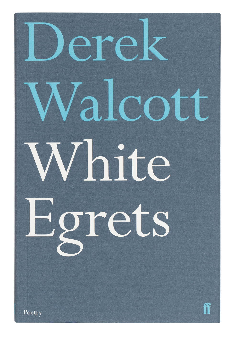
Top: Faber’s poetry list is one of the strongest in the industry. The series design shown here was conceived by Justus Oehler at Pentagram design in 2001 amd was still in use in 2011. Large text and simple two-colour combinations create a striking and powerful set of covers.

More often, a type-only cover has been used to create an air of classical restraint, to lend authority, after the fashion of Gallimard’s Collection Blanche. For the German publisher Deutscher Taschenbuch-Verlag (DTV), Celestino Piatti created a distinctive look of white jackets and ranged-right Akzidenz Grotesk type across its whole range. While the majority of its covers featured vignetted imagery, a special reprint of 45 volumes of Goethe’s complete works, begun in 1961, was treated typographically.
Similarly, in 1969 Hans Schmoller’s design for Penguin’s 3000th book, the first paperback edition of James Joyce’s Ulysses, was a lyrical typographical tribute that remains one of Penguin’s most distinctive covers.
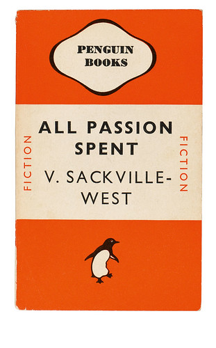
The orange banded jackets developed for Penguin’s start-up in 1935 are the exemplar of house styles. Initially designed by Edward Young, they were refined by Jan Tschichold during his short tenure (1947-49) at the publisher.
In the early 1950s, when Lustig suggested that Meridian’s non-fiction titles should all have type-only covers, it was more a case of wanting to try something fresh. The American Modernist had already created brilliant combinations of type and image for the publisher New Directions; for Meridian he used a mixture of fonts, often including antique Victorian types, in a rational, modern layout on different coloured backgrounds. Sometimes the choice of font reflected the book’s theme or title, but for the most part these were purely typographic compositions. Though the books were designed to be displayed together in a show of strength, in practice bookstores rarely offered such a luxury.
The decision to stick to type can also be made for negative reasons – a rejection of illustration rather than a positive vote for type. J. D. Salinger’s position as a classic author was undoubtedly cemented by the plain covers that invariably adorned his books but that was a side-effect of his insistence that the covers not contain any imagery or reviews, after he had been incensed by an early cover.
Graham Greene attempted to repeat this gambit in 1972, when he convinced Penguin to drop the distinctive Paul Hogarth illustrations it had been using for his novels, and go with type only. So Derek Birdsall placed Greene’s name in black type at the top, with the title underneath in the same font but a subdued colour, leaving the bottom two-thirds of the jacket an expanse of white. The result was stark and elegant … and sales plummeted. Hogarth was brought back.
But authorial vanity is not the only reason for rejecting illustration. When deWilde came to tackle Who Will Run the Frog Hospital?, she found the task of coming up with a suitable visual reference too difficult; she made an effort to play with the title typographically but decided that ‘with each attempt, it looked silly’. In the end, she resorted to a stark type treatment of black text on a white background – which, apart from anything else, stood out in the bookshops among a sea of illustrated covers.
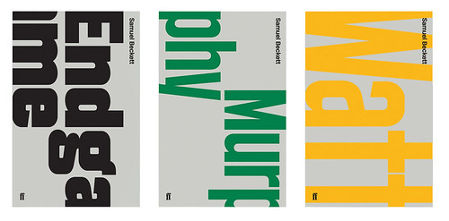
When Faber came to reprint Beckett’s complete works, the art director, Miriam Rosenbloom, was keen to avoid either visual cliché (a pair of boots for Waiting for Godot, say) or the lengthy debate that inevitably ensues when an illustration is commissioned. The designers A2/SW/HK (see Eye no. 67 vol. 17) began by looking at earlier Faber covers for Beckett – which meant, mainly, layouts designed under Wolpe’s aegis and dominated by the muscular Albertus typeface he created in 1934 for the Monotype Corporation. Over three decades Wolpe had established an austere aesthetic based on Albertus and standard British jobbing types – particularly Monotype Grotesque – used only with rules and differing colour backgrounds. Following his lead, A2/SW/HK came up with a bespoke typeface, Beckett. Text was arranged vertically and type size changed from book to book, so that each title bled off the edge of the cover, creating jackets that, while individual, were clearly part of a series.
For Faber’s collected Samuel Beckett (2009-11), designers A2/SW/HK used their bespoke typeface, Beckett. Titles bleed mid-word off the bottom of the cover and reappear at the top of the page. This disarming device creates a puzzle for the viewer to decipher as well as establishing a discernible series style.
Dropping imagery can be an attractive option when dealing with books with inflammatory (sexual, religious) subject matter – a typographic jacket can either shield the contents from public view, or have the effect of a warning sign (which is also a promise of excitement). When Vladimir Nabokov’s Lolita was first published by the Olympia Press in Paris in 1955, the cover stuck to the house style of centred type within box rules: in part, this was how things were done in France, but also because, for a publisher producing salacious books for surreptitious import to the uk, an anonymous cover was a form of disguise. Eric Ayers’ cover for the first British edition in 1959, for Weidenfeld & Nicolson, used only a large headline font in black on an orange cover with the author’s name under a white rule; a first sketch had contained abstract colour blobs but even these were considered to have too much visual information for such a notorious book. (See Christopher Wilson's ‘The look of Lolita’)
Even today, publishers can feel the need to be guarded on occasion. In 2010 the agency Fuel was given the job of designing the cover of The Ice Age by Kirsten Reed for Picador. The publisher said a typographic solution was needed as the book was a ‘Lolita novel for a new generation’. Fuel’s response was to wrap an extract from the book around the whole of the jacket so that it became fragmented, with only certain words or phrases (‘waitress shot’, ‘edgy’) discernible on the front.
Similarly, when Jamie Keenan was asked to design the jacket for Philip Pullman’s The Good Man Jesus and the Scoundrel Christ, early roughs that included subverted religious imagery were rejected for fear of offence. Keenan settled on a mixture of type styles, part Bible cover and part boxing poster, mirroring the book’s conflict of good and bad.
The logotype for the Penguin Plays series uses a dotted letterform to evoke theatre signs; the rest of the title information is set in a uniform size of sans serif. Differing coloured backgrounds and a horizontal colour band separate the books in the series.
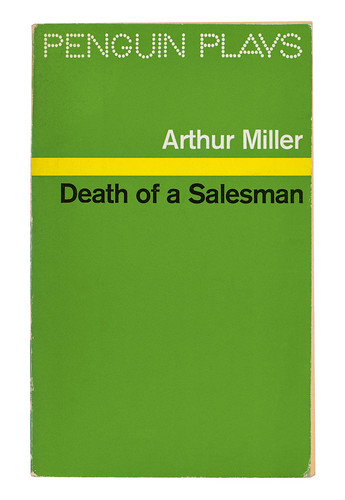
Once font and rules have been decided, colour can be the only element left to play with in a text-only layout. Edward Young’s Penguins – blue for biography, pink for travel – were an early example. In 1963 the German art director Willy Fleckhaus was asked by Suhrkamp Verlag to design a series style for the Edition Suhrkamp collection of classic literature. He developed a highly ordered layout of evenly spaced rules with a single weight of Garamond for all the text but then gave each of the original 48 covers in the series a separate colour, so that when lined up in order their spines formed a perfect graduated rainbow. The result was to make the series instantly collectable.
The typographic jacket appears to work as a definitive statement on any cover. Less prone to the vagaries of style common to image-based jackets – but also less marketing-friendly – they are for the most part a timeless testimony to their contents. These most nuanced of covers rest solely on the power of the word and reaffirm the essence of what a book is: a piece of text with a title and author. A book needs little more information on its cover and certainly no less.
Jason Godfrey, designer, writer, London
First published in Eye no. 82 vol. 21 2012
Eye is the world’s most beautiful and collectable graphic design journal, published for professional designers, students and anyone interested in critical, informed writing about graphic design and visual culture. It is available from all good design bookshops and online at the Eye shop, where you can buy subscriptions, back issues and single copies of the latest issue. You can also browse visual samples of recent issues at Eye before You Buy.

