Autumn 2005
Nameless thing

various designers
Katsumi Asaba
Taku Satoh
Philippe Apeloig
Neville Brody
Matthew Carter
M/M (Paris)
Stefan Sagmeister
Why Not Associates
Tokyo’s TDC rewards work that transcends means, intention, content, context – and just ‘is’

Come summer, the annual migration of the graduate is in full swing. Readers of this magazine will empathise with the graduate’s dilemma; many will also sympathise with those of us looking at their portfolios, a process that can be dispiriting for both interviewee and interviewer.
The reason for this lies with the culture of present-day education. Teachers and art schools are under-funded, undermanned, under-supported, overstretched and overburdened by administration. Over the past decade, art school education has seen a gradual shift from education to educational management, with success being measured in placements rather than individual fulfilment. Couple this with the ubiquity of the computer and its effect on both practice and thinking, and the whole system resonates to the effect of ‘programming’. This creates a generation of weavers not thinkers, generators not innovators, which in turn affects not only graduates but also the world outside college, with the basic tools of approach and response being replaced by ‘skill sets’ and ‘solutions’. Instead, we need examples to inspire and challenge, to act as catalysts of possibility. That’s why we are drawn to annual awards and the publication of annuals.
But in the search for inspiration we are often let down by work that is either predictable or dull. The ‘industry’ says that it needs creativity, but what it really means is ‘creativity’ within tightly defined parameters. The apparent reliance on ‘solution’ is a slipknot around the hopes, aspirations and potential of all of us. The twin constrictors of conformity and method have insidiously worked their way into the common psyche and this has further aggravated the age-old tussle between personal belief and motivation, and the need to earn a living.
A blank sheet of paper or a frame on the screen is alive with possibility. There are no rules. So why are we constantly confronted with work that is so predictable? There is a self-enforced tautology: to be ‘accepted’, the work must be ‘acceptable’, so only ‘acceptable’ work is created and entered. This has a debilitating effect on not only the upcoming student population but also education and the ‘industry’ in general.
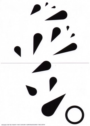
Poster for the ‘Message for the 21st Century’exhibition by Taku Satoh, winner of Members’ Bronze Prize, 2000. The typographic layout draws on Satoh’s love of surfing and the rhythms and motion of the waves.
Top: Pictographic Inscription 2, exhibits for the fifteenth Rakusyo-kai, by Katsumi Asaba, winner of Members’ Silver Prize, 1997-98 and TDC chairman and founder. This series of works is inspired by Asaba’s obsession with the ancient Tomba Language of the Naxi tribe of China.
But there are inspirational individuals at every level within design in every part of the world. If there is a common thread that distinguishes them it is the fact that they are ‘growing old alive’, their enthusiasm and curiosity undiminished and often broadened and accelerated. Their enthusiasm emanates as soon as they walk into the room, every fibre of their being resonates and their work dances in front of your eyes to a unique song that, once encountered, vibrates within you. So why is it that when such people are placed in an organisation or institution, the sum total of their efforts, energy and spirit is diminished?
Is it in the nature or structure of these organisations that they sap the spirit? Is it due to the demands of scale, time and / or perceptions of how they should behave? In the case of the design competitions and organisations, and educational institutions, is it that they have become mini-economies in their own right, the management of which has unwittingly created limits? Education, at any level, must be about installing confidence and a sense of self-worth in people, whatever their ability. Otherwise what is education for?
The world is changing and demanding a flexibility and intelligence that is antithetical to the habitual behaviour and method of the ‘industry’. There is work being produced everywhere that has verve and authenticity, work that energises the contemporary flux with its own evolutionary trajectory and economic force.
I have rarely encountered a client not excited by work of this nature. Communication and presentation, though important, are nothing if the confidence for genuine experimentation is not there in the first place: we have to grant ourselves the freedom to do this. The problem for all of us is what to do with a blank rectangle or frame – where to place an image and / or type in relation to the boundary or field. For all the work in the design annuals and competitions in the West, it is remarkable how limited the basic strategies are in response to this universal problem. This is all the more depressing when you consider the rich heritage and culture of experimentation in Western graphic design and art.
In the twenty-first century our cultural generator and influence is a global one. For centuries the West (Europe and North America) has regarded the rest of the world as exotic and has remained impervious to the lessons and possibilities it could offer. The West has stolen and assimilated style but has rarely compared and assimilated the basic strategies and responses of work from the rest of the world as an equivalent possibility. How many examples have there been of work awarded or even present in the annuals that is not in a Latin alphabet? How often is such work properly discussed and analysed at art school? In a world that is in accelerated flux and global in its influence, how long can this situation last?
The Japanese way
Over the past fifteen years, the work selected and awarded by the Type Directors Club (TDC) of Tokyo has been inspiring and intriguing. From the outset work from outside Japan has been considered and given awards: in its first year (1990), Garry Emery (Australia) won the Non-Members’ Gold Prize for a catalogue for a Tokyo exhibition of Australian jewellery designer Susan Cohn. In 1993, Matthew Carter won the same prize (for his typeface Sophia), as did Philippe Apeloig in 1995. Apeloig also won the Judges’ Special Prize in 1999. In recent years the TDC Grand Prix has been won by Andreas Müller (2005), M/M (2004), Why Not Associates (2003), Stefan Sagmeister (2002) and Neville Brody (with Naomi Enami, 2000). In the past five years, work from France, Germany, Russia, Switzerland, Korea, the US, Britain, Holland and China have all been selected for the annual. Would the Art Directors Club in New York or the D&AD award gold to a Japanese design in Kanji?
In November 2004, when I was asked to help judge the 2005 awards, my immediate reaction, beyond that of being honoured, was one of curiosity and doubt. Curiosity in observing at first hand the process and structure of the TDC, but doubt of my ability to judge ‘foreign’ work. (How was I to know what is good or bad Kanji? How would I know whether something was of genuine creative value or just something that had been seen a thousand times before?
All my assumptions and opinions seemed rather fragile, and the potential for embarrassment loomed large. However Katsumi Asaba, the chairman and founder of the TDC, soon assuaged my fears. Asaba-san, long recognised as one Japan’s foremost art directors and innovative typographers, has a reputation as a maverick and as a 65-year-old ‘enfant terrible’ – a moniker he relishes. Any thoughts that the eccentricity might be purely an image were quickly dispelled as he entered the jury room in a flurry. He embodies many contradictions: a master craftsman who practises calligraphy for two hours every morning; a stand-up comic and street performer; a typographic explorer, as his current studies in Arabic, Thai and Indian Devanagari scripts testify. Another scholarly element is his discovery and study of the last living pictographic script (Tomba) as used by the Naxi people in China.
The TDC’s sense of what typography is and can be is different to that experienced elsewhere. Interestingly it becomes obvious that there is an immediate and broad agreement among the fifteen judges over which work progresses through the successive rounds, despite the fact that twenty per cent of the work is in a language that the Japanese judges do not understand and ten per cent in a language that none of us understand (and 80 per cent is in a language I don’t understand). The only non-Japanese judge besides myself is Chinese art director / designer Wang Xu. We all do our best to translate details for each other but it is clear that we are responding to the spirit and energy of each creation as much as the strategic layout and the choice of elements of type, colour, image and form. In the end it is Andreas Müller’s poetic interactive piece that narrowly takes the top honour from Noriko Usui’s experimental work ‘Form of Words’.
Of the three other non-member prizes to be awarded, one was another experimental piece by Mizuki Ohno and the other two were by Stefan Sagmeister (US) and Trevor Jackson (UK). The process is joyous and educating – to see these experts skip around the work laid upon the floor and to pore over its details and then enjoy the complete composition was a reminder of why we all picked up a pencil or crayon in the first place and never let it go. And why we become interested in the work of others. Analysis and research can only inform and describe the effect of a work – it cannot name the ‘nameless thing’ at its core. There are times when a piece of work resonates simply because it transcends its content, context, means, intention and production and just ‘is’.
John Warwicker, designer, Tomato, London and Melbourne
First published in Eye no. 57 vol. 15.
Eye is the world’s most beautiful and collectable graphic design journal, published quarterly for professional designers, students and anyone interested in critical, informed writing about graphic design and visual culture. It is available from all good design bookshops and online at the Eye shop, where you can buy subscriptions, back issues and single copies of the latest issue.


