Summer 2008
New frontier
When art director Art Paul made the journey from Bauhaus to Hefner’s Playboy mansion, men’s mags became truly ‘Modern’.

When Playboy premiered in 1953 it attacked an ossified culture. It may not be politically correct today, but back then it enabled men to experience sexuality free from prudish mores and censorship. Its founder, Hugh Hefner, believed that men had the right to fantasise about being libidinous rogues who listened to cool jazz, drank dry martinis, drove imported sports cars and maintained hip bachelor pads. Through the magazine he contrived a culture that encouraged hedonistic and narcissistic behaviour on the one hand, and social and political awareness on the other.
But Hefner did not accomplish this alone. His message would not have been so broadly accepted if not for Playboy’s innovative graphic approach, developed by its art director, Arthur Paul, a former Chicago Bauhaus (Institute of Design) student who studied with Moholy-Nagy from 1946 to 1950. He was a serious designer / illustrator, and initially reluctant to join the fledgling magazine, then titled Stag Party.
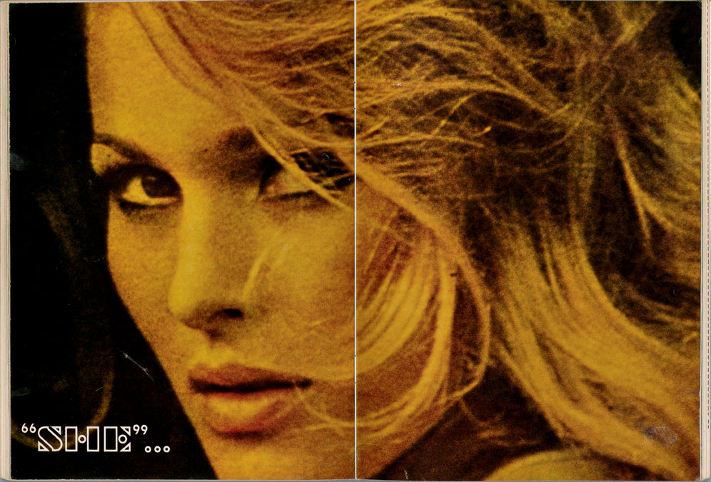
Top: a spread from ‘“She” … is … Ursula Andress’, an ‘eye-filling 12 page pictorial’ of the movie star photographed by the actor John Derek for June 1958.
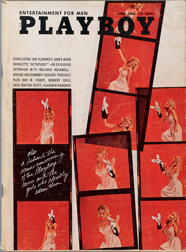
Below: April 1966. Playboy was originally titled Stag Party. Shortly after he changed the name of the magazine, Paul dreamed up the ubiquitous Rabbit icon that would appear on every cover. Photography: Pompeo Posar.
Hefner’s original inspiration came from The New Yorker of the 1920s and Esquire of the 1930s. Hefner, who was raised in a Midwestern Methodist home with puritan parents, explains: ‘I believe that my life and the magazine were a response to that, and a direct reaction to the fact that after the First World War I expected the period to be a reprise of the Roaring Twenties. But it wasn’t. It was a very politically and socially repressive time. Even the skirt lengths went down instead of up ... So the magazine was an attempt to recapture the fantasy of my adolescence.’
Paul embraced Hefner’s concept, but he was not pleased by the Stag title. Hefner explained: ‘Playboy [the title of a 1920s literary magazine] was in disuse at that point, and reflected back on an earlier era, particularly back on the Twenties – I liked that connection.’
Paul proceeded to develop a format that reconciled nude photography with the sophisticated writing that became hallmarks of the Playboy formula.
‘I took on the challenge in broad strokes,’ Paul recalled. ‘I said to myself, “This is a men’s magazine; I want it to look masculine. I want it to be as strong as I can make it.” But I was very limited in the number of typefaces and ended up using Stymie.’ The slab serif Egyptian was a perfect fit, being quirky yet bold. For the interior of magazine Paul employed white space to counterbalance the limited colour of the first few issues.
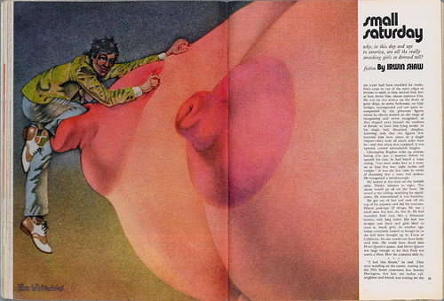
Above: spread from September, 1971. Fiction illustration by Kim Whitesides. Paul developed a stable of conceptual illustrators that went on to define their respective periods of erotic art.
The cover of the first issue was critical. Only two colours were available, but conceptually nothing could be more seductive than the photograph of Marilyn Monroe next to the headline ‘FIRST TIME in any magazine. FULL COLOR the famous MARILYN MONROE NUDE.’
The absence of multiple colours on the cover was a problem that turned into an asset, Paul noted: ‘Most [magazines] used big heads and a lot of colour and type. I felt that ours would have to be simple and so using the black-and-white photo with a little red on the logo was a plus, because it stood out no matter where it was displayed.’
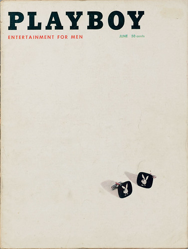
Paul’s Playboy covers were driven by witty ideas and visual puns. They became games that challenged the reader to find the trademark bunny (a drawing Paul developed from a fabric bunny made by his then wife) wherever it was hiding, whether on a tie clasp, or fashioned from the legs and torso of a cover model.
Below: June, 1957. Photograph by Morton Shapiro. Explicit sex was forbidden, so Paul emphasised the rabbit brand.
While a large number of men flocked to the sign of the bunny, Paul argues that Playboy was not a sex magazine per se, more a lifestyle magazine. Hefner wanted to present sex as a common occurrence, not a prurient taboo. By the end of the first year Hefner had begun to take his own photographs. His breakthrough shots were of Janet Pilgrim, Playboy’s subscription manager, whom he was dating at the time. In the picture Hef is in the background in a tuxedo with his back turned, while Pilgrim powders her nose for a date. ‘I was trying to personalise it,’ says Hefner about the notion that nudity had either to be connected to ‘art’ or be considered obscene.
Paul was less interested in nudes than the other aspects of the magazine. Playboy art was resolutely eclectic, drawing from Surrealist, Pop art, and post-pop schools. The fine art alumni included Salvador Dalí, Larry Rivers, George Segal, Tom Wesselman, Ed Paschke, James Rosenquist, Roger Brown, Alfred Leslie and Karl Wirsum. And Paul frequently published top commercial illustrators, including Paul Davis, Brad Holland, Cliff Condak, Robert Weaver, Don Ivan Punchatz and Tomi Ungerer.
Despite Playboy’s contribution to art and design, it did promote negative female stereotypes. Yet such criticism must be balanced. In the 1950s and 60s sexuality was a new frontier – and bucking taboos was a political statement. Playboy’s legacy is not just rabid (or rabbit) sexploitation; it was an entity that attacked a repressive culture while it settled into a new status quo.
First published in Eye no. 68 vol. 17 2008
Eye is the world’s most beautiful and collectable graphic design journal, published quarterly for professional designers, students and anyone interested in critical, informed writing about graphic design and visual culture. It is available from all good design bookshops and online at the Eye shop, where you can buy subscriptions and single issues.

