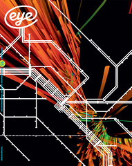
Winter 2009
On message
Content is king at Nicolas Bourquin’s Onlab, but its editorial focus incorporates visual delight and conceptual ingenuity.

Don’t tell Nicolas Bourquin that there’s no future in editorial design. Framing content lies at the heart of Onlab, a studio much admired by his fellow Berlin designer-residents. Onlab has been going for less than a decade, with rarely more than six employees and interns, but it has the range, depth and vision you might expect from a larger, more established practice.
Swiss-born Bourquin was recruited by MetaDesign Suisse in July 2000, just a day after he graduated from the design school in Biel / Bienne. This confidence was repaid when his first project won Meta the pitch to design the identity for the Lucerne Festival. Around the same time, he began working ‘in parallel’ on projects for Swiss museums and exhibitions, using the studio name Onlab.
Bourquin quickly discovered that ‘the way MetaDesign deals with design was not my thing,’ and quit after just nine months. However, the Meta stint did give him the opportunity to spend a few weeks working with Erik Spiekermann (see pp.42-47) and other designers in Berlin. This led to an invitation, early in 2001, from Polyform, a small Berlin studio, to work on an international competition for Berlin’s Museumsinsel [museum island], in the centre of the reunited city. Bourquin spent three months there, working on the branding, orientation, website and other design elements for the museum.
‘I went out a lot, discovered the crazy nightlife of Berlin, and fell in love with the city,’ says Bourquin. ‘We won the competition, and ever since then I’ve lived in Berlin.’
For six months, Bourquin divided his time between the Museumsinsel project with Polyform, and new commissions for Onlab, including a book, Los Logos, for Gestalten, the first of what was to become a trilogy under his direction.
Initially, Bourquin rented desk space from Sven Ehmann, a Berlin photographer and editor, who was also working on a project for Gestalten. ‘During coffee breaks and late nights working, we started to talk,’ says Bourquin. ‘We had a very similar approach to content and the kind of work we wanted to do. We come from different worlds, but share the same opinions and values.’
Independent publishing
In 2003, Ehmann and Bourquin, together with Polish journalist Krystian Woznicki, founded Etc. Publications, ‘a platform for independent publishing’. Peace Etc., their first publication (now out of print), was a monster, two-colour, twelve-page broadsheet that anticipated recent titles such as The Drawbridge and Frontline. This was followed, in 2004, by Genoa Etc. and Swiss Etc., both in the same format, with bigger pagination and more colour. Though the first two were self-financed, the third was commissioned to complement an exhibition of Swiss art in Dortmund.
These broadsheet ‘readers’ combine serious, thoughtful writing with big graphic gestures in print. Peace Etc. (whose real subject is the impossibility of peace) was divided into ‘Stocktaking’, ‘Theory’ and ‘Perspectives’, with illustrations by Karlssonwilker and Jeremy Hollister – a full-page image of soldiers made from tiny blue iterations of Gerald Holtom’s 1958 nuclear disarmament logo. The centre-spread ‘Roadmap to Peace’ is an imagined infographic by Swiss-Austrian art collective [./ logicaland].
Etc. Publications also produced Local Studies, a joint project with Swiss photographer Joël Tettamanti (who also works with Bourquin on his Tramelan project, see pages 70 and 72) and Luxembourg’s Musée d’Art Moderne. For this collection, Bourquin marries Tettamanti’s photographs, which mix an artist’s subjectivity with documentary coolness, in an alphabetical ‘glossary’ that starts with ‘Absence’ and ‘Barca’ and ends with ‘Weakness’ and ‘Zagaya’.
The Etc. team also published Silkpiece I by artist Jens Risch as an A1 ‘poster edition’, an cleverly folded glossy sheet with a lattice of texts on the uncoated verso: articles, credits, email, and other materials are organised within thick black rules.
Print and linoprint
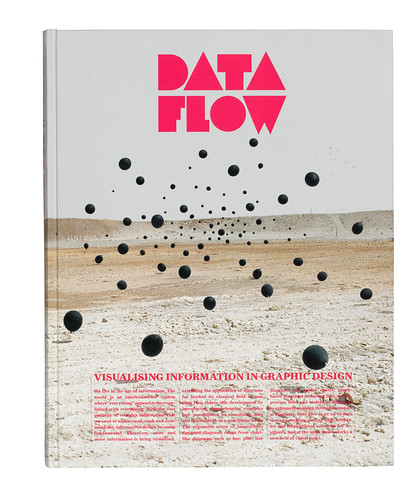
There is a commitment to printed magazines and books that runs throughout all Onlab’s work. As well as the studio’s Logo’s trilogy, book projects include Marshall McLuhan Unbound (Gingko, 2005), a series of twenty separately bound essays by the Canadian media prophet in a card slipcase (art-directed by Robert Klanten); Pictoplasma 2 (DGV, 2003), whose bright pink cover encloses a sober and well ordered introduction to the world of character design; Space Time Play (Birkhäuser, 2007), a book for architects about computer games. Data Flow: Visualising Information in Graphic Design (Gestalten, 2008) attracted popular and critical approval for its ingenious and clear-eyed presentation of a huge amount of complex content.
Smart Surfaces and their Application in Architecture and Design (Birkhäuser, 2009) required Onlab to pull out all the stops. Aimed at architects and designers, the book deploys 460 illustrations of every description, from full-bleed scientific photographs to thumbnails. More surprising at first glance are the scientific diagrams made using linocuts. Yet the use of this technique is not an eccentric choice: the linocuts’ form and texture make a welcome break from the photos and typography – which are punctuated by magazine-style pull quotes – and make a visual point about older technology, too.
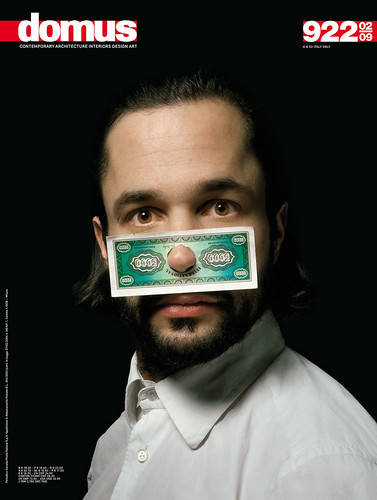
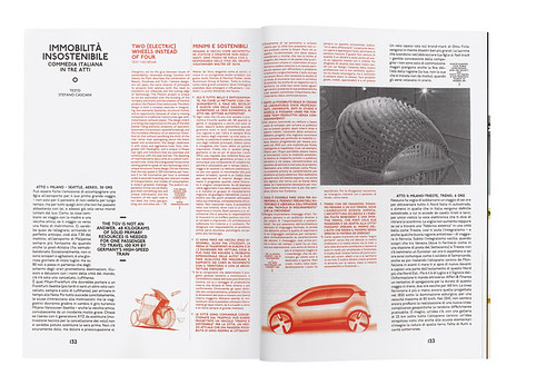
Onlab’s redesign and reshaping of Domus magazine took much of the studio’s time and energy in 2008. Using new, exclusive typefaces for text and display (designed with Mika Mischler from Binnenland, a type foundry based in Bern in Switzerland), Onlab restructured the content in a rational and stylish way that gave a welcome boost to the long-established Italian architecture and design journal, starting with no. 913 in April 2008.
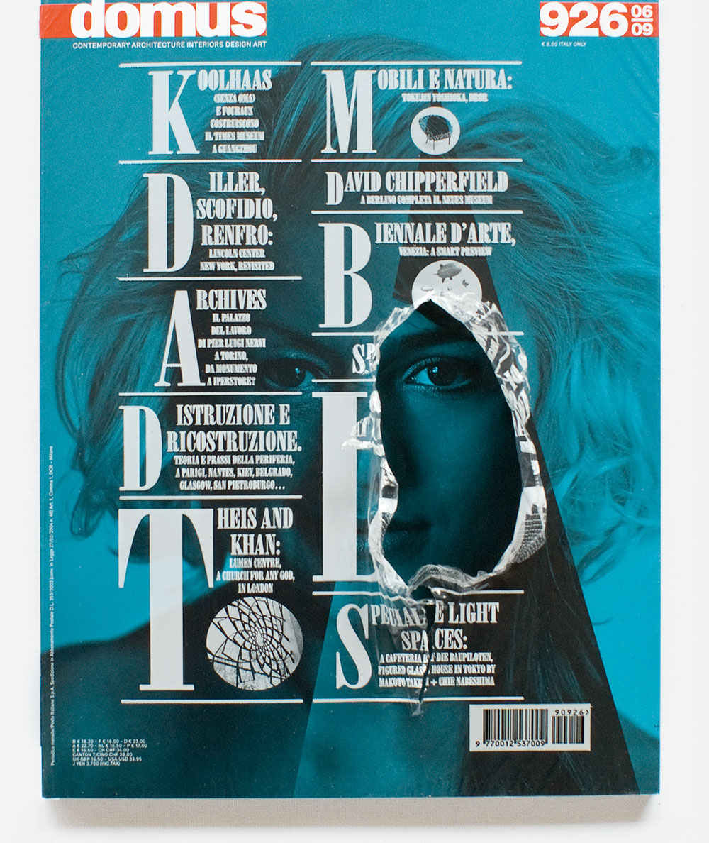
The in-house team at Domus now handle the editorial design (to Onlab’s redesign guidelines), while Onlab concentrates on its powerful, two-tier covers. A polythene wrapper contributes a complementary graphic layer, such as the curious portrait of a rider that can be torn off to reveal a masked horse (April 2008) or the illustration that reveals just the eyes of Hendrik Kerstens’ cover image for May 2008. The new cover series that began in April this year uses the outer wrapper for extravagant typography, as in the radically compressed capitals of the Africa issue in July, the concentric coverlines of May or the old / young collage of June 2009 (see opening spread).
The studio also contributes a regular editorial section, ‘Intersections’, the first of which (in March 2009) used complex paper-folding to express the challenges of Web 3.0. ‘Global View’, launched in July 2009, is another regular section, a series of diagrams that revisualise the buildings featured in each issue as information diagrams (on a graph-paper background) showing location, design time, construction time, average temperature, building area and height.
Meanwhile, in Berlin, the Museumsinsel project is almost finished. Bourquin has mixed feelings about it, suggesting that its spirit has been compromised by changes in direction and pressure from the museum directors, the Berlin Senate and the architects. ‘Some applications are great and working well. Some are disastrous.’
Small town strategy
Bourquin has nevertheless drawn on this experience for a project closer to his heart: the corporate design and identity for Tramelan, the small town in the Jura mountains where he was born and grew up.
In 2004, Onlab took part in a research project to examine opportunities for the town, whose population and industry were shrinking. The resulting report analysed many aspects: political, economic, social and cultural, together with the town’s national and regional image and self-image. Two years later the studio was commissioned to develop a new visual identity and communication strategy for the town. Onlab’s work uses the three linden leaves of the town’s ancient emblem with a new typeface called Tramelan-Lutz (again designed with Binnenland’s Mischler), which will be used for all the signs. The new identity was launched in September 2007.
Confronting students with content
Bourquin preaches what he practises, at editorial workshops that teach design students how to make books or magazines in a short space of time. Since 2008, he has also been teaching part-time at Bremen’s University of the Arts. ‘Teaching is refreshing and thrilling,’ he says. ‘I’ve learned to listen attentively and speak slowly.’
Asked whether he and his students see a long-term future for the editorial sector, Bourquin is surprisingly upbeat (while deploring ‘the niche products flooding and polluting the market’). ‘It’s a bad era for the media industry, a great one for us designers. Everything can be rethought and recreated. Our perceptions must be changed, adapted, repositioned.
‘The students, at the beginning of this thinking process, were born in the internet era and are using Web 2.0 tools in their everyday life. On the other hand, they are more interested in the formal aspects of design than in the infrastructure or the media systems and processes.’ He suggests that this is to be expected: ‘They would sooner make nice designs and publish on blogs than create a contemporary magazine structure!’
For Bourquin, the advantage in teaching editorial design is that his students are always confronted with content. His method is to solve the stylistic aspects of a project in its later stages, first making sure that his class understands the structure of the story.
In addition to his design and teaching work Bourquin somehow manages to maintain an independent art practice that embraces film, video, photography and writing, with ambitious and engaging projects, documented on his website, nicolasbourquin.net. His artwork tends to have a documentary aspect, including videos and photographic portraits of workers in different parts of the world: some of Bourquin’s fixed-camera videos in his ‘Workers’ series, made during a 2006 residency in Cairo, were shown in the recent group exhibition ‘Im Schatten der Pyramiden’ at the Museum of the Arts in Altdorf.
The ‘2:00’ series of video clips also has an editorial element (what Bourquin calls ‘field recording’) in addition to the basic conceptual thrust: an uninterrupted fixed-camera piece of video footage that lasts exactly two minutes.
‘I aim to break down the barriers between the designer’s practical approach as an element of consumer society and the artist’s subjectivity and commitment,’ he says. ‘Research, design, education and artistic practice should not only create utopias but also tap into specific new territories.’ So in Bourquin’s mind, there is a continuum between the way both artists and designers approach their raw materials and content, the essential components of any brief. ‘The essence of a task and of a project is always the guide to solving it.’
In addition to the steady stream of client work, Bourquin has further ambitions for Etc. Publishing: ‘We are evolving at the edge of two domains: journalistic / editorial work; and designer / stylist tasks. As authors, we operate on both sides to communicate a story or idea. But in general, people don’t know what we are doing, nor do our clients or partners! At the beginning of a project, we don’t know how it will end,’ he admits with a smile: ‘This is complicated to communicate and, on the client side, difficult to support.’
They are keen to extend their printed, two-dimensional projects into the greater dimensions of exhibitions, installations or online. Working in two or three dimensions or multimedia comes down to a few fundamental questions, Bourquin says. ‘What’s the story? And how do I tell it?’
Experimental visual laboratory
Berlin is full of talented graphic designers and studios, but Onlab’s prominence and success point to some significant factors. Bourquin is from Switzerland, with a neighbour’s affinity for the culture, an outsider’s objectivity and a strong design education. He recruits a mix of locals and outsiders for his studio and collaborative projects. Fellow Swiss designer Thibaud Tissot, for example, came to Onlab as a student intern, returned as a designer and is now an art director. Austrian project manager Judith Wimmer joined the studio in 2008, while Sven Ehmann continues as an independent consultant. Bourquin’s greatest asset, however, encompassing every project from the most arcane art venture to publishing and identity design, is his visual storytelling ability.
Quizzed about the studio’s name, Bourquin remarks that he started at a time when a design practice had to sound like a rock band: ‘I was searching for a short name, easy to remember and to use on the internet.’ So he decided upon the names ‘onlab’ for his (online) Web work and ‘offlab’ for his print work. In the event, he decided not to use ‘offlab’ because of its negative connotations, but he still has the URL in reserve: ‘If Onlab crashes, I can use Offlab as a backup!’
There is serious purpose in his use of the word ‘lab’: ‘I wanted to express the idea of an experimental visual laboratory,’ says Bourquin. ‘You can’t keep using the same thinking parameters or design styles and schemes. The vocabulary of visual language must develop continuously.’
First published in Eye no. 74 vol. 19.
Eye is the world’s most beautiful and collectable graphic design journal, published for professional designers, students and anyone interested in critical, informed writing about graphic design and visual culture. It is available from all good design bookshops and online at the Eye shop, where you can buy subscriptions, back issues and single copies of the latest issue.

