Spring 2010
Over the rainbow

From advertising to illustration; posters to badges; fashion shows to pop videos, the design work of Anthony Burrill has become quietly ubiquitous

Anthony Burrill is the multitasking man of the moment – designer, illustrator, artist, set decorator and video director, quietly ubiquitous without being annoying or repeating himself. Need a slogan that’s feelgood without being clichéd? Burrill’s the guy – you see his letterpress Work Hard & Be Nice To People poster on the walls of cosy living rooms and London’s smartest new-media agencies. Need images to warn travellers of the dangers of the London Underground? Burrill’s posters and animations are direct without being stentorian or needlessly scary. And when KesselsKramer needs a deadpan image to support its long-running ‘so counter-intuitive it’s intuitive’ campaign for the Hans Brinker Budget Hotel in Amsterdam, who is Erik Kessels going to call but Burrill, who has been inking scuffed rooms and dodgy concepts for him since the 1990s.
Burrill’s work is so plain and simple it can seem as though everything is on the surface. The posters, postcards and placards, full of teeth and smiles (‘Eat It All’), telegraph his ‘A. B.’ initials. Posters such as Bring Back the Golden Sunshine seem deliberately facile, in tune with an increasingly popular area of graphic design that can appear to be about nothing but itself. Burrill is at the forefront of the new wave of designer-illustrators, and by the mid-noughties he had developed a substantial commercial career working with advertisers and brands in public, private and cultural sectors, building a confident and distinctive portfolio. The creator of a poster saying ‘It Is OK For Me To Have Everything I Want’ seemed to have it all.
Then, in the summer of 2008, just before the banking crisis that knocked the stuffing out of design and advertising’s biggest clients, came the ‘European Championship of Graphic Design’ show, which featured Burrill alongside ten graphic ‘team-mates’ including Happypets and Antoine+Manuel, at the Dutch Graphic Design Museum in Breda (see Eye 68). It is fascinating to see how much Burrill’s practice has branched and blossomed since then. He has moved smoothly into installation, exhibitions, music, video and fashion; advertising commissions figure hardly at all. Many of these projects are collaborations, and he cites the Breda ‘Championship’ as the crucial catalyst.
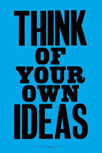
Woodblock poster, open edition, signed in pencil, 2009. Printed by Adams of Rye on recycled paper using traditional woodblock printing techniques.
Top: Portrait by Maria Spann.
Burrill comes from a working-class background in Oldham in the north of England, and he was the first in his family to go to college. When he showed promise at school (‘I was the best in my class at drawing’), his father suggested he get a job as a draughtsman at an engineering company. ‘I had a look round and thought – it’s my kind of place!’ – but his art teacher suggested a foundation course at the local college, which led him to studying at Leeds Polytechnic, under John Ross. ‘He was like a mill owner from the nineteenth century, walking around in hobnail boots and corduroy trousers with braces. It was his kingdom.’
‘I’ve never been a full-on illustrator and never been a full-on designer, and Leeds was perfect for that,’ says Burrill. ‘The course was quite freeform. If you wanted to go on the roof of the building and set fire to a cupboard, you could do it – John Ross actively encouraged that kind of behaviour.’
Another important figure from that time was illustrator Russell Mills, who found time to help Burrill with his dissertation about Kurt Schwitters when Burrill visited his studio. ‘He had this ambient music playing. And he spent all afternoon showing me stuff – I always think how important that visit to his studio was when people come to visit me.’
When Andy Stevens, who was in the year above him, got a place at the Royal College of Art, it was an encouragement to apply there himself. Burrill was nominated to take his fellow students’ portfolios to London. ‘I went down on National Express with everyone’s folders, but I was the only one who got in.’
Burrill’s Royal College contemporaries included future graphic design stars such as Mathias Augustyniak (later one half of M / M Paris); Fuel (in the year below); and Stevens, Nigel Robinson and Paul Neale (who went on to found Graphic Thought Facility; see Eye 39) in the year above.
His own progress was less eventful. ‘It was like when you join the army and first they break you, and then they make you!’ he laughs. ‘There were these things called “ideas”. Before it had been about shapes and textures.’ He felt like an outsider at the Royal College: ‘I spent most of the time not really getting it!’
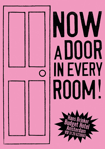
Poster, 1993, from KesselsKramer’s campaign for the self-proclaimed ‘worst hotel in the world’.
Adams family
The first couple of years after graduating (in 1991) were spent assisting Emma Parker, his photographer wife, and working on the kitchen table at home. He bought type books from the Dover Bookshops and made little books by ‘fiddling around with bits of type and sticking them down with Pritt Stick’, and using the photocopier in a stationery shop. ‘In those days it was the geeky boffins who used computers,’ he says, ‘it wasn’t the cool kids. Macs were too expensive.’
When Parker was working on a poster campaign for ad agency GGT, she introduced him to the agency’s art director, Erik Kessels. ‘I showed him some stuff and Erik was, like, “ja, it’s good”.’ A short time later, Kessels set up his KesselsKramer agency in Amsterdam, and called Burrill to help with a campaign for a new client, the Hans Brinker Budget Hotel. ‘He sent me through eighteen copy lines.’ These included ‘Now even more dog shit in the main entrance’ and ‘Now more rooms without a window’.
‘I don’t think he expected me to do them all,’ says Burrill, ‘but I did them in two days. ’Cause it was a job. All these clip art things I had collected – I used them all.’ The campaign attracted attention – design press, awards – and the time-lag between jobs started to reduce. Hans Brinker was his first hit: ‘It got me in the charts.’
He continued doing jobs for ad agencies, and making his little books, steadily building a substantial stream of work in advertising and editorial design. After the birth of their second child, the family moved to the Isle of Oxney, near Rye in rural East Sussex.
Noticing that the posters for local church and school events were much more attractive than the scrappy laser-printed jobs typical of provincial Britain, he tracked down their source – Adams of Rye, a family-owned printing business with a fully functioning letterpress printing works out the back. He started making posters at the press, the first of which was Work Hard & Be Nice To People (2005), and the collaboration continues to this day. The text, which he describes as being ‘like the things you see outside churches’, was, according to a woman he overheard in a check-out queue, the secret to a happy life.
‘I carried it around in my head for a while,’ says Burrill, who printed 300 copies on pale yellow paper and sent them out to people in the manner of his little books. After a while, people started to ask for them, so he printed more, first on orange paper, then on the brown paper he still uses. The image has whizzed around the Web (on sites such as ffffound.com) and appeared, in a ‘distressed’ version, on the cover of Wallpaper* magazine (June 2008, the ‘work’ issue). One fan copied the poster as a tattoo and sent him the photograph. ‘The kerning’s not quite right,’ he notes.
Burrill’s letterpress posters continue to sell for an ‘affordable’ £30 from his website, where limited edition silkscreens such as Sunlight and Moonbeam sell for £200.
His advertising client list – a high street’s worth of brand names – is impressive by any standards: Sony, Virgin, Audi, Diesel, Uniqlo, Howies, Guinness, Nike, Habitat, Oxfam, Christian Aid. But in 2008 things began to change, not only in adland but also in Burrill’s own approach to life and work.
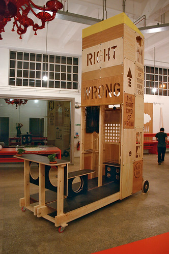
Burrill and Michael Marriott’s ‘Trojan Horse’ in the Mother advertising agency.
Clever Trevor
His work in the ‘European Championship of Graphic Design’ show had the same controlled stridency you saw in his self-published products and advertising work of that time, only writ large – another red, green and blue mix of bold caps, lightning-flash arrows, big dots and trademark ‘A. B.’ (‘It’s a bit of a gift,’ says Burrill, though he no longer uses it.)
The scale and conviviality of the week in the Dutch gallery inspired huge changes in his practice. To fit the high-ceilinged space, he had decided to build a tower out of four one-metre cubes. And when he got to Breda, there they were. ‘It’s not like doing an exhibition here [in the UK], where you have to pay for everything yourself. It was amazingly well funded, and they were perfectly made. I had all the vinyl surfaces made here and took them with me – it was pretty much as I’d planned it.’
It was the unplanned aspects of that week that opened his eyes to new possibilities, hanging out with Happypets, Scott King, Jonathan Ellery, Antoine + Manuel et al. ‘I thought, yeah, I want to do more of this,’ he says.
When advertising agency Mother asked him to make an exhibition for its vast reception area, Burrill invited product designer Michael Marriott to collaborate with him, in what has proved to be a productive creative relationship.
He started with a poster of the exhibition title, ‘The Right Kind of Wrong’, for which every line was set in a different typeface. To fill the central space he and Marriott devised the idea of a ‘garden shed on stilts’ in which they could hang prints and make texts that were part of the wooden construction.
It was ‘like a Trojan Horse’, says Burrill, who was becoming quite disillusioned with the world of advertising. ‘The whole thing feels like it’s grinding to a halt. So this was my swansong!’ he says. ‘It’s about not knowing the difference between right and wrong. I’ve just had some bad experiences in advertising, and working with people who are not truthful and I was getting a bit disillusioned. It changed how I thought about my own work, and whether I wanted to hand it over to Barclays Bank.’
But did Mother’s account managers realise he was erecting a Trojan Horse in their entrance hall? ‘I don’t think so,’ he says. ‘For the opening, we had more than 1000 people on the guest list. That huge space was full of people, and there was a queue to get in. That’s when I first got a sense that people knew who I was. It made me think I should start doing my own stuff.’
As always, his timing was spot on. London’s Design Museum commissioned what he calls the ‘dream team’ of Burrill and Marriott to make trophies for its Designs of the Year Awards 2009 in wood, acrylic and brass, a quirky alternative to plastic or paper.
Shortly after the Breda show, he had been invited to design six temporary window boards for Colette, the cult Parisian boutique, a connection that blossomed into ‘Geometry in Nature’, an exhibition held there in early 2009. For this he made a series of shiny, colourful pieces in lasercut Perspex, employing the services of a specialist company in Uxbridge, Middlesex. ‘A friend of mine, who’s a project manufacturer for an exhibition company said, “just speak to Trevor,” and Trevor said, “Your work’s fantastic, I can just see it in Perspex.”’ The investment involved in making seven large pieces and some smaller prints was an act of faith. ‘I’d reached a stage where we were kind of OK for what we wanted to do really. This was me thinking let’s do something really different.’ Even if they hadn’t sold, he would have felt it worth doing. But they did sell. ‘You get used to having exhibitions and nothing ever selling,’ he says, ‘but the people who go into Colette … it’s a different world!’ Making another show for TBWA in Los Angeles was another culture shock. ‘You drive along the freeway, and it looks like an industrial estate somewhere near Croydon, and you turn into this aircraft hanger and it’s an advertising agency. It’s like KesselsKramer on an enormous scale.’
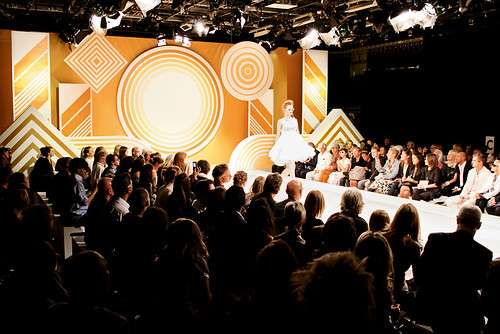
Fashion designer Jenny Packham had got in touch with him after the Colette exhibition, and soon he was applying his hard-edged circles and stripes to her catwalk show for London Fashion Week 2009. For this job, his customary printer’s red-and-black and rainbow acrylics were replaced by a new range of warm golds and browns, effortlessly adapted to go with Packham’s Spring / Summer collection. ‘It’s her business to make things that are beautiful,’ he says of his new collaborator. ‘It’s a privilege to make things like this.’ You can see extracts from Packham’s show in ‘Pretty Girl No. 1’ on Burrill’s Vimeo channel.
Catwalk show for Jenny Packham at London Fashion Week, 2009.
Ballad of John and Yoko
The fashion connection continues with some new commissions – wall art (with Marriott) for Oliver Sweeney’s shoe shops and a clock for The Lollipop Shoppe, a new retailer for design objects and furniture. There’s a similarly trendy aesthetic in his hard-edged, minimalist videos for French electro duo Acid Washed.
The current reinvention and recycling of 1980s tropes in pop culture chime nicely with Burrill’s latent interest in that era: he was a student during the rise of acid house and cites his earliest graphic memory as the red and black De Stijl-influenced cover of Kraftwerk’s Man Machine (1978). ‘It was so different from everything else … it was the combination of graphics and music.’
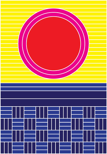
Burrill’s sound projects go beyond covers and videos. There’s an ingenious and modest TV commercial for VPRO, the Dutch radio broadcaster, which illustrates a famous interview with John Lennon and Yoko Ono with filmed footage of domestic activities: eating breakfast, making bread. A project with astronomer John Griffiths for ‘If You Could Collaborate’ at Rochelle School, London in January 2010 saw a further permutation of the hard-edged acrylic approach. These works, with titles such as Partial Lunar Eclipse and Ring of Saturn, show a more measured side to Burrill’s work. New pieces for a show called ‘We Live & Learn’ at Analogue Books in Edinburgh reveal an almost rural aspect to Burrill, with references to hillsides, sunrises and sunsets. The prints, posters and badges – in a new range of colours, including pink, red, yellow and two blues – emit bucolic warmth, a kind of techno landscape.
With each new project, Burrill reveals increased confidence and a firm grasp of what works, what’s possible and what sells. Yet most of his work, however ambitious or grand in scale, retains the simplicity and directness you see in those early little books and adverts that he stuck together in the Wimbledon copy shop. To borrow a phrase favoured by GTF’s Paul Neale he has ‘an analogue mind in a digital world’, and it may be this attribute that enables him to move easily between materials and methods.
He retains a sense of wonder alongside his Northern sense of humour. This is the person who made a poster saying ‘Life is Hard’, complete with interlocking rainbow and raincloud. ‘With my parents, everything was based on humour and not taking things too seriously,’ he says. ‘Because life is pretty grim for most people.’ Burrill grins: ‘I’m lucky – I’ve created my own little world.’
Sunset over fields. Giclée print for Burrill’s exhibition ‘We Live & Learn’ at Analogue Books, Edinburgh, 2010. Simple pictures using basic geometry to describe nature. ‘The Analogue series is all based on a simple grid, using “modular” elements that fit together to make simple pictures,’ says Burrill. “The colour palette is also simple, using basic colours. The pictures are about walking through the fields where I live during the summer, feeling happy.’
Burrill is an exhibitor at ‘Pick Me Up’, the graphic art fair at Somerset House in London, from 23 April to 3 May 2010.
John L. Walters, Eye editor, London
Eye is the world’s most beautiful and collectable graphic design journal, published for professional designers, students and anyone interested in critical, informed writing about graphic design and visual culture. It is available from all good design bookshops and online at the Eye shop, where you can buy subscriptions and single issues.

