Winter 2008
Power of two

Clients who hire the company behind Five’s new identity always work directly with the main men

Simon Dixon and Aporva Baxi quit their old jobs on the same day in 2001, determined to start their new studio, DixonBaxi, with a clean slate. ‘We decided we wouldn’t work with our old clients, and we wouldn’t show any work we had done,’ says Baxi. ‘We wrote two lists,’ says Dixon. ‘One list of things we would do … ’ ‘Simple things like being honest, no bullshit,’ interrupts Baxi. ‘And one list of things we wouldn’t do, like music design and working for agencies,’ continues Dixon. ‘But we didn’t quite know what we would be doing.’
What they do now – with flair, humour and considerable success – is design, art direction and branding, notably in television. After seven years as DixonBaxi, with some distinctive and memorable projects for Formula 1, the Sci Fi Channel, Last.fm and MTV under their belts, they have just completed their biggest job to date, the rebranding of Five, the UK’s newest terrestrial television channel, which launched in 1997.
The Five commission has taken them beyond the usual boundaries of art direction, forcing them to leave the comfort zone of cult or niche channels for a more mainstream, tabloid approach that would engage Five’s ‘telly-loving’ public.
‘Five’s brief said that everything was up for grabs,’ says Baxi, explaining that the duo had to look at the identity and how everything looks, plus all the ‘underpinnings’ – the tone of voice and the way that is articulated. In some senses, their role was closer to management consultancy and branding than graphics, as they sought a refreshed identity for the channel, working to an ‘aggressive timeline’ that obliged them to shelve other projects and turn down new clients for half a year. As well as working within Five – with its 300-plus employees from shop to boardroom level – they commissioned many different independent design, film and animation studios, including Mate Steinforth and David Cairns.
DixonBaxi’s work has had the trajectory of many similar design duos: a few small jobs for like-minded clients in the first few years as the workflow slowly grew in size, scope and value. What is remarkable, however, is that it has remained the same size: two people. The principals preside over the generous space of their East London studio in splendid isolation: two desks, a few chairs and lots of wall space for current posters, positioning statements and try-outs, plus a few mementos of past projects.
No interns, junior designers, account managers or admin staff interrupt the view from behind their matching 30-inch monitors. The duo made a deliberate decision to play down their prehistory as part of Attik, whose turbo-charged, computer-driven graphics seemed to be everywhere at the close of the previous decade. Baxi, who studied graphic design at Middlesex University, joined Attik in 1995 after stints at Michael Peters and Saatchi & Saatchi. Dixon studied at York College, and founded Orange Design with Chris Ashworth and Gary Brown before joining Attik in 1993. Baxi and Dixon worked together in London before Dixon went off to initiate Attik’s New York operation in 1995. Baxi set up the company’s San Francisco office three years later, before joining Dixon in NY in 1999, where they spearheaded campaigns for brands such as Sony, Ford, Levi’s and Swiss Re.
Seven years ago, they hardly dared imagine how the new practice might develop. But their ‘manifesto’ would guide the fledgling company into a new way of working, with guideline statements that reminded them to ‘Look underneath, but craft the surface’, to ‘Work with the client directly’ and to have the ‘confidence to say “no”’. They decided to eschew the sectors taken care of by 100 other London practices, such as music packaging, book covers and elaborate websites. Their first two projects quickly defined the direction they would follow: identity work for a financial services company and for MTV.
Despite their ‘no music’ rule, DixonBaxi’s logo and information design for the Last.fm website helped the fledgling social networking outfit (founded in 2002 by Martin Stiksel, Felix Miller and Richard Jones) transform the way music is disseminated, part of an ongoing change that is forcing the industry to rethink the relationship between music and imagery.
Last.fm was a ‘little’ client, financially, but the system that DixonBaxi designed adapted seamlessly as the network took off: ‘In some senses it wasn’t small at all,’ says Dixon, ‘because all the elements we put in place expanded as it grew to 20 million people.’
Top: On-air look and channel package for MTV UK. Client: MTV Europe, 2002-2005. The iconic music channel engaged DixonBaxi to devise a ‘newer Brit-focused identity … a strange and twisted reality where nothing is quite as it seems.’ Dixon and Baxi wrote and directed 60+ live action idents featuring stuffed and live animals and devised a style guide for the channel’s on- and off-air look and ‘tone of voice’.
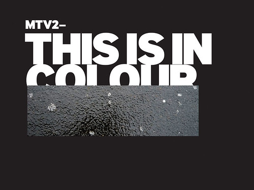
Below: MTV2 Channel Package and on-air look, 2002-08.
Creative direction and design: DixonBaxi. Animation: James Wharfield. A refresh of the original 2002 look created by DixonBaxi, which uses hundreds of new irreverent statements: either written by the designers or sent in by viewers, leading to new ways of communicating and creating dialogue with the audience in screen graphics, information system and channel navigation.

Their work for Formula 1 is actually their most visible work; DixonBaxi’s on-screen branding and information delivery system reaches 40 or 50 million viewers around the world for each race: it is a huge sub-brand within sports television. The team won a three-way pitch for the job, beating two broadcast design companies with a background in sports programme graphics.
‘When we did Formula 1,’ says Dixon, ‘if we hadn’t made use of our graphic design skills it wouldn’t have been as good as it is now.’ He sees a direct link between the Swiss orthodoxy he learned as a student and the discipline required for a job like this, where the client required an information system that was rigorous and robust. ‘It’s actually a three-dimensional grid,’ he says. ‘Because you have to add time to it. Without the technology aspect of it, the design part of it wouldn’t have been as good. The design is quite simple, it’s all about watching the race. If I switch on to ITV twenty minutes in, I just need to know who’s winning and who’s second and what’s happened.’
Both designers are adept at slipping between big picture and detail: they talk the brand talk while walking the graphic walk: ‘The thing I like about graphic design is that it’s a craft-based discipline,’ says Dixon. ‘The best graphic designers have this deep-seated need to make things almost perfect. Whether that’s Farrow or Build or North (whoever your favourite is) they have this way of looking at the world which is really high quality and well considered. If you can take that mindset to a different discipline, it’s really exciting.’
Their work for MTV and the Sci Fi channel also puts the emphasis on the viewers – who are typically quite different to the people who run the channels. To prepare a presentation for the MTV2, they first drove around London, seeking out the places where the typical audience would hang out. They took photographs, collected detritus – trainers, flyers, etc. – and constructed a ten-foot wide junk collage that became a giant ‘mood board’ for the channel. ‘This resulted in almost “anti-channel” design,’ explains Dixon. The MTV identity, tapping into what they term ‘the disenfranchised, boy-in-bedroom, music-with-attitude’ tone of the channel, was based on the way their audience spoke, in obtuse, snarky statements and text-style language.
A later variation on this identity sought to be more ‘gritty’, with backgrounds and overlays made from photographs of pavement, planks of wood and found material from skips. ‘The colour palette and visuals were designed to be strong,’ says Dixon, but the language was stronger, because it was based on how their audiences spoke, and updated with actual emails sent to the MTV2 website from its viewers: the audience could actually see their words on the screen.
An identity for MTV UK took another unexpected turn, using photographs of scenarios that are odd, bleak or downright peculiar, a ‘Martin Parr’ worldview for alienated teenagers. Dixon and Baxi wrote and directed more than 60 live action idents featuring animals (stuffed and live) in addition to bizarre characters such as ‘Smell Guy’ and ‘Dougie’ the taxidermist. By contrast, their work for TMF (The Music Factory) was fundamentally graphic, with coloured blobs and typewritten captions – a much-needed ‘lick of paint’ for the highest-rated (if not the coolest) Freeview music channel.
The Sci Fi channel required a different tone of voice, or rather set of voices. With a brief to take the broadcaster from ‘geekdom’ and make it into ‘the fearless brand it should be’, DixonBaxi designed and art-directed a set of 48 picture cards whose reverse texts would also give the channel’s staff some very broad brand guidelines (somewhat reminiscent of Schmidt and Eno’s Oblique Strategies, see Eye no. 24 vol. 6). The images include aliens, the cast of Star Trek imagined as rock band, some other-worldly countryside manifestations and a mysterious pyramid.
No apologies for the F word
Writing, systems and typography lie at the heart of DixonBaxi’s thought processes. Dixon studied Swiss typography with Jim Deans at York College, where he later worked as a college designer. ‘It was very beneficial to be taught traditional typography,’ he says, ‘it brings a sense of craft to the discipline. We were lucky because at York we could work in hot metal letterpress, there was a big Berthold typesetting machine and photo labs, and they had Macs.’
The Five job obliged them to produce a slew of words (often with the help of the writing agency 26) to ‘explain the channel to itself’. They printed out all the elements of their initial work on to A2 cards, which they put in a big white box and presented formally to Five. ‘The presentation is a story. Before you even get to some of the key core components, you’ve already seen them,’ says Baxi, ‘The typefaces and the colours are already integrated into the presentation as a whole.’
They wanted to challenge the ‘brand idolatry’ of TV channels – what Baxi calls ‘the monolithic let’s-find-the-logotype-in-the-environment kind of thing’ that Channel 4 does so well. ‘Television is unusual,’ Dixon explains, ‘because in very few other places in branding do you linger on it for a long period of time before you do anything else. The only reason it happens on TV is that continuity – the voiceover which tells you what’s happening and where you’re going – needs something to accompany it. So the voice picks up, starts talking about the TV programme, the logo appears and 25 seconds worth of material happens. That’s the convention. ‘Our feeling was that the identity should just filter in and out of the whole channel and pop up when you need it, not have large chunks of it sat there for periods of time. People are watching TV, they don’t want to be looking at logos!’
They had to present their designs to Five’s bosses (six times in the first week), rapidly working their way up the management chain, to the CEO (who had never before in the eleven years of the company had to deal directly with ‘suppliers’), then the board, who asked ‘quite tough questions’. The final hurdle was a presentation to Gerhard Zeiler, the chief executive of RTL, the media group that owns Five. ‘He thought the “F” was a bit apologetic, and asked us to write “Fuck” on the board,’ says Dixon. The designers responded by saying that they were aiming to befriend Five’s viewers rather than swear at them. After some refinements to the apologetic ‘F’, they found an option he was happy with. Dixon says their aim was to produce a logo mark, not a typeface, and one that would look good in monochrome. ‘There’s something nice about these old logos by guys like Saul Bass. Even when you see them in black and white, printed badly, in all these logo books, they still look good!’
The identity was also tested in focus groups, with Grey London, the company responsible for advertising the new-look Five. ‘We fine-tuned the colours and the language a little bit, based on the focus groups. The writing was a bit verbose, and you could almost hear scriptwriting in it.’ But he adds: ‘You have to take research with a pinch of salt. You set up a situation where people know it’s research, so they act in a way that isn’t normal.’
In fact Five already had a very clear idea of who is watching the channel – it checks the ratings every day – so the research did not derail the process.
The demands of Clarity, the computerised system that manages all Five’s on-air design assets and content, meant that the designers had to go straight from the broad-brush, creative aspects of the brief to typographical detail. For this, using the typeface Gloriola, they laid down a set of rules and guidelines for Five’s content managers. ‘You have to be very, very robust about the design components,’ says Dixon, ‘because if you don’t make the right decision now, when you get to the middle of the testing a small tweak here could have big effects there.’
Once this was under way, DixonBaxi had to address the need for interstitials (short clips between programmes), bumpers (the items that separate programme content from the adverts) and what they call ‘brand bursts’, embarking on a quest to find and commission potential collaborators around the world.
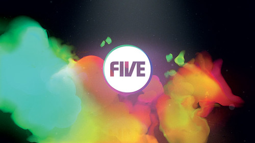
After looking at more than 100 submissions from companies and individuals, they picked directors that they thought appropriate, and sent them an open-ended brief, all about values and spirit. ‘Suddenly, we had this huge volume of ideas. Some directors came back with one idea, others with thirteen or fourteen,’ says Baxi. Companies commissioned so far include Grant Gilbert, Mate Steinforth, Aardman, Robert Seidel and Chris Cairns, whose witty clips turn everyday items like store trolleys into musical instruments. In each burst, the logo appears briefly, with an animated, coloured halo. ‘We didn’t want the logo throughout, or have an ident that arrives at the logo, or finds it in the space. We try and create a seamless experience, with one piece of content blending into another, then another.’
Dixon and Baxi have reached an enviable stage in their careers, working with large clients on extensive projects without the hassles of running a big company. They enjoy their ‘below the radar’ status: they don’t send out press releases, or enter awards. The only ‘promotion’ they do is to give lectures, such as the one they gave at Design Yatra in Kuala Lumpur, Malaysia, last November.
‘Using collaborators has completely freed up the way we work,’ says Dixon. ‘There’s no preciousness … we don’t care how it gets made as long as it delivers what we want it to deliver.’ They effectively ‘edit’ their clients, and are single-minded about the work they take on. ‘We operate better on the larger projects.’ Dixon says: ‘We work very well with certain kinds of companies – people who need somebody to reposition them, redirect them, motivate them. They have access to two very senior creative directors, all the time, who never pass down. All our work is direct to clients who make a difference in the business.’
Dixon compares their methods to those of a bigger company, where the principals ‘would do two or three meetings and disappear’, maybe coming back for the odd presentation, and the client ‘would speak to account managers and junior designers and other people who do the work.’ By contrast, he says, ‘People who work with us, work with us, literally! It streamlines the process, because we make decisions as we go – everything we do is a live experience.’
Frame from one of two fifteen second ‘Brand bursts’ – part DixonBaxi’s identity for the UK television channel, 2008. The comprehensive rebranding includes a new on- and off-air look and logo. Production and animation teams such as Partizan, Aardman Animations, Buck, Rokkit, Flynn, Hornet Inc, Agile Films, Man Vs Machine and Mini Vegas were commissioned to create bursts that set the template for the project, which was managed through DixonBaxi’s long-term production collaborator ASD Lionheart. Creative directors: Simon Dixon and Aporva Baxi.

John L. Walters, Eye editor, London
First published in Eye no. 70 vol. 18 2008
Eye is the world’s most beautiful and collectable graphic design journal, published quarterly for professional designers, students and anyone interested in critical, informed writing about graphic design and visual culture. It is available from all good design bookshops and online at the Eye shop, where you can buy subscriptions and single issues.

