Spring 2011
Raise the bar

Frédéric Bortolotti
Olivier Körner
Nicolas Ledoux
Pascal Béjean
Uncompromising posters for the Théâtre Nanterre-Amandiers in Paris

Visual communication for the cultural sector is, in the opinion of many designers, the last best hope for expressive and radical graphic design before it is finally submerged in a sea of anodyne branding and corporate sterility. And yet, as was pointed out in these pages by Nick Bell (‘The Steamroller of Branding’, Eye 53), the cultural sector is not always the ‘promised land’. Bell wrote: ‘Since the 1980s, art galleries and museums have chosen to employ the same methods of persuasion that business uses, because they see themselves more as businesses. In the grip of a new spirit of openness, they believe their customers need to be lured to look at art with a mode of address they understand from spending time in the supermarket – an approach that can easily become patronising.’
Not so the Théâtre Nanterre-Amandiers. Under its director, Jean-Louis Martinelli (described by Pascal Béjean – one of the designers of the theatre’s promotional material – as someone ‘imbued with the spirit of 1968’), this small venue, half an hour from the centre of Paris, offers a bold repertoire of broadly leftist theatre that deals with geopolitics, Africa and France’s colonial past.
In 2002, a competition was organised to find a design team to give the theatre a ‘new spotlight’. The contest was won by the Parisian design group Labomatic (Pascal Béjean, Frédéric Bortolotti and Nicolas Ledoux). Labomatic were prominent members of the new wave of 1990s French designers. Their work, well known and greatly admired in France, showed the influence of the radical developments that had taken place in America during the 1980s and 90s. The spirit of Cranbrook – and of Rudy Vanderlans’ Emigre – was evident in the group’s early work for French cultural institutions and art galleries, and in the posters and printed material they did for Nanterre-Amandiers.
Labomatic disbanded in 2009, and Béjean and Ledoux broke away to work as a duo under their own names. They were subsequently joined by Olivier Körner, and together they have carried on the task of designing the print campaigns for Nanterre-Amandiers.
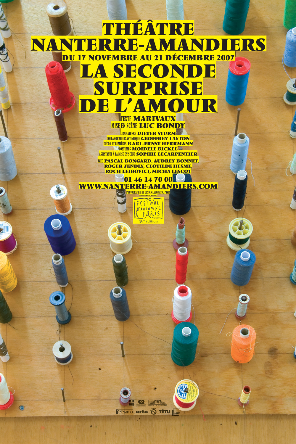
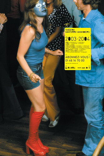
Posters are central to the theatre’s efforts to attract audiences. Produced for display on the Paris Métro, these posters make no attempt to depict individual plays. Instead, they offer the viewer a graphic mix of ambiguous pictorial imagery, eccentric typography and madcap illustration. In the words of Béjean, the posters seek to ‘encapsulate a mood’. This is both a matter of artistic choice and the result of promotional material being required months in advance of actors being cast for roles. Nor do the posters offer a consistent homogenous graphic approach: there is no logo; no house typeface; none of the patronising repetitiveness and template-driven uniformity beloved of branding evangelists. Only the bold use of yellow and black is retained from one season to the next.
In En jaune et noir,* a handsome book published to celebrate eight seasons of work, the theatre’s catalogues, leaflets, flyers and posters are presented chronologically in a blunt, matter-of-fact style. In addition to the visual materials, French-language texts are interspersed throughout, as are meticulously detailed credits, including listings for every typeface used.
Is there a lesson for commissioners of cultural design to be gleaned from the graphic output of the Théâtre Nanterre-Amandiers? Definitely. In my experience, commissioners of cultural design are mostly concerned with the task of attracting people who do not normally attend theatres, galleries or museums. This is commendable: why should cultural institutions appeal only to initiates? But the consequence of this open-arms policy is, mostly, promotional material that fails to rise above the level of Disneyfied infantilism.
The designers of Nanterre-Amandiers’s posters are open to the criticism that they fail to provide succinct graphic summaries of the plays they are charged to attract audiences to see. Yet it can also be argued that they offer something better: firstly, there is a fierce visual bite to these posters that will ensure that they ‘stand out’ among the hair care products and mobile phone offers they sit next to on the walls of the Paris Métro. Secondly, with their use of unconventional design tropes, they offer a non-patronising and ultimately more truthful and genuinely dramatic insight into the unconventional repertoire of Théâtre Nanterre-Amandiers.
* En jaune et noir. 8 saisons. Théâtre Nanterre-Amandiers. Published by Pyramyd, Paris, 2010. Editorial direction: Céline Remechido and Michel Chanaud.
Texts by Etienne Hervy, Vanina Pinter, et al.
Book design: Pascal Béjean and Nicolas Ledoux.
First published in Eye no. 79 vol. 20.


