Autumn 2000
Read me! Part 2. Literacy in graphic design education

‘Relativist’ debates within the profession have extended to the way design and typography are taught. If there are no agreed standards – no absolutes within design – how can one teach? Are we heading towards a state of ‘institutional ignorance’ as tutors have less knowledge to pass on to their students?

Within education there is a consensus that literacy is valuable for all graphic design and typography students, but there are disagreements about the methods of teaching and the level of importance placed on language in general. In an attempt to be democratic and give an equal voice to all positions, are staff doing students a disservice?
Kelvyn Smith, former typography tutor at Middlesex University, cites 1995 as a time in which a significant change became evident in British art and design education. Though typography is an area of the curriculum that is practise-based and requires one-to-one teaching, staff-to-student ratios were making such approaches impossible. The increased number of places available led to a decline in overall standards of expectation, while the high turnover in staff, particularly part-timers, reflected a lack of morale.
In Smith’s experience, many graphic design and typography first-years lack basic writing skills. Given that graphic designers continually handle words and are being called upon to edit, proof-read and often write themselves, this may mean having to start by teaching ‘to the lowest common denominator’. The National Curriculum in the UK now includes a daily ‘literacy hour’ in primary schools, but it will be several years before we see its effects in higher education.
The Typography & Graphic Communication course at Reading University is unusual both in its intake and teaching methods. In the first year, students study three subjects and will choose to specialise after that. This may mean that an applicant who originally applied to the geography department may decide to move to typography in their second year. This results in a student body that is broader in its world view than the traditional art school intake, and is generally more academic. As Sue Walker, the Reading head of department, comments: ‘If you come here you’ve got to enjoy reading and writing.’ Her colleague Paul Stiff agrees, but wants students to recognise for themselves that ‘reading isn’t just one sort of activity.’
‘When people talk about literacy they are talking about a particular kind of reading; of a rather demanding engagement with an extended text, monitoring discourse, integrated complex arguments but there are all kinds of literate activities that people engage in in everyday life,’ says Stiff, noting that ‘glancing is a form of reading as well, pictures also demand to be read.’ As far as he is concerned, it is the staff’s responsibility to help students acquire knowledge in order to ‘tackle problems without fear’.
Changes in technology and the vanishing roles of the typesetter and comp have meant that ‘there’s no place to hide’ from inadequate specification. ‘We see some aspects of designing as being closely related to the act of editing: shaping language to be appropriate.’ In this process, notes Stiff, ‘literacy alone is not enough.’ In one recent project, his students worked with members of the linguistics department to redesign packs of formula milk. Some problems with the written instructions were identified by the linguists, but making the new text accessible, inviting and easily understandable involved primarily visual concerns.
Nigel Robinson, graphic design option leader at Buckinghamshire Chiltern University College, thinks relating form and content is essential – not least because’ in education typography has a really bad name.’ He is aware that the perception that ‘boring people do typography’, coupled with an awareness of a few typographer ‘pop stars’ is hard to combat. Most students’ mark-making has taken the form of images since early childhood and they are understandably first seduced by graphic form. Exposure to typography makes new and often frightening demands. Yet introducing design students to text both for its image-making potential and as readable language is not a problem: they are not mutually exclusive. As Paul Stiff pointed out, students can ‘learn quite a lot from “style lifting”’ but the big leap comes in asking: ‘What’s appropriate for this situation? Is this the time and the place?’
For Robinson, the combination of typography’s low status and the impact of new technology is hard to counteract: ‘even though we live in ‘the information age’ the language is becoming more pictorial, visually led … New technology, which is meant to improve standards, is in fact doing the opposite – poor line lengths, poor onscreen bastardisation of fonts, poor kerning.’ As part of Buckinghamshire’s modular course, students who opt for typography will be made aware of issues relating to legibility, hierarchy and acquire basic editorial skills but they often find it hard to ‘get the rhythm of language.’ Robinson believes that his job is to ‘make [the students] open their eyes’ and points out that in teaching typography, constraints are often liberating: ‘If someone says ‘do what you want’ that’s often the worst thing.’
Teal Triggs, director of postgraduate studies and research at the LCP (part of the London Institute) believes it is important to give students permission to consider breaking the rules. ‘The only absolute we have is process,’ says Triggs. ‘If you can go through the process being aware of your stages of development, your stages of mark-making, taking all aspects into consideration, you will come out with something which is appropriate but allows flexibility.’ Triggs is keen to focus teaching on context, believing that issues of legibility and language presentation are as much tied to audience as to the norms imposed by reading. ‘We all agree the point has to get across, [but] I recognise the audience and its ability to read.’
So the general public may not discern the difference between one well crafted font and another but they ‘will understand a Jonathan Barnbrook typeface as symbolic.’ The questioning of the relative importance of language in graphic design education is part of a larger cultural debate. ‘Words to us are media and are no less or more valid than any other media. It is a question of appropriacy,’ says David Crow, head of department of graphic arts at Liverpool Art School, Liverpool John Moores University.
‘Language is shopping lists, football chants, market stall banter, public service announcements, a baby’s first word,’ says Robinson who, like many of his colleagues in design education, is a passionate believer in the necessity for diversity and broad cultural knowledge. While it is necessary for students to express an interest in language at interview, this can take many forms. David Crow looks for ‘signs of an interest even though they may not recognise it themselves. They are sometimes quite naïve at this stage and have rather narrow ideas of what language might encompass.’
Teaching at postgraduate level, Triggs is usually interviewing potential students who are/ have been working within the field. Seeing the role of graphic design courses as facilitating an engagement with all forms of language – cultural, subcultural, linguistics – Triggs endeavours to encourage reading of all forms: newspapers, books, billboards and so on. Trips to the theatre form part of the course, too, ‘to give [students] opportunities, that’s the best one can do.’ At Liverpool, Crow says that an enthusiasm for language in its broadest sense is encouraged: ‘A student who is fascinated by comics or graphic novels needs exposure to other forms of literature, but also needs guidance from someone who understands their language. Many of the briefs we set make reference to literature and all modules have an indicative reading list.’ This is interesting to compare with the RCA, where the course does not set a reading list – instead there are suggestions made by individual tutors. Although one would expect postgraduate students to be pro-active in searching out source material, this could be seen as evidence of a lack of confidence on the part of some of their tutors.
The issues that tutors concern themselves with are a miniaturised version of those with which the profession and culture is engaged. Simon Esterson, of publishing specialists Esterson Lackersteen, talks of his role as similar to that of a solicitor who ‘takes instructions’ from a client. The balance that needs to be struck between design as an art form and a service directly mirrors that between education for its own sake and for vocational objectives. Crow comments: ‘It is common for us to find our most interesting work is in what appears to be our least employable folders. If we as a society want design to move forward we cannot be judged purely on how many of last year’s graduates have a junior position six months after graduation – not unless we can be sure that employers and clients have the future of the discipline and the development of our culture as a primary motive’.
The skills that graphic designers need to prepare themselves for professional practice must be re-assessed in the light of changing technology. It is interesting to speculate on the content of graphic design courses were they to be introduced for the first time now. Would the subject be named differently to reflect the graphic designer’s pivotal role in co-ordinating other professionals, and taking responsibility for much of the detail and minutiae of a project? Perhaps students would be training to become ‘content presentation managers’ or ‘message consultants’?
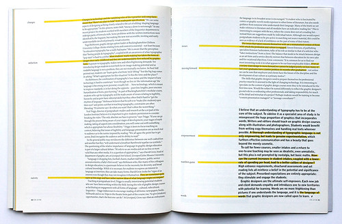
I believe that an understanding of typography has to be at the core of the subject. To sideline it as a specialist area of study is to misrepresent the huge proportion of graphics that incorporates words. Writers and editors should teach on graphic design courses along with illustrators and photographers. Students would benefit from writing copy themselves and handling real texts wherever possible. A thorough understanding of typographic language is not only empowering, but leads to genuine experimentation, which furthers effective communication and has a beauty that goes beyond the merely cosmetic.
To call for fewer courses, smaller intakes and a return to one-to-one teaching may be seen as idealistic, even unrealistic, but this plea is not prompted by nostalgia, but basic maths. How can the current increases in student intakes, coupled with a lower rate of spending per head, lead to a better calibre of designer? High entrance requirements, structured assessments and set reading lists all reinforce a belief in the potential and significance of the subject. Prescribed expectations are entirely appropriate: they stimulate and engage the students.
Graphic designers are the ultimate self-improvers. Each new job and client demands empathy and introduces one to new territories with potential for learning. Words are no more frightening than pictures if one understands the language, and it is the language of words that graphic designers are now called upon to learn.
‘I was told that the three rules of graphic design are
1. Read the copy
2. Read the copy
3. Read the copy again
… and it’s more fun designing things that I want to read’, Simon Esterson in discussion with the author.

Lucienne Roberts, designer, Sans + Baum, London
First published in Eye no. 37 vol. 10, 2000
Eye is the world’s most beautiful and collectable graphic design journal, published quarterly for professional designers, students and anyone interested in critical, informed writing about graphic design and visual culture. It is available from all good design bookshops and online at the Eye shop, where you can buy subscriptions and single issues.

