Winter 1993
Relics of the Modern
Doing up typefaces is not like doing up buildings – more like re-creating the parts from which buildings can be made
European Modernists in the years between the two world wars believed in the new, at the expense of an old that was rotten beyond saving. What are we now to make of the relics left by these designers, who rejected the idea of restoration and re-creation? This is the dilemma behind attempts to do up Modernist artefacts: one with which architects have been seriously engaged for some time.
But doing up typefaces is not like doing up buildings: it is more like re-creating an old form of brick or window frame from which new buildings can be made. This is one of the facts that cripples historical affectations in typefaces, whether the model dates from 1525 or from 1925. The spirit of history in letterforms is not so strong, and is at the mercy of the more powerful factor of overall arrangement of text. It may disappear altogether when the old typeface shows up in an advertisement for dog food. Architype re-creations have the air of a considered attempt at dealing with a chunk of Modernist heritage. So how do they look, in the light of the best intentions of the designers after whom the typefaces are now named?
That these alphabets are non-starters as readable typefaces is beside the point. They were first of all implementations of an ideal of simplicity and rationality. Bayer’s universal alphabet was based on the calculation that “lowercase-only plus strict geometry equals time saved, better comprehension, and greater happiness.” This theory just about floated in the months when people had hopes in the League of Nations, but sank with the Wall Street crash, Stalin and Hitler. Renner’s early characters for Futura have a decorative charm, and led to a usable typeface, in no need of re-creation. The alphabets by Bill, Van Doesburg and Van der Leck are display faces made by painters with ambitions.
The most interesting of these alphabets is the Tschichold. It was published as a pull-out section of Typographische Mitteilungen, March 1930, under the weary title “noch eine neue schrift” (“yet another new alphabet”). But, Tschichold explained, this was not just a set of new forms. It was part of the collective attempt to come to terms with the problems of alphabetic representation: a live issue in Germany at the time. Tschichold’s typewritten annotations to the specimen have been omitted from almost every subsequent reproduction of the letters. But you can see them reprinted with the whole article in the edition of Tschichold’s writings edited and published by Günter Bose and Erich Brinkmann. What does Architype Tschichold do with this exploration of phonetics? Throws it away, by adding characters such as “k,” “y,” “z” and “ß.” This undermines the foundation of the alphabet. It is like adding a pitched roof to the Bauhaus buildings.
The Tschichold alphabet may serve to remind us that formal innovation has meaning only when connected to a context of human need and use. Any life in the relics of Modernism comes from this connection. The Architype adaptations are without it. So too are the Fuse alphabets, which have not been able to escape from the trap of empty formal play.
There are areas of socio-linguistic need that could provide work for typeface designers. The resurgence of minority languages and scripts, and the possibilities that digital technology offers here; typefaces for disadvantaged readers; alphabets for new technologies of information capture and display. These are all areas where formal innovation becomes necessary rather than just pretty. The logic of Modernism points there.
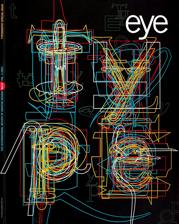
First published in Eye no. 11 vol. 3, 1993
Eye is the world’s most beautiful and collectable graphic design journal, published for professional designers, students and anyone interested in critical, informed writing about graphic design and visual culture. It is available from all good design bookshops and online at the Eye shop, where you can buy subscriptions and single issues.

