Summer 2003
Reputations: David King
‘You develop a visual style as you would a handwriting one … The content is what you concentrate on’

For the past three decades David King has moved deftly between roles as designer, photographer, editor, researcher and author. His graphic style – an easily recognisable mix of explosive sans serif typography, solid planes of vivid colour and emphatic rules – reworked for the New Left in Britain the graphic language of the Russian Constructivists.
King was born in 1943, and studied at the London School of Printing and Graphic Arts (now London College of Printing) under Robin Fior, who describes King’s approach as ‘compare and contrast as a political stance’. As art editor of The Sunday Times Magazine from 1965-75, he collaborated with art director Michael Rand to create the new language of the supplement: features sporting dynamic picture cropping and processed graphic effects gave the magazine a cinematic feel. King forged important friendships with other Sunday Times contributors. With Francis Wyndham he compiled the first pictorial biography of Leon Trotsky (1972). King began supplying his own pictures to the Sunday Times, and an assignment with Muhammad Ali in 1974 resulted in the book I am King.
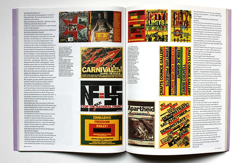
In the mid-1970s King began designing posters for organisations such as Apartheid in Practice and the National Union of Journalists. These works demonstrate a flair for extracting the most from tight budgets – ‘additional’ colours were cheated by overprinting; the impact of photos was boosted by printing two colours dot-on-dot.
The onset of glasnost brought increased interest in the collection of Soviet-related images which King had been building since the early 1970s. The David King Collection is now the largest of its kind in the Western world, boasting over a quarter of a million pictures. Posters from the collection are on display in a room of their own, Soviet Graphics, at London’s Tate Modern. King has always intended that the collection should present alternatives to a Stalinist reading of Russian history – an aim carried further by his recent books The Commissar Vanishes (1997) and Ordinary Citizens (2003).
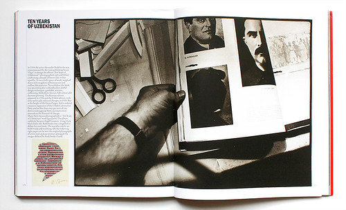
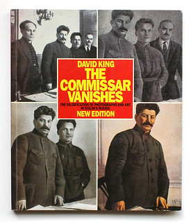
Cover and spreads from The Commissar Vanishes (new edition, published by Tate Publishing in association with Francis Boutle Publishers, 2014). This spread shows King’s discovery of a copy of Ten Years of Uzbekistan in Alexander Rodchenko’s former studio in 1984. Rodchenko had designed this album himself, but had been obliged to deface his own copy when many of those illustrated were executed by Stalin’s regime. Anyone found in possession of such material risked arrest.
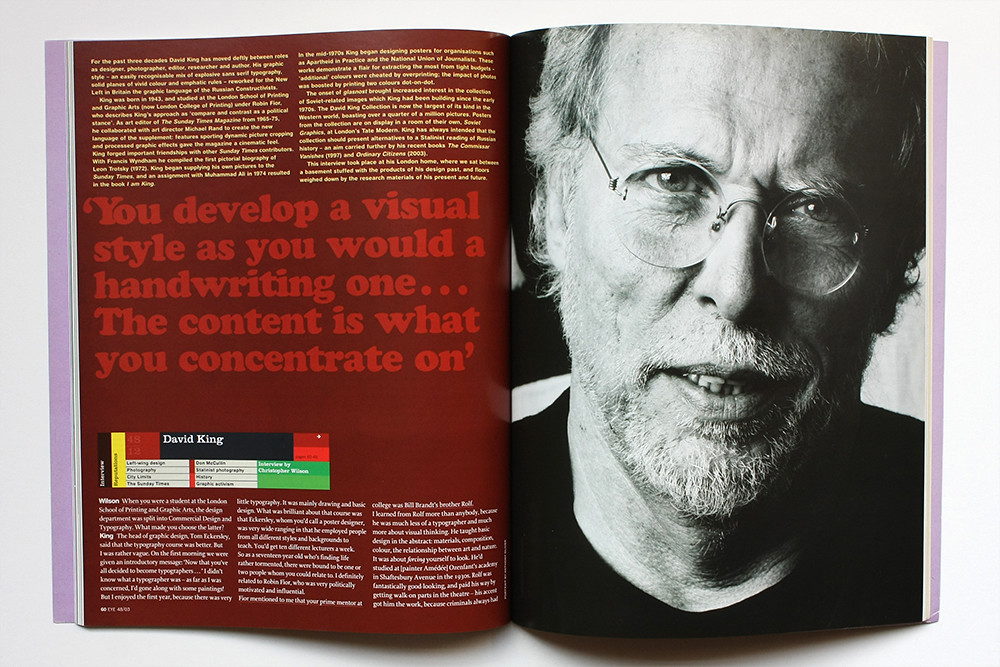
Top: Spread from Eye 48 showing a portrait by Anthony Oliver.
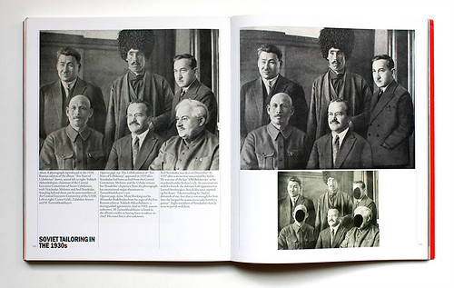
King’s research demonstrates how, one by one, Stalin’s party rivals were airbrushed out of existence.
This interview took place at his London home, where we sat between a basement stuffed with the products of his design past, and floors weighed down by the research materials of his present and future.
Christopher Wilson: When you were a student at the London School of Printing and Graphic Arts, the design department was split into Commercial Design and Typography. What made you choose the latter?
David King: The head of graphic design, Tom Eckersley, said that the typography course was better. But I was rather vague. On the first morning we were given an introductory message: ‘Now that you’ve all decided to become typographers … ’ I didn’t know what a typographer was – as far as I was concerned, I’d gone along with some paintings! But I enjoyed the first year, because there was very little typography. It was mainly drawing and basic design. What was brilliant about that course was that Eckersley, whom you’d call a poster designer, was very wide-ranging in that he employed people from all different styles and backgrounds to teach. You’d get ten different lecturers a week. So as a seventeen-year-old who’s finding life rather tormented, there were bound to be one or two people whom you could relate to. I definitely related to Robin Fior, who was very politically motivated and influential.
CW: Fior mentioned to me that your prime mentor at college was Bill Brandt’s brother Rolf.
DK: I learned from Rolf more than anybody, because he was much less of a typographer and much more about visual thinking. He taught basic design in the abstract: materials, composition, colour, the relationship between art and nature. It was about forcing yourself to look. He’d studied at [painter Amédée] Ozenfant’s academy in Shaftesbury Avenue in the 1930s. Rolf was fantastically good-looking, and paid his way by getting walk-on parts in the theatre – his accent got him the work, because criminals always had strong German accents. He’d rush from the academy to the theatre, make himself up for an hour, say ‘Bang – you’re dead’, then have the rest of the evening off. Fantastic. But out of loyalty to Rolf, we never used to mention Bill.
CW: In case there was a rivalry there?
DK: There was no rivalry; we just admired Rolf so much that we weren’t particularly interested in Bill. [Hard German accent] ‘My brother Billy, he gets so angry when he is not called English.’ And of course Bill had just as strong a German accent as Rolf did.
CW: Fior said your college work looked Constructivist before you’d seen any Constructivism.
DK: Yes, possibly. It’s nice of him to say so.
CW: So when you came across Constructivism, did it feel familiar rather than new?
DK: Oh, certainly. But what does this mean? It’s not just a question of style – that work had been borne out of the same ideas and preoccupations. And if you’re working on the Left, then you run up against all the same problems: where’s the paper coming from? Who’s going to print it? You can have whatever ink you want, so long as it’s black or red. When I worked more commercially, and could use four-colour, I did so. But the leftist stuff was governed entirely by lack of money, materials and time. And that had been the same in Russia.
CW: But a two-colour limitation on a job does not necessarily mean …
DK: … that it has to be an enormous piece of woodletter [laughs]. No, you’re right.
CW: So what made you design in that way?
DK: You have to make decisions in your life quickly about what you don’t want to do. Within half an hour of going to the LSP [London School of Printing and Graphic Arts] I decided that I didn’t want to do leaflets and letterheads. The vernacular stuff that was being done, like billboards, boxing posters and newspaper ads, was frowned upon at the LSP, because it wasn’t Swiss design. But I thought, ‘Actually, although they’re rough and badly carried out, the attitude’s quite good.’
CW: Because the aesthetic is so forthright?
DK: Well, you get the ideas across quickly when the type’s three feet high! A lot of the tutors were very much anti-art in those days. They didn’t see the point in art, and I did.
CW: But it was never a conscious decision to make your work look ‘Russian’?
DK: Never. I hate things that look Russian when they’re not – it’s just silly. I always thought design should be low-key.
CW: Yours isn’t.
DK: No; it’s odd, isn’t it? [laughs]
CW: You’re renowned for pushing the medium of paste-up to its limits. Where did you learn it?
DK: Some of it came from working with Fior on Peace News in 1962. I’ve always thought of design as a very tactile medium: get the prints and stick it all down on the layout and see what it looks like. I could never work on a screen, just as I couldn’t slavishly work on marking up tracing paper. From a labour point of view, it’s obviously better to design on a computer, but I don’t think it’s better in terms of composition. I still design my books using full-scale xeroxes on the lightbox, which I then give to others to transfer to computer. I still have a lot of the original artwork from my posters – they look amazing now, because the prints have faded and they’ve turned sepia and silver.
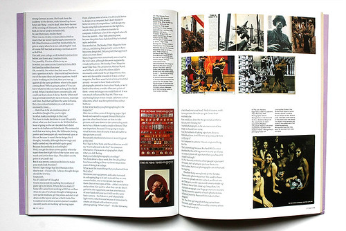
Spread from Eye no. 48 vol. 12, 2003.
CW: You worked on The Sunday Times Magazine from 1965-75, and during that period it seems to have been very design-led. Did you push that approach when you were there?
DK: Many magazines were notoriously non-visual in the mid-1960s, although they were supposedly visual publications. The Sunday Times Magazine wasn’t like that. The art director, Michael Rand, was brilliant, and while the editors didn’t necessarily understand the art department, they were very favourable towards it. It was a colour magazine, but there wasn’t a lot of colour material around – we used to have black and white photographs printed in four-colour black, or we’d hand-colour them, or make silkscreen prints of them – every technique you could think of. It was very much influenced by Pop Art. There was one boxing feature where I made a thirteen-colour silkscreen, which was then printed four-colour halftone.
CW: Is that what lead to you photographing for the magazine?
DK: After two or three years of designing pages, I got bored and wanted to expand. Donald McCullin gave me a four-hour lecture on how to take pictures, and came down to the camera shop with me to buy a Nikon F2 and a couple of lenses. That was important, because if I was going to make visual features, then of course it was advisable to take pictures as well.
CW: Presumably that kind of crossover wasn’t typical at the time.
DK: No. I’d go to New York, and the art director would say ‘You’re allowed to do this?’ No crossover whatsoever. If you were a typographer, that’s what you did. Boring.
CW: Had you studied photography at college?
DK: Yes, I did about a day a week. But I’m afraid that four hours talking to Don was better than three years of doing it at college.
CW: What were the main things that you learned from McCullin?
DK: Minimise your equipment, and carry it around in a shopping bag so it isn’t noticed. One or two camera bodies, one or two lenses. Get used to them. One or two types of film – a black and white and a colour. Get used to what they can do. Don’t get hit by the equipment; use it as an extension of your hand and your eye. I still use the same basic camera – the Nikon F2, and a hand-held light meter, which is nice because it immediately creates an impact with whoever you’re photographing. ‘What’s that?’ – it’s like throwing a black hood over your head. And of course, with his war pictures, Don always got closer than everybody else.
CW: How would you describe the pictorial aesthetic that you were looking for?
DK: I wanted photographs to be an extension of my design work, and vice versa.
CW: So at the moment of taking a picture, do you think about how it will fit into a layout, and how you’ll crop it?
DK: No, I compose in camera. I never crop anything that I do.
CW: That’s interesting, because Richard Hollis once described the David King maxim to me as ‘If you can crop any more off a picture then you haven’t cropped it enough.’
DK: Yes, but that only refers to other people’s pictures! Obviously, if it’s a fantastic picture then you leave it alone, but most photographs are enhanced by cropping.
The other thing we explored at the Sunday Times was the photo-sequence. We used to have six or seven spreads on one subject, without any ads. That gave you the space and time to make up the feature like a film: close-up, long-shot, lots of pictures on a page, one huge picture on its own.
CW: Was the cinematic quality of such photo stories influenced more by Russian filmmakers than designers?
DK: Yes – the close-up / long-shot thing came from Eisenstein, and I was influenced by cinema when it was a visual medium.
CW: You mean the silent era?
DK: No, I mean when cinematographers worked in black and white. Noir was the last great visual medium in the cinema.
CW: Many noir films are American – did some of your influence came from there as well?
DK: Loads of it. America and France were the two great centres of photography.
CW: So do you think that too many of your influences have been attributed to Russia?
DK: I’m interested in content far more than I am in form. You develop a visual style as you would develop a handwriting one. And when you’ve done that, you can almost forget about it. The content of your work, assuming one has any interests at all, is what one should concentrate on. So if people say that then it’s entirely my fault, because what I’m interested in is visual history, and particularly that of Communist movements. But as a designer, I wasn’t particularly interested in what country anything that I liked came from. A lot of American stuff – especially in Roosevelt’s New Deal – was fantastic. Much of it – such as Margaret Bourke-White’s photographs – looks Russian anyway. But I’ve never been interested in the Fascist stuff. Intellectually, you must have some sympathy with the content of your work.
CW: But even in the case of a horrifically oppressive regime, the design isn’t necessarily bad.
DK: In those circumstances, design doesn’t much matter. The horrors of the regime are what matter.
CW: But to ignore, say, the aesthetic of the Nazis is merely to brush it under the carpet, which is worse than not attempting to evaluate it.
DK: But what I’m interested in is telling stories that aren’t much known about, like the photographs in Ordinary Citizens. The whole thing of Hitler’s Germany has been done to death. People go on about Leni Riefenstahl and Triumph of the Will – it just doesn’t interest me at all. I don’t care how well it’s filmed or what the lighting’s like; it’s a disgusting Nazi rally.
CW: But aesthetically, there are points at which the extremities dissolve: there may be Eisensteinesque shots in Riefenstahl’s work, or vice versa. Visual styles are rarely as mutually exclusive as their exponents like to think.
DK: I’m interested in those crossovers more in terms of ‘compare and contrast’. My room at Tate Modern is a fast-forward of Soviet posters from 1917-89. And of course there’s Stalinist design which looks that way too – some of it absolutely bizarre. In that context it’s useful, but I couldn’t curate a room glorifying Stalin.
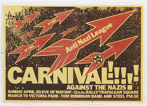
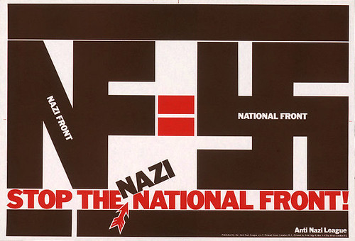
Posters for the Anti-Nazi League, 1978. In many designs such as these, elements such as stars and rules were created from cut-up strips of masking tape.
CW: How did you become involved in designing for the Anti-Nazi League?
DK: After leaving the Sunday Times, the thing that really hit me, in 1976, was the riots and killings in Soweto. I contacted Apartheid in Practice, and ended up doing ten posters in ten days. Then the Anti-Nazi League called, and I had another week to do another ten posters. To my astonishment, they printed them in a run of 70,000, and began getting a load of publicity … from the right-wing press [laughs].
CW: Those posters make great use of dot-on-dot printing.
DK: Cheap printing would usually turn any duotone into some dreary grey, whereas with dot-for-dot, one colour would be placed directly on top of the other, which would sometimes make the picture blurred [laughs], or sometimes it would make it sing. But I didn’t exactly get it from the Russians – my friend Judy Groves, whom I work with on many things, had pioneered it on Time Out.
Cover for City Limits magazine, 1982. King was cover designer for City Limits for its first year. As with his poster designs of the 1970s, the brief was to create the strongest effect within a tight budget. Photographs were often rendered more graphic by processing on a PMT (photomechanical transfer) camera, a tool also used for the tube ticket details shown here.
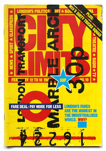
CW: You designed the covers of Time Out’s rival, City Limits, in 1981. How did your approach differ from Sunday Times covers?
DK: With the Sunday Times, the magazine was tucked inside the paper, so it didn’t really matter what you put on the cover, although they hated black covers. Silly marketing people.
CW: They thought black looked funereal?
DK: Exactly. There was a marvellous Lana Turner cover with a black background and the headline ‘America made me’, which meant several things. The marketing department went ballistic, but it was the best cover we ever did.
CW: The City Limits covers seem more specifically ‘graphic’ – enlarged details of tickets and so on.
DK: Again, there was no money, so you had to make something yourself. City Limits was semi-political – it had been born out of a strike [over the abolition of Time Out’s ‘parity pay’ scheme for its staff]. So it was the same problems as ever.
CW: City Limits was later redesigned by Neville Brody, who felt that ‘Dave King’s design was successful, but … it did something you shouldn’t do, which is to lay all your cards on the table … [there was] no chance of reaching the wider public who might buy City Limits because they simply wanted to go out and enjoy themselves.’ In retrospect, do you think he was right?
DK: This is really why I didn’t want to design any more: the ‘thinking on design’ and design in-fighting just didn’t interest me. I’ve trained myself over the last fifteen years to be unable to recognise typefaces – that terrible barbed wire that you get into when you see something badly spaced or inept. I thought ‘I’ve really got to get out of this.’
CW: But doesn’t Brody have a point as regards ‘laying all your cards on the table’? Once there becomes a visual style for Left-wing content, then it can be very easily dismissed by an audience that you may be trying to attract.
DK: Okay. Before the anti-apartheid and anti-Nazi material, there wasn’t a visual style on the Left – it was a mish-mash. Fior and Hollis did some marvellous posters, but there was no visual statement position over a wide area like they did it in Russia. We contributed to doing that.
CW: Were you consciously trying to create a visual style for the Left?
DK: Absolutely.
CW: But as soon as you create a style for a political stance, then it becomes easier to disregard.
DK: In my experience, the creating of a specific visual style for that ethos went a long way toward putting it on the map in the first place. The Left is still using it, strangely enough.
CW: But is that a good thing or a problem? King-derived work tends to look uncompromisingly hard now, especially after the softer, more fluid typography of the 1990s.
DK: I would have thought that someone else would have had a few ideas by now. I never wanted to beat anyone over the head with this stuff; it was just the way in which I worked. As regards the design making the politics off-putting, well, people will always find an excuse to not get involved. There were still a million people on the anti-war march, so somebody’s not being put off.
CW: In the mid-1980s you turned away from graphics to focus on your collection of Soviet images. Were you reluctant to leave the field of design?
DK: The objective conditions had changed, and there was tremendous disillusionment on the Left because there was no major struggle, except through the trade unions. So it all wound up in a big way. I’d had a very long run as a designer, and in the end I ran out of ideas. Concurrently, Gorbachev came to power and everyone began asking me for pictures. And researching is so exciting – it becomes a sort of detective work.
CW: That ‘detective’ aspect is especially obvious in The Commissar Vanishes, where falsified images appear next to the undoctored originals.
DK: The Commissar exhibition has been travelling around Europe, and when it opened in Milan, this rather grand Italian woman came up to me and said ‘Oh, you are so clever, Mr King, to have done all these yourself.’ She thought the whole thing – these huge blow-ups of Stalin and his victims – was some kind of conceptual art work!
CW: The subjects which you deal with are usually the exclusive preserve of academics. How does it feel to approach such issues having come from a design background rather than a more traditionally academic one?
DK: Academics are usually notoriously visually illiterate – they don’t see the visual side at all. There were thousands of books being written about the Russian Revolution, and Socialism in general, and I wondered how many of them were being read. It was always my idea to get across complex or difficult subjects to a wider audience. The Trotsky photographic biography that I did with Francis Wyndham sold 25,000 copies. I shouldn’t think that anything on him had sold more than a few hundred previously. That’s what visual people like us can do, which is passed over by academics. Ultimately, I don’t want to write 40 volumes that only fourteen people are going to plough through.
Christopher Wilson, designer, writer, London
First published in Eye no. 48 vol. 12, 2003
Eye is the world’s most beautiful and collectable graphic design journal, published quarterly for professional designers, students and anyone interested in critical, informed writing about graphic design and visual culture. It is available from all good design bookshops and online at the Eye shop, where you can buy subscriptions and single issues.

