Autumn 2009
Reputations: Kathy Ryan
‘It’s a balance between art and content. With art, it’s pure visual delight. And because it’s The New York Times Magazine, we balance that with content. At the same time, most of the photographs have to deliver information. But we often have leeway for the photos to be more interpretive and elaborate beyond the text – the photography is expected to be a powerful voice unto itself.’

For two decades, photo editor Kathy Ryan has been advancing visual boundaries, both at The New York Times Magazine, and as an author, teacher, mentor and exhibition curator.
Her interest in the connection between art and idea began when she was eight or nine, at school in Bound Brook, New Jersey, where Sister Mary Williams had her class paste reproductions of art works into black marbled notebooks. Ryan went on to study art and art history at Douglass College (now part of Rutgers University) though she says that at the time she ‘wasn’t interested in photography at all’.
However, when an opening at the French photo agency Sygma emerged in 1979, she pursued it. In 1985, Peter Howe, then picture editor at the New York Times Magazine, hired her as deputy photo editor, and when, two years later, he left for Life magazine, he named her as his successor.
Ryan’s open mind and talent for pairing photographers with stories became apparent in 1997, when she assigned Jack Pierson, Abelardo Morell and Nan Goldin, among others, to a feature about Times Square, bringing an innovative artist-photographer approach to the magazine’s photojournalism. The theatrical, large-format images of poverty in unexpected places that Taryn Simon took for her in 2000 marked another turning point for photography in the magazine. Other leading photographers commissioned by Ryan include Lee Friedlander, Ryan McGinley, Lauren Greenfield, Gregory Crewdson, Massimo Vitali, Thomas Struth, Paolo Pellegrin, Lynsey Addario, Gilles Peress, Eugene Richards and Dan Winters.
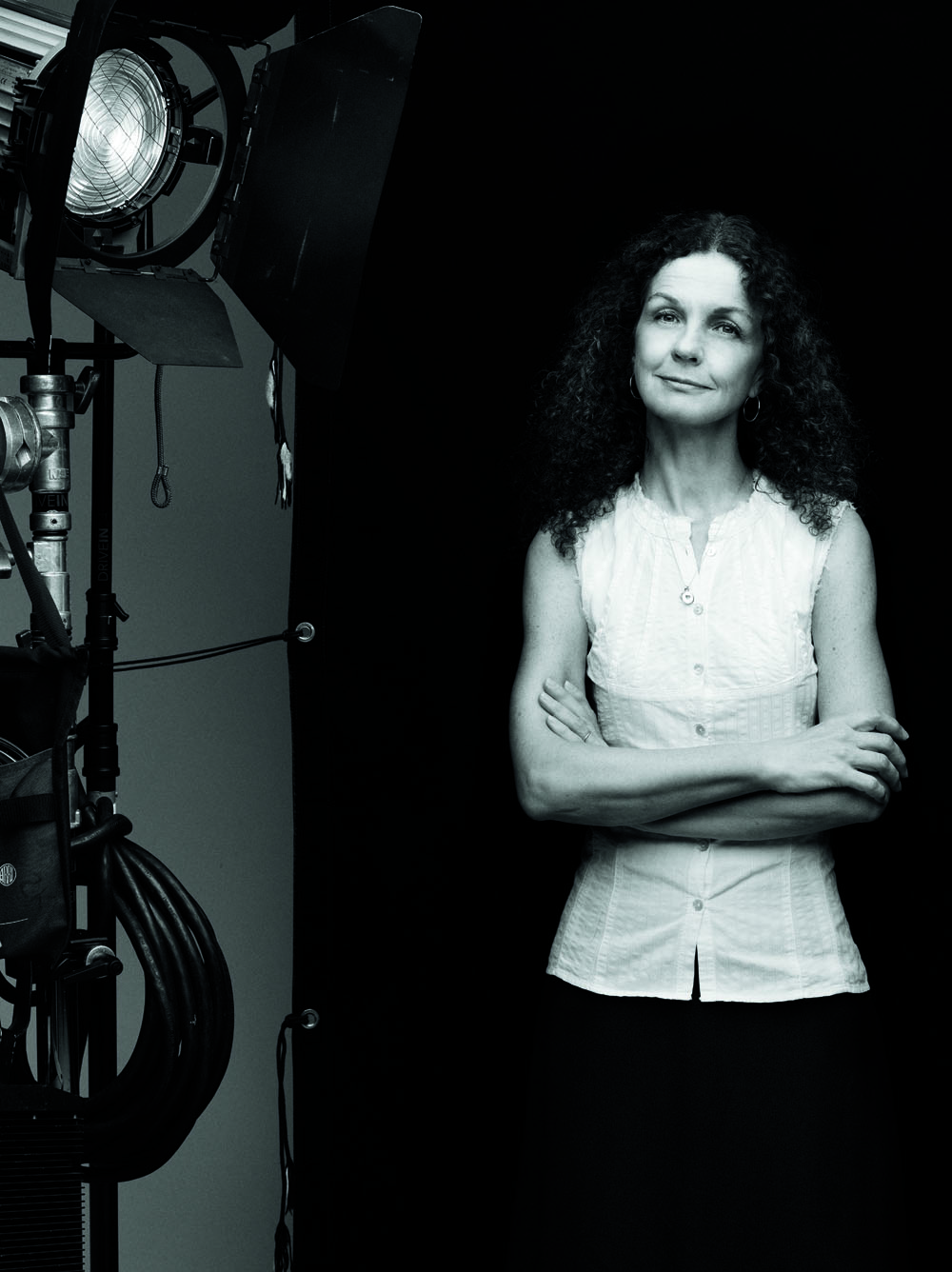
Two of ‘Obama’s People’, photographed by Nadav Kander (18 January 2009). Top. Portrait of Kathy Ryan by Robert Maxwell.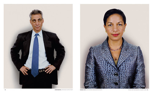 Under Ryan’s direction the magazine has won awards from the Art Directors Club and the Society of Publication Designers, as well as the Best Use of Photography award in the 2006 Pictures of the Year competition. She herself received a Picture Editor of the Year award at the 1997 Visa pour l’ Image festival in Perpignan, the first annual Lucie Award for Picture Editor of the Year in 2003, and a lifetime achievement award from the Griffin Museum.
When I visited Ryan at the New York Times headquarters in Manhattan, I didn’t expect to find her at an open desk, with few boundaries between her and her team, rather than the larger space originally assigned to her. ‘I used to be in that office, but there was no openness, no light,’ she says.
Ryan also blurs the boundaries between her role and the photographer’s, so her own high standards become shared. But in July 2009, controversy erupted after readers disproved the claim that images (by Edgar Martins) in ‘Ruins of the Second Gilded Age’, a picture essay first published in the magazine, had been created with ‘long exposures but without digital manipulation’. Times staff acted quickly and removed the online slideshow, stating: ‘Had the editors known that the photographs had been digitally manipulated, they would not have published the picture essay.’ The incident remains an embarrassing anomaly. Nadav Kander, who photographed ‘Obama’s People’ for Ryan and the magazine earlier this year, talks of her ‘incomparable’ integrity: ‘There was never any consideration that one could deviate … There’s no retouching allowed.’
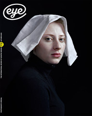
Ryan was a curator, alongside Martin Parr, Lesley A. Martin and Tim Barber, of the inaugural New York Photo Festival in May 2008. Earlier this year she guest-curated ‘Dutch Seen: New York Rediscovered’, an exhibition of work by contemporary Netherlands photographers – including Misha de Ridder, Rineke Dijkstra, Charlotte Dumas and Hendrik Kerstens (see his ‘Napkin’ on the cover) – at the Museum of the City of New York, to mark the 400th anniversary of the Dutch arrival in Manhattan.
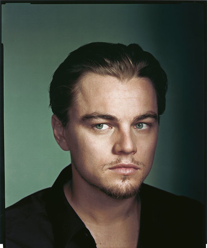
Portrait by Dan Winters for ‘Leonardo DiCaprio’s Seventh Act’ (24 November 2002).
Her review of three decades of photography in the New York Times Magazine will be published by Aperture in 2010.
Liz Danzico: What is the role of a photo editor?
Kathy Ryan: Simply to make the photography happen, from the initial idea to the page. Some days, it’s being a coach back in the New York office. Other days, it’s discovering great work in a gallery, and getting that artist to shoot for the magazine for the first time.
The most important part of what I do is ‘casting’ – choosing the photographer. The person you choose to do an assignment defines it. If that match is right, it’s smooth sailing.
LD: Did you always want to be a picture editor?
KR: I didn’t have that talent early on. I might have had the inherent ability to see a good picture, but not the confidence. I’ve gained that confidence at the New York Times, working with editors who have conveyed to me what matters about storytelling and how to present stories in a provocative way.
Knowing whether a picture is good or not is a constant evolution grounded in real work. Recognising formal qualities is somewhat inherent, in the way that someone might have a good ear. The other part – how to juxtapose images so that they’re meaningful or knowing what makes a good cover – I was fortunate enough to learn.
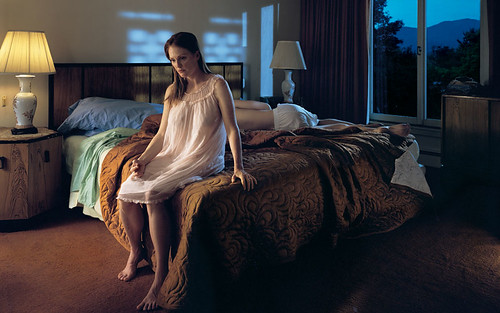
Actor Julianne Moore photographed by Gregory Crewdson, for the ‘Dream House’ portfolio (10 November 2002).
LD: How did you come to evolve your trademark juxtapositions of the unexpected –assigning an artist to a piece of photojournalism or placing a young photographer alongside a seasoned one?
KR: I take personal satisfaction in that. We dart from the unknowns to the most well known in the world. It’s almost like having an inner dialogue: ‘Is this story best served by a documentary approach? Is it best served by a fine art approach?’ (I hate labels; I only do that to simplify.) I believe in blurring boundaries between genres. A documentary photographer does a fashion assignment; an art photographer goes out to do a newsworthy subject. That cross-pollination results in wonderful and original photography. Because great themes repeat themselves, the photos have a responsibility to tell stories in a fresh way, so people will pay attention.
LD: How do you ‘evolve’ (as deputy photo editor Kira Pollack puts it) after two decades at the same publication?
There are moments when you set out to present something people haven’t seen on a magazine page. There are other days when you’re operating very much within a strong tradition – the magazine has been going for more than a century, and covers a wide range of subject matter: on any given day, I might be moving between hardcore photojournalism and celebrity portraiture. Because I have to be able to segue quickly from one genre to another, I maintain agility, openness and a love of many kinds of photography. I can look at incredible portraiture and get goosebumps. At the same time, I can be deeply moved by great photojournalism. Journalism is paramount. But photography is only interesting if you can figure out how to take journalism and sculpt it into something visual that’s highly creative.
LD: Are you an adventurous person?
KR: I’m not very brave in life in general; I wouldn’t have the enormous courage our photographers do. But I do feel that I’m courageous when it comes to photo assigning. I like the risk-taking. It is also connecting somebody with a subject that’s new for them, like Gregory Crewdson and the ‘Dream House’, where he reinvented forms of celebrity portraiture [placing famous people in elaborately surreal sets]. The risk was that he wasn’t setting out to make people look beautiful, so it wasn’t what actors expected.
LD: Why did you take a risk on Crewdson?
KR: With that kind of story, the risk is losing access to the people. The magazine is always looking for new ways to tell stories with the goal of arriving at great pictures. But the subjects want to look good. If a picture doesn’t look good or if it’s off-putting, you might close the door to that access. You’re always going out on a limb.
I contacted Crewdson at a moment in the magazine’s history where I was looking for an artist with a singular vision that beautifully translated to the page. He shoots on large format with rich detail and a high level of craft. He keeps his eyes wide open, and that is immensely appealing on the magazine page.
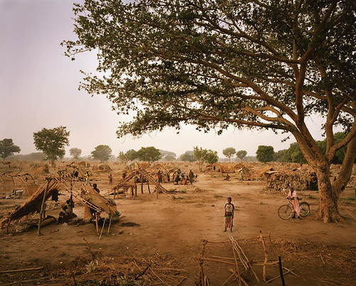
Moro Camp, Chad, March, photographed by Simon Norfolk for ‘Displaced Places’ (21 September 2003).
LD: Where did your visual intuition begin?
KR: One of my strongest memories was at school with Sister Mary Williams who taught us art history when I was eight or nine. She would talk about what an artist was thinking, something an image would symbolise. That was a ‘Eureka’ moment. I just got it.
I’ve always been a visual person. About half-way through my career at the Times, Adam Moss, former editor-in-chief, got impatient with me, saying: ‘You’re such a visualist!’
Even though I knew he was encouraging me to pay more attention to the content, I felt validated. It was as if he had articulated something I had thought about but never said out loud. I took it as a compliment. I am a visualist.
LD: You publish 52 issues per year with more than a dozen other special issues with only ten people in your department. How do you do it?
KR: You develop a rhythm with people. When I have a conversation with Kira [Pollack, deputy photo editor], Rem [Duplessis, creative director], or Gerry Marzorati [editor], I know what we desire is the same. I know what Gerry wants the picture to achieve in attitude and tone with just a single word or gesture.
I don’t do anything alone. I have constant dialogues with Kira – almost in shorthand, because we’ve worked together so many years. She is so important to the work of the magazine. The talented photographers are making the pictures, and the talented photo department brings the magazine to life. Something like ‘Obama’s People’ could not exist without
the close strategies of the team.
LD: Your team, with photographer Nadav Kander, shot and edited most of those 52 portraits of ‘Obama’s People’ (18 January 2009) in just a few days. How did you capture the incoming administration so quickly?
KR: We were really after something that defined each person; something that was true to them. Like any astute portraitist, Nadav quietly observed people the minute they walked in the room. The way people present themselves – before they even walk on set and adopt a posture to be photographed – in the minute or two when they walk into the studio says a lot. Nadav had to make superfast decisions about what was working and what was not, with me giving him superfast responses about what was effective. It worked.
LD: What makes a good photograph?
KR It’s a balance between art and content. With art, it’s pure visual delight. And because it’s the New York Times Magazine, we balance that with content. At the same time, most of the photographs have to deliver information [but] they don’t have to literally illustrate the text. We often have leeway for the photos to be more interpretive and elaborate beyond the text. The photography is expected to be a powerful voice unto itself.
LD: Yet photographers can’t possibly always have the foresight to be shooting well in advance of a story. How does it happen?
KR: What people don’t always know about photojournalists is their extraordinary timing, and their ability to see something before others do. They’re moving with tremendous speed, so when something becomes newsworthy, they’ve already been engaged in the story. That said, we always have to think ahead. We go on press a full ten days before the magazine comes out.
For example we did a story on refugees, focusing on three camps – a new one in Chad, just three weeks old; a nine- or ten-year-old Chechen camp where people were living in much more elaborate tents with gardens out front; and one in Pakistan that had existed for generations. Here was a newsworthy story being told by an artist, [photographer] Simon Norfolk. So even journalistic stories can be a wonderful marriage of an artist and an intensely newsworthy story. When you take a step back to tell the story of refugees in a different way, it can be presented with a more interpretive vision.
LD: What did you see that led you to think that Norfolk would be the right person?
KR: He has a landscaper’s eye, informed in part by British painters and the [nineteenth-century American] Hudson River School. He sees landscape in an incredibly informed way, but he can go out and make a picture – you can give him the most rigorous, tough assignments. He’s an intrepid guy. Yet you can step into his pictures the way you can with a large painting.
LD:How did you feel when it was discovered that Edgar Martins’ images in the picture essay ‘Ruins of the Second Gilded Age’ had, despite claims to the contrary, been digitally altered?
KR: Nothing like this has ever happened. I regret that this meaningful and timely piece has been invalidated.
LD: But many photographers do ‘correct’ their work. To what extent does your own team retouch or manipulate work when the story or aesthetics demands it?
KR: We don’t manipulate photography. We send all photographers we work with the ‘Guidelines on Integrity’ for photo-graphy and images. Here’s an excerpt: ‘Images in our pages that purport to depict reality must be genuine in every way. No people or objects may be added, rearranged, reversed, distorted or removed from a scene (except for the recognised practice of cropping to omit extraneous outer portions). Adjustments of colour or gray scale should be limited to those minimally necessary for clear and accurate reproduction, analogous to the “burning” and “dodging” that formerly took place in darkroom processing of images.’
Clint Eastwood by Inez Van Lamsweerde and Vinoodh Matadin, for the annual ‘Great Performers’ portfolio (27 February 2005).
LD: You once said that curating an exhibition requires ‘different muscles’ to editing a magazine. What are the differences?
KR: Curating a show is much looser; you only need to put really good work up on the walls. With editing, there’s a different level of pressure because the photography has to achieve so much. Curating must be disciplined so when viewers walk through the show they’re changed in some way. The juxtapositions change viewers emotionally and intellectually.
Editing has a lot more masters to serve. You want photos to look great, to deliver the message and to convey information.
Creativity often comes to minds that are somewhat disorganised. But the whole point of the magazine is being fiercely organised. That fierce organisation has to somehow coexist peacefully with a bit of untethered creativity
LD: In ‘Dutch Seen: New York Rediscovered’ at the Museum of the City of New York, about 85 per cent of the work was created exclusively for the show. How did you go about telling the story of New York?
KR: Each [photographer] was different. Hendrik Kerstens’ portraits are extremely contemporary, and yet extremely traditional. People are seduced by beautiful photos. Then they see a garbage bag on the head, or something else unexpected, and realise there is wit and humour.
Wit and photography are not often combined. Wijnanda Deroo had the idea to do restaurant interiors because they told the story of Manhattan. Restaurants are historical – as pure documents of today – and beautiful as interiors in a graphic sense. Two hundred years from now, these photographs will have that resonance that comes from an old picture.
LD: How did you make your choices?
KR: It helps to compare photography to other art forms. In reading a poem, you recognise what the words signify, but the best poems are the ones where the poets say something else with words. Photography can do that too.
In the ‘Dutch Seen’ show, Misha de Ridder, the great landscapist, sought out the virgin territory that the Dutch [immigrants] encountered 400 years ago. He knew that he wanted to get
at both the extraordinary beauty that beckoned the settlers and the fearfulness that must have been there as well. Every one of his pictures achieves that. I like when there’s an undercurrent, some kind of subtext. The photographer is capable of that.
LD: As boundaries merge across media, how do you think that will affect the role of the visual editor?
KR: Even online, material doesn’t just happen – it has to be sorted, edited, and thoughtfully produced. For me, the question is how much will be editing for the Web, and how much for the printed version of the magazine. We’ll always need editors to define culture for us, make selections, package them, and say, ‘this is important’, ‘this isn’t important’. None of us knows the future, but we do know that we live in a visual culture.
Godyns Point by Misha de Ridder, from the exhibition ‘Dutch Seen: New York Rediscovered’, 2009, also reproduced in the New York Times Magazine (31 May 2009).
Liz Danzico designer, editor and chair of MFA Interaction Design writer and curator, New York.
First published in Eye no. 73 vol. 19 2009
Eye is the world’s most beautiful and collectable graphic design journal, published quarterly for professional designers, students and anyone interested in critical, informed writing about graphic design and visual culture. It is available from all good design bookshops and online at the Eye shop, where you can buy subscriptions, back issues and single copies of the latest issue.

