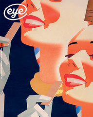
Winter 2014
Reputations: Mucho
Simon Esterson
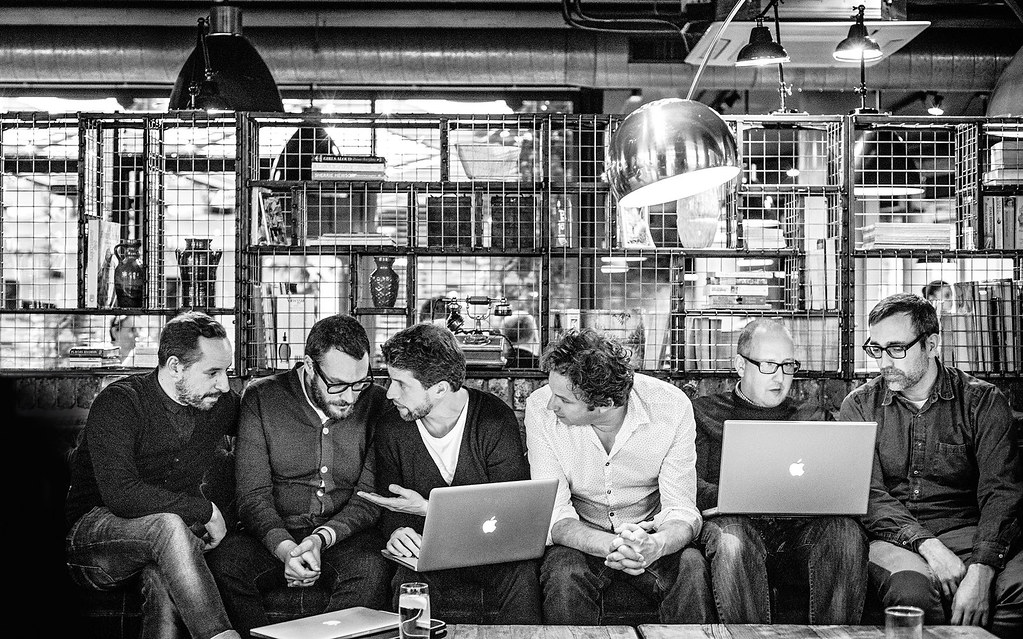
Mucho
Marc Català
Pablo Juncadella
Loran Stosskopf
Rob Duncan
John Dowling
Tilman Solé
‘We were interested in working internationally, to learn from different cultures and to know how design behaves globally. We had international clients. But you really need people in those places to stay active. So the answer is sharing.’

In just a few years, Mucho has expanded rapidly in size and ambition. Originally a Catalan practice formed by two schoolfriends, it is now an international practice with offices in five countries across two continents. Close friends Marc Català and Pablo Juncadella collaborated for several years, founding Mucho in Barcelona in 2003, to be joined by Tilman Solé in 2010. In 2013 they hooked up with John Dowling (Newark) and Rob Duncan (San Francisco) of Anglo-American design team Duncan Dowling. The Mucho hexagram was completed by Paris-based Loran Stosskopf, who became the sixth partner in early 2014. The partnership also has satellite offices in Berlin, New York and London.
The Mucho network has its roots in the late 1990s, when Solé, Juncadella, Català and Duncan left college, and Dowling, a few years out of university, started work at Pentagram.
By 2000, four of them were working for Pentagram in London: Català and Juncadella as part of the team led by Fernando Gutiérrez while Dowling and Duncan worked for John Rushworth. Stosskopf joined Pentagram’s London office in 2001, leaving to work for Wallpaper* in 2003, the year that Duncan left for the United States. Solé, who knew Juncadella and Català from Eina, is the sole Mucho partner who has never worked for Pentagram.
At their Typographic Circle talk in May 2014, each partner presented an example of his own work, followed by an example from one of the other five, which gave a good idea of the range of work and clients that they tackle, and their underlying friendship and good humour.
The relatively new technologies of video conferencing (via Skype) and long-distance file-sharing (via services such as Dropbox and WeTransfer) have made their transcontinental collaborations and conferences possible in a way hardly imaginable a decade ago.
The Mucho partners describe their approach to graphic design as ‘ideas-based’, but there is a level of visual fastidiousness and typographic detail that distinguishes their work from that of other branding agencies. Alongside robust commercial work for international clients there is an editorial design thread, from the Observer redesign of the early 2000s to Stosskopf’s continuing art direction for French weekly Télérama.
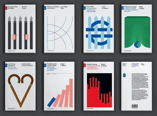
Barcelona. Book designs for Spanish publisher El Hombre del Tres, 2012.
Top: Mucho partners’ meeting in London, May 2014. Photography by Anthony Duncan.
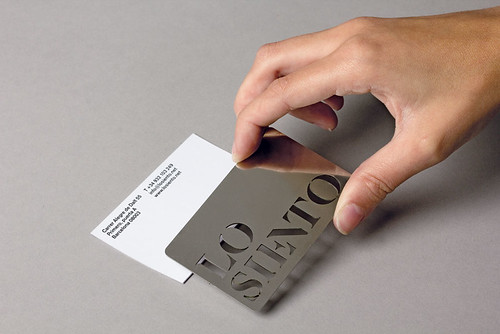
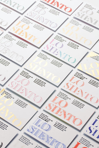
Stencil logotype for Barcelona design studio Lo Siento, 2012. Each new member of the studio is given a stencil template, which they can use to personalise their business cards.
The interview took place at Eye magazine’s Shoreditch office, followed up by several email conversations with the individual Mucho partners.
Eye: How did the idea to collaborate first come about?
Loran Stosskopf: Rob and I talked about working together one day and we all kept in touch after leaving Pentagram. I regularly asked Marc and Pablo to give me a hand on projects through time.
Eye: Does the Mucho ‘work ethos’ come from Pentagram?
Pablo Juncadella: There is a lot of the Pentagram mentality that we’ve inherited. Having said that, Marc and I, although we were integrated, we came in as part of Fernando Gutiérrez’s team. So it was more about our relationship with him.
Rob Duncan: They’d spend all their time arguing!
Marc Català: People thought that we hated one another but actually we were just having a friendly chat!
Eye: You seem to have a common taste in British TV humour. You interspersed your talk for the Typo Circle with clips from Only Fools and Horses and so on.
Marc Català: It’s funny about these TV show references. In Madrid they wouldn’t get it. But in Barcelona in the 1990s we had these newly independent channels that weren’t generating any new programmes, so we had all these English shows translated into Catalan.
Eye: So is that how you got to know things like Fawlty Towers?
Marc Català: Yes! In Fawlty Towers Manuel spoke in Spanish and everyone else was in Catalan.
Rob Duncan: So when Manuel said ‘Qué?’ you got the joke!
International view
Eye: Is there a big difference between Mucho now, with six partners, and the original version?
Marc Català: We’re developing a new way of working together.
Rob Duncan: The way I sell it is that you can come to me and you can have five or six creative directors come up with ideas and I can present them to you. It will be a much more international view … especially for big corporations that have offices all around the world. Once you’ve lived in a different country you realise the different nuances between what works in graphic design in America and what works in the UK. I can give a much broader range of ideas to my clients.
Eye: How does that work from the client’s perspective?
Pablo Juncadella: There’s always one ‘captain’ who is the creative muscle.
Marc Català: For example, we’ve just landed quite an important job with a museum in Barcelona. The fact that we can say that it’s possible to have a strategic analysis from an international perspective was key to them. They need to project their brand on to the international stage.
Tilman Solé: So having John’s point of view or Rob’s point of view was really important.
Eye: When you have conferences via Skype, does the technology force you to be more polite?
Pablo Juncadella: It is much harder to have a proper conversation. We try and talk about practical things or update on individual or common agendas. It becomes like an operational talk and a brief ‘get in touch’ type of talk.
Rob Duncan: In terms of Skype it’s probably harder to banter and argue as much as real life. We can’t shut the Spanish up! They always sound like they are arguing anyway. But it disciplines us to listen to each other, as all talking at once on Skype doesn’t work.
Pablo Juncadella: We do individual Skypes when specific questions come up that need our attention – these never involve more than two people. Skype is not perfect but it is crucial to make sure we stay together and take advantage of being a few partners with access to a bigger chunk of knowledge than each one has alone.
Eye: Is the time difference a problem?
Rob Duncan: The time difference works out very well. We all meet on a Skype call every Monday to talk about business, promotions etc., so it’s first thing in the morning my time and last thing in the afternoon in Europe. If we need to talk more, I get in earlier or they stay a little later. It also works out well on projects where we collaborate. When my team finishes working in San Francisco, the European designers can continue working while we sleep!
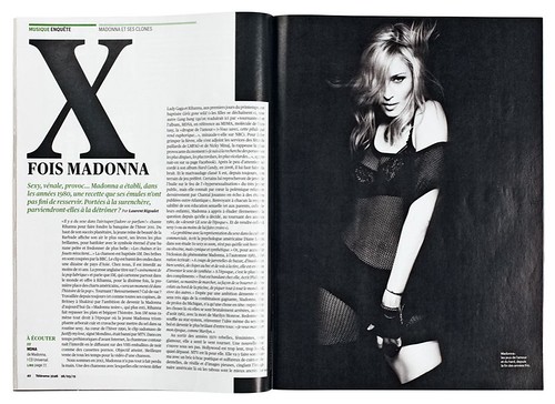
Paris. Spread showing ‘X fois Madonna’, 2012, for Télérama, the influential French weekly, which has a circulation of 600,000. Stosskopf’s 2011 redesign employed type by Christian Schwartz and Paul Barnes of Commercial Type (see Eye 82).
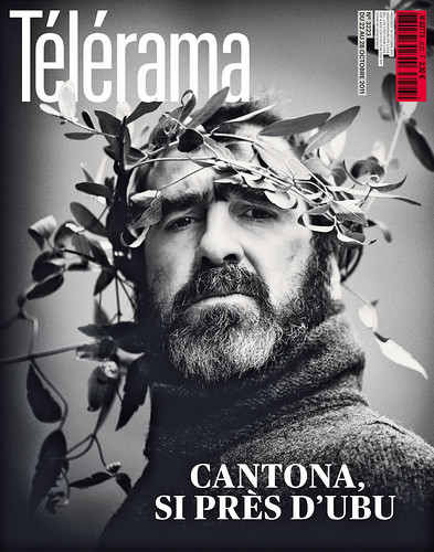
Eric Cantona cover, 2011. Stosskopf recalls: ‘Cantona was playing Ubu in Alfred Jarry’s play Ubu roi. We went to photograph him in the woods and we wanted him to use his hands to figure a crown. Unfortunately he had a hand injury, so we improvised and he ended up with this crazy crown. Very few people could wear it with so much pride. Cantona later told us that it was his favourite portrait.’
Collecting people
Eye: Did you always have ambitions to work internationally?
Loran Stosskopf: Yes. By living in New York City and later in London, I wanted to be part of what was happening globally.
Eye: Marc, you were saying it was important to get out of Spain …
Marc Català: We were interested in working internationally, to learn from different cultures and work in different places and to know how design behaves globally. We were always interested in that and we had clients that were already international. We were working with Mexico, the UK, in France. But it all happened a bit by coincidence. We had connections but sometimes they started to wear out because we weren’t around. You really need people in those places to stay active in the industry.
Tilman Solé: So the answer is sharing.
Eye: Do you think that way of working is in Catalan culture? Barcelona is a very international city.
Tilman Solé: I went to German school in Barcelona and it gave me a different perspective. All this thing about nationalism that’s going on in Catalonia … you see it from the outside. You don’t say, ‘I’m proud of being this’, or ‘I’m only that’.
This mentality also also applies to the company – taking the best parts of everywhere and not saying, ‘I’m Catalan’, or ‘I’m Spanish.’ It’s like, ‘we’re international.’ In design terms, it happens the same way: I like this English typography, but this Spanish illustration, and you mix it all up. And we influence each other, so we’re growing and working together and learning from each other.
Eye: And it’s like you’re collecting cities as you go.
Marc Català: It’s more collecting people than cities. If you’re teaming up with someone who is already central in the scene then an amazing amount of work is already done for you.
Eye: And this is the strength of that model?
Marc Català: Absolutely. But it isn’t a formula. We’re testing the water and trying new things. There will be places where we succeed and places where we won’t. It’s not growing for the sake of growing. We don’t want people in every part of the world. We want people we admire.
Eye: Some might think that this was a highly strategic international network.
Marc Català: We get asked this all the time: ‘So where in Asia are you going to find someone?’
Eye: Do national distinctions still count in graphic design the way they did a generation or two ago? Do the different Mucho partners design in different ‘accents’?
Loran Stosskopf: It is definitely not the same. The internet and social networks make us all aware of what is being done on a global scale. And things tend to look alike because of that. So now, more than ever, we have to cultivate our own design heritage in order to distinguish ourselves. We have different flavours in our work, but the idea comes first and that is what holds us together.
Rob Duncan: We never follow trends or styles or do things for arbitrary or stylistic reasons. At Mucho, the first step of design is not to surf the Web and fill our walls with cool design for inspiration, as that’s all been done before. Our first step is to study the problem and look for the right solution.
Pablo Juncadella: I think this alliance could not be possible if we did not have very similar ideas of what good design is. A similar work ethos. Every designer has their own particularities, their personal creative paths, their cultural background and the market they are designing for, etc. When you look at the work of Mucho, you sense there is a common design thinking and also a need for individual exploration. What we come up with is not a formula but something created specifically for that client in that market or industry.
Design on trust
Eye: Do you ever turn projects down?
Pablo Juncadella: I try not to. For starters I believe that good design can be implemented in every sort of project, apart from the projects that I think should not be done for moral reasons. There are three considerations.
First, am I suited for this project? What will I need from my other partners? So I will put together a team. Or, if need be, pass it on to another partner.
Second, we always say ‘We want to work with clients who really want to work with us’. No matter the scale or background. The design process is a very intense one. That is why trust is crucial. If you have that from the starting point you have a big advantage. That is why I try not to pitch. A commission is normally based on trust, a pitch is based on doubt, so you end up doing what needs to be done to earn that trust instead of doing what is best for the project.
The third is to find who has the power to say ‘yes’. In many cases, the bigger the company, the more you find people who have the authority to say ‘no’ but no real power to say ‘yes’!
Rob Duncan: I’ll only turn projects down if there isn’t a fit between us and the client. I take on low-budget and pro bono work as well, but only if we think it’s for a good cause or I believe we can do something incredibly creative for it. Of all of the partners, I have the largest overheads to cover in terms of salaries and rent in the States, so it’s hard for me ever to turn work down.
Lincoln. Cover and spread from Typewriter Art (Laurence King, 2014) by Lincolnshire-based designer and publisher Barrie Tullett. Design: John Dowling / Mucho.

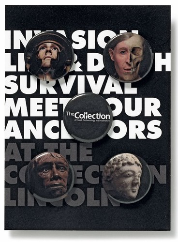
Badges for the Collection Museum of Art and Archaeology in Lincoln, 2010. The flexible identity uses imagery by local photographer Andrew Weekes. The campaign focused on the phrase ‘… at The Collection Lincoln’, preceded by different words to communicate the museum’s artefacts and events.
The buck stops
Eye: Rob and John entertained the design community quite a lot with your winning entry for the ‘Dollar Rede$ign Project’.
Rob Duncan: That was the Dowling Duncan job that really put us on the map.
John Dowling: It was organised by Richard Smith in New York who was at Sullivan. He used to be my boss at Area and he said that he’d got this interesting project to redesign the dollar. Rob did it and it opened up the floodgates – some of the responses that we got were …
Rob Duncan: … ‘What a horrendous bunch of Brits touching our money – you just get out …’ If you think about it, it’s the most recognised bill in the world. So changing it to something that might look more European might not be the best idea to do anyway. It does represent America. You can be anywhere in the world and pay with dollars. When you look at European currency – you can see it but you wouldn’t know which country it comes from.
Pablo Juncadella: The Euro is a very young currency…
Rob Duncan: For one of the youngest countries in the world, America has this very old-fashioned approach to design. Look at Australia’s banknotes – they’re beautifully designed. Canada’s as well. We were getting to the point where we were almost getting death threats. I was telling my designers to not open packages!
Eye: Rob, you said during Mucho’s Typo Circle talk that you spend 50 per cent of your time being a salesman.
Rob Duncan: Yes, but probably more so in the US because of the culture … maybe even more so on the West Coast. There’s an element of education I have to do with every presentation. That is the salesmanship: being good at selling an idea enough to see it through.
Eye: Is it difficult?
Rob Duncan: No, but it has taken a long time. I’ve been there eleven years now. Seeing how corporations work in-house was pretty important.
Eye: You all appear to have a fondness for the ‘smile in the mind’ – an approach familiar from Pentagram that was out of favour for a while …
John Dowling: We also liked that Paul Rand quote about finding a balance. Rand said there were ‘two goals’: ‘The first is that everything … must have an idea: it cannot just look nice. The second is, it has to look nice. Without visual beauty, even a good idea will not pass.’
Rob Duncan: Alan Fletcher used say, ‘Stroke a cliché until it purrs like a metaphor.’ Taking something and giving it a twist. CDT [Carroll, Dempsey & Thirkell] did that very well. They were clever with ideas and made things look very beautiful, like when Fernando worked on the ENO.
Pablo Juncadella: Ideas have to be there from the start point. But from an aesthetic point of view you have to be able to offer something. There’s nothing new under the sun, but at least we have a responsibility not to bore people and offer something a little extra. It has to look nice in a way that won’t look like the 50 other things around it today.
Many times the idea is based around the editorial. However, too much pumping up the volume of the idea might give too obvious a design result.
Eye: The clients you’re working with must be pretty sophisticated about what design can bring …
Rob Duncan: You’d be surprised. San Francisco is an outdoor city and not as stressful as New York. That visual-ness of when you go to New York is always an influence. On the West Coast there’s still this hippy attitude. And they are still caught up in the April Greiman / David Carson thing.
Eye: Does that affect the people you try to recruit?
Rob Duncan: Absolutely! I’m always torn as to whether I bring over a bunch of Brits or Europeans because I can’t find …
Marc Català: Design is not catching up with the technology and ideas there …
Rob Duncan: Yes. The technology is amazing, but graphic design-wise …
Marc Català: I know a couple of designers from Spain who have gone to the United States as designers and have ended up becoming entrepreneurs.
Rob Duncan: That’s the thing about San Francisco, everyone’s got an idea and everyone’s got a start-up. It’s fantastic.
But then I have to convince them about the value of design because they don’t see the value of making it look good and how it can make their business work.
Early years
Eye: How did you first discover that there was such a thing as graphic design?
Marc Català: Well in my family, we had always valued the arts and I wanted to do something creative. But at the same time I was scared that
I was going to be poor. I thought of architecture, but I was shit at maths, so I thought, ‘Maybe this isn’t going to work out!’
Loran Stosskopf: I am from a working-class family, but I discovered that a famous seventeenth century painter had my last name, almost: Sebastian Stoskopff. I liked drawing so I got curious about him and then about art in general. I studied fine art but I was not sure about what to do: become a painter? A photographer? Then I saw the Atelier de Création Graphique (led by Pierre Bernard, with Dirk Behage and Fokke Draaijer) and their symbol for the French National Parks and I thought: ‘That’s what I want to do.’
Pablo Juncadella: I’ve always been aware of graphic design. My mum was an interior designer and I was good at drawing from a young age. It’s basically the only thing I was doing. I would draw lettering on other people’s folders, including Marc’s.
Eye: Did you know the names of any designers?
Pablo Juncadella: No but I knew that there was such a thing as a graphic designer. A friend of mine had a poster by Milton Glaser and that was the first name I heard.
Marc Català: I wanted to do something creative, but I also wanted to have a life. There was a sister of a friend who was studying graphic design and she said it was creative and you might get paid for it. Graphic design was catching up in Spain: in Barcelona there were really interesting South American designers who were coming over, and companies began to understand the need for design and that design was good business. I was worried that I couldn’t draw, but she said: ‘You don’t need to, it’s okay.’
So I decided to look around for universities and I went to Eina, the art school in Barcelona. One of the first classes was drawing. Since then – after a lot of practice – I’ve loved and enjoyed drawing.
John Dowling: I wanted to be an artist because I was good at drawing, but during my foundation year a teacher said: ‘You’re a rubbish artist – why don’t you try being a graphic designer?’
So I went to Newcastle, which was a great course, very craft-orientated, and I realised you could get paid for this.
Eye: You all began studying design at an interesting time for changing technology …
Pablo Juncadella: I didn’t have a computer at home. But then these rich kids in class started getting Macs and they did cool stuff just because they had the Macs.
Marc Català: There was one room in the entire university that had three or four Apple Macs! I was doing everything with photocopies in Barcelona – I lived in the outskirts and had to take the bus. It took me an hour just to get to Barcelona. It was a nightmare.
Tilman Solé: We were neighbours and I remember Marc was singing in a band. So his father came to my father and said: ‘I don’t think he is going to make it.’ And my father said: ‘My son’s going to be a graphic designer.’ And Marc’s father said: ‘Oh that’s interesting … would he mind coming over to talk to my son?’ So I went over to talk to Marc. Took him in my car one day to the university to show him.
Eye: So you saved Marc from a career in music?
Tilman Solé: Yes! But I must say that he has a great voice. I was at the German school in Barcelona. These German guys wanted to go and become architects or do engineering. And I didn’t want to do that. I wanted a job where I every day I could do something new, and I came up with graphic design. My father took me to see a design studio and I thought that this was the place that I wanted to be in. We had amazing teachers, and we all finished up working with teachers that we had in school.
Marc Català: At the time when we were finishing school, there was the incredible project with El País de las Tentaciones [a youth supplement to El País], designed by Grafica. It’s probably the first newspaper that I wanted to read.
I didn’t even know it was editorial design but I thought it was amazing. People were used to fresh design being in posters, not newspapers, because newspapers were boring.
Grafica’s Pablo [Martin] and Fernando [Gutiérrez] were teaching at the school. I realised that this was really what I wanted to learn. That was the first thing that made me think about type. I had been learning about the proportions of the type and calligraphy but I didn’t realise you could use type in such an expressive way. So I wanted to do the same thing because I thought that it was cool.
Pablo Juncadella: We ended up working with Fernando and Pablo in the afternoons and it was almost like an extension of school.
Tilman Solé: At one point we came really close to working together. They called me from Grafica and said that I should come work with them. But I was leaving the next day to go on vacation.
Marc Català: We missed ten years there!
Tilman Solé: It was the first time someone had ever rejected a job to go on holiday.
Eye: How did you start, Rob?
Rob Duncan: I was always drawing Disney cartoons at school – Mickey Mouse, Donald Duck – so my dream was to be an animator. But then everything was starting to be done by computers and I loved doing stuff by hand, so it put me off. While I was on a foundation course in Kent somebody said: ‘You’re never going to make a career as an illustrator, you should do graphic design.’ So I went to Bath Spa University where we had a great course leader called David Beaugeard, a 1980s advertising ‘clever ideas’ person. We also had Hans Dieter Reichert from Baseline and we got the foundations of grids and typography from him. My first internship was at Baseline magazine, which was extremely scary.
The importance of being friends
Eye: What kind of design did you want to do?
Rob Duncan: Through my three years at Bath there was so much going on. There were people telling us graphic design was ideas. And then all this deconstructed type going on in California, at Cranbrook (see Eye 03) in the States. And Ravensbourne, outside London, was doing all this crazy, cool stuff.
John Dowling: New Swiss.
Rob Duncan: I couldn’t work it out. What am I doing here. Was I good at ideas? Or should I do this? The book Fax You just came out, and we were all hanging on to faxes as they went through the machine.
Marc Català: This sense of ‘I don’t know what is good or what is bad,’ I remember having that feeling at university. There was The Designers Republic doing stuff, Ray Gun …
So the obvious reaction to this confusion was to get a job at Pentagram?
Rob Duncan: Well another tutor was Bob Mytton from Mytton Williams and he was ex-Pentagram. I went to work with him, so when Bob said ‘Where do you want to work?’ I said Pentagram. Which is where I met John.
John Dowling: I had to interview Rob for John Rushworth at Pentagram and I came back up and said ‘He’s done all this fantastic stuff and, most importantly, he’s a nice guy.’ I think Rushworth sent me down to see if we would get on because it was really important that everyone got on well within the teams. You were working really hard and doing silly hours and most of the time the partner would just leave you. It was important that we all got on and were friends.
San Francisco. Dowling Duncan’s winning entry, 2010, for the ‘Dollar ReDe$ign Project’ initiated by Richard Smith.
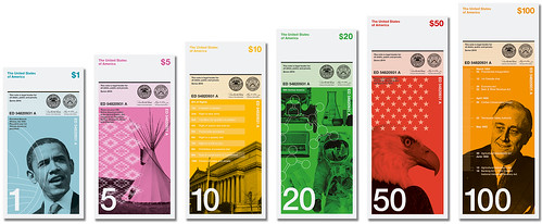
Poster and identity for San Francisco Art Exchange, 2014. ‘The existing identity and look and feel didn’t reflect the work the gallery represented,’ says Duncan. ‘We developed a new identity based around one typeface, Avant Garde.’

Simon Esterson, Eye art director, London
John L. Walters, Eye editor, London
First published in Eye no. 89 vol. 23 2014
Eye is the world’s most beautiful and collectable graphic design journal, published quarterly for professional designers, students and anyone interested in critical, informed writing about graphic design and visual culture. It is available from all good design bookshops and online at the Eye shop, where you can buy subscriptions, back issues and single copies of the latest issue. You can see what Eye 89 looks like at Eye before You Buy on Vimeo.

