
Summer 2024
Reputations: Sharp Type, Chantra Malee and Lucas Sharp
Simon Esterson
Eye editors
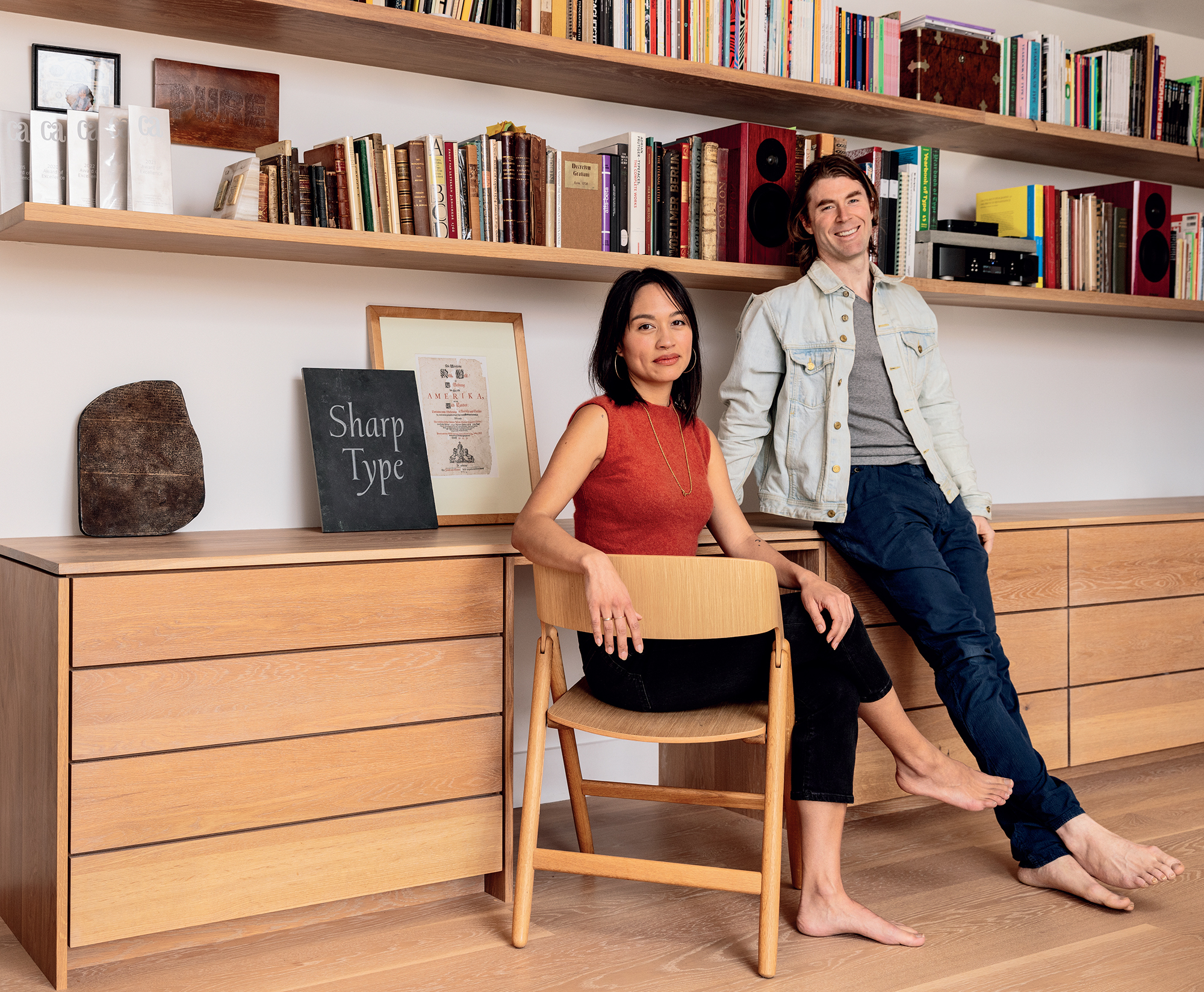
Lucas Sharp
Chantra Malee
Marc Rouault
Connor Davenport
Emma Piercy
Justin Sloane
Lucas Sharp: ‘The only thing keeping me excited about being in this industry, and doing this work, is the stuff I have yet to draw.’
Chantra Malee: ‘We could have sold the entire foundry but ... what are we supposed to do for the rest of our lives?’
[EXTRACT]
Lucas Sharp and Chantra Malee started Sharp Type in 2015, in what they now call ‘Season One’ of their digital type foundry. Just over eight years later, they announced ‘Season Two’. Sharp, born in 1986 in Marin County near San Francisco, studied at Parsons and interned with Joshua Darden. Malee, born in 1989 in Newport, Rhode Island, studied Design and Management at Parsons, which is where the couple met and became partners in life and type. Initially working from their one-bedroom apartment in Chinatown, New York, they moved to Granada, Spain in 2016, and the studio soon expanded with the addition of type designer Connor Davenport.
Sharp Type’s early releases captured the spirit of the time and were used extensively by companies such as Samsung (Sharp Sans), Dropbox and la Repubblica (Sharp Grotesk). When Pentagram’s Michael Bierut and OCD’s Jennifer Kinon approached Sharp to be the typeface designer for Hillary Clinton’s 2016 presidential campaign, he redrew Sharp Sans Display no. 1. Sharp wrote later (in The Baffer) of the ‘hard lesson’ he learned, the need to ‘foster variety instead of prescribing homogeneity’ in political campaigns. In 2017, Malee and Sharp moved to Madrid, releasing Sharp Slab, Beatrice and Davenport’s Garnett the following year. By 2019, when Sharp Type released Doyle, Simula and Ogg Text, My-Lan Thuong and Calvin Kwok had joined the studio in Spain. Later that year, the foundry decided to move back to New York and Malee started up the annual Malee Scholarship, a programme for women type designers from less well represented backgrounds.
The following year, after Covid-19 hit, they moved to San Francisco and were joined by Justin Sloane and Marc Rouault, whose Trois Mille typeface they released at the height of the pandemic. Sharp Type made a custom typeface for communications company Twilio and released Greenstone in 2021, followed by Ghost and Octave in 2022 and Sharp Grotesk Global.
Over the years, the foundry’s clients have included the BBC, Discovery Channel, Jimmy Fallon, Pentagram, Prudential, Sid Lee, Bare Minerals, GM and most of the tech giants, including Dropbox.
By late 2023 the studio had grown to include Theodore Jahng (who runs Sharp FM), Zyanya Rodriguez and Léna Le Pommelet and Connor Davenport left to start his own foundry. The new ‘Season Two’ typefaces are Earth, which Sharp began sketching during a long road trip through Thailand, visiting Malee’s family, in February 2017, and Sharp Serif (the text font for this issue of Eye). On 6 February 2024, Monotype announced their acquisition of all Sharp Type’s ‘Season One’ typefaces. Sharp and Malee unveiled the surprise deal by announcing: ‘We’ve got some news fam. Most of those fonts you know us for: We’ve sold them to Monotype … moving forward, we are 100% focused on where our passion has always been: drawing cool new stuff.’
In May 2024, the company published Sharp Type Volume One, which they describe as a ‘monument to nearly a decade’s worth of work’. The limited-edition 368-page book, printed in Italy, is both a history of the company and its founders and a specimen of Sharp’s ‘Season One’ typefaces.
The conversations between Eye’s Simon Esterson and John L. Walters and Sharp and Malee of Sharp Type were conducted via Zoom and took place in early 2024, a few weeks before (and then shortly after) the news of the Monotype deal became public, with a few additional exchanges via email.

Eye: What drew you to design when you were growing up?
Lucas Sharp: I was raised by a couple of semi-starving artists who tried to convince me not to follow in their footsteps. My solution was to get into design. I wanted to do comparative religion at one point, but ended up going to New York City, attending Parsons where I met Chantra.
Typeface design was a great fit for me. A big part of graphic design is curatorial, where you’re pulling in these different disparate elements, whereas I was always honing my own aesthetic. Working with form and coming at it from a fine arts background, type design was a niche that I worked my way into by having the patience to do it. My mentor Josh Darden said, ‘You have attention surplus disorder.’ I was a bit of a marijuana addict for a decade, which helped. Building these things takes a long time, a lot of late nights. A lot of discipline, a lot of patience.
I took an elective class with Josh, and he was my window into that world. I interned with him for a year and then worked freelance, did a sort of apprenticeship deal, and he pushed me out of the nest.
Chantra Malee: I was in the design and management programme, a dual degree. We learned foundation in graphic design, but graduated with a bachelor’s in business. It was for entrepreneurs and people who wanted to be in the art world. It focused primarily on strategy and design theory with an emphasis on graphic design. We learned basic elements of typography, but it wasn’t until I dated Lucas, that I started hearing about type all the time. It became a big part of our daily conversation. I used to go hang out with him and Josh at the Darden studio, so I started absorbing it early on. I had been involved in the art scene and understood the importance of craft.
Did you always want to run your own show?
Malee: Yes, both my parents were entrepreneurs, so that came naturally to me. That was my end goal. When Lucas came along, that solidified it.
Lucas, did you imagine running your own foundry or being part of a studio like Darden’s?
Sharp: The work was always the main focus. I’ve always been single-mindedly enmeshed in whatever I’m doing. But I could never imagine myself working for anyone else.
Is this the Sharp Type secret ingredient? Two partners, one focusing on type design, one focusing on growing the business?
Malee: Yes. We can’t have too much overlap. I think that makes for a successful partnership …
John L. Walters and Simon Esterson, Eye magazine
Read the full interview in Eye no. 106 vol. 27, 2024
Eye is the world’s most beautiful and collectable graphic design journal, published for professional designers, students and anyone interested in critical, informed writing about graphic design and visual culture. It is available from all good design bookshops and online at the Eye shop, where you can buy subscriptions and single issues.