
Summer 1991
Reputations: Wolfgang Weingart
‘My work is like a quarry. People see a stone they like, appropriate it and work it until there’s nothing left.’ Eye talks to the father of New Wave typography.
Wolfgang Weingart was born in 1941 and trained as a typesetter in Basle. Largely self-taught as a designer, since 1968 he has been a tutor at the Schule für Gestaltung Basel, Switzerland, where he concentrates on experimental typography. Since 1972, Weingart has lectured widely on his teaching methods in Europe, the US, Canada and Mexico. He is a contributor to the journal Typographische Monatsblätter, for which he designed a series of covers, and is founder of the periodicals Typographic Process and TM/Communication. Weingart has influenced a generation of typographers who exported his ideas to America and the world. Never predictable and sometimes perverse, his oeuvre must rank as one of the most personal and expressive in recent typographic history.
Yvonne Schwemer-Scheddin: Retrospectives like your recent exhibition in Darmstadt always have something of a narcissistic element to them.
Wolfgang Weingart: Developments are important to me. I think it’s very interesting to look back at a body of work, including things that have been made ‘under duress’. I’ve a whole stack of these ‘mementoes’ – school notebooks, early works, manuscripts, drawings – even 40-year-old geometry course work.
YSS: Often the time you spend in school has a decisive influence on your later life. Was this the case for you?
WW: I was really untogether at school. I found the abstract subjects hard to grasp, and things like arithmetic and maths incomprehensible. Painting and drawing were the only things I was considered good at, although looking back now at the few scribbles I’ve held on to, this seems hard to believe.
When I turned 18, in 1958, my parents pressured me to continue my education. Unsure about what to do, I visited a new, vocationally-oriented school, the Merz Academy for art and applied graphics in Stuttgart. And I had an overnight revelation – the idea of learning a good solid occupation. The first thing I did was to apply for a plcae as a trainee compositor at the Stuttgart publishers, Klett, but I was turned down because they said my typing wasn’t good enough for the job. However, I was taken on by a small printers in Stuttgart and completed a three-year apprenticeship which is still a big influence on my work today.
YSS: Then you went to Basle. The light, delicate typography of some of your first works there seems to indicate that you discovered the idea of the line as image very early on.
WW: I went to Basle because of Emil Ruder and Armin Hofmann, but I was quickly disappointed. Hofmann went off on a one-year sabbatical, and I had the feeling I wasn’t learning anything with Ruder. I was never a regular student at Basle, but I had a special understanding with Ruder and he let me use the workshops whenever I wanted.
YSS: The course at the Merz Academy was unstructured, in contrast to your current teaching methods at Basle, which demand strict discipline from your students. How do they react to these methods?
WW: I find it much easier with the advanced graphics course, where I teach students from all over the world. They arrive already motivated and disciplined, with the relevant background knowledge. When I went to the Merz Academy, no one thought of doing things systematically. On my very first day there, they said: ‘Design a poster for Lufthansa with the slogan Fly to Athens.’ I had no idea about colour or typography, so I wasted my time. I first learnt about a systematic approach from Armin Hofmann at Basle. On our first day there we were put in the charge of another tutor and told to draw a cube. I spent the day drawing a cube in outline form – the wrong way to do it, according to the tutor, who called us together at the end of class. After that, I stopped going to lessons.
YSS: But you insist that your students do so!
WW: On the whole I get on very well with my students. They know they can ask me anything, and that I’m there if they need me. This means that it’s a pleasure, rather than a hard slog, to do analytical work with them. By itself, typography is as boring as hell: what makes it exciting is how you interpret it. You have to make the teaching come alive, stage by stage. And you have to be clear about why the basic exercises are so important, explaining to students that they will need to know how to equalise capital letters in the outside world, for example when they’re doing signage on a building.
YSS: Expressive typography is the foundation of your work. Was New Wave the translation into type of a subjective, youthful sensibility?
WW: Exactly. The moment I space out a word, I become involved in an exercise in graphics. This in turn developed into a way of teaching. I took ‘Swiss typography’ as my starting point, but then I blew it apart, never forcing a style upon my students. I never intended to create a ‘style’. It just happened that the students picked up – and misinterpreted – a so called ‘Weingart style’ and spread it around.
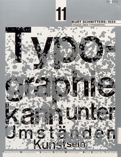
Magazine cover, 1973.
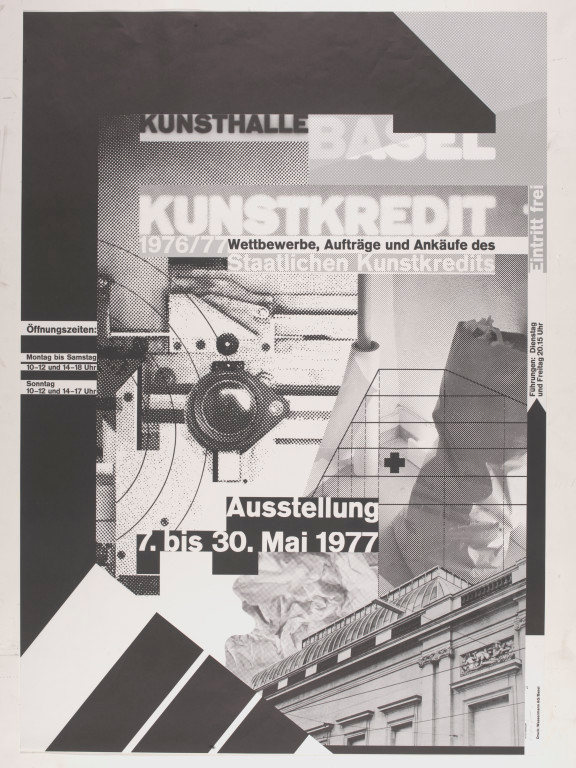
Top: Exhibition poster, 1977.
YSS: They say imitation is the proof of success, but isn’t it also irritating?
WW: It was annoying at first. But it was also positive in that it forced me to look for new ideas to keep one step ahead of the pack. I did this with my posters, which make full use of the lithographic process. They are not so easy to imitate, because most people don’t know the technique. It’s also hard to copy the individually hand-worked screen foil technique that I developed.
YSS: What else?
WW: We also found that this very personal form of teaching, with its element of experiment, was no safeguard against plagiarism, so we radically restructured our course at the beginning of the 1970s. We went back to basics – to the elementary typographic problems which had been somewhat neglected – in an attempt to get away from the new, all-pervasive style. Of course you can always see traces of the hand of the teacher and, in our case, the spirit of the school, which to some extent carries on the thinking of the Bauhaus.
Besides, even reproductive design is a necessary step in the process of human development, for it gives rise to new creativity. The problem with design today is that it often has little to do with content. It’s more about the designer’s ego, full of references only the initiated can understand. The general public doesn’t get the information. Because of this, I find myself in an incredible state of conflict. I’m not designing any more.
YSS: You’ve reached a turning point in your work. Is that unsettling?
WW: No, not at all. You just have to wait ’til something new comes along. It’s part of life. I always begin to repeat myself when I use a particular device, for example with the posters. The basic principle with the screen foil is always the same. When it gets too much or too boring for me, when it looks like I’m just repeating myself, I look for something new. At the moment I’m not in a position to find anything new, because I’m no longer so enthralled with design, because I teach 35 hours a week, because I’m involved with a lot of other projects – exhibitions, books, lectures, trips, and so forth. Creative design work wears you down physically. For a poster I need 12 weeks from the initial concept to work out all the technical details and get the film ready for press. At times like that, I don’t sleep at night, but dream a great deal. Then, despite my best efforts, the printers may do a bad job. I’ve learned to resign myself to not being able to control every single thing – I can’t really set up my bed at the printers.
YSS: For me the most surprising works at your recent exhibition were the sketchy, conceptual notes, not just because they encapsulate a spontaneous, artistic sensibility, but because they seem to give an insight into your inner world.
WW: Without wine, music, the company of friends and, in the past, heavy smoking, those sketches and personal notes wouldn’t exist. Nor would that exhibition have taken the form that it did. My sketches show visions, moments of madness, idiocy. They contain nonsense, humour, animation, depression – everything that can and can’t be done in this funny, beautiful world. Sometimes, after a bottle of wine, I come up with some remarkable drawings which seems to reflect just how I feel at that moment. The craziest ideas come especially at night. I set them down in brief sketches and carry them around with me until I’ve forgotten what they were for, or I feel the time is right to make one more attempt to complete the project. This constant collecting of ideas, which are then set down in words and drawings, is an essential step towards further development. It’s a way of slowly working one’s way into the technical processes of the project and preparing oneself for a new encounter with technology.
YSS: The sketches contrast sharply with the reprographic works, which are cooler, more impersonal. Is it true to say that you use the specialised technique and the day-to-day discipline of teaching as means of channelling unsettled, emotional impulses into more ordered, productive outlets?
WW: I find it hard to identify with some of the posters I have designed. I can’t see myself in them – which make me think they must have come from somewhere else, from another planet. Sometimes a technique will lead me to a new idea, but when that happens, I tend to think that nothing in the work is mine. I believe that technique is enormously important. There aren’t many designers like me who take on all the technical aspects of a job themselves.
For me, the B4 format [90.5 x 128cm] posters were a technical highpoint, and also a kind of summing up of my creative activity, confirming my feeling that each thing made is an important element of a whole, that different aspects of my work are interlinked. Over the years, I’ve been able to apply the collage technique I learned in the 1970s to film montage. I work out every visual and technical detail for the printer, from the design concept to the final artwork – the screen nuances and structures, line elements, surfaces. These recurrent visual elements have now become something of a trademark. The lithographic half-tone dot, which I saw as a new, self-contained graphic element, has possibly become part of my personal image.
YSS: The theorist Vilém Flusser has called you a ‘linear’ thinker. Do you think he said this because you deal with linear material, with type? Flusser has also said that type explains – and therefore destroys – the image. Are you a destroyer of images?
WW: I see type as a kind of picture that speaks. I am a maker, not a thinker. What’s reflected here is my activity, not my inner being. I experiment simply to broaden my knowledge of the vocabulary and techniques of typography. What gives me satisfaction is the practice, not the theory.
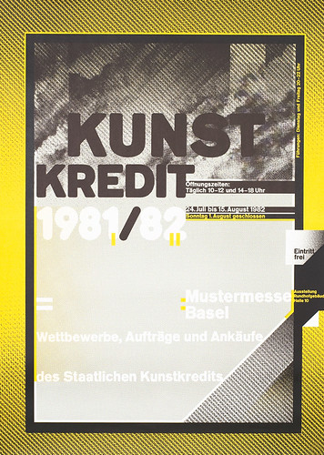
Exhibition poster, 1982.
YSS: Or are linear pictures an emotive thing to you?
WW: Perhaps. My travels through the mysterious, endless expanse of the Syrian desert, and the Orient, for example, conjured up typographic images. Dried-up riverbeds reminded me of curved composing lines, tended fields of straight ones. The pattern of houses and alleys on the edge of the desert made me think of hand-set blocks of type. But I don’t see my work as, say, the first stage in a new, consciously less ideological conception of typography. It’s simply an attempt, an experiment, that’s worth pursuing.
YSS: Are you saying that you can extract personal style out of a technical process? Shouldn’t it be the other way around, with the tool as the servant of the creative mind?
WW: For me technology is the ultimate challenge: it’s both a partner and a friend. But I’ll never be completely under its control, because I know how to do things by hand, how to draw. If you know about only the technical side, you’ll never produce a complete design.
YSS: But isn’t the new technology necessary for new ideas? What about the computer, which you introduced into your typography course at Basle in January 1985?
WW: For the most part, my hopes for the computer have not been fulfilled. In fact there’s nothing it can do that can’t be done by hand, or film montage. It hasn’t produced a new visual language. At the time I introduced the Macintosh to Basle, for example, New Wave was already at its peak in the States. I have to admit, however, that the computer has speeded things up, leaving more time for design and conceptual thinking.
The PC represents the second big revolution in typography since Gutenberg, but to take full advantage of it you still require a thorough, basic classical training in design. People who haven’t mastered the conventional graphic techniques won’t be any better on a computer. The computer has a considerable impact on teaching, but it is also a valuable tool.
YSS: What do you think of Neville Brody’s work?
I think of him as a great colleague. In my opinion, it’s important to have people who make such ‘non-sense’ out of type. In the same way, it’s important that there’s so much computer-generated rubbish – it forces us to take stock. It’s good that other places don’t know how to deal properly with the computer because, on the whole, we do. That’s why so many students come to Basle. And there are still a few good people who are prepared to go against the grain.
The teacher in Vienna told me that he gave his students three weeks to design a poster. They all came back with the same thing: a little Brody.
YSS: Or a little Weingart?
WW: Not any more. They no longer know where New Wave came from. My work is like a quarry. People see a stone they like, appropriate it and work it until there’s nothing left. When that happens, they go back and get themselves a new stone. In my opinion, most designers don’t think or develop anything for themselves any more. They just process fragments. The result is emotional chaos. Today students look to Emigre magazine for ideas. They find this chaos wildly attractive: they imitate it and think it’s modern.
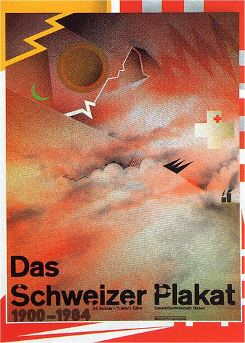
Exhibition poster, 1984.
Yvonne Schwemer-Scheddin, design writer, Munich
First published in Eye no. 4 vol. 1 1991
Eye is the world’s most beautiful and collectable graphic design journal, published for professional designers, students and anyone interested in critical, informed writing about graphic design and visual culture. It is available from all good design bookshops and online at the Eye shop, where you can buy subscriptions and single issues.