Summer 2003
Retro-sexism
The bleak reality of sexism, however 1970s, or ‘cool’, demands a critique
Sexism in advertising. It sounds almost quaint. The very words have a retro ring to them, conjuring up, on the one hand, scenes of be-aproned housewives serving casseroles to hungry husbands, and on the other, posters of leggy models in platform boots and hotpants with – and this is a key image in the scenario – feminists in dungarees slapping ‘this degrades women’ stickers all over them.
For sexism isn’t just a phenomenon, it’s an idea: and has no currency as such without people who actually hold it, discuss it and apply it. Without some public airing of the critique it involves, the idea itself falls out of fashion. Of course, what then becomes passé isn’t actually sexism, which is doing just fine, but the concept of sexism, in advertising or anything else for that matter. Unlike ‘racism’ – a term which, similarly, refers to both actions and attitudes – ‘sexism’ has fallen strikingly into disuse in recent years, and is now rarely employed in public debate. Therefore our view of the situation it describes becomes locked in the moment when the term flourished; and ads themselves, as I will show, present sexism as a kind of stylistically ‘Seventies’ phenomenon, so that it becomes at once past and present, ‘innocent’ and knowing.
There has already been a certain amount of commentary on ‘ironic’ or ‘knowing’ sexism (often as if the irony or knowingness cancelled it out) but what has been little analysed is the formal method of placing the ironic or knowing quote marks around that sexism. Moreover, given that every era has its visual unconscious – there is no possibility of total ‘knowingness’ – there has also been little investigation of the ways sexism and sexual power relations are portrayed without quote marks in ads today, because, of course, the concept of sexism is no longer being used without quote marks either.
There is not space here to analyse all the reasons why this is so, but just as the use of the term racism implies that the phenomenon it refers to is wrong, so the term sexism involves both a description and an implicit critique. And as the critique has subsided, the description itself seems to have vanished from view, despite the facts – to take just three – that women’s income lags far behind men’s, that domestic violence against women is frighteningly common, and that women still perform the bulk of domestic labour. In other words, sexism in society has not disappeared, but it seems to have disappeared from social consciousness: certainly you would never know from advertising images that those facts held true. In today’s ad world, women outperform male colleagues in the boardroom while husbands with skewed ties struggle over baby formula, and anxious young men worry about their spots before dates. The idealised imagery of advertising has, over a couple of decades, airbrushed away the grinding day-to-day sexism women still encounter in reality.
To complain about this would merely be to berate advertising for being itself; what has changed since the 1970s is not the process of idealisation but the content of the ideal. Where once this was portrayed, for women, as being loveable, now it is portrayed as being successful. In 1978 I analysed an ad for Birds Eye peas which went, ‘Birds Eye peas will do almost anything to get your husband’s attention’. Clearly they were identified with the wife trying to do just that, but it is impossible to imagine such an ad running today – the woman would seem too domestically subservient. Yet the 1970s was itself a period of great social change, with a high proportion of women working outside the home: the portrayal of the full-time wife and mother was already nostalgic, and the dominant retro imagery of the time was a sort of 1930s graphic style which conjured up a prewar social order (see, for example, the classic Hovis ads). Kellogg’s ‘Every Body likes a Taste of the Country’ (1977) illustrates this phenomenon: the wholesome scene of woman as provider, her hand reaching for the cereal while husband and son wave from the path, is as nostalgic socially as the pictorial style is graphically. The lines of the trees, the Rupert Bear painting-by-numbers light and shade, even the facial expressions, are a reference to an earlier period. It is the graphic style that fixes the social wish, preserving it while reactivating it – a process I will return to in investigating retro-imagery in ads today.
Looking at 1970s ads it is possible to divide their sexism into broadly two categories: social and sexual. Obviously these overlap in practice – just as
the personal is political, so the sexual is social – but in tracing the genealogy of sexism in advertising it is useful to make a distinction, because developments over subsequent decades have been asymmetrical between the two strands. What I would call social images (workplace, domestic, etc) have changed enormously in content, and are self-consciously contemporary: see the advertisement for Baxi Boilers, spring / summer 2002 campaign, where the point of the punch-line is the novelty of the man vacuuming (though he looks as unconvincing as those Calvin Klein men holding babies). This is a pretty straightforward illustration of the social transformation in gender relations that ads have depicted faster, and more thoroughly, than has actually happened.
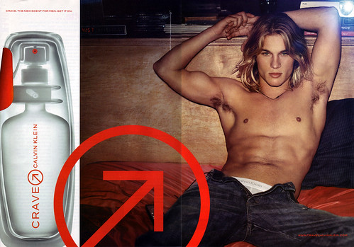
Calvin Klein Crave, 2003, from Cosmopolitan.
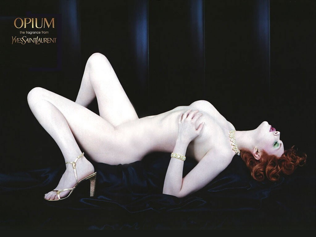
Top: YSL Opium, 2000, from Vogue. Photograph: Nick Knight.
The tension of change itself was marked by a genre of ads halfway between the social and the sexual that I would categorise as ‘sex war’, referring directly to battles that were perceived as following the women’s movement. These ads depict hostile relations between men and women, with men frequently cast as the losers. The woman who flicks through a magazine rather than answer her boyfriend’s call (in a 1968 Panasonic answering machine ad), and the explicit male deficiencies catalogued in the 1992 Triumph underwear ad from women’s magazine Options and the 1990s Cotton clothing advertisement from fashion title Elle, lead up to the more equalised ones which suggest complete antagonism within sexual relations.
This theme runs alongside the harassed-dad, spotty-youth type ads and, though obviously tongue in cheek, taps into something repressed in that genre; for the remarkable change which advertising has so prematurely depicted within fully clothed social situations leaves nowhere contemporary, within such contexts, for sexism to go. ‘Social’ advertising has achieved a gender revolution before the fact, creating an implicitly post-feminist image-world in which women are powerful and men compliant (or, if not, about to get their comeuppance). If this could be seen as a distorted expression of a feminist wish, it can also be seen as a wholesale embodiment of male fears. It is a depiction of gender relations that fuels male sexism, while simultaneously banishing it: the portrayal of contemporary society as female-dominated (remember the ad where a woman snips the balls off her colleague’s executive toy?) generates powerful sexist feelings which, however, cannot ‘innocently’ be expressed in this imaginary present.
So they become channelled on the one hand into what I call retro-sexist imagery, where sexism operates freely within the frame of a period style; and, on the other, into increasingly fetishistic sexual imagery, which depicts power relations as about S / M sex rather than who washes up or chairs the board. An ad on the cusp of all these issues is for Quorn which reads ‘Curry that helps you get the most out of your husband.’, which presents us not only with a clothes-on parody of the sexual domination imagery now widespread within advertising, but a reminder, albeit a comical one, of what feeds it. The explicit reference is to Allen Jones’s glass coffee tables supported by kneeling, naked (apart from fetish gear) women, a 1970s example of ‘knowing’ art world sexism, at once joking and for real. The parody here is not merely in the gender change, but in the shift of sensibility from sexual to domestic – the man even has socks on. Despite its sexual banter the ad is addressed to women in the traditional role of food provider, the small print offering assurance that Quorn is low in cholesterol and good for your husband, so you can ‘get the most’ out of him, presumably sexually. Yet the man himself looks rather weedy, and neither woman looks like a dominatrix. This is an ‘ordinary’ scene, ‘social’ advertising parodying ‘sexual’ advertising – which proves that the latter has become a strong and recognisable enough genre to be imitated.
It is no coincidence that this ad refers to a work from the 1970s. As much as we like to see previous generations’ sexism as ‘innocent’ compared with our own, a glance at explicitly sexual (as opposed to social) 1970s ads shows them to be just as self-conscious about the power relations they portray. The late 1970s Mandate, Dormeuil and Marantz ads are all sexually ‘knowing’, and are remarkably similar in their basic structures. ‘Mandate. All the power a man needs’ – is the most disturbing, a semi-rape fantasy with the implication that the man has a ‘mandate’ to do whatever he wants with the sleeping woman. The Dormeuil ad is perhaps the closest to present-day sexual imagery: although the couple are clothed, the woman’s posture (an Allen Jones table minus the glass top) reinforces the fetishistic undertone. The Marantz ad employs the same basic iconography of upright man and prone woman, but the man’s roses, though phallically positioned, hint rather more chivalrously at a little courtship before sex, which nevertheless is clearly invoked, with the man in a dominant role.
This shows how hard it is to present female submissiveness successfully in a contemporary style (except, significantly, through literal bondage imagery, which I will return to later). The Conqueror paper example is a recent ad which has solved the problem by relocating, style-wise, to the 1970s, invoking the kind of seductive, semi-prone femininity seen in the Dormeuil and Marantz, while the shag pile rug and the fireplace echo the mise-en-scène of the Mandate example. The coy expression on the woman’s face is one that can only be read as a kind of retro-gesture: it works in the present, but because it is located in the past.
This location is not literal, but is both social and stylistic: a device also at work in the 1990s ad for Georges Marciano. This ad goes back a little further historically to frame its similarly coy female gesture, one that conjures up Marilyn Monroe, 1950s movies, and a whole lexicon of mannerisms connoting femininity – a lexicon that still works today, but only through a ‘knowing’ sense of the past. Certain kinds of male / female imagery, and masculine / feminine gestures, can only work any more within this retro style framework, which has become almost inseparable from certain kinds of content. Examples such as the CD cover for Calypso and the 1999 Base Shoes ad from men’s magazine Loaded employ a sort of soft-core sexual imagery which is, precisely, retro-sexist. Tame by some of today’s standards, it nevertheless combines a mildly pornographic use of the female body with – crucially – a connotation of ‘innocence’ which suggests, this is what sexism looked like when it was allowed. As the Mandate, Dormeuil and Marantz ads showed, there is nothing inherently innocent about sexist ads from the 1970s, but from the viewpoint of the present, what seems innocent is the fact that they were able straightforwardly to portray male social and sexual power over women without the need for any defensive device or contextualising quote marks. They had an apparent freedom, and retro-sexism nostalgically reinvokes that freedom while ‘knowingly’ placing it in the past.
CD covers for the dance market, released in 2002: Calypso (Life Enhancing Audio) by Sven van Hees and Full Frontiera (Z Records) by Nova Frontiera.
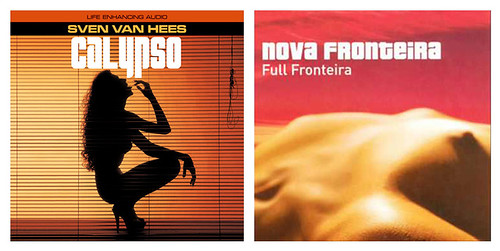
These period quote marks are, again, graphic and stylistic: CD covers for the dance market released in 2002, Calypso and Full Frontiera, frame their old-fashioned soft-core nudity with typographic styles from the late 1970s / early 1980s, and the backdrop of the venetian blind in Calypso invokes the fashion for film noir decor in that period (movies like Body Heat come to mind). Full Frontiera employs a classic 1970s trope, the naked female body as landscape, in a kind of wholesome soft porn nostalgia for countless Athena posters and rock album covers of the time. Although these two examples are CD sleeves rather than advertisements, they illustrate particularly clearly the combination of nostalgically sexist content and nostalgically retro graphic style that characterises retro-sexism in a range of media today.
The next two examples go slightly further, towards the realms of kitsch: a recent Alfa Romeo ad, is almost camp in its presentation of leggy model, powerful car and flaming sunset. Again there is a suggestion of 1970s style – partly in the bizarre outfit the woman wears which, combined with her posture, makes her vaguely reminiscent of a sort of very high-class Pan’s Person. This ad invokes a nostalgia for the traditional trope of sexy-woman-and-car, which makes it somehow almost sweet: this is what old-fashioned sexist car ads used to be like, it seems to say. The Base Shoes ad, similarly, offers a kitsch presentation of the naked-prone-woman-at-feet-of-clothed-man cliché by wrapping it in an explicitly 1960s / 1970s graphic. The pop art target, even the colours, plus the stylised positions of the man and woman, recall ads and art imagery of the ‘swinging’ era, and so conjure up an apparently freer sexism, an innocent and unbridled time when women could be naked and men could be men.
All these retro-sexist images seem to refer back to a golden era before feminism: they suggest a nostalgia for days when sexism was an innocent part of life and it was perfectly OK to think of women as domestic servants or sex objects. But the era they invoke the most, the 1970s, was not a pre-feminist era, it was the feminist era: the decade which saw the birth of the women’s movement and during which terms like sexism entered public language. It was also a time when women not only complained about and defaced advertising images they saw as demeaning, but actually experimented with trying not to look like them, and with changing gender roles in both social and personal life. The period these retro ads refer back to is one where such images were known and labelled as sexist in a way that has not been repeated since: their ‘innocence’ is a nostalgic myth.
So how to account for the powerful association of sexist imagery with the 1970s? It was precisely at that time that such images were seen as sexist – that the term was associated with them. The fact that this term became less and less used as we entered a supposedly ‘post-feminist’ era meant that it remained associated with the period in which it had currency, and the images to which it had been applied. To signify sexism today – to make an image look consciously sexist – retro-styling is necessary to activate the ‘period’ language in which it had a widely understood social meaning.
For both feminism and sexism were concepts which, by the 1990s, were perceived by many to be slightly passé; issues of ‘sexuality’ rather than gender became the focus of cultural debate with the bizarre result that, as sexual imagery became more and more explicit, a feminist critique became less and less fashionable. The reasons for this shift are complex and cannot be fully explored here: they are a part of a wider process whereby the political counter-culture gradually embraced of the objects of its critique during the 1980s and early 1990s. During that era women began publicly to ‘reclaim’ the kinds of images that might previously have been seen as pornographic or expoitative (an example being Madonna’s sex project) and it became increasingly hard to achieve a consensus about ‘sexist’ imagery – one effect of this being, as I have argued, that images which did invite such a label ended up associated with modes of the past.
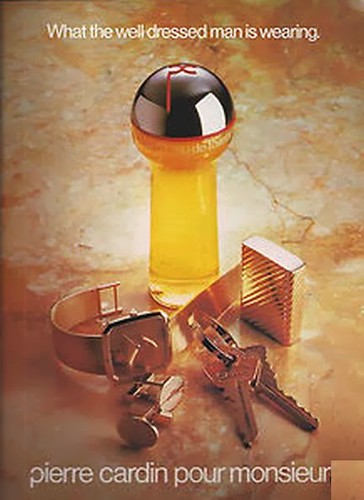
But another has been that, far from seeming reactionary or exploitative, highly sexualised imagery now tends to be seen as cutting-edge, and therefore ‘radical’. While not a new phenomenon, this has been especially striking over the past decade, during which there has been a noticeable growth in the sexual explicitness of even fairly run-of-the-mill ads. Two simple comparisons show this well enough. The Pond’s Cream and Cocoa Butter ad, from the early 1980s, presents a woman’s body in sarong from knees to shoulders – with the reasonable alibi of being a body-lotion ad; by the late 1990s, as the 1998 Minolta Vectis ad from Guardian Weekend shows, the acceptable public image has honed in directly to the female crotch which, further, bears no relation to the product advertised (a camera). A parallel in explicitness with male sexuality can be found in the early 1980s Pierre Cardin ad and the 1996 Red Bull ad from Time Out: the early 1980s ad relies on phallic packaging to suggest potency, while the 1996 Red Bull ad explicitly places the product as the male erection.
The increasing commodification of sex in imagery can be seen as disturbing for many reasons, not all of them to do with feminism, but while it is very of-the-moment to attack commodification – an aspect of global capitalism – it is difficult to extend this critique to the sexual dimension without appearing puritanical. Therefore highly sexualised imagery has become, unlike social imagery, an arena in which sexism can operate with very little criticism, or even awareness of its existence. This is partly because men are now portrayed as sex objects, too. For a straightforward illustration of this see the 2003 Calvin Klein Crave, from a recent Cosmopolitan (i.e. aimed at women) – an image which 30 years ago could only have been read as gay. Today, it also reads as a man ‘available’ to women, just as women have traditionally been portrayed to men: and we end up with the cultural illusion that the one cancels the other out, an illusion furthered by a whole genre of ads such as the 2001 Bally Shoes ad from Vogue, which reverses the trope of Bse Shoes with the man (though clothed) now in the prone position previously allotted to the woman.
But the notion of gender ‘equality’ within today’s sexual imagery takes no account of the gender inequality in the world surrounding it. This needs to be kept in mind when looking at an image like the peculiarly vicious Lee Jeans ad where a woman rests her stiletto boot on a man’s naked buttock. Numerous men complained to the Advertising Standards Authority about this ad, on the grounds that it encouraged violence against their sex. Unpleasant as the image is, however, its relation to actual violence may be the exact reverse of that proposed in the complaints. It is an image seething with sexism, but, as with a great deal of sexual imagery today, projects in fantasy form not so much some men’s wishes but their fears, and at the same time, an eroticised justification for their anger. In the world of sexual ads, the dominatrix, the bitch and the whore wield power over men; in the real world, current research shows that one in four British women will experience being beaten up by a male partner.
Nicky Clarke Sports Haircare, 1998, from GQ, and Boucheron Jaïpur Perfume, 2000s, from women’s magazine.
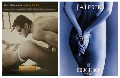
This fact suggests that, rather than expressing some kind of sexual liberation, today’s increasingly fetishistic and sadomasochistic sexual imagery provides a language for expressing both sexism and, perhaps, the pain and rage of a sex war which at heart is about social, not sexual power. Such imagery translates the social as sexual, allowing gender power struggles to be shown nakedly in every sense. In this climate repetitive images of female bondage, as in the Boucheron Jaïpur Perfume ad from the 2000s and the 2002 Jean Paul Gaultier ad from Vogue, escape the critique of sexism entirely, for they are located, not in the past, or in a socially recognisable present, but in a funky S / M fantasy world to which, it seems, only the most repressed or uptight would object.
The difficulty in criticising such images was illustrated in the public debate surrounding the 2000 Opium ad where model Sophie Dahl was shown naked but for stilettos (a whole essay could be written about their currency in contemporary ads) with spread legs and raised hips, a position easily perceived as inviting sexual penetration but one which could also be seen as an auto-erotic pose depicting female self-pleasure. Of course the image is ambiguous: the issue is not what it ‘means’ precisely, but the fact that it simultaneously offers the view of a female body as a sexual object, and the alibi of a supposedly female eroticism. Objections to this ad were treated as if they were objections to female sexuality: it was labelled ‘offensive’ by many critics, but ‘sexist’ by almost none.
I have used the term ‘sexist’ throughout this piece in the full knowledge that it may appear archaic or at least, inaccurate – too simplistic a label for a sophisticated discussion of gender images in our complex world today. But I would argue that this attitude is itself revealing of the extent to which sexism is taken for granted as a part of our cultural life, in a way that racism is not. Graphic designers who would not dream of producing playful ‘gollywog’ images can win kudos for doodling up crude sexual images of women (see eBoy and others). A currrent British television show, Boys and Girls, elevates adolescent sexism to acceptable public status with ‘Babe or Minger’, the title of its self-styled ‘Totty Competition’ which, though applied to both sexes, functions in terms that are inexorably male. (The programme is also vividly retro-sexist, its smut packaged in late 1960s graphics to a campy use of Andy Williams’ 1967 Music to Watch Girls By.) And perhaps one of the clearest indicators that sexism is alive and well is the fact that men’s magazines have become a ubiquitous presence on the newsstands over the past decade.
Taken from their pages, examples such as Nicky Clarke Sports Haircare (1998), Boots T-Zone spot cream (1999), Ben Sherman (1999) and Virgin Cola (1999) present what can’t be shown so starkly in more mainstream publishing contexts: such images remind us what sexism looks like when the constraints are off. I have argued that our unwillingness to name it in the present has on the one hand encouraged it to develop as a form of nostalgia – as if it was OK because it was old-fashioned – and on the other, allowed it to flourish in highly fetishised sexual imagery which we perceive as daringly cutting-edge. Alongside these phenomena we have the interesting fact that mainstream social advertising has concocted an impossibly female-dominated world which makes sexism, both the fact and the term, appear extinct. The reality of sexism is, however, still with us: it is time to resuscitate the term and bring on the critique.
Pierre Cardin, early 1980s, from men’s magazine.
Judith Williamson, writer, London
First published in Eye no. 48 vol. 12 2003
Eye is the world’s most beautiful and collectable graphic design journal, published quarterly for professional designers, students and anyone interested in critical, informed writing about graphic design and visual culture. It is available from all good design bookshops and online at the Eye shop, where you can buy subscriptions and single issues.