Spring 1992
Rietveld’s children
New work from graduates of Amsterdam’s famous academy.
Recent work by four former students of the Rietveld Academy in Amsterdam shows the rich variety of Dutch typography and graphic design. Lex Reitsma draws on the disorientating visual language of Jan van Toorn; Melle Hammer creates books animated by a meticulous sense of typographic play; and the team of Armand Mevis and Linda van Deursen wield aggressive, mass-culture imagery and logos with near surrealistic attack.
Melle Hammer
Melle Hammer’s goal is to achieve the optimum in typographic communication. He takes the point of view of a writer (he is a writer himself) and tries to find typographic devices appropriate to the text; he is one of those designers who truly see their role as serving the written word.
Hammer’s favourite devices are size variations in the type and the rhythmic distribution of text across the page like syncopated jazz, or, more fancifully perhaps, the sound of the human voice. These highly personal designs border on fine art. For inspiration, Hammer looks at the concrete poetry of Apollinaire – he is himself a kind of Apollinaire of the Macintosh – and the Dadaist typography of Kurt Schwitters; an early project was a typographic version of Raymond Queneau’s Exercises in Style (1947) in which the same story is told in 99 different ways. A typographer in the traditional craft sense, Hammer carries out all stages of production, even producing his own page films. He also acts as publisher, funding projects himself. After graduating from the Rietveld Academy, Hammer put in a stint at Total Design, then went on to become art director at an advertising agency. He currently works with a designer Bas Oudt in an agency called +X.
Armand Mevis
Linda van Deursen
Armand Mevis and Linda van Deursen emphatically reject the idea that they belong to any particular school of design. Nor do they believe there is anything to be gained from the example of contemporary fine art, which they find to be without goal or content. In their view, there is more to be learned from a visit to a fashion shop than from a museum or gallery.
After graduating from the Rietveld Academy in 1986, Mevis and Van Deursen rapidly abandoned the ‘neo-constructivist’ style they had borrowed from Hard Werken and Studio Dumbar. Working as a partnership, they developed an approach that combines clean typography with a near surrealistic use of glossy, mass-culture images and endless repetition of logotype-like letterforms.
Mevis and Van Deursen want their designs to be an expression of the times. From the world of fashion and the streets, and a provocative mixture of chic and junk, they derive images which can be applied in their work. They have no interest in producing tranquil, unassuming solutions. If the world is chaotic, they say, it makes no sense to try to organise it through design. Instead, they seek to gain control of chaos by exaggerating it and reducing it to caricature.
Lex Reitsma
As a student of Jan van Toorn at the Rietveld Academy, Lex Reitsma was heavily influenced by his visual style, though not by his commitment to social causes. Van Toorn’s rhythmically structured typography, fragmentary collages and disorientating compositions came as refreshing change from the purified minimalism of the functionalist era. By his example, Van Toorn created a space for an individualistic approach that allowed the designer to tell his or her own story, while resolving the given contents of a brief.
In one of his earliest designs, an annual report for the Dutch arts council, Reitsma pushed the formal freedoms granted by Van Toorn to the limit, rotating grids and intermingling them to create page layouts of great complexity. A visual strategy that had started out as a political tool was used as a way of distinguishing clients in a communications landscape dominated by conformity.
The complex symbolism that underpins Reitsma’s image combinations and his clear typographic approach make his posters stand out from the urban wallpaper which is the fate of most commercial graphics. His designs have a strong personal character without being off-putting; materials and bindings are used to create attractively crafted objects. But Reitsma achieves his effects at a price, and his polished elegance prevents any real confrontation with either the subject matter or the spectator.
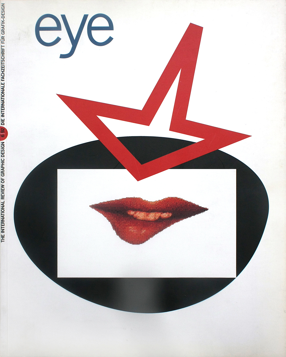
First published in Eye no. 6 vol. 2, 1992
Eye is the world’s most beautiful and collectable graphic design journal, published for professional designers, students and anyone interested in critical, informed writing about graphic design and visual culture. It is available from all good design bookshops and online at the Eye shop, where you can buy subscriptions and single issues.

