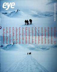
Winter 2000
Self-aggrandising, self-satisfied

John L. Walters
Stephen Banham
Frost Design
MetaDesign
Elliott Peter Earls
Office of CC
anonymous designers
Brochures: Frost, Push, Elliott Peter Earls, the Office of CC …
Self-aggrandising
The self-promotional brochure is an example of an impossible brief that designers set themselves. For many it is part of the pitch, the start of a process, from initial contact to commission, that may be carried out over the phone, in person, by email. When it doubles as a PR device, the messages can get mixed. Letterbox employ a ‘less is more’ approach with a miniature booklet that’s easy to add to a letter, disk or one of their polemical publications. Frost Design’s brochure is a crisp poster which confidently assumes that the work will speak for itself: all the work shown on the extended sheet is shown without captions. Push make an initial impression: a sleeve containing cards and a fold-out brochure held together by a robust rubber band and wrapped in a blue heat-sealed bag. ‘Push have no house style,’ they claim. Form shows an impressive amount of work (and long client list) snapped into an industrial-strength binder. This brims with the self-confidence that its recipients are waiting eagerly to add yet another item of their portfolio to the loose-leaf file. Meta forgo the beauty parade approach for A day in the life, a visual, conversational essay about a day’s work in their studio that for all its modesty implies egos as big as those at Push, Frost or Form. ‘In the course of the day … we worked towards effective, enduring, beautiful solutions,’ spins the copy. ‘The approach, working from the user’s perspective, seems to be having its day.’ In other words ‘don’t look – just feel the way we work.’
The Lilliputian +M by Spanish designers Bis ‘represents the fact that life is a collection of small moments.’ Paquebot produce similarly tactile objects, expressive and expert, indebted to creative relationships with printers and private enthusiasms. Yet perhaps they’re not so different from Frost’s brochure: creativity and craft make a pitch all their own.
(J. O’R.)
Self-satisfied
For some designers, self-promotion, self expression and showing off are all good for business, as this Emigre font catalogue for one-man-band Peter Elliot Earls demonstrates. Earls cannot detach himself from his products: he has become his own brand as much as any ambitious painter or pop star. Earls nurses musical ambitions as well, and a spirit of performance once thought antithetical to typography informs his entire body of work. Take it or leave it, it’s only rock’n’roll. The Chinese specimen sheets of the Office of CC (see Eye no. 28 vol. 7) have a confident, multicultural delight in the good things of life, that makes their cards, leaflets and other products a pleasure to receive and handle.
The more commercial the design studio (or branding consultancy), the less visual their self-generated output. Slogans are the order of the day. With the exception of SAS’s sharply focused and articulate ‘Case Histories’, visual communication through images, fine print and paper and even decent typography are often given a lower priority. Ingratiating or oleaginous blown-up buzzwords such as ‘customer’, ‘communication’ and ‘profit’ are splashed on to oversized and banal page layouts until they lose meaning.
‘Is this irony?’ you might ask, if unfortunate enough to find Fitch’s garish and breathtakingly vacant Entertainment A4 fold-out in your mail. No, just a sad, bad relic from the last days of branding (or a taste of the horrors yet to come). (JLW)
First published in Eye no. 38 vol. 10 2000
Eye is the world’s most beautiful and collectable graphic design journal, published quarterly for professional designers, students and anyone interested in critical, informed writing about graphic design and visual culture. It is available from all good design bookshops and online at the Eye shop, where you can buy subscriptions and single issues.
