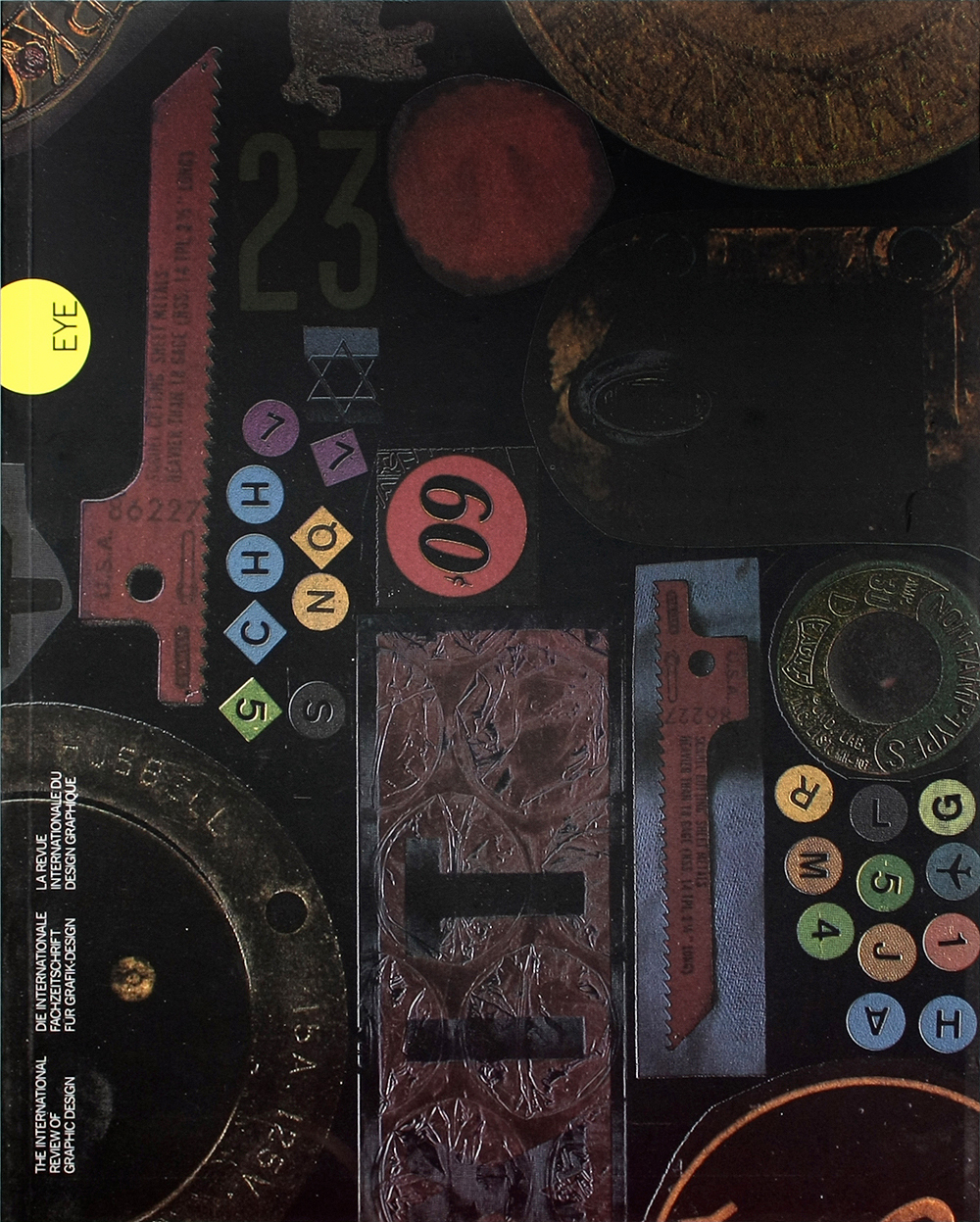
Winter 1990
Signals in the street
Poster design is an instantaneous art. Eye looks at prize-winners from “Typography Germany ’90”
What sets “Typography Germany ’90” apart from other graphic design competitions is its emphasis on typography. By consciously promoting a thoughtful and thought-provoking use of type, it has encouraged creative and intelligent solutions in which word and image maintain a fruitful dialogue.
The first “Typography Germany” competition and exhibition was organised in 1987 by Olaf Leu, chairman of the German Type Directors Club, and Eckehart Schumacher-Gebler, head of the Munich-based Typostudio. The work shown embraced a wide range of categories, including stamps, books, advertisements, business reports, calendars and posters, though not advertising posters. This year graphics from both Germanies were judged together, though only forty of the 1,000 pieces were from the former GDR. Of the 280 commended entries, many have a distinctly German flavour; otherwise the work presents a sensibility very much in the spirit of the European community.
The core of the exhibition is the poster. In many ways, the most spectacular and challenging design task, the poster has to be able to assert itself within the crowded urban landscape and to reduce its message to a bare minimum. The average poster has only one-fifth of a second to make an impression on the passing motorist. But in the case of the cultural poster, usually aimed at more visually aware pedestrians, the task is in some ways easier.
The designs of Ott + Stein provide a compelling example of what the cultural poster can achieve. The designers use empty (often black) backgrounds to throw their typographic messages into sharp relief. Sometimes the message is reduced to a signal; sometimes it is consciously complex and full of detail. In either case, the public is challenged and its involvement demanded.
“Typography Germany ’90” is an exhibition of exciting polarities. The range of work expresses the full potential of typography as an intellectual, emotional and functional tool.
First published in Eye no. 2 vol. 1, 1991
Eye is the world’s most beautiful and collectable graphic design journal, published for professional designers, students and anyone interested in critical, informed writing about graphic design and visual culture. It is available from all good design bookshops and online at the Eye shop, where you can buy subscriptions and single issues.

