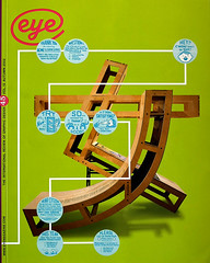
Autumn 2002
Smartest letterer on the planet
Chicago’s comic book hero has a finely tuned gift for hand-lettering
Cloistered away in his Chicago studio, Chris Ware spends hours meticulously lettering covers, splash panels and dialogue boxes. Simple conjunctions such as ‘and’, ‘thus’, ‘later’ and ‘meanwhile’ are imbued with the import reserved for more expressive bon mots. Ware, the man behind such contemporary illuminated manuscripts as Jimmy Corrigan: The Smartest Kid On Earth, Rocket Sam, Big Tex and Rusty Brown comic strips, as well as the ACME Novelty Library comic books, is a compulsive letterer. Over the past decade, Ware has refined a unique illustrative and typographic language that bridges comic art and graphic design.
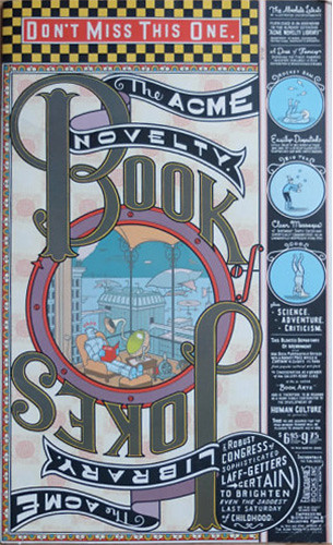
The lettering for the cover from The Acme Novelty Book of Jokes (no. 7, Summer 1996) is lettered precisely in the old show-card tradition.
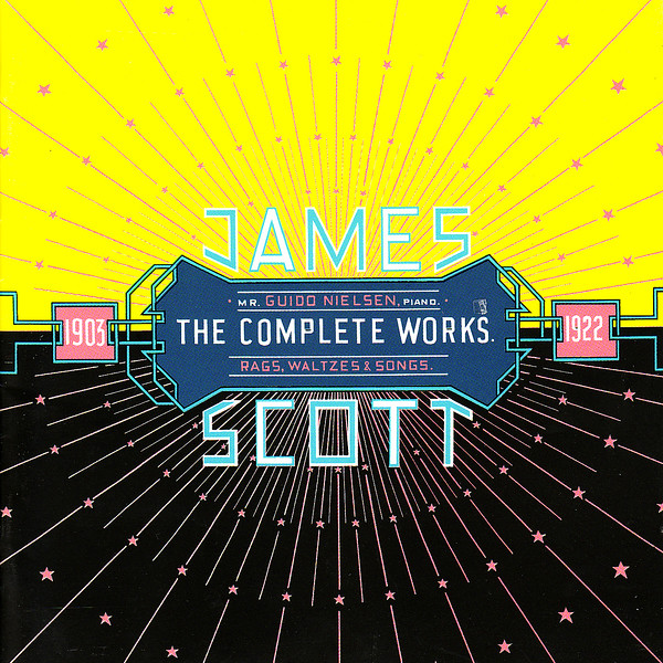
Top: Cover for James Scott: The Complete Works, 2001. For Ware, the act of rendering the notes almost exclusively by hand was a labour of love and a way of expressing his admiration for arcane ragtime.
During the 1990s, when a surfeit of stylishly distressed and often foolishly stylish digital fonts were routinely issued, Ware crafted some of the most artful alphabets and colourful letterforms seen in print, most of them for his own comic books, but occasionally for less obvious venues, too. One of these was the 2001 ‘Summer Reading’ special issue of The New York Times Book Review (under my art direction) for which he redesigned the otherwise immutable masthead, rejecting all traces of the standard Bookman typeface to conform to the visual character of the comic strip that began on the cover and continued inside, all rendered by hand. The only residue on the cover of official ‘Times Style’ was the Old English Times logo anchored to the masthead. Ware replaced the contemporary one with a much older version. This was not, however, arrogance or hubris on his part. Ware is one of the most sincerely unassuming artists I have ever known. So devoted is he to the most arcane details of vintage commercial art that he actually knew that the earlier Old English version (long obsolete) had an iota more calligraphic flourish than the newer, ever-so-slightly streamlined version. Yet more importantly, he put in the extra effort (which is considerable when one is on a tight deadline) to render these intricate letters by hand. And that’s not all. Throughout the interior of the Book Review, Ware used an original, quirkily curvilinear abstract display lettering style that transformed the publication from its usual literary look into a typographic carnival that transported the unaware readers some-WARE else.
Ware’s comics are so conceptually astute and compositionally engaging that they cannot fail but connect with their audience. His sympathetically melancholy characters (Jimmy, Rusty, Quimby the Mouse, among them), his nostalgically futuristic world-scapes, and his genius for conveying subtle time-shifts in two-dimensional space have all the components of compelling narrative. But it does not take a design critic to realise that his ingenious typography is equally (perhaps more) essential for enabling access to an eccentric comic world that could otherwise be opaque. Ware’s various lettering and typographic compositions exude a curiously universal allure and a timely timelessness like that of a personal signature. Yet one will be hard-pressed to find any of his custom (and nameless) faces in digital type foundry specimen books.
Although Ware’s comics are receiving wide exposure these days (his critically praised book Jimmy Corrigan: Smartest Kid on Earth remains a bestseller two years after its release, and he was the only comics artist to be featured in the 2002 Whitney Museum Biennial in New York), his lettering is not for sale. Rather than commercial property, his type is a personal signature and each typographic confection stems from a private obsession. ‘A type company asked me to do some fonts a while back,’ says Ware, ‘but I realised that seeing my lettering appear on billboards and annual reports would be about the most horrifying thing imaginable. Besides, I don’t really think of my lettering as fonts; it’s more or less circumstantial to the page on which it appears, and I try to let my instincts shape how it looks.’
All the letters in this cover from The Acme Novelty Library (no. 15, Winter 2001) were rendered by hand.
In addition to his instincts, however, Ware is inspired by Victorian, Art Nouveau, and a multitude of nineteenth- and early twentieth-century commercial display styles, particularly from old sheet music, magazines, advertisements, record labels and fruit and cigar labels. ‘I steal constantly from all sorts of things,’ he admits, ‘especially when something affects me emotionally, either for reasons of colour, composition, letter style – sometimes it’s even something as simple as the ascender and descender width relative to each other. I’m sure that if I’d taken a class about this stuff I’d know much better why it all works the way it does, and I wouldn’t have to fumble around in the dark so much.’ Yet fumble, fiddle or fidget, Ware has raised his lettering beyond mere pastiche into the realm of reincarnation. Ware is a veritable born-again ‘show-card’ letterer who, back before computers and photostats, effortlessly rendered one-of-a-kind lettering for signs, windows and displays.
Warmth and humanity
Of course, all comic strip artists worthy of the art must be skilled letterers. But Ware acquired his skill long after he had been doing a regular strip for a student newspaper in Austin. ‘Up to that point, I’d sort of considered type and lettering secondary to storytelling, some kind of additive decoration, at best a sort of “mood-setter”, at worst, simply titles and logos,’ he explains. But once he began studying early twentieth-century newspaper strips (as well as later R. Crumb comix) Ware realised that the older style lettering radiated what he calls ‘a warmth and a humanity that contemporary lettering didn’t, and that it had a potential as a primary expressive element, if I can say that without sounding too academic.’
He was smitten by the hand-made quality of the old methods and he decided to learn the craft (or what he calls ‘the disposition, or whatever it was that made this old lettering so great’) himself. Since he had self-consciously eliminated all words from his own comics for a number of years (‘to try and communicate everything through gesture and rhythm,’ he says) Ware was now ready to bring words back into them. ‘I wanted to get to the point where my lettering was as, or more, important than the pictures were, as second nature as drawing – that a font or a type-style would come to me as naturally as a word would come to a writer; that I would “feel” the type the same way I did the pictures and the words; i.e. that the cartooning would be of a whole, like a writer’s voice.’
Ware allows it was a tall order. ‘But I started to realise that comics were really more of a visual language rather than simply rows of pictures with words tacked on top of them,’ he says. ‘And I had an inkling that perhaps by taking more of a typographic approach to the entire medium rather than a purely artistic – or even worse, illustrative – one, I might arrive at something formally that made a more direct emotional hit than I had up to then.’
Ware lacked formal lettering training, so for many years he’d teach himself by copying examples from old Speedball manuals, the bibles of commercial show-card writing from the 1920s to the 1950s. Yet the desired effect was elusive. ‘I always gave up in disgust, sensing that somehow there was something missing in the instructions,’ he says. ‘I just couldn’t get the hang of it from those stupid pen-stroke diagrams.’ So Ware devoted increasingly more attention to display lettering, trying to learn how to use a ruler and a ruling pen. By his own account he struggled on hopelessly, until one day, shortly after moving to Chicago, he found a box of original advertising lettering artwork for a small novelty concern, the Val-Mor Company, in an old store named Uncle Fun.
The store’s owner, Ted Frankel, had briefly worked for Val-Mor before they went out of business and had retained a stack of original sign drawings which one day he presented to Ware. ‘I don’t think there was a greater single effect on me than this one benevolent gift of dusty old Bristol Board,’ Ware happily sighs. Meanwhile from this Holy Grail he instantly understood exactly how the lettering process worked, what materials were used (ruling pens and brushes) and how letterers evened out the bottom of their letters with white ink. The problems he had been wrestling with in his own strips suddenly clicked in his mind. ‘There was a clarity, as well as a humanity, to this old type – I thought it was unbelievably beautiful; it glowed with a care and respect for the reader. Most importantly, though, it suggested to me how I might approach my drawing, or more specifically, cartooning, and I began to refine my methods to reflect a more typographic approach.’
To this day Ware equivocates that his cartooning is not drawing per se: ‘it’s more like typography, a mechanical sort of “picture lettering”, which is why I guess some people hate it and say that my stuff is unemotional. I think it’s probably the same sort of approach that Dan Clowes and Charles Burns have taken – their stuff was a real inspiration, obviously, along with Ernie Bushmiller – though I doubt they were anywhere near as ridiculously self-conscious about it.’ Self-conscious or not, describing his drawings as typography underscores the essence of his unique comic characters. While they do not necessarily have the overt emotionality of a Clowes (Ghost World) or the satirically goofy personae of a Crumb, they are imbued with graphic power that make them mnemonic. His characters Jimmy and Rusty, for example, are akin to early twentieth-century trade characters, logos that adhere to the memory and evoke emotion and recognition. The characters are typographic not simply because they are geometrically rooted but because they are vessels for meaning – but hey, that’s enough ethereal analysis for now. Technically speaking, Ware’s work relies on a great facility for achieving perfection.
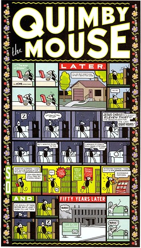
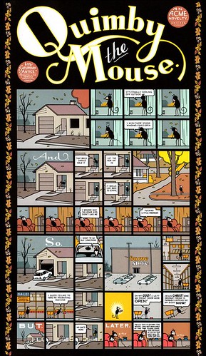
Splash panels from Quimby the Mouse.
Mechanical clarity
What distinguishes Ware’s lettering is fealty to the hand. Everything is hand-drawn on Bristol Board with pen, brush and ink – excepting, of course, the blocks of typeset text he occasionally uses, which are pasted on the originals, or assembled in Quark (the introductory pages for the comics, for example). It’s a painstaking business: ‘On an average strip, the actual balloon lettering usually takes an hour or two, the “logo” an hour or two,’ says Ware. ‘The whole strip takes about 40 hours. The cover of the last issue [of ACME Novelty Comics] took about three weeks.’ And that is because he rendered what he refers to as ‘super-fancy’ engraving lettering that ‘I’ve pathetically tried to imitate in the comic books. Sometimes, that’s more of just a personal challenge to see if I can do it, to see if I can get that sense of delicacy and care into my stuff – which I never do.’
The sheer virtuosity of Ware’s lettering should belie his self-effacing modesty. But when asked to compare why his is so painstakingly perfect while Crumb’s, for instance, is so rough-hewn, the answer suggests his motivating force: ‘He’s a good artist and I’m not.’ But he quickly adds: ‘I don’t know – I used to cartoon much more loosely, with a crow-quill, and still do in my sketchbook, though I want the fictional stories I do, at least, to have a distance to them – a sort of mechanical clarity – that I can’t get from just a pen.’
Over the years Ware has focused on expanding his lettering repertoire. His self-published zine The Rag-Time Ephemeralist, devoted to a passion for arcane turn-of-the-century American music, is exquisitely lettered and accurately typeset (with lots of Cooperplate and Latin Condensed) to suggest late nineteenth-century magazines like Phrenology or Frank Leslie’s Monthly. It is a masterpiece of typographic pastiche. It is this love of history that keeps him interested in pursuing type. But when pressed to explain why he renders a new logo for each weekly Rusty Brown comic strip, he doesn’t extol the virtues of art or history. He’s got a more practical motive: ‘I do a different one every week, just to keep things lively, and to keep in practice.’
Steven Heller, design writer, New York
First published in Eye no. 45 vol. 12 2002
Eye is the world’s most beautiful and collectable graphic design journal, published quarterly for professional designers, students and anyone interested in critical, informed writing about graphic design and visual culture. It is available from all good design bookshops and online at the Eye shop, where you can buy subscriptions and single issues.