Winter 2008
Step and repeat
Richard Rhys’s new foundry, which sells original patterns by designers and artists, gives a new twist to a timeless concept

The idea of a company that sells patterns as a foundry sells typefaces seems as logical as it is unexpected, both timeless and achingly contemporary. ‘I think things with a pattern on them go down really well,’ says Richard Rhys, the Pattern Foundry’s progenitor, with admirable simplicity. Only two years out of college, the young graphic designer has laid the foundations of an impressive new business, making and promoting his own patterns, and acting as a curator / agent for other designers, both celebrated and unsung.
Rhys first started making patterns when he worked for Alexander McQueen in his late teens, before college. Working on his own, he quickly became a ‘pattern factory’ for the fashion designer, turning out new designs on a daily basis. ‘I had an opportunity to make patterns, so I did, and I found I was quite good at it,’ he says. ‘Then I found out that I loved it.’ When Rhys subsequently went to Central Saint Martins College in London to study graphic design (he graduated in 2006), the passion did not diminish. The Pattern Foundry was part of his final-year project.
Having come up with the pattern-selling idea, Rhys began to approach other designers he thought would make interesting contributions. Soon the project snowballed, attracting illustrators and designers as well as fine artists; contributors to date include Ryan Gander, Dexter Sinister, Karel Martens, Jonas Williamsson and Alex Rich. For the next batch of work at the Foundry, to be released early in 2009, he intends to cast his net even wider, incorporating the work of a Belgian cartographer, the fruits of a research project based around some virtually unknown Peruvian artists, plus more fine artists – as well as designers such as James Goggin.
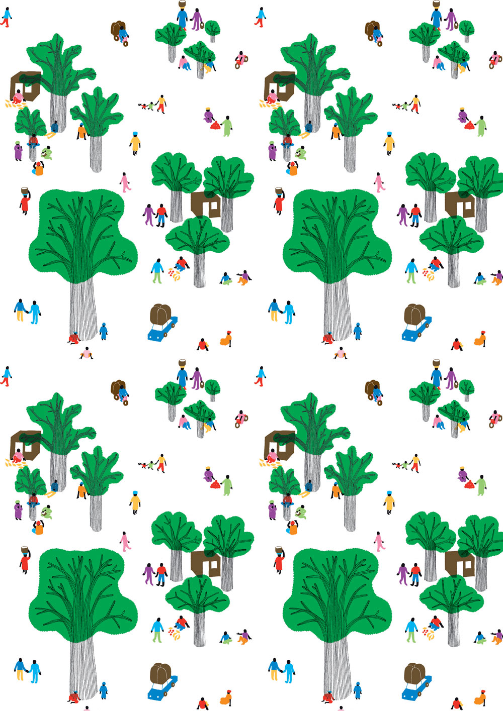
Top: AfricoKoe by Körner Union, Lausanne, Switzerland, a pattern inspired by traditional African and Pacific island drawings.
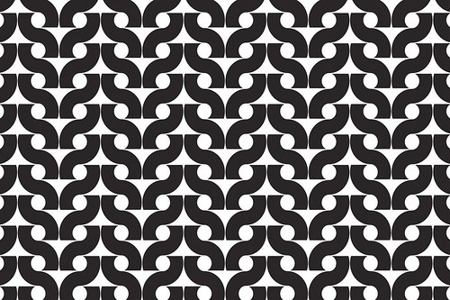
Below: Untitled 015, originally designed for the cover of Onaangepaste Pubers in Groepsverband by Dr. G. Smallegange, 1966. Pattern by Karel Martens.
Goggin, while art director of The Wire, was one of Rhys’s earliest clients when he used Distorted Rectangle for the sleeve of Wire Tapper no. 16 (a compilation CD distributed with the December 2006 issue of the music magazine). The experience convinced Rhys he was on to a good thing: ‘This is a good example of him getting the artwork off me, paying me money for the work, like he would do anybody, but this is licenced. I get paid for this work and then somebody else can uses it again!’
Among the very first people Rhys invited to supply patterns was Karen Willey, a student at the Werkplaats Typografie, the highly regarded college / studio founded by Karel Martens and Wigger Bierma. Another was Paul Elliman, who suggested that Rhys approach Martens himself, who quickly became an enthusiastic contributor to the Pattern Foundry. ‘Then I thought, wow, wouldn’t it be fantastic to get Wim Crouwel!’ Rhys says. ‘Not that I thought it would happen.’ But Paul said, “Why not ask Karel?” – because they were good friends.’
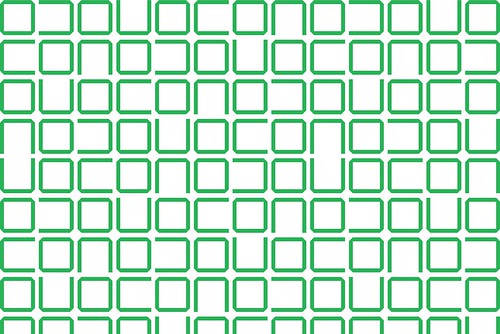
Crouwel responded immediately with a handsome series of patterns based on his New Alphabet and Stedelijk typefaces. He told Rhys that whenever he designed a face he put it into a grid-like pattern, though he never had much reason to use or even show them to anybody. The brief text for them on the Pattern Foundry website explains: ‘Selected letters have been arranged into pattern formations. The letters link up in logical ways in every direction, despite being sometimes arranged in random ways.’
New Alphabet 2. One of a set of patterns where selected letters of the designer’s New Alphabet (1967) were arranged into pattern formations. The patterns are based on three weights of the typeface: regular, semi bold and bold.
Hatching and heraldry
Karel Martens’ Untitled 015 also draws on the past, with a pattern originally designed for a 1966 book cover, a paperback of which sits proudly on Rhys’s bookshelves. Other patterns reflect Martens’ familiar experiments with overprinting in different colours.
A different, more contemporary aesthetic appears in the patterns by Körner Union, a collective that comprises a designer, a filmmaker and illustrator, all recent graduates from ECAL in Lausanne. Rhys points to their Untitled 001, with its little houses, trees and clouds, saying that the group’s illustrator gave him the story that this was about ‘life in the suburbs in Lausanne [and] the insecurities of people in that environment’. Rhys discovered the collective’s work through Select Arrange, the Vitra catalogue (see Critique, Eye no. 56 vol. 14). Cornel Windlin, its designer, was one of the first people Rhys contacted to make a pattern. ‘But he’s quite a character, Cornel,’ says Rhys, ‘so I think it will be 2012 before I get a pattern.’
Dexter Sinister, the New York practice founded by Stuart Bailey and David Reinfurt, contributed several patterns based on heraldic ‘tincture’ that reflect the duo’s deadpan humour. ‘It’s nice that there’s a white one in there because that’s just ridiculous, having white as a pattern!’ grins Rhys. Tincture is a system that uses black and white hatching to represent colours: Sable is a neat array of perpendicular criss-crossing lines, Vert a series of parallel lines angled 45 degrees to the left. It is hard to imagine anyone buying the all-white Argent, though it would make a fine background for the score of John Cage’s 4'33". (In fact, it already does.) Bailey and Reinfurt have subsequently used these patterns in several different projects: for the cloth covers of a series of architectural books for the forum Project, and as ‘coloured’ section dividers in Primer (On the Future of Art School), based on a symposium held at the University of South Carolina’s Gayle Garner Roski School of Fine Arts.
Another, more modest use of the Pattern Foundry’s work is as endpapers for textbooks reprinted by Bracken Books. Celtic Art, for example, uses Jonas Williamsson’s Hilbert Curve, a continuous fractal space-filling line which is based on a concept first described by the German mathematician David Hilbert in 1891.
Type-spotting fun
The patterns Sans and Serif by Amsterdam-based designer Karen Willey show a different kind of visual sensibility at play, and even funnier than Dexter Sinister’s solemn hatching – at least for typographers. The former is made from 1296 sans serif full stops (periods), while Serif uses 1271 different typefaces to create a larger serif full stop. Willey’s work could be viewed as a delicate, obsessive companion piece to Fiona Banner’s giant typographic sculptures for London’s City Hall, and hours of fun for type-spotters.
As to the Pattern Foundry as a business and a way of life, Rhys admits that ‘to a certain extent I’m making it up as I go along!’ The business model is close to that of a type foundry, but he realises that he will have to ask more from an ad agency wanting to base a big campaign around his intellectual property than he would charge to a small publisher that wanted to use his patterns for endpapers. Since he started publicising the site just a few months ago, Rhys has received enquiries and positive feedback from a wide variety of potential users – commercial, social and artistic – intended for purposes that vary from traditional stationery to backgrounds for websites.
Rhys envisages a time when the business of buying and selling patterns will be as easy – and perhaps even as profitable – as trading in typefaces or MP3s. For the moment, he is concentrating in acquiring more patterns, and continuing the conversation with pattern-makers, clients and collaborators worldwide. His patterns have been used for dress fabrics, wallpapers, posters and floor coverings, and he is in discussions with a Welsh carpet-maker about adapting his patterns for traditional methods of production.
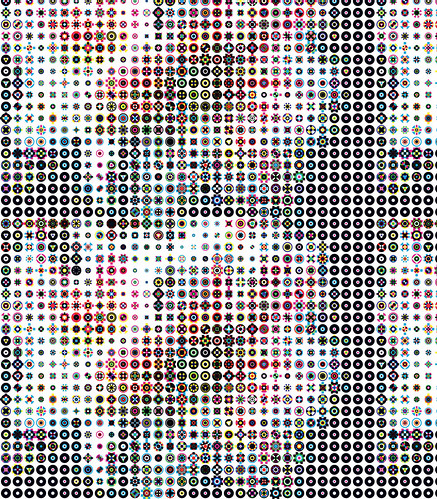
Untitled no. 2, ‘the translation of an image of a flower using special bits’. Pattern by Karel Martens.
The Pattern Foundry’s work marks a break with the past, and separates Rhys from the areas of practice he might have followed within design, illustration or fashion. ‘There are a lot of people in the fashion industry behind the scenes who don’t get noticed, working quietly behind the scenes making textiles,’ says Rhys. That’s unlikely to be his fate: new clients, contributors and fans appear all the time. He has lectured at the Royal College of Art, and has an invitation from Sheila Levant de Bretteville to speak at Yale early next year.
He also has ambitions to teach patterns ‘to little children in schools’, and other ideas that would take the Pattern Foundry beyond the perimeter of the design world. ‘That’s what excites me,’ says Rhys. ‘Like my mother would like a curtain in that,’ he says, pointing to a Crouwel pattern, ‘because it’s aesthetically pleasing. That’s the difference between a font foundry and a pattern foundry. Like my mother wouldn’t really know the difference between one typeface and another – she wouldn’t really care – but with a pattern she can say: “Yes I like it; no I don’t.”’
Recently, Odd Project, a shop in Stockholm, inquired about producing a line of Pattern Foundry products. ‘Before I know it,’ says Rhys with a grin, ‘I’m putting on a Pattern Foundry party in Stockholm!’
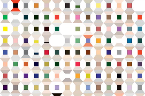
Cotton Reel. The colour system is generated randomly by a colour-picking computer script. Pattern by Richard Rhys.
John L. Walters, Eye editor, London
First published in Eye no. 70 vol. 18 2008
Eye is the world’s most beautiful and collectable graphic design journal, published quarterly for professional designers, students and anyone interested in critical, informed writing about graphic design and visual culture. It is available from all good design bookshops and online at the Eye shop, where you can buy subscriptions and single issues.

