Summer 2009
Storytelling giant
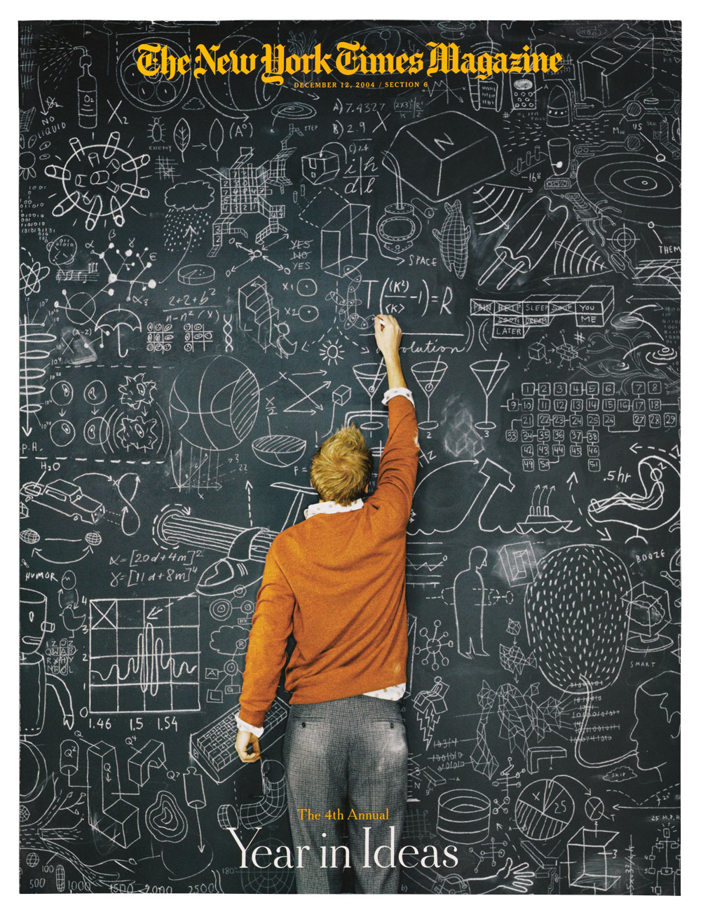
Everything Christoph Niemann makes, from visual blogs to picture books, reveals his witty, literate personality

At a recent event in Paris, Grapus co-founder Pierre Bernard raved about a poster he had commissioned to commemorate the twentieth anniversary of the Chaumont poster festival, a large black rectangle with the left-hand corner folded over to reveal an ace of hearts (the ‘A’ stood for ‘affiche’). It was one of twenty different images by as many designers, yet Bernard singled this one out for its graphic simplicity and conceptual acuity. Its designer, Christoph Niemann, later explained the poster this way: ‘Instead of trying to out-type all those other designers I went for the very conceptual approach.’
Niemann is essentially known as an editorial illustrator, but I would match his design prowess against anyone who is celebrated as a graphic designer. I’ve worked with the lanky German-born Niemann since he moved to New York City in 1997 and watched him evolve from a clever illustrator – one among many – into a virtuoso artist, designer, storyteller and commentator – one among a few.
I recall the first time I saw his work, a booklet of satiric computer icons created while he was a student of Heinz Edelmann at the Academy of Fine Arts in Stuttgart. These were not just facile puns but, seen as a whole, a veritable satire on the computer revolution. His keen ability to go beyond the one-off pictorial gag into a realm of visual profundity convinced me to assign him what became dozens of illustrations for The New York Times Book Review. He never let me down, either; with few exceptions his myriad solutions were as smart as the scores of articles he illustrated – occasionally they conveyed much more.
And I am not the only one who recognised his uncanny ability to turn words into pictorial representations that trigger everything from laughter to tears while effortlessly illuminating difficult political and social issues. At The New York Times, and I am sure this is true at other magazines and newspapers as well, he has long been the go-to artist when an art director was bereft of viable ideas (or idears, as Niemann intones in his otherwise perfect English in a lilting German accent). And most were puzzled by how, on most days, he could respond to an assignment within minutes (an hour or two at the latest), providing one or more really good idears for difficult themes. He used to keep copious sketches – from simple logos to more elaborate vignettes – in case an article commission came along that could be well served by his content, but stopped doing them because they were cluttering up his life.
Towards graphic authorship
Niemann’s work owes as much to the tenets of design as it does to pictorial illustration. During these trying days, when newspapers and magazines are tightening their belts, while he continues to make illustrations for many publications, his passions have veered towards authorship. In addition to two children’s books, The Police Cloud (2007) and last year’s The Pet Dragon: A Story About Adventure, Friendship, And Chinese Characters (a multifaceted but totally accessible lesson in deciphering Chinese characters), and a couple more in the pipeline, he creates a visual / textual blog for the New York Times website, called Abstract City.
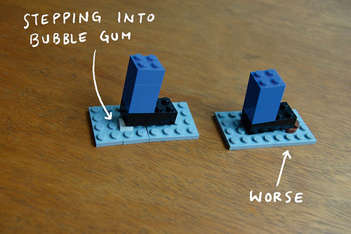
This slice of digital real estate is a hothouse for new ideas and approaches. The February 2009 post, for example, was an ingenious visual essay, ‘I Lego N.Y.’, in which he uses Lego blocks to wittily represent daily life in his adopted metropolis. What is remarkable about this blog is his ability never to repeat himself in either form or content. The response from readers has been incredible, and he is certainly on his way to becoming as popular a visual storyteller as Maira Kalman, Ronald Searle or Edward Gorey.
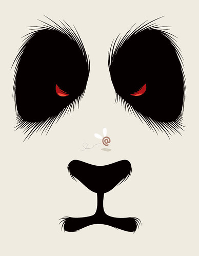
The root of Niemann’s storytelling comes down to how he sees things – major and minor things, and otherwise imperceptible things – and how he reinterprets them as art and design. Abstract City is not illustration in the conventional sense, rather a kind of visual thinking that is as rational as science and as irrational as art. It is a curiously entertaining but also forward-thinking vision, that appeals to senses on various levels.
Niemann may seem to have fallen into these opportunities for making art, but from early on he definitely had a clear sense of what he wanted to do and where he wanted to go. He knew at the outset that he wanted to become an illustrator: ‘Not a fine artist – an illustrator.’
Backstory
He studied graphic design at the Stuttgart State Academy of Art and Design because it wasn’t possible to study illustration per se. ‘I would have preferred to get away further from home (I grew up twenty miles north of Stuttgart), but it’s a really terrific school, and so I decided that instead of studying abroad, I’d have to find other ways to become more knowledgeable about the world.’
More backstory: in 1995 Niemann applied for a summer internship in New York, and spent two months at Paul Davis’s studio. The following year, he ‘hit the jackpot’: an internship at Pentagram, with Paula Scher’s team. After he graduated in 1997, the obvious choice would have been to go to Hamburg or Berlin, but he felt that this was the only time when he had nothing to lose and – like a million other illustrators from Europe, Asia and the United States – decided to give New York a shot.
It was surprising how easy he found working in an American context. ‘I work so much with cultural references and metaphors that I was concerned that I would have to acquire a whole new visual vocabulary,’ he says. ‘It turns out that the US and Germany are much closer in terms of visual and cultural references than, say, Germany and France.’
The difficulties came from different areas: he lived and worked in very uncomfortable circumstances, which he is reluctant to discuss. ‘It’s tempting to romanticise those days in retrospect, but after a year it became a bit much, and I spent two very unpleasant weeks at Beth Israel hospital, with a slipped disc and other ailments.’ Despite these early hardships, his stay in New York lasted more than a decade before he returned to Germany to make a new home in Berlin last year.
Making symbols speak
It is always challenging to unravel the mystery that is creativity, and Niemann is a wonderful case study. He is so adept at making symbols speak, of being at once representational and Rorshachian. I have long wanted to find out his formula or magic trick – how he synthesises words into picture. Yet he insists there is no easy answer: ‘I wish there was a secret. To a very large degree it’s simply practice. You develop a way of rattling words, symbols and metaphors in your head, or preferably on a piece of paper. Then you try to mess with it, and ultimately something sticks. Unfortunately the painfulness of this process and the quality of the ideas are pretty proportional.’
But is there a kind of mantra that he recites when sitting down to solve a problem? Even while humouring me, Niemann is always a gentleman. ‘First,’ he says, ‘there always is another idea, and for each job I have a certain person in mind that I would want to like the piece (whether they end up seeing it or not). I always try to imagine that person looking at the piece and wonder whether he / she would think it’s funny / lame / unexpected etc.’
And does his facility for unlocking the hard-to-extract ideas mean he receives a larger than average share of themes and subjects to tackle and tame? ‘I’ve done a good deal of “The Great Investment Guide” and “World’s Best Websites”, but in a way I do not find it too hard to come up with yet another visual for the same story. I find it much harder to draw images for a real newsworthy story,’ he says.
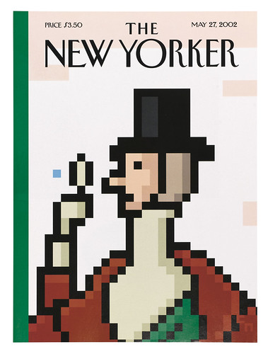
Nonetheless, he is sure-footed when it comes to commenting on the financial crisis – his weekly illustrations for the Financial Page in The New Yorker are both witty and cautionary. His ability to see humour while the rest of us see dread and despair is a true gift. My favourite piece he has done for me was for a story on how much Americans love their guns: it is a skeleton of a human arm and hand attached to the ‘skeleton’ of a handgun. Brilliant!
There are only a few illustrators I know who take as much pleasure in finding the perfect elements and creating the optimal image. Niemann explains: ‘Ultimately it’s all about how the piece is perceived by the readers. Sometimes I come up with a piece and think it’s hilarious, but realise it falls flat with the audience – and I instantly start disliking the piece myself. This means I have a somewhat distant relationship to my work. My favourites are always the ones where I have an obsession with a topic and realise that the audience shares this obsession, and something really clicks.’
Each piece is so distinct that they can appear to have come from a different person. Niemann is stylistically ambidextrous yet also attitudinally consistent. Clearly, what draws him to a particular style is critical to his visual decision-making. ‘I am a designer by education, and my approach to styles in illustration is similar to a designer and his typefaces,’ he says. ‘There are styles that are fashionable, and sometimes I find myself trying to find a venue for a spiffy pencil drawing, but ultimately it is always the idea that dictates what style I must use. Every idea needs a pretty exact amount of realism / abstraction, certain emotional warmth or cold graphic objectivity. I try to constantly broaden my range, and adapt new ways of solving problems, not out of vanity, but because it’s essential to my approach.’
Books for children
Lately he has added children to his audience (he has three young boys of his own, too), which is probably a more fundamental pictorial and linguistic adjustment than any he has made up to now. And while his first book, about a cloud that wanted to be a police officer, was rooted in the conventions of children’s fantasy, his second, which required mastery of a new textual language, pushed the boundaries further.
‘I have only done a few kids’ books and I still feel a lot more confident when working on political / cultural / business topics for adults,’ he admits. ‘The bigger transition when working with kids’ books wasn’t the audience, though, but rather working with a story. I see my editorial work as the visual equivalent of a headline. It should sum up a fairly complex topic in a simple image. It should be understood immediately and ideally, should reveal a second or third layer of meaning once you have read the story.’ Niemann notes that the way a book is read is absolutely different; he has to reveal images more slowly, the compositions can be more sophisticated, so much of it is about how the pages interact, about the play between text and image.
But let’s return to the Dragon. I am curious why he wanted to set himself such a personal challenge. ‘When I learned my first ten characters, I had the idea for the book,’ he explains. ‘Then I just looked up thousands of characters and their meaning, in order to see whether there are enough graphically simple ones that I can use for a story. It was a terribly difficult process, because I had to work with more or less finalised illustrations to see whether a given idea worked, and as soon as one character changed the whole story fell apart and I had to redo fifteen pages. It was a bit like three-dimensional Sudoku.’
The fun, he says, was being in the very same position as the intended reader. ‘In design it’s always hard to take something you know a lot about, and boil it down for the reader who knows nothing. In this case I could identify perfectly with the five-year-old who’s supposed to read the book.’
Currently he is working on a book about children and the New York subway, which is loosely based on ‘The Boys and the Subway’, his first blog post. After more than a decade in the city, he knows the language of the underground quite fluently.
Abstract city
The Abstract City blog has been an opportunity for Niemann to push the narrative process. The challenge here is to come up with the problem first and then find a solution to it. ‘To make things harder I had agreed with the editors to give all the stories a very personal angle (something I have pretty sternly avoided in my work up to now),’ he explains. ‘Since I started Abstract City I try to collect random notes on all sorts of topics that I obsess with, and wait (and hope) that I find enough to reach a certain critical mass to validate a series of ten to fifteen ideas. For most of the ideas so far I have started with the writing and then looked for a way to translate the idea visually, but I do not treat this as a rule.’ The two rules he gave himself were: ‘to more or less come up with a new approach for each post and to work only in analogue styles (as a response to only publishing it in digital form)’.
His ‘One Man’s Roller Coaster History with Coffee’ was entirely rendered on paper napkins, using mostly coffee for ink; his second post was on how he decorated the bathrooms in his new Berlin home with ‘very low-res art mosaics’.
Niemann is international to the core. His visual language is accepted in more places than the Visa card, yet it continues to change and evolve – and push limits. He has always admired contemporary art – is that a future direction? ‘I can’t really see this right now, since I am plenty overwhelmed trying to get a grip on the new directions I have just started. Maybe some idea will bubble up all of a sudden and build into a wave that washes me to the shores of the art world. For now I see too much art that I really like, and just don’t see yet what I could contribute that would fill a gap in that field.’
First published in Eye no. 72 vol. 18.
Eye is the world’s most beautiful and collectable graphic design journal, published quarterly for professional designers, students and anyone interested in critical, informed writing about graphic design and visual culture. It is available from all good design bookshops and online at the Eye shop, where you can buy subscriptions, back issues and single copies of the latest issue. You can also browse visual samples of recent issues at Eye before You Buy.

