Summer 2011
Taking care of business
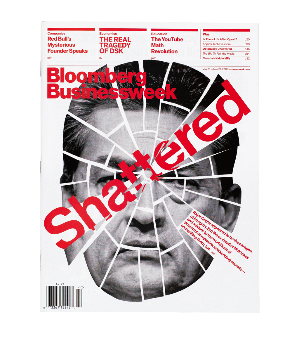
The pages of Bloomberg Businessweek explode with infographics, illustration and design experiment. Interview with creative director Richard Turley

Economic cycles breed new kinds of business publications. The rise of US capitalism in the twentieth century gave birth to Fortune, with its pioneering use of illustration, information graphics and photography, while the Dot-com boom brought Fast Company. Now today’s rise-of-the-internet, collapse-of-everything-else global economy has created the rich environment for Bloomberg Businessweek.
The financial data company Bloomberg bought BusinessWeek magazine in 2009, installed Josh Tyrangiel (formerly of Time and Time.com) as editor and relaunched in April 2010. From London they hired Richard Turley, previously the art editor of The Guardian’s G2 section, as creative director. Early online critics described the redesign as ‘too gridded’, but it has become clear that for Turley the grid is there to be broken by graphics, diagrams and pictures.
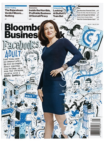
Bloomberg Businessweek covers from 2011. Creative Director Richard Turley told Grids, the Society of Publication Designers (SPD) blog: ‘A cover should just be surprising...I’m happy if it looks a little removed from what people would imagine a business magazine to look like.’ Below. Illustration by John Hendrix. Photograph by Robyn Twomey, 16 May.
Top. Cover image: Gordon Magnin, 23 May.
Bloomberg Businessweek’s pages explode with the energy of breaking news, editorial intelligence and design experiment, while achieving perfectly detailed typography. Along with its weekly counterparts New York and the New York Times magazine, Turley’s art direction is a sign that mainstream magazine design is still alive.
Simon Esterson: You seem to have that powerful combination … large resources and great design freedom. How do the editors and designers work together?
Richard Turley: Editorial and design work together very closely. What is perhaps unusual about our process (certainly in comparison to other American magazines) is the geography of our office. We work with editors and designers sitting side by side. So apart from getting on and understanding each other on a personal level, it means that we are aware of each other’s thought processes pretty much the moment they happen. That places design in a central role in the editorial process.
It was something I felt worked very well at The Guardian, which uses a similar scheme of splitting departments up and grouping editors and designers. So when we moved offices last summer and we were drawing up the seating plan, we decided to replicate it. I think also because Josh [Tyrangiel, Editor] came from Time, which is incredibly formal, and puts a lot of layers between departments and people, he was very interested in a flatter working culture.
We do have good resources. But I wouldn’t say we have design freedom. Every design decision we make is discussed multiple times. Naturally we try and push the design as much as we can, but we get pushed back a lot, too. And, to be frank, I usually agree when that happens.
SE: Everybody’s fallen in love with infographics again, but few designers seem to know how to commission and create them. How do you do it?
RT: The graphics team at Bloomberg Businessweek are best described as graphic journalists. They are as much researchers as they are designers and they collaborate daily with our network of reporters. Data is retrieved largely from the resources of Bloomberg’s network. Deciding when a graphic is called for and what kind of graphic will work best is a shared discussion between graphics and editorial.
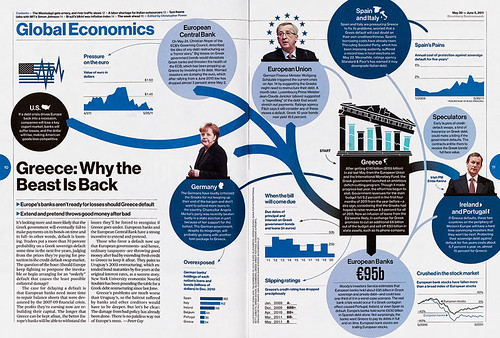
Spread from the ‘Global Economics’ section of Bloomberg Businessweek, 30 May 2011.
The resulting charts, maps and visualisations are developed narratives that go through several revisions. We try and scale a chart to the appropriate size. Often I’ve found that infographics are an afterthought, a big hole left in the middle of a layout, waiting for the chart person to provide some magic dust that somehow animates the story into a simple easily digestible visual take-out. For me, that is a back-to-front way of working. We start small and scale our charts up according to their merit. If we find a lot of good data or a new interesting take on the story then we make the chart bigger.
This highlights another way we work, which may be a bit different from other places, in that we constantly swap and exchange layouts, with multiple designers working on any given layout. We aren’t precious about people ‘owning’ layouts. We all try and figure the problems out together. This is probably best illustrated in the way we apply charts to pages: the lead designer of that page / article / section will check the InDesign documents in, after which they are picked up by one of the infographic team who adds the chart, and adjusts and changes the layout as necessary. They will add graphic elements, shift around page architecture, making their work integral to the end page design.
I have described this process before as graffiti-ing the pages. The type structure and spacing are the bricks and mortar from which we build the walls of magazine, and on top of that, we spray graffiti. Whether pictures, display typography, big numbers, charts, captioning, or illustration, they’re syncopated moments – many sitting completely free of the grid – that disrupt the organisation, breaking those grid conventions and giving energy and tone to the pages. These elements are the magazine talking to you. It’s a form of narration, with insightful or flippant, informative or sideways-glancing commentary, set in a separate voice to the author’s.
SE: How big is the design staff and how do you work as a team?
RT: Including me, we have six designers, three chart info-designers and a photo team of five. So by UK standards it’s huge. In fact by US standards it is pretty big.
We have at least one run-through of the magazine with the whole design and editorial teams every day; sometimes we meet anything up to three times and look at the run of pages. These meetings tend to be pretty informal, but we will look at every page in the magazine and discuss the design and pictures (as well as story orders / headlines etc.) pretty intensively. Anyone is free to comment and most people do.
We work as team by me forcing them to go to museums and exhibitions, often against their will. We try to get drunk fairly regularly.
SE: How did you originally get approached about the redesign project … and what was the brief?
RT: I applied for a job at Time magazine many years ago, when it still retained a bureau in London. A PDF of my work ended up on the desktop of the then design director of Time, Arthur Hochstein. When Bloomberg bought the magazine in 2009 they asked the ex-editor-in-chief of Time, Jim Kelly to recruit the editor and art director. Jim contacted Arthur asking if he knew any designers who might want the job, Arthur said ‘Well there is this guy’ [me]. He still had my PDF. Jim called me and I had a couple of calls with the people at Bloomberg. I was asked to pitch for the job, and to my surprise I won it.
There was a long brief from Josh of the design he wanted. But that was just given to me for the pitch. After that the brief was just let’s try and make a great magazine that we would want to read.
The structure of the magazine is utterly indebted to the grid and type philosophy I learned when working for Mark Porter [at The Guardian in London]. In some ways it is also some sort of evolution of Guardian design methodology and, despite the knocks [the online criticism] I took initially because of that, it has always been a source of pride that
I am taking on those principles and still living by them.
I certainly didn’t help myself by choosing Helvetica. But then that font choice was really far more about being bored with custom typography at the time. I just wanted something that didn’t surprise anyone and was just a typeface, rather than a branding exercise. I just chose the most obvious idea for a font. I didn’t think about it for long. In fact, pretty much as soon as I put the phone down after being asked to submit a pitch, I thought I’d do it in Helvetica.
I am in many ways quite a lazy designer. If it doesn’t come quickly, almost instantly actually, then I lose interest. The more I force an idea, the less convinced I am about it. Sometimes it will take a little while to find the idea, but when I get it, it tends not to change much from the beginning to the end of the process.
That said, will the next magazine I design look as similar to The Guardian? Maybe not, but at the heart of its design will always be the same discipline and structure.
I was once working with Mark Porter on an Italian magazine called Internazionale, going back and forth with him as we tried to reinvent our (well, his) style. And there was a moment when Mark came over and said: ‘I just did a few pages a bit like The Guardian. It may not be the most exciting thing for us, but it looks right.’ I remember that moment: freeing yourself from an obligation to reinvent yourself. If you’re getting hired to do a job, the chances are it is because they like the work you’ve already done, so pushing yourself to do something markedly different is often just a posturing exercise. Most good magazine design isn’t about the design, it’s about the strength of the ideas and how they are expressed with the typography and pictures. Design is just a bullshit word to articulate that process.
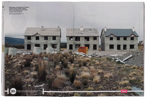
‘Stuck’: a double-page photograph of an unfinished ‘ghost’ estate in County Leitrim represents the collapse in Ireland’s housing market.
SE: What do you see as the differences between working at The Guardian and working life at Bloomberg Businessweek? Or working life in New York compared to London?
RT: Sounds a little trite but you can take your career seriously over here without feeling somewhat apologetic about doing so.
I love it. I am very, very happy here. One different thing about working in New York is the crazy attitude to picture cropping. I’m sick of people not cropping pictures. I’m wary of this holy attitude we have to photography and photographers.
If a picture is great then yes, no crop, no text on it. I anecdotally know of a big magazine over here where the art director doesn’t get to see the spreads until the picture editor has approved the crops. I mean: crop the pictures! It is fine to crop pictures. It’s good to crop pictures. The single book that led me into this industry was Harold Evans’ Pictures on a Page: Photo-Journalism, Graphics and Picture Editing. [See Eye 73]. My dad bought it, probably by accident. We had this book on our shelves at home. I used to obsess over this book as a kid, even though I didn’t really know what it was about. The best chapter in it is the one where it tells you how to crop a picture.
SE: How much influence has the fact that it’s a business magazine made to your art direction?
RT: Power is fed by money, so following the money is a good way of understanding power. Moreover, I think money is central to the way we perceive ourselves, like it (or admit it) or not. Personally, I have always been interested in business. I am far more interested in business than I ever have been in politics. Money is the system that runs us.
Simon Esterson, Eye art director, London
First published in Eye no. 80 vol. 20.
Eye is the world’s most beautiful and collectable graphic design journal, published quarterly for professional designers, students and anyone interested in critical, informed writing about graphic design and visual culture. It is available from all good design bookshops and online at the Eye shop, where you can buy subscriptions and single issues. You can see what Eye 96 looks like at Eye Before You Buy on Vimeo.

