Autumn 2018
The alternative viewpoint
The magazines in the stable of Jop van Bennekom and Gert Jonkers are as distinctive in their editorial voices as they are in their visual tone and design

The Dutch-born creative director Jop van Bennekom leads a growing armada of niche publications and brand collaborations. Fantastic Man, a quietly sophisticated alternative to the genre of men’s magazines that was launched in 2005, is the flagship magazine. It was joined in 2010 by The Gentlewoman, with Penny Martin as editor-in-chief and Veronica Ditting as art director. This bi-annual magazine rethinks the category of women’s magazines by claiming to represent the way modern women actually look, think and dress, and by publishing in-depth interviews with iconic women, from Beyoncé to Vivienne Westwood, conducted at moments when they are not focused on promoting a product.
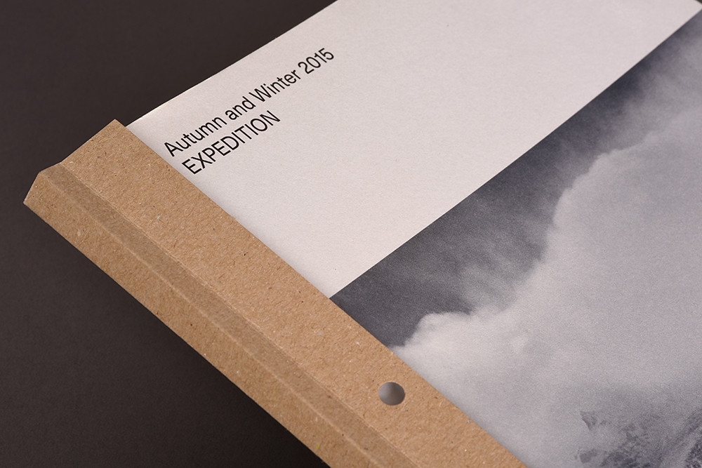
More recent publications include COS magazine for the Swedish high street fashion brand, and The Happy Reader for the classic literature division of Penguin Books. Both posit that, as well as being marketing targets, consumers can also be readers and intellectual contemporaries of the magazines’ producers.
Van Bennekom’s first experiment in publishing was Re, a magazine he developed while a graduate student at the Jan van Eyck Academie in Maastricht in the late 1990s. Although it attracted the attention of the design community, it did not reach far beyond its avant-garde milieu. ‘At first, I was creating content for myself … to get away from self-serving design in the Netherlands,’ says Van Bennekom. He admits that Re, which addressed a new theme in each issue, was a ‘confused project’.
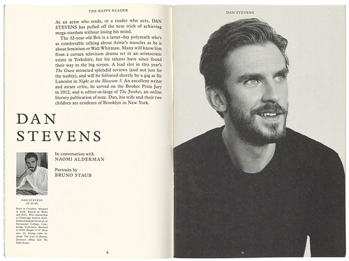
Cover and spread from The Happy Reader, No. 1, Winter 2014 featuring actor Dan Stevens.
Top: Cover from COS magazine, edited by Jop van Bennekom and Gert Jonkers in collaboration with fashion company Cos, showing a detail of the ‘Expedition’ issue, Autumn and Winter 2015. Creative director: Veronica Ditting. Designer: Helios Capdevila.
With his next venture, Butt, (see Eye 61) a gay magazine launched in 2001, Van Bennekom and his publishing partner Gert Jonkers brought increased experience and a more closely defined editorial filter to their subject matter. With low-key typography and unflinchingly realistic photographs printed monochrome on pink paper, small enough to hold in one hand, Butt’s distinctive and self-assured sensibility quickly attracted the attention of the art and fashion establishment. It also drew advertising support from big brands such as Gucci, Helmut Lang and Dior Homme, and gained an unlikely success well beyond its initial audience.
Van Bennekom moved to London in 2009, even though the consumer magazine industry and the advertising revenue model were collapsing around this time. Despite this, Fantastic Man and its related titles continued to grow, and they now draw 95 per cent of their revenue from advertising, with brands regularly approaching them for collaborations.
‘For me, it’s been a golden time,’ Van Bennekom observes of the thirteen years since the launch of Fantastic Man. ‘I think we were very early in creating an alternative to the internet … it was an intuition of ours to focus on really good content and pictures, and on profiling people who are worthwhile, while consumer magazines were not investing in content at all.’
Now he sees a revival of the independent magazine format and is optimistic about what he refers to as ‘directional’ magazines – a growing number of biennial or annual publications with focused topics, such as ‘plants, Syria, fathers, scriptwriters, or whatever.’ He particularly admires The Real Review for its editorial attitude and awkward format.
Fantastic Man is still a Dutch company with a sister company in London, and Van Bennekom retains an office in Amsterdam where he returns once a month. He thinks the success of his magazines has been due to his Dutchness, his stubbornness and the fact he came from outside the fashion system. His and Jonkers’ ‘mission to save publishing’ developed well away from global urban centres such as London, Milan or New York.
COS magazine, Autumn and Winter 2016, ‘Re-Nature’. Art director: Van Bennekom. Designers: Merel van den Berg and Helios Capdevila.
‘On Paper’, Spring and Summer 2015, ‘inspired by a love of paper and the tactile pleasure of consuming words, images and ideas on the printed page.’ Art directors: Van Bennekom and Ditting. Designers: Ditting and Helios Capdevila.
The latest COS magazine, ‘Building’, Autumn and Winter 2018. Art director: Merel van den Berg. Designers: Capdevila and Antoine Roux.
Van Bennekom is aware that, now he and Jonkers are publishing veterans who consult for numerous fashion brands and understand the mechanics of the fashion system, it is harder to retain this ‘outsider’ quality. Today he leads a team of around 50 people, overseeing four magazines, three websites and a range of multimedia brand collaborations. He still retains tight control over the visual quality of his magazines – working with photographers on the casting and art direction of images and continuing to hone page grids and typography – but there is a risk that these elements will become codified.
The influence of Fantastic Man’s tongue-in-cheek perspective on masculinity has pervaded the media landscape and can be seen everywhere, from luxury e-commerce sites such as Mr Porter to the casting of more recognisably ‘real’ men in advertising campaigns. What is harder to replicate is the way the design is enmeshed with the content, as Van Bennekom is also a guiding presence in the editorial direction of each issue, even providing input on articles. He told Aerodrome journal: ‘The design has so much to do with the content, and my design is almost nothing: it’s just a very classic typeface with a bunch of rule lines. It’s more how it sounds with the paper – how the whole thing comes together.’
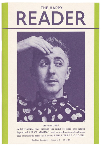
His collaboration with Penguin Classics, The Happy Reader, follows the same form-follows-editorial logic, even though the quarterly publication is designed by Penguin in-house designers Matt Young and Tom Etherington, who work within guidelines developed by Van Bennekom and Helios Capdevila. Each issue of The Happy Reader – in the form of a small-sized, 64-page subscription publication printed on paperback-book paper – includes contributions that relate to a book from the Penguin Classics range, alongside a long interview with a notable reader, such as comedian Aziz Ansari or actress Kristin Scott Thomas. Signature Fantastic Man design gestures are carried over, such as centred and justified typography, and the same attention to detail prevails in the provision of thumb space at the edges of pages, references to Penguin’s design legacy and links between the endpapers and the subject of the book featured inside.
Cover of The Happy Reader, no. 8, Autumn 2016. Design concept: Jop van Bennekom and Helios Capdevila. Design: Tom Etherington.
Cover from The Happy Reader, a small-format (246 × 172 mm) quarterly publication created by Fantastic Man for Penguin Classics. In issue no. 4, Autumn 2015 the celebrity subject is actor Alan Cumming. Design: Jop van Bennekom, Helios Capdevila and Matthew Young.
With the stewardship of COS magazine, which Van Bennekom took over from Saturday magazine, the brief was to make a less brochure-like and more editorially considered publication, and to create an intellectual and ‘attitudinal’ context around the brand. It is the least personality-driven of Van Bennekom’s publications, focusing instead on more abstract themes, such as materials and textures. The current issue looks at ‘Building’, for example.
Even as he continues to attend to the details of kerning, image sequencing and budgets, Van Bennekom conceives of a magazine in broad terms. These extend beyond its print and digital pages to its role as a nexus for a network of relations, gathering a like-minded public into being, and performing as a community generator. ‘A magazine is not just a magazine,’ Van Bennekom says, ‘it’s also about people, collaborations and clubs.’ The Happy Reader can be considered as the manifestation of, or stimulus for, a book club. After Butt forsook its printed format, it pioneered a pre-Grindr-app social network presence with around 50,000 members as Club Butt. And The Gentlewoman Club, with its activities for members at stores in several cities, is given precedence over the magazine on the website’s masthead.
As other comparable independent magazines, such as 032c, launch their own fashion labels, Van Bennekom considers a similar possibility. Fantastic Man has ‘dabbled’ with merchandise, including an underwear collection with The White Briefs, jeans in collaboration with Acne and a cologne with Byredo. But ultimately Van Bennekom considers the day-to-day work of running a fashion label as belonging to a different conceptual and economic reality to that of creating magazines, or even clubs. While allowing for the possibility of new ventures, he is most concerned with the precise arrangement of text and image on the page, refining his fleet of rather fantastic magazines.
Alice Twemlow, Professor, Design Readership: Design and the Deep Future, Royal Academy of Art The Hague (KABK)
First published in Eye no. 97 vol. 25, 2018
Eye is the world’s most beautiful and collectable graphic design journal, published quarterly for professional designers, students and anyone interested in critical, informed writing about graphic design and visual culture. It is available from all good design bookshops and online at the Eye shop, where you can buy subscriptions and single issues. You can see what Eye 97 looks like at Eye Before You Buy on Vimeo.


