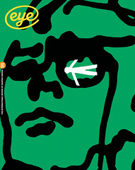
Spring 2016
The case of Romek Marber
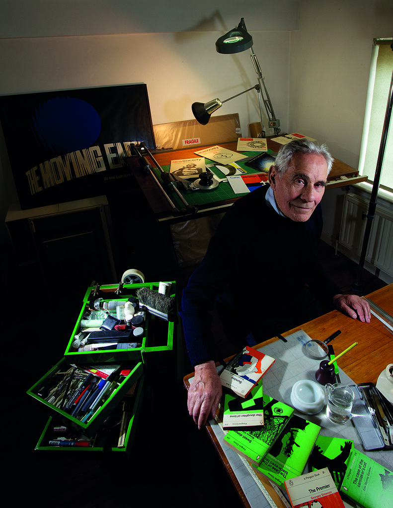
The Polish-born graphic designer behind Penguin’s ‘Marber grid’ helped to define British postwar graphic design with work of great power and originality. His work can be seen in a touring exhibition, now in Krakow. Interview by John L. Walters. Portrait by Philip Sayer

When Romek Marber (b. 1925) arrived in the UK in 1946, he could hardly speak the language. A decade later he was writing notes on the design of Penguin Crime book covers that would soon revitalise the entire paperback list.
Marber was then the latest in a long procession of émigré designers who had left their stamp on the British publisher. He was a late starter, not through choice but as a result of war. A Polish Jew, he narrowly escaped death in the concentration camps of occupied Poland, and in the chaos following the Second World War he came to Britain via Switzerland and Italy. His early experiences are described in his moving memoir, No Return: Journeys in the Holocaust (2010). In the late 1940s, while Marber was employed sweeping floors at a London clothing factory, he struck up a friendship with a Belgian dress designer, who learned of his interest in art and encouraged him to attend evening classes. When he applied for a grant to study painting full time at St Martin’s, he discovered that financial support for refugees was only available for vocational courses. Marber was obliged to study design.
After St Martin’s, Marber went to the Royal College of Art, where his fellow students – much younger than him – included rising stars such as Alan Fletcher. Though Marber was offered a job by Ashley Havinden of Crawfords on graduation, he decided against working in advertising and set out to establish his own practice, supplementing his income by teaching and working part-time for Herbert Spencer, the legendary designer / editor of Typographica (see Eye 31).
In retrospect, Marber joined the British design scene at a key moment, rubbing shoulders with individuals such as Anthony Froshaug, Derek Birdsall and Fletcher, and printer Desmond Jeffery, whose Marylebone studio he used to set the type on his covers for Penguin Crime.
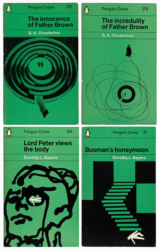
Marber is rightly celebrated for these Penguin covers and the ‘Marber grid’ that transformed the look of Penguin Books in the 1960s, but his work for other clients, including manufacturers, distributors, publishers, newspapers and film producers, is equally arresting. With its no-nonsense use of sans serif type, highly original illustration, sharply conceived photography and photograms, Marber’s design encapsulates a distinctive form of European Modernism with a British émigré twist.
Penguin Crime covers, early 1960s, designed to the ‘Marber grid’, with type set in Standard (then the British name for Akzidenz Grotesk) in the Marylebone studio of printer Desmond Jeffery.
Lord Peter Views the Body, and Busman’s Honeymoon, by Dorothy L. Sayers, 1962. Marber used a small white cut-out figure as an identifying device for all Sayers’ Penguin Crime novels.
Throughout his career Marber worked from home: first in Notting Hill; then in a flat on the third and fourth floors of a Georgian house in Harley Street; and then in a house in Gloucester Crescent, Camden Town, before leaving London for the countryside in Essex, where this informal conversation took place.
John L. Walters: When you started out as a designer, what equipment did you need?
Romek Marber: Very little: a table to work on; pencil and pens and brushes. One wasn’t at all as business-oriented as I imagine designers are today.
JLW: It’s gone full circle now. If you have a laptop you can work in a bedsit.
RM: Well, at that time we didn’t have laptops. Design wasn’t such a clean profession that all one had to do was hit the keys of a keyboard. One had brushes, pens … One did things in a completely different way. It was necessary to have skills in order to express oneself visually, what one wanted to do. Even to draw a clean straight line without smudging …
JLW: What would you use? A Rotring pen?
RM: Oh, no, no, when I started there was no such thing. That was much later, that was quite an advanced tool. One used ruling pens, brushes, pencils: one didn’t need very much.
All typography was done on a layout pad. It wasn’t a question of instantaneous change from one size to another, from one font to another. One had to mark it up on layout paper.
JLW: When you specified type would you always do that on the layout?
RM: Oh yes, [I marked] all the specifications and that’s what went to the printer. One indicated exactly the type, the size, the line spacing, indents, anything. One had to have a previous idea of what one wanted it to look like. Actually, you didn’t see it until you got the proofs from the printer. Any change was quite expensive – one couldn’t just change it at will. One had to be quite positive in how one did it.
‘Slightly primitive’
JLW: You made distinctive use of photography in your covers.
RM: Well, I used a camera in my work, and an enlarger, but I didn’t have a darkroom. I used to wait until it got dark and the kitchen wasn’t in use, quite late at night. I had a screen to cover the window …
JLW: … and this was your darkroom?
RM: Yes, and my print room and everything.
JLW: Did you work with 2¼ inch square format film or 35mm?
RM: Both. I’m not a photographer, but I use photography.
JLW: You’ve always worked from a home studio – was that ever a problem with clients?
RM: You know, Harley Street was right on the corner of Cavendish Square, so it was right in the very centre of London, and people didn’t find it too difficult to come and see me.
What I very often found was that clients who came the first time quite liked the slightly primitive way that I worked. It was a surprise to them, because at that time designers had been influenced by the set-up of designers in the US.
Harley Street was a good address; so was Gloucester Crescent, where I had very nice facilities, nice rooms and a house. I now live in the Essex countryside surrounded by fields, as you can see.
JLW: Did you socialise with other designers?
RM: Yes, I saw most of the designers – mind you, there weren’t all that many in those days! Derek Birdsall, George Daulby and George Mayhew were students at the Royal College but they are (in the case of Daulby and Mayhew were) friends. David Gentleman and Dennis Bailey were ahead of me at the Royal College, not my contemporaries, but remain close friends. Alan Fletcher and I studied together at the Royal College in the same year, and we retained a close friendship. I have a beautiful photo of him and myself, taken by his wife Paula years later, on a trip to Lavenham, Suffolk.
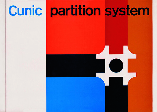
Identity and print design for Cunic, late 1950s. Cunic was a new system for creating office partitions, devised by Robert Nicholson, brother of Marber’s former tutor Roger Nicholson.
JLW: In the 1960s some designers became more like agencies. Did you think of going the same way?
RM: No. I don’t know why, because I knew them all well, and I used to go to their studios. There was, of course, Pentagram, then called Fletcher Forbes Gill; and there was BDMW (Birdsall, Daulby, Mayhew and Wildbur), who were very much connected to Balding & Mansell, the printers.
It was the time when Alan Fletcher came back from the United States – he had been on a Yale scholarship and had worked for Fortune magazine – with this idea that designers as a group should publicise their profession, and that’s how D&AD began.
It was a very alive period for designers, architects. It was the 1960s and there was a certain optimism in the air. In fact, with everybody.
JLW: Were clients sympathetic to designers in those days?
RM: No. In Britain, even big companies had not much of an idea of how to use designers, so really everyone had to educate the client. I remember at the time I was art director of the Observer, I had a phone call from someone who was very pleasant, telling me that they had just built a new warehouse and that they were advised by an architect that they should get in touch with me about their identity. The warehouse wasn’t completely finished and I was very busy, so I said I didn’t know whether I could do it. But he was so persuasive and pleasant over the phone, I said yes.
[The warehouse] was a tool distributing company, quite big. So I went to a little suburban house in Ealing, West London, and there was this big jovial man sitting behind a desk, telling me how much he would like me to do his designs. Then he produced a whole lot of designs that were presented to him by printers, for nothing.
So I said to him, ‘Mr Matthews, you must understand that I won’t do you a design for nothing. What I submit I have spent a certain amount of time on. There will be a fee for it.’ And then he asked me what the fee would be? I said: ‘There will be two fees: one is the design fee. The other fee is the actual implementation of the design.’ And I gave him a kind of a vague figure. He said, ‘Let me take a breath.’
He was a big man, and he wasn’t used to paying anything. And then he said ‘All right.’
And I had a fantastically good relationship with the company for many years!
JLW: You also had a very good relationship with the Nicholsons.
RM: They became very close friends. I had a long working relationship and personal relationship with them for many years. I first met Roger Nicholson, brother of Robert Nicholson, when I did evening classes at St Martin’s. [Marber later designed Nicholson’s Streetfinder and London Guides, and the identity for Cunic.]
JLW: It sounds as if many of your client relationships started in a fairly casual way.
RM: Do you know, I have never looked for a job!
Type and education
JLW: Did you have skills in typography when you left the Royal College of Art?
RM: No. The only school to do type was the London School of Printing (later the LCP / LCC). There was absolutely no typography at St Martin’s, and even at the Royal College typography wasn’t taught as a discipline. One simply used type.
In 1955, Marber’s fellow RCA graduate Alan Fletcher left his post as assistant to Herbert Spencer (the influential designer and editor of Typographica) to take up a scholarship at Yale, and recommended Marber to Spencer, who offered him a part-time job.
RM: That’s where I got my first experience of what typography is. Where I learned to mark up type and to prepare sheets for printing.
JLW: Was that from working alongside Herbert Spencer?
RM: Yes. At that time he did a lot of work for London Transport and London Underground, and that is where I really learned about typography … and I learned how to specify the page for the printer – you know, that was a most valuable experience for someone leaving art school to have had.
Marber was also offered a teaching job at St Martin’s.
RM: One of the first things I did was to persuade the principal that we needed some typesetting facilities (he appreciated that this was lacking). The budgets were terribly small but I got someone to teach typography and to set up this tiny little print room with facilities to compose the type and to print it. I asked Libertad, Desmond Jeffery’s first wife, to come in and set up the type facility at St Martin’s. The budget was very limited, and she came once a week to work with students. I was only there one day a week, so I hardly ever saw her. Libertad is Spanish – her parents had fled from Spain to France during the Civil War.
Cover for The Economist, 1961. Marber designed the covers overnight in his home, in which his living room doubled as a photo studio and his kitchen served as a darkroom after dinner had been cleared away. A motorcycle courier would arrive to take the artwork to the printer the following morning
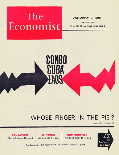
Covers for The Economist
RM: Originally the Economist covers were just text, but they decided to have a pictorial cover. It was printed on newsprint, very thin paper. And I loved doing those covers. I really loved the impression …
They had appointed a new art director, Peter Dunbar, who was a painter, so he had no idea about design and he didn’t know anybody. A friend of his told him about me, and a few months later someone knocked at the door and said a friend of mine has just become the art director of The Economist and he is desperate to find designers to do the covers.
Well, I was very excited and said yes. Then I was told that the cover had to be done in less than 24 hours, so I became very apprehensive that I could do it in that time.
JLW: When were you given the subject for the cover?
RM: The magazine had to be on the newsstands on Thursday. On Wednesday it was printed; on Tuesday I was told what the subject would be. So I was called to The Economist – at that time it was still in temporary accommodation before moving to its new building in St James’s Street, designed by the Smithsons. I used to come in about ten or eleven o’clock and wait for a decision about which story would be featured on the cover. Sometimes the decision would not come until four in the afternoon.
JLW: Did you stay there all day?
RM: Oh yes, we would go to lunch, we had drinks, it was a very pleasant day. The covers that I did were not easy to do in a short time. One didn’t do a very perfect image, one just indicated what one intended to do, what the story was about, and the editor said yes.
I used to go back home to the studio, and the next morning there was a motorcycle messenger waiting for the artwork at 9am, because it had to be at the printers early on Wednesday for the magazine to be on the newsstands by Thursday. I enjoyed doing those covers. I really liked that.
JLW: So you had to work late into the night?
RM: Yes, to produce finished camera-ready artwork. Once I had a positive idea of what I wanted to do, I just sat down and did it, using the sitting room and the kitchen to process things … developing sometimes. I didn’t have much control about the cover lines, because they were left until the very last minute and phoned through to the printers. Therefore they could be placed anywhere on the cover.
JLW: Did you ever have to do alternative covers?
RM: No. It was quite relaxed. You might think it would be tense but it wasn’t. There was no likelihood of it being rejected!
Photomontage cover for New Society, 1967. An agency picture of British prime minister Harold Wilson is juxtaposed with Marber’s photograph of his own fist.
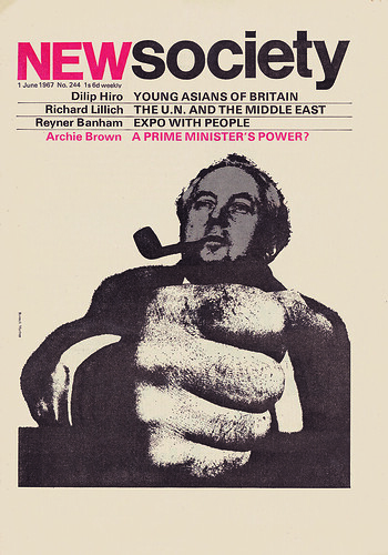
The type for Marber’s Penguin Crime covers was set by printer Desmond Jeffery.
RM: I knew Desmond well, because I worked in Harley Street, and he had his printing press in Marylebone Lane, a narrow lane between Wigmore Street and Oxford Street. I used Desmond for setting the type for all the Penguin covers. He was the only person in Britain who had Standard [Akzidenz Grotesk], which was a bit worn, of course. He had a template, which is to say he had a chase already set up. I just gave him the title and some indication of how the lines were going be to formed, and he would send me back a proof.
JLW: Did you just walk there?
RM: Yes, round the corner.
JLW: What was it printed on?
RM: [Jeffery] did it on a proofing paper, specially coated for proofs, which were then pasted up as part of the artwork.
JLW: Good quality?
RM: Very good quality. Every printer had a thing called a proofing press. He would print on this beautiful kind of satin paper. Of course, one realised at that point, by the time the type reached the actual cover of a Penguin book, it was first set, then proofed, then pasted up, then photographed, and then printed, so then it wasn’t normally as crisp as it would have been when it was printed off the font. But Desmond’s fonts weren’t very pristine …
JLW: Had he used the font and press for a long time?
RM Oh yes, he did all the setting himself, usually in Standard and one other face, a classical face … Desmond was the only one that had Standard. Very limited. He didn’t have a Monotype or a Linotype setting machine, so it was all cold metal.
JLW: So you have letters that have character …
RM: Yes, in some ways it adds … a visual softness to a line of type. Today, it’s all too crisp. That applies not only to type, but also to photographs. There are always too-perfect edges to everything, and this doesn’t only apply to print but also to film and television.
JLW: … and to music …
RM: If you ask me which I prefer, it’s the letterpress page, because the edges of the letters are not as perfect, and the impression of the letterpress on the paper is totally different.
Desmond Jeffery and the vicar
JLW: Jeffery didn’t like to call himself a designer …
RM: No, he called himself a printer. He was a great disciple of Anthony Froshaug. I got to know him well and we used to drink in the same pub, the Pontefract Castle. He wouldn’t print for everybody, he was quite selective, and he was quite a difficult character.
JLW: In what way was he difficult?
RM: At times he drank too much, so this made him unpredictable. You know, it’s a sad thing that he moved eventually (he made a number of moves) to Kettlebaston, a village in Suffolk. For his printing press he rented the old school, which belonged to the church … a tiny little school. And he didn’t like the vicar. I don’t know for what reason.
And eventually he shot him!
JLW: With a gun?
RM: With a gun.
JLW: What kind of gun?
RM: A .22 rifle. I recall sitting in a pub in Kettlebaston when Desmond was telling everybody, including the local policeman, how he was going to ‘do in the bastard’. There was this kind of animosity between him and the vicar. Mind you he [Jeffery] was an anarchist.
I got a telephone call after twelve o’clock late at night from Piccadilly Underground station. The voice said: ‘Mr Marber you don’t know me, but I know you, and I know you are a friend of Desmond Jeffery and I have just picked up the late edition of the Evening Standard. And it says in the margin that a Suffolk printer shot the vicar. Do you think that could be Desmond?’
And I said, I’m absolutely sure that it couldn’t be anybody else!
He ended up in Norwich prison, then he was released on bail. And while on bail he rang up the vicar (once he knew he was off the danger list) and said that he didn’t mean to shoot him. At which point the vicar rang the police and said he was being molested by him – and he then had to go back to prison.
At the trial (I didn’t go but my wife did) the ballistics expert said that it was highly likely that the bullet ricocheted and hit the vicar – who was just picking out a biscuit from a tin – through the window.
JLW: Bizarre, almost like a British film …
RM: Yes … of that period. The whole thing was a bit of a farce.
JLW: What was the conclusion of the trial?
RM: Once the ballistics expert testified that most likely the bullet ricocheted off a tree, the case against him couldn’t be proved. There was a local young chap who worked on a farm who used to go out shooting with him. When he was called as a witness, he said that he never walked in front of Desmond, he always made sure he walked some yards behind him!
At the time he taught at the London College of Printing (LCP, now the LCC), where he was a great favourite with the students. The LCP students collected money to get some defence lawyers for Desmond. Then there was someone who had strong connections to Amnesty; and as Desmond was an anarchist, some other influential people provided a barrister.
Desmond Jeffery was declared not guilty.
He was a very likeable man. He spent a lot of time in the pub, and he did some lovely typography for Greene King, the brewery in Bury St Edmunds. At the trial, the boss testified as to what a nice chap he was.
Striptease, 1963. Cover designs for the first Penguin editions of crime novels by Georges Simenon, published in ‘fiction’ rather than ‘crime’, featuring Marber’s own three-colour illustrations.
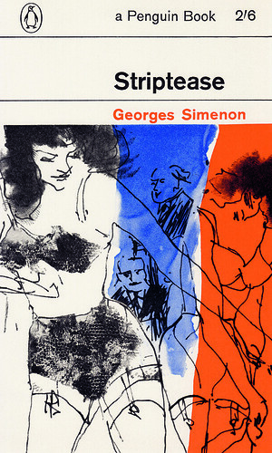
John L. Walters, Eye editor, London
First published in Eye no. 91 vol. 23, 2016
Eye is the world’s most beautiful and collectable graphic design journal, published quarterly for professional designers, students and anyone interested in critical, informed writing about graphic design and visual culture. It is available from all good design bookshops and online at the Eye shop, where you can buy subscriptions, back issues and single copies of the latest issue.You can see what Eye 91 looks like at Eye before You Buy on Vimeo.

