
Spring 2018
The contents
An unglamorous page, true, but it’s also a clever multi-tasker, says Mark Porter
The contents page. The T. O. C. (Table of Contents). Sommario. Sommaire. Inhalt. Making a good one is an under-appreciated art. Although, after the cover, it is usually the first piece of editorial content that readers see, it can often be the last thought for editors and designers. Rarely considered glamorous or important enough to be part of the initial client / editor presentation, the contents page is easily forgotten while more engaging or problematic parts of the magazine are sweated and agonised over. On one of our recent redesign projects, editorial guidance and text for the contents arrived just twenty minutes before the printer’s deadline, causing profound anxiety and an intense 100-metre sprint of enforced creativity. Really, the T. O. C. deserves better.
A good contents page is an over-achiever and a multi-tasker. It is a navigation tool, a sales pitch, and a brand statement all in one. Just how hard it needs to work depends on the nature of the title. What works for The Economist won’t work for 032c. A literary review or a scientific journal demands a rigorous listing of article titles and authors’ credits. A style magazine is more likely to prioritise a visual feast. Design teams can be inclined to view it as an exercise in information design, with rules and tabs worthy of a Swiss railway timetable. The photo department sees it as a place to display images without the cacophony of competing headline typography. For the editor, it’s an opportunity to run another celebrity portrait, in case you missed the one on the cover. And the 300-page heavyweight glossies slice it up into sashimi-thin fillets so they can clone ‘premium positions’ for advertisers.
Do readers actually use the contents for navigation? It’s an intriguing question. Flicking through pages is probably a more satisfying way of sampling, but nothing is more frustrating than getting hooked by an attention-grabbing coverline then failing to find the article that belongs to it. Even if wayfinding is a low priority, a contents page can be a great place to express the spirit of a magazine, to make a statement about who you are and what you believe in.
Th best are unmistakable. The much-imitated Vibe magazine always ran a provocative full bleed photo with a bold label in sans-serif caps (eccentrically stacked CO/NTEN/TS), and an artfully minimal list of articles. Under art director Fred Woodward, Rolling Stone used bold illustration on the contents page as a foil to photographic covers. The great Willy Fleckhaus – the art director’s favourite art director – was responsible for two classics of the genre. In Twen, the German youth magazine of the 1960s and 70s, he reinvented the contents page every month, combining Teutonic typographic rationalism with playful and eclectic imagery. At the Frankfurter Allgemeine Magazin, a short list of articles between impossibly heavy rules, braced four columns of justified text above a field of white space and a still life photo so realistic you could almost reach out and pick it off the page. The format never varied, but an endless variety in the objects photographed, as well as in their scale and position, made every issue a surprise.
In the hands of a genius, even the T.O.C. can make you smile.
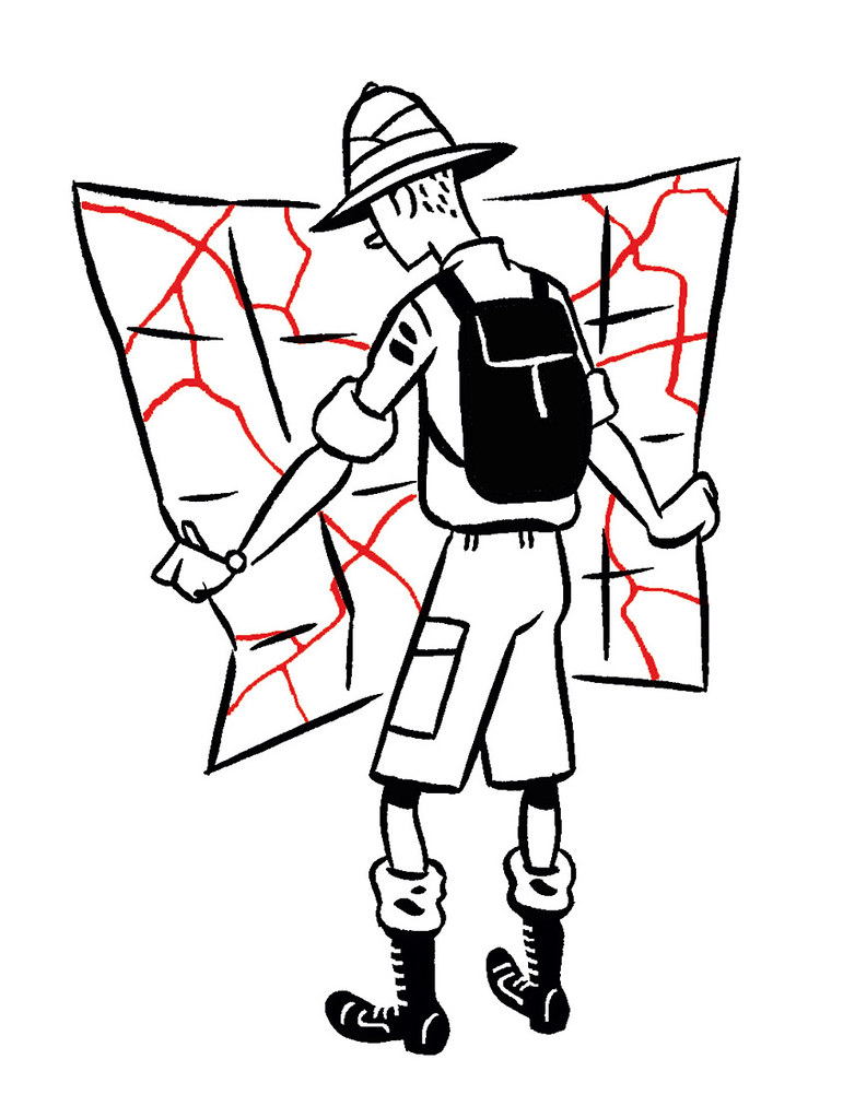
Top: Illustration by Jason Ford.
Mark Porter is principal of Mark Porter Associates and former creative director of The Guardian
First published in Eye no. 96 vol. 24, 2018
Eye is the world’s most beautiful and collectable graphic design journal, published quarterly for professional designers, students and anyone interested in critical, informed writing about graphic design and visual culture. It is available from all good design bookshops and online at the Eye shop, where you can buy subscriptions and single issues. You can see what Eye 96 looks like at Eye Before You Buy on Vimeo.