Winter 2016
The long look
Creating playful, thoughtful images for The Guardian’s ‘long read’ section relies upon a close relationship between the paper’s art desk and a roster of illustrators who can make exemplary work at speed

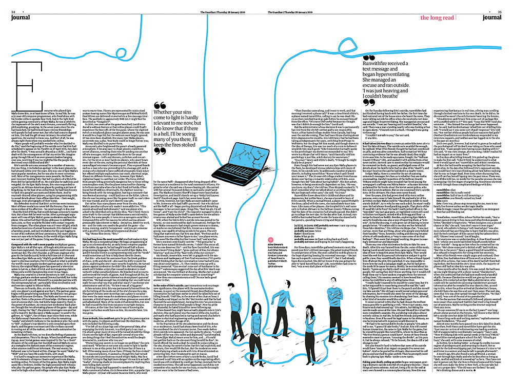
Four times a week, British newspaper The Guardian publishes a substantial piece of writing – usually between 3000 and 5000 words in length – that follows the paper’s international news section and marks the start of the more opinion-led ‘journal’ section. This essay, labelled ‘The long read’, is accompanied by a full-page illustration commissioned by deputy creative director Chris Clarke. Recent articles have featured images by Anna Kövecses, Nathalie Lees, Sébastien Thibault, Paul Blow and Ellie Foreman-Peck; Clarke and his colleagues have an expanding, international roster of emerging illustrators on whom they can call.
Clarke, who helped devise the section more than two years ago – alongside then editor Alan Rusbridger – describes the page as ‘the heart in the middle of the paper’. He is still excited by the project’s scale, which uses a full page of the Berliner format (315 × 470mm), often with further illustrations on the following spread.
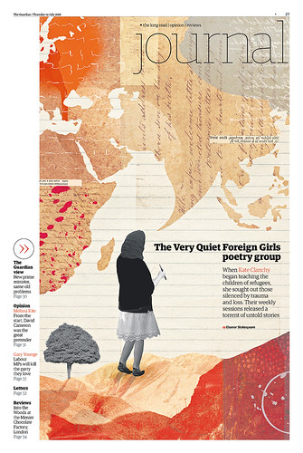
‘This is visual storytelling. We just give them the space, we give them the page,’ he says. He points out that the content is usually based around current affairs, but that it can stretch the boundaries of hard news: the use of illustration sets ‘The long read’ apart from the Guardian’s news pages, which use photographs and charts. Since the Guardian is a daily, the schedule can be tight. Clarke says that they get a maximum of three days to find a suitable illustrator, commission them and get the piece ready. Sometimes the time span can be as little as four hours. This was the case for illustrator Eleanor Shakespeare, who made a subtle collage of paper fragments and photos to illustrate ‘The Very Quiet Foreign Girls poetry group’.
Eleanor Shakespeare: ‘The Very Quiet Foreign Girls poetry group’, 2016. ‘This was my first job for the Guardian and my first experience of a fast turnaround – Chris Clarke commissioned me at around 11.30am on a Wednesday. My first rough was approved within 45 minutes and the final was signed off by 5pm the same afternoon. It was stressful, but exciting.’
Top: Paul Blow: ‘Death of a troll’, 2016.
Subjects tackled by ‘The long read’ include ‘The Kremlin’s hall of mirrors’ [illustrated by Daniel Haskett], ‘The whistleblower trap’ [Nathalie Lees] and ‘How technology disrupted the truth’ [Sébastien Thibault]. Clarke says that such subjects are much harder to illustrate than, say, the Saturday review section opener. ‘They vary in subject and seriousness,’ says Clarke, ‘but there’s always a playful intelligence that we try to get for “The long read”.’
The Guardian is able to achieve strong results with such short deadlines because of the close relationships between the design department and illustrators, who keep each other up to date on what is going on. ‘We try and pair the illustrator with the right kind of brief. Sometimes we know they’re going to love it … we often get emails back and forth just checking in,’ says Clarke.
Working at such a large scale can be intimidating, so the Guardian’s art direction team work closely on the layout with the illustrator once they have come up with a core idea. Sometimes, illustrators try to fill the space with too much material.
‘They often try to overwork it – to fill the space – so we tell them to dial it back,’ says Clarke. Other illustrators new to the section are not used to working at such a luxurious scale, sending in ‘boxed out’ images that are too small. ‘We sometimes play with the scale [of the image], blow it up and send it back, saying “what do you think about this?”’ he says. ‘It’s very fluid.’
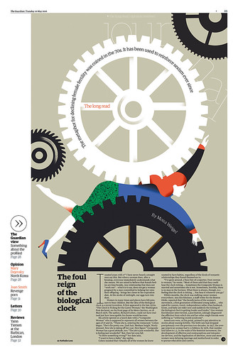
Nathalie Lees: ‘The foul reign of the biological clock’, 2016.
Holly Catford, designer, art editor of Eye, London
First published in Eye no. 93 vol. 24, 2017
Eye is the world’s most beautiful and collectable graphic design journal, published quarterly for professional designers, students and anyone interested in critical, informed writing about graphic design and visual culture. It is available from all good design bookshops and online at the Eye shop, where you can buy subscriptions, back issues and single copies of the latest issue. You can see what Eye 93 looks like at Eye before You Buy on Vimeo.

