
Summer 2021
The pandemic that launched a thousand visualisations
various designers
uncredited designers
John Burn-Murdoch
Caroline Nevitt
BBC News data visualisation
Felippe Rodrigues
Covid-19 has generated a growth in information design and an opportunity to compare different ways of visualising the impact of this deadly virus. By Paul Kahn
The very nature of the Covid-19 pandemic presents a challenge for information design.
We have become regular consumers of the visualised statistics generated by news events. A sporting event produces a set of data describing who is winning. A major election, even a natural disaster, occurs in a predictable time. It generates data, the data is presented and it is over. The Covid-19 pandemic, by contrast, is unfolding daily, with no clear end in sight. This has created enormous pressure to produce not only individual visualisations, but entire visual systems into which data can flow, day after day. The curve of a line, the spikes of a histogram and bubbles on a map have become the brush and the background upon which we see our world changing.
Graphic representations describe concepts as well as numbers. Several of these concepts have significantly shaped the language we use to describe how we measure, experience and fight the disease. We seek to ‘flatten the curve’ with interventions meant to decrease the spread of an infectious disease. The arc of that curve threatens the line representing a nation’s healthcare capacity. Describing how the virus spreads, we anticipate the rise and fall of an undulating line forming ‘waves’. The fluctuations of infection numbers measured at specific locales are spoken of as ‘regional spikes’.
In June 2020, Irene de la Torre Arenas, a member of the BBC News data visualisation team, recalled a planning meeting held in January. The news team discussed events for the coming year: the Tokyo Olympics; the US presidential election; Brexit; and the effects of climate change around the world.
Yet within a week of that meeting, reports of a new infectious disease in Wuhan, China began to enter the news cycle. When the Chinese government issued a lockdown order for Wuhan’s eleven million residents and discouraged a billion people from travelling to their ancestral village for the Spring / New Year Festival, new forms of visualisation appeared.
After more than a year of constant daily practice by the news media, governmental agencies, non-governmental organisations, scientific publications and independent media, COVIC (the Covid-19 Online Visualization Collection) has acquired thousands of examples. Numbers are presented as cumulative or new, by country, province or state, representing totals or proportion of population. From the first months, the most common theme was the magnitude and spread of the disease, measured in confirmed cases and deaths. Now we have diagrams that show virus variants and rates of vaccination.
Every day, data visualisation designers are challenged to communicate a situation that is difficult to understand, linked to a future that is impossible to predict. Concrete issues, such as wearing masks, are closely linked to abstract concepts of how infectious disease spreads. The shape of curves must tell a story of public policy and available hospital beds, the science behind innovative vaccines and the economic impact of lockdowns. These examples are a small selection from the COVIC collection.
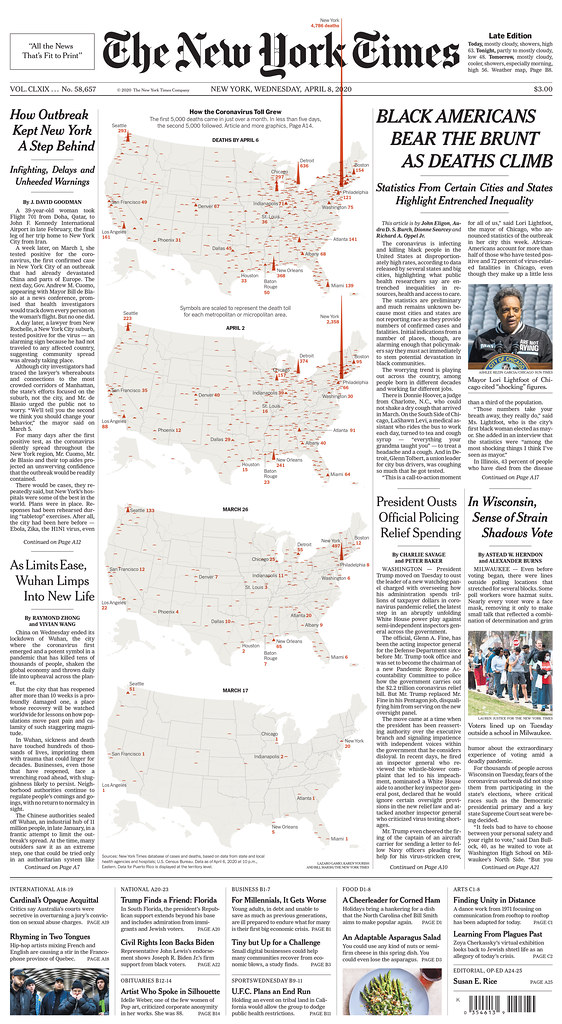
Above: On 8 April 2020 The New York Times published a striking visualisation about crossing the threshold of 10,000 US deaths, nearly half of which occurred in New York City in the previous week. Taking up a third of the front page, the visualisation shows the April total for NYC surging into the masthead boundary. Quantity is represented by the height of a triangle. For the online version, presented as an animated time series, the peak expanded past the box of the visualisation.
Johns Hopkins dashboard
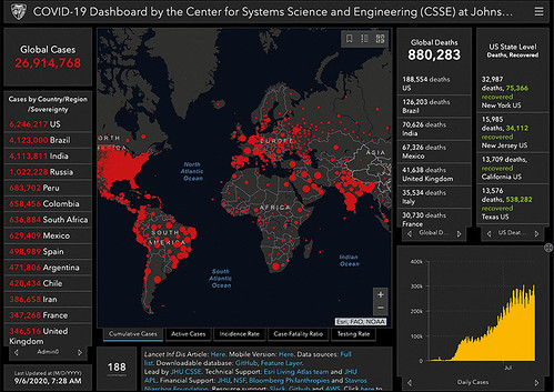
While reported cases were still limited to Chinese provinces and nearby, the Johns Hopkins University (JHU) Covid-19 Dashboard (above) became an objective visualisation of quantity associated with location. This bubble map was the first graphic evidence that the Wuhan lockdown had not stopped the spread of the virus. The dashboard was the urtext or ‘urmap’ for visualising the magnitude of the pandemic, the single source of truth for international media. JHU’s data collection continues to be the source for other visualisations, though since April 2020 several more sources of aggregated data have appeared. The dashboard, built from the Esri ArcGIS toolkit, combines numbers in bold contrasting colours with a bubble map. Its most striking visual comes from the red dots that represent cumulative reported cases on a black or grey geographic outline. The global focus results in a visualisation as uneven as the data that drives it. The dot number varies per country, representing the absence or availability of national, provincial or local data. The impression is of a world covered in red wounds. The user can pan and zoom into parts of the map to reveal additional detail.
Johns Hopkins University (JHU) Covid-19 dashboard.
Flatten the curve
Numbers can be used to tell the story, but shapes can also communicate concepts. Visualisations that communicate concepts based on epidemiology models have had a direct effect on political decisions made by non-scientists in government. This diagram (below, 16 March 2020) from the Imperial College, London, Covid-19 Response team associates ‘flattening the curve’ with measures intended to reduce the spread of infection. Some of the most influential visualisations presented this concept.
Diagram (16 March 2020) from the Imperial College, London, Covid-19 Response team.

Choropleth vs bubble
Online visualisations can place the advantage and disadvantage of choropleth and bubble maps in the hands of the reader, as seen in the German daily Der Tagesspiegel (below). The display for total cases (‘Anzahl der Fälle’) is a map with a range of three bubble sizes. To show cases per 100k population the visualisation switches to a choropleth display with six shades from light to dark encoding quantities. The density of cases in the south is more visible in the choropleth, while the distribution of cases is clearer in the bubbles.
Bubble map published by the German daily Der Tagesspiegel.
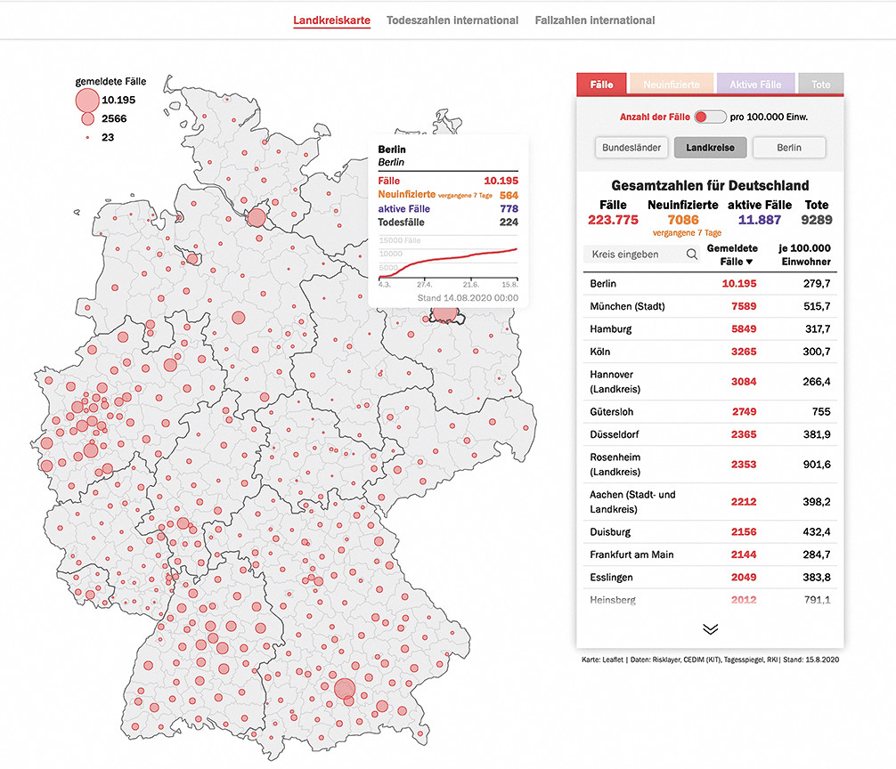
Choropleth published by the German daily Der Tagesspiegel.

Swiss daily newspaper Tages-Anzeiger published a bubble map (below) to represent global deaths (red) and cases (yellow) simultaneously.
Bubble map published by the Swiss daily newspaper Tages-Anzeiger.

Measuring from the first case.
The line graph is by far the most common form of Covid-19 visualisation type. This can be explained by several factors: the nature of the data, which predominantly represents quantities over time; the relative simplicity of the format; and its strength in representing both a value and change over time. The format has been harnessed to produce remarkable results.
Line graph (5 September 2020) by the Financial Times.
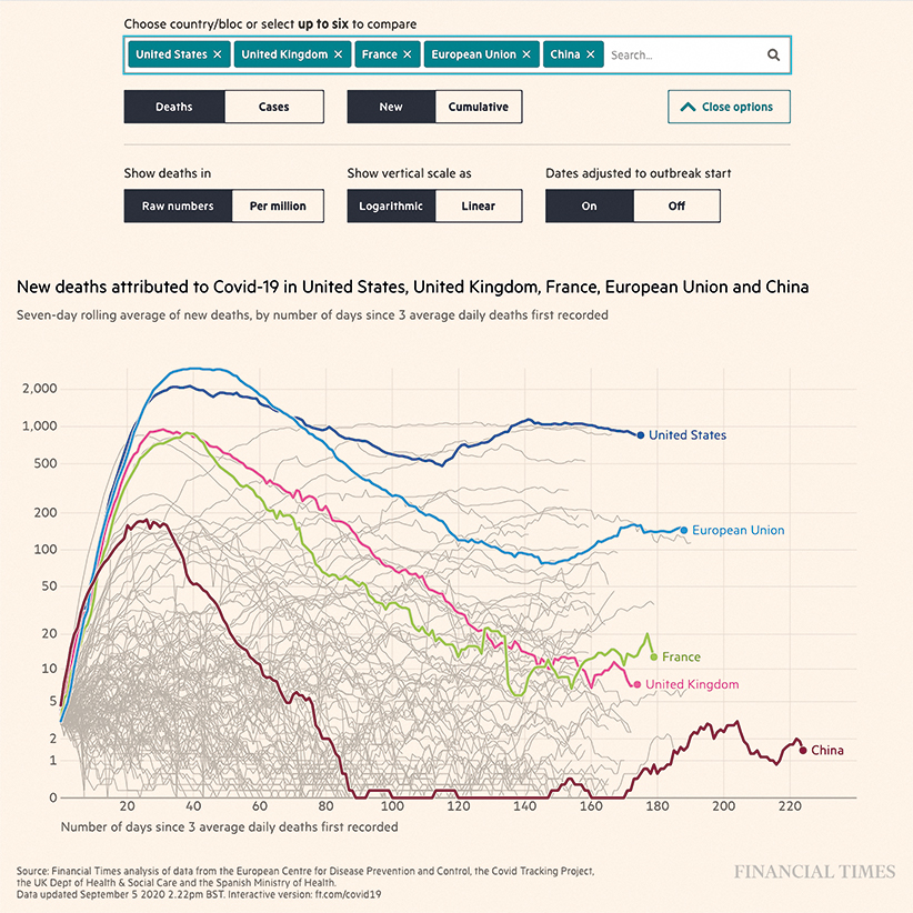
The financial press quickly recognised the pandemic’s potential for economic disruption and tracked its financial, social and human impact. In London, the Financial Times (FT) developed an ingenious visualisation to support comparisons of country data. This line graph (above, 5 September 2020) focuses on change over time rather than current state. The x-axis represents days since a pandemic landmark (days since ten deaths in the original, days since three average deaths in this later version) rather than calendar time. This allows the graph to align data to the same ‘timescale’, though the pandemic began at different times in different countries. The y-axis is the number of deaths or cases on a logarithmic scale (in which 10, 100, 1000 are spaced evenly), which is better suited to displaying higher rates of change than a linear scale. This so-called ‘hairy chart’ helps FT readers compare Covid-19 infections per country by comparing the slope of two or more lines.
The earlier version of the visualisation (24 March 2020) is a handdrawn static chart by John Burn-Murdoch.

The earlier version of the visualisation (above, 24 March 2020) is a handdrawn static chart by John Burn-Murdoch (a senior data visualisation journalist at the FT, see interview, opposite), which made explicit the comparison between countries such as China, Italy and South Korea. The FT’s charts evolved into an interactive application in early May 2020, including lines for all the countries in the world, creating a cluster of grey hairlines that spreads over time. The current chart illuminates a line for the US and the UK by default, with an option to select and compare four more countries. User controls for the paper’s quantitatively sophisticated audience now include switching between y-scales, start date and total numbers or proportion of population.
The logarithmic ‘Daily death tolls’ chart (19 April 2020) by the Financial Times.

The logarithmic ‘Daily death tolls’ chart (above, 19 April 2020) demonstrates the crest of the first wave.
Scrollytelling
A piece written and designed by Felippe Rodrigues for the New Zealand news site Stuff, created in early May 2020 when that country managed to stop its infection rate, uses curves and permutations in line graphs to explain and compare the health situation in various countries (below). In an interview in Storybench, Rodrigues describes the ‘scrollytelling’ animation technique. Scrolling through the page focuses the reader on NZ data as he changes from a logarithmic scale for the number of cases (which displays flattening when the rate of infections decrease) to a linear scale that shows the moment when the number of falling active cases crossed the rising number of recoveries, producing a bell shape as the numbers decrease following a peak.
Scrollytelling animation designed by Felippe Rodrigues for the New Zealand news site Stuff.

Where are the worst-hit places?
CovidPulse, published by the GIS software company Esri in late August 2020, presents case and death statistics for the 3000-plus US counties as ‘sparklines’ (small trend lines with no axis) on a map. In this field of geographically organised small multiples, the hot red colour and spike shape make some counties stand out. In this detail, the peak of Marion, Ohio rises above the shapes around it. Selecting a county presents a more detailed line and bar chart. We see the peak occurred in April 2020, followed in May and June by a rise in deaths. We also see the cool blue colours clustering along the mountainous regions of West Virginia and Pennsylvania to indicate counties where the spread of Covid-19 is ‘under control’.
CovidPulse, published by the GIS software company Esri in late August 2020.

Flowers of fatality
Towards the end of 2020, the BBC News data visualisation team devised a multimedia approach that combined quantitative visualisation, animation and sound. The case count in the world (below: left, 15 April 2020, right 6 December 2020), and in each individual country, was programmed to draw a growing stem from which the circles of monthly death counts fanned out into a spiral. The result is an asymmetrical pattern resembling a flower, with the light halo of circles representing the rise and fall of fatalities.
Infographic by the BBC Visual and Data Journalism team: Irene de la Torre, Scott Jarvis, Sarah Rainbow, Catriona Morrison, Harriet Agerholm and Ed Lowther. (left, 15 April 2020, right 6 December 2020).

The vaccine race
Using a cartogram (below), which distorts the geography of a region to convey information, is useful for representing the states and territories of the US, whose size and population vary widely. This example from the NPR (National Public Radio) website presents the percentage of population fully and partially vaccinated with four shades of blue. Other dimensions of the same data are represented as bubble charts in the same story. Now the population (below) is visible in the bubble size. How close or far away states of the same colour are is visible by their position on the x-axis.
Cartogram published by NPR titled ‘Which States have vaccinated more of their population?’.

Bubble chart published by NPR titled ‘Which States are leading in the race to get their population vaccinated?’.

Mutation family tree
In December 2020, the data visualisation challenge mutated into how best to explain the complex interaction between coronavirus and human cells, genetic mutation in viruses, and the cellular biomechanics of the first vaccines. While mutation has been present in the scientific literature, it was now the contributing factor in the rise of infections in the UK and elsewhere. Those mutations were appearing at the interface between the vaccine and the virus. While there had been both 3D and cut-away representations of Covid-19 from the first months of the pandemic, featuring extending proteins resembling spikes or suction cups, the level of sophistication increased. Dozens of laboratories were focused on both tracing the lineage of mutation and visualising the molecular structure. The Economist, which on 27 February 2020 had introduced the ‘flatten the curve’ abstraction under the caption ‘Press Down Firmly’, one year later printed a detailed mutation tree and spike-protein genetic code (below).
Detailed mutation tree and spike-protein genetic code by The Economist.

Crossing the threshold
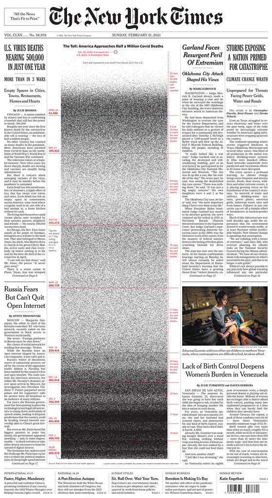
Crossing the threshold of 500,000 deaths in the United States in February 2021 has inspired several dramatic visualisations, each meant to turn the number into an image that expresses the seriousness of the situation. The New York Times chose an approach to print 500,000 individual dots in a column, aligned chronologically with annotations to illustrate the time elapsed between 50,000 lives lost. The death rate over time becomes the density of the pattern rather than the rise and fall of a line or bar and the annotations compress in the second wave.
There have been many other examples of newspaper visualisations designed to convey the enormous quantity of deaths including those in The Times (London), The Washington Post and a two-page spread in the Minneapolis Star Tribune, which expanded the triangle method to show the spread of fatalities across the entire country. The peaks of cities are drowned in a dense forest of triangles.
The New York Times cover on crossing the threshold of 500,000 deaths in the United States in February 2021.
COVIC
Covid-19 Online Visualization Collection
The examples in this article are drawn from COVIC, a collaborative effort begun as a personal project with Yixuan (Janice) Zhang, now a graduate student at Georgia Institute of Technology, and Hugh Dubberly, my fellow lecturer in the Northeastern University’s Information Design and Data Visualization programme, writes Paul Kahn. The project continues with support from the Dubberly Design Office and Northeastern’s Center for Design, led by Paolo Ciuccarelli.
Our ongoing effort grew out of the impulse to collect the visualisations flowing from responses to a single global event. Hugh Dubberly and I have cast a wide net to include both qualitative and quantitative visualisations. We hope to realise a collection that defines both the problem space and the solution space faced by designers and their audiences, while at the same time making a resource to support discussions between people in fields such as biology, computer science, graphic design, epidemiology, healthcare, journalism and public policy. We are designing COVIC as a common point of reference (sometimes known as a ‘boundary object’) to be used by different groups and domains of knowledge and practice. The collection will be shared for teaching and research purposes later in 2021. For further information, contact me by email: [email protected].
UPDATE (November 2021), the COVIC website, Covic-archive.org. is now live.
Paul Kahn, information designer and lecturer at Northeastern University, Boston
First published in Eye no. 101 vol. 26, 2021
More on the topic of Covid-19 data visualisations in:
‘Conversation with John Burn-Murdoch’ by John L. Walters
‘Visual systems of life and death’ (web-only) by Paul Kahn
Eye is the world’s most beautiful and collectable graphic design journal, published for professional designers, students and anyone interested in critical, informed writing about graphic design and visual culture. It is available from all good design bookshops and online at the Eye shop, where you can buy subscriptions and single issues.