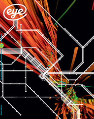
Winter 2009
The shape of the century
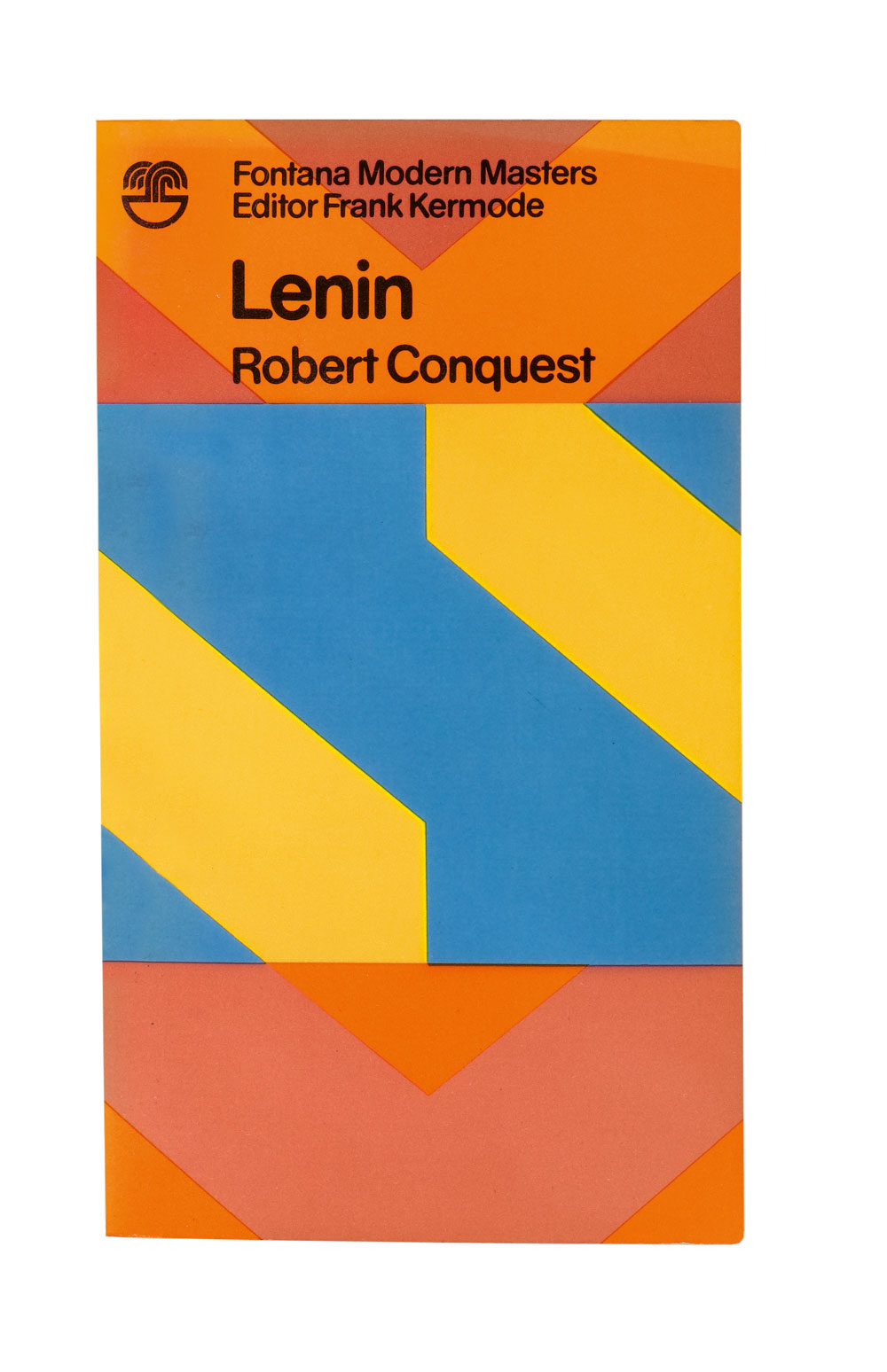
How 1960s Op Art and cut-up culture informed the cover designs of Fontana Modern Masters in the 1970s.

In the late 1960s, John Constable, art director at Fontana Books, needed a cover concept for a series of brief biographies about the men (and all but one were men) whose ideas were shaping the twentieth century. Victor Vasarely’s rearrangeable Op Art compositions, based on his ‘Alphabet Plastique’, were much in vogue at the time, as were William Burroughs’ cut-up novels, and Constable’s brainwave was to combine the two techniques as a set of book covers. Initially he experimented with cut-ups of The Mud Bath (1914), a key work of British geometric abstraction by the painter David Bomberg, but on visiting the Grabowski Gallery in London and seeing Op Art projects by Oliver Bevan, a recent graduate of the Royal College of Art, Constable put aside his scissors and commissioned Bevan.
The Fontana Modern Masters, as the series was called, was launched in 1970. For the first ten books Bevan created rectilinear arrangements of tessellating blocks that Constable used to fill the front covers. These angular shapes in garish, clashing colours gave the covers an ‘edgy’ quality that was offset with soft typography superimposed across the top of the artwork in a rounded sans serif bold. And, in a stroke of marketing genius, the back cover explains that ‘the set combines to form [a] whole painting, and can be arranged in an unlimited number of different patterns’ – an obvious enticement to buy all ten books and make your own art à la Vasarely. Better still, when the reader had finished mugging up on Camus & Co, this homemade composition could be framed, though perhaps that was taking it a bit too far.
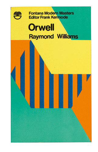
Either way, the titles that followed in 1971-73 repeated the ruse with a modified typeface, a new set of Bevan cut-ups and a similar statement on the back: ‘The whole painting, the second in the series, has been divided to form the individual covers so that ten of them make the whole painting. The pieces can be arranged to form a variety of patterns.’
Likewise the Modern Masters of 1973-74, which moved away from cut-ups but continued the theme with covers reproduced from a kinetic ‘painting’ by Bevan. Pyramid was made of transparent materials that changed colour in ‘a recurring cycle of change’ when illuminated by polarised light. ‘Ten points of that cycle have been recorded to provide covers for the third cycle of ten volumes,’ the covers explained.
However, things did not quite go as planned, since the painting on the cover of Guevara was inadvertently reused for Joyce, making eleven covers in the first ‘set of ten’ and nine in the second set. Then in 1974 Mike Dempsey took over as art director and the set-of-ten incentive was scrapped. A new artist, James Lowe, was commissioned to produce the cover art and Bevan’s third set of ten – the Pyramid paintings – was aborted after eight covers. Between 1975 and 1979, Dempsey art-directed a set of eight covers for Eliot to Schoenberg, plus a further set of nine for Engels to Piaget. For these he switched the covers to a white background overlaid with tessellating block designs by Lowe, although it was often Dempsey who selected the colours of the blocks, in order to avoid repeats.
Dempsey left Fontana in December 1979 to set up the design company Carroll & Dempsey, from where he continued to oversee the Fontana Modern Masters series until a new art director, Patrick Mortimer, was appointed in 1980. Three more titles followed under Mortimer, who replaced the angular artwork of the previous covers with a flourish of coloured curves (and a revised logo).
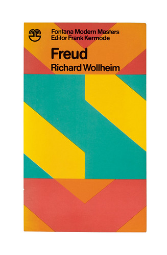
A generation later, the use of art as book covers was reversed by young British artist Jamie Shovlin, who in 2005 re-created the entire Op Art series of Fontana Modern Masters covers (from 1970-83) as drippy watercolours for a show at London’s Riflemaker Gallery. Shovlin also added ten books which had been announced but never published, devising a ‘Fontana Colour Chart’ to create covers for the ‘lost’ titles.
After 1983, several other Fontana Modern Masters were published, and some of the earlier titles were reprinted, using a new cover design that featured a portrait of the ‘Master’ as a line drawing or, later, as a tinted photograph, and mixed serif and sans serif typefaces, block capitals and lowercase, upright and italic letters and faux handwriting.
Compared to the clean typography and colourful geometric abstraction of the earlier covers, these later covers suggested a meltdown in the publisher’s art department, and the less said about them the better. For, paraphrasing Wittgenstein, if you don’t have anything to say then shut up, and as a Modern Master he should know.
Many thanks to Mike Dempsey for filling in the gaps in the story.
The author is publishing fine art prints of the series of 48 from 1970-83, see fontanamodernmasters.org for details.
First published in Eye no. 74 vol. 19.
Eye is the world’s most beautiful and collectable graphic design journal, published quarterly for professional designers, students and anyone interested in critical, informed writing about graphic design and visual culture. It is available from all good design bookshops and online at the Eye shop, where you can buy subscriptions, back issues and single copies of the latest issue.

