Winter 2009
The show must go on
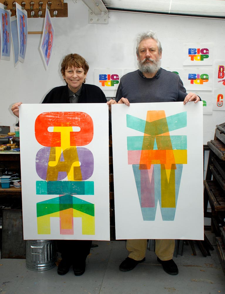
Buy a pension or a huge collection of theatrical type? For Celia Stothard and Alan Kitching, the choice was clear.

The fax was a page from the Antiques Trade Gazette: ‘For Sale – a very large quantity of Printers’ Wooden type mostly early 20th Century’, forwarded by typographer Paul Byrne to my partner Alan Kitching in the autumn of 1997.
Alan had launched his Typography Workshop in 1989, and over the years he had acquired more type from those keen to see their collections used. We had been partners since 1994, after meeting one night at the Chelsea Arts Club where I was singing jazz. As a freelance graphic designer and art college lecturer, I was familiar with his work and shared his interest in design and letterpress. We began to collaborate, and over the ensuing years we purchased equipment together at two closing print-shop auctions, also buying Herbert Spencer’s small hand-press and fine collection of wood-letter as he made space for his oil painting and easels in his London home.
So when the fax arrived, Alan had no real need for more wood type and there was no space in his Clerkenwell workshops. But I had some new space, earmarked for my type teaching workshops, and a gallery / showroom at my recently acquired Stothard Arts studio / home. The ad aroused our curiosity. How much was ‘a very large quantity’? What were the fonts? I dialled the saleroom number.
A barn full of type
It was when the auctioneer mentioned theatrical poster woodblock letters that we became cautiously excited. He agreed to give me the vendor’s details. John Organ, theatrical printer in the village of Wrington near Bristol, came to the phone. Alan asked him to describe the fonts and the quantity. ‘I’ve got a barn full,’ he replied. ‘You’ll have to come and look for yourself.’
Webbsbrook Printing Works, the home of G&M Organ Theatrical Printers, was a short walk from our rather dingy B&B. Down a narrow gravel drive behind the centre of the village, we found two single-storey stone barns, each 90ft long. The door to the left was open and hung with a horseshoe greeting.
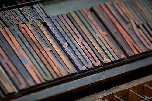
By the light of a single naked bulb suspended from an enormous elaborate press, the interior long wall was almost totally black – stacked to the ceiling with ink-ingrained wood-block letters the size of tea-trays. Beneath the shelves and around the walls were wood and metal type, seven-foot high cabinets of poster type, steel composing surfaces, and chase and furniture racks to match the scale of the press. It was a heart-quickening sight.
There were four presses in the barn and their owner was perched on the delivery platform of the magnificent centrepiece, a 28ft-long, two-colour, Extra-Quad Royal, stop-cylinder Elliott Wharfedale press, circa 1906 and still in working order.
The only other bidder was an antique dealer. John Organ said he would prefer to keep his family’s stock together and used, and that we could not cherry-pick the most interesting faces. If we won the bid, we had to take it all. We returned the next day to examine the collection in detail, to list, log, photograph, explore and consider not just the bid but the enormity of the project we were thinking of taking on.
George Organ, John’s father, had started a general printing business in Bristol in 1928. Work for the Bristol Hippodrome and Theatre Royal soon led to more: setting and printing posters, playbills, programmes and tickets for other West Country venues, and George’s sister Marjorie joined him, as ‘G&M Organ Theatrical Printers’. This specialisation proved successful, reaching all over the United Kingdom. The few posters left hanging in the barn headlined entertainments: from the Victoria Theatre, Ilfracombe, Devon, to the Gaiety Theatre, Ayr, in Scotland.
Alan climbed up a ladder to check a range of condensed letters stacked on the barn wall shelves. Some had become damp and infested with woodworm. They would have to be dried out and treated, but first the make-ready (random bits of printed paper, glued to the underside of letters to bring them to type height) would have to be removed. As I logged, measured and photographed cabinets and randoms of type around the barn, I heard a shout of ‘Schwitters!’ and joined Alan, looking in amazement at the first of many examples of the Wrington pressmen’s unconscious ‘make-ready’ art, reminiscent of Dada collages.
Some old typecases and homemade type racks were warped shut but we were able to open them and take quick, pre-digital snaps to record the faces and characters available in most of the fonts. The collection was predominantly sans serif, grots of every size from 4 line (3/4in) to 100 line (18in). The most interesting were the two-colour outline and inline fonts, and the ultra condensed, almost abstract, wooden ancestors of the almost unreadable hairline condensed letterforms that entertainment designers still use today for those endless co-production credits.
A few black-letter, wide latins, slab-serifs and stylish Victorian oddities brought some slightly decorative interest – faces fit for murder-mystery matinees and Hammer horrors.
Most of the smaller type had been cut from hard fruitwoods, and the larger were of lighter, less dense wood. By the localised pattern of woodworm holes in the largest letters and the softer wood typecases and cabinets we learned that the woodworm beetle prefers easy burrowing and consumption near to home. This actually makes them easier to deal with. If discovered in a large letter ‘Y’, the beetles might also have invaded neighbouring ‘X’ and ‘Z’, but rarely ‘A’, ‘B’ or ‘C’.
The problems of woodworm and damp were minor compared to the overall scale of the project; the sheer number of loose letters, cabinets and randoms to be transported to London and housed. During that first visit we realised what a historic collection this was: a successful and substantial letterpress jobbing printer typical of its time, with all the equipment in situ. The ‘make-ready’ was a bonus and we were keen to explore more corners of the barn for extraordinary items and ephemera. But who would take the immense composing stones, the furniture and chase racks? The Organs thought they were likely to be scrapped. If our bid was successful, we were welcome to take these too.
Alan already had enough type in his ‘palette’ but the prospect of working with this range and scale was thrilling. In June that year I had up-sized from a two-room flat in SW7 to a former alehouse in Kennington SE11. I had envisaged Alan and some of the Typography Workshop in the covered rear yard, but almost an entire print works? Still, there was plenty of room on the ground floor, the joists could take the weight and the old beer cellar was dry. Who else would or could do it?
A fateful decision
Perhaps it was the full moon over the horseshoe atop the Organ’s barn door, or the sweet Somerset air that added to the feeling of fate, but I turned to Alan: ‘Pension payments or this?’ ‘This!’ we chorused and returned to London to make the bid.
It took a year of fortnightly working weekends to bring the Wrington collection and composing room equipment to Kennington. We had to clean, treat, log and pack the type first, and the Organ family were happy for us to work there. The fastest way to produce an accurate visual record was to make a rubbing with pastel. So while Alan cleaned and preserved more ‘Schwitters’, I was banishing woodworm and producing a frottaged account of the new theatrical palette.
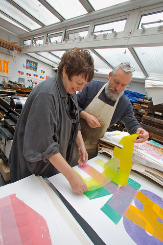
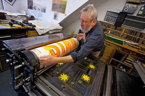
With the Wrington collection, Alan now had a wide choice of subtle variations – simple sans / grot types of every size with which to compose his designs. The range of font forms that allowed printers to create the hierarchy of entertainers’ names demanded by the Victorian bill poster, squeezing in the minor performers and necessary small-print at the base of the sheet, now facilitates the finessing of contemporary messages, the creation of exciting typographic images and limited-edition prints.
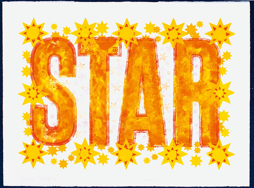
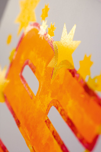
Nameless fonts / cuts condensed or expanded by subtle degrees; dynamic changes of scale from billboard to book locked in the same printing forme; big bold simple letters supplying a generous canvas for Alan’s hand-inked textures of colour integrated on the type itself with sparks of metallic – all these features of the Wrington collection gave us a new look for commissions and for large-scale printmaking on the A1 proofing presses.
The Wrington effect
To see the ‘Wrington effect’ on Alan’s work, look at the Metonyms series with The Ring’s two-colour, solid and outline type, ‘Why Iraq? Why Now?’, broadcasting its message simultaneously as newspaper ad and protest banner. Or the inspiring texts of the Manchester Guardian’s 1821 manifesto, expressed in a 30ft mural at the newspaper’s former London office in Farringdon Road; and uplifting evocations of Spirited, Liberty, Zealously Enforce and Boldly Expose composed and printed around a single word and initial letter.
‘Entertaining Types: the Wrington Suite’ (2009), the set of four limited edition prints inspired by the collection, uses a selection of the faces and forms, blocks and borders, to evoke the golden era of English popular entertainment, from music hall and the travelling circus, to faded 1950s variety shows at the end of the pier and Saturday morning flicks and matinees. This set is the first of a series that we hope will also serve as an homage to the generations of skilled, jobbing letterpress printers who put bums on seats for hundreds of years. The show must go on !
Twenty Years of New Letterpress Prints, Advanced Graphics, 19 Nov–19 Dec 2009.
First published in Eye no. 74 vol. 19 2009
Eye is the world’s most beautiful and collectable graphic design journal, published quarterly for professional designers, students and anyone interested in critical, informed writing about graphic design and visual culture. It is available from all good design bookshops and online at the Eye shop, where you can buy subscriptions and single issues.

