Summer 2016
The thin controller

Progress bars have changed the way we engage with songs, films and stories

The internet is hailed as the great liberator of information and media. Films, audio, music and texts have all been transplanted from the archive to the net. With varying degrees of legality, everything is available. Everything is searchable, rippable, downloadable and playable. Whether you want anthropological field recordings, obscure B-sides or clips of David Bowie looking surly on Australian chat shows, the chances are you can get it.
We are free to dance through this constant downpour of media as we please, watching and listening to whatever we want to, whenever we want to. Yet we are not free. We are bound by a silent master, a thin and glistening tyrant that incites us to rush and panic, an all-powerful graphic controller that delineates our art: the progress bar.
It is the creeping red line at the bottom of every YouTube video; the grey strip that ticks alongside every iTunes file; the black bar at the bottom of your Kindle screen that reminds you how much you have failed to read. Every piece of digital media is measured by a horizontal strip and a marker that moves from left to right, denoting how long it is, how far one is into it and when it will finish. By moving the marker, we can skip, scroll, fast forward and rewind. We can see with grim finality when the thing we are experiencing is about to end.
The progress bar eliminates the surprise ending; everything is subjected to a nerve-wracking countdown. The days of hidden tracks at the end of CD albums are gone – songs have been reduced to tasks that require completion. All time-based media are now digitally imprisoned by these bars, which move us further away from what we are attempting to engage with. No longer are we fully absorbed in a film or song, we must constantly be aware of our progress. We must know at all times where we are, lest we lose ourselves.
Instead, we lose patience. The progress bar shows us how a song or film will unfold, and encourages us to jump ahead. We have always been able to fast-forward through analogue film and music, but the progress bar grants us new ease and precision. Often a miniature preview window will appear along the bar as we scroll, tempting us with images of what is to come. Today almost all video websites have their own bespoke, gleaming progress bars. Some remain glued to the bottom of the screen while others fade into the background once the media has begun. The shape of the progress bar used by the music streaming website SoundCloud mimics the undulating audio waves of the track being played. Thus we can anticipate any crescendos, build-ups and drops before we hear them, and nip straight to the moment the vocals start or the beat kicks in. SoundCloud users leave traces in the form of comments pasted along the progress bar at points in the song that they particularly like. Their remarks (‘this song is my jam!’) then pop up as the marker passes through: it is littered with avatars and profile pictures of people hanging out on the bar, digging the tunes.
While the supposed purpose of these bars is to aid the navigation of time-based media, it can feel like the opposite. They demand to be given time, and allowed to buffer and load. Their disobedient cursors can jump and drag. YouTube has introduced a dreaded yellow bar that inches forward beneath the unskippable adverts. In these moments it is not the advert I watch, but the progress bar as it crawls towards the finish line.
Progress bars are merely graphical representations of data processing. The colourful bars that illustrate the loading and preparation of data work in a similar way. I used to watch these loading bars fill while sat cross-legged on my bedroom floor, waiting for videogame levels to boot up. Then I watched as low-res mp3s and their associated viruses took days to illegally download on to my unwitting father’s desktop computer.
‘The wheel of death’
Such bars are the descendants of ‘per cent-done progress indicators’, the loading strips introduced into computing to soothe impatient programmers. Software engineer and designer Brad Myers, now a professor in the Human-Computer Interaction Institute at Carnegie Mellon University, is considered by many to be the father of the progress bar, and in the early 1980s he built them into operating systems. He tested his invention, and by 1985 was able to show that computer users found progress bars to be a soothing, reassuring presence. This lineage continues today, in the form of ‘throbbers’ such as Microsoft’s rotating hourglass icon and Apple’s spinning rainbow ‘wheel of death’. Many loading bars are now animated by a rippling, backwards motion that generates an illusion of movement when the bar itself is painfully stationary.
The graphic timeline has been a means for collecting and displaying data since long before the arrival of computers. Scientist and theologian Joseph Priestley’s A New Chart of History (1769) condensed thousands of years of global power struggles into neat rows of coloured bars, while Cincinnati clergyman Sebastian Adams’ wildly ambitious Synchronological Chart of History from 1871 attempted to plot a wobbly lineage from Genesis to the arrival of the steam train in upstate New York. Musical notation uses icons sequenced along a horizontal strip to express actions over time. Isotype, the visual language developed by Otto Neurath in the 1930s, arranged icons in cumulative lines to illustrate a change in numbers, though progress bars themselves are perhaps more closely related to the Gantt Chart – a pre-digital graphic bar chart system developed by American management consultant Henry Gantt in the 1910s, which he used to track the simultaneous progression of engineering projects. Gantt and his Marxist colleague Walter Polakov promoted their new breed of kinetic statistics as ‘the obliteration of conflicts between men and management. It promotes the fullest exercise of man’s creative forces and places work in its proper relation to life.’
Fetishising completion
However, Gantt Charts and Isotype provide open-ended forms of data visualisation. They can display as much or as little discrete quantity as is needed. Progress bars, on the other hand, depict a proportion or percentage of a whole. The bar remains static in size, regardless of absolute quantity of time or data involved, and so two or more progress bars are not directly comparable in a precisely quantitative way. The progress bar’s signifier of progress has nothing to do with its length or thickness. All the information it divulges is contained within the speed of the moving cursor or coloured bar. Thus it can only illustrate single, bookended tasks. It fetishises completion. Success is achieved when the bar is filled, or the cursor reaches the end of the line.
Is this the case with films and songs? Streaming services such as YouTube and Spotify are now the prime indicators of chart success for pop music, with stream numbers considerably outperforming actual sales. Both sites used to register a single stream as one full play of the song or video; one full sweep of the progress bar. But our promiscuous digital listening habits mean that we often listen to portions of songs, skipping between tracks; they now log a single stream after just 30 seconds of playing time. With so much choice at our fingertips, it seems natural that we consume faster and with less care. We have to speed up to take it all in.
So the progress bar exists to accelerate us, to position us as ‘time-poor’ editors rather than educated audiences for this new, superfast media. In a world in which culture is ever more something that is taken rather than earned, it makes it all too easy to skip to the good parts – or to the end.
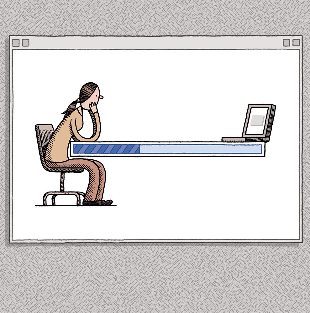
Top: Illustration by Tom Gauld.
Tom Harrad, writer, London
First published in Eye no. 92 vol. 23, 2016
Eye is the world’s most beautiful and collectable graphic design journal, published for professional designers, students and anyone interested in critical, informed writing about graphic design and visual culture. It is available from all good design bookshops and online at the Eye shop, where you can buy subscriptions and single issues. You can see what Eye 92 looks like at Eye before You Buy on Vimeo.

