Spring 2010
They work with words: 3

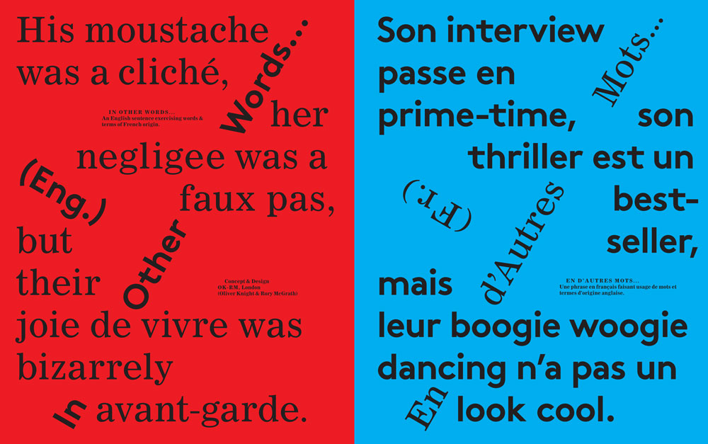
As an exercise in cross-Channel translation, OK-RM has devised a typographic spread exclusively for Eye.

Oliver Knight and Rory McGrath studied graphic design together at the University of the West of England and set up OK-RM in 2008 after six years of independent stints for London and New York studios, as well as intermittent collaborations. Their work, which has been primarily for the arts / culture sector, continues to grow out of this longstanding collaboration – intuitively and in conversations. This unconstrained base provides room for a project-specific approach and a highly varied output. ‘It’s about making something really expressive of the project’s logic using limited means,’ they say; ‘it’s about being modest, accurate and truthful’. In pursuit of the play of logic and illogic behind language, OK-RM recently initiated ‘In Other Words…,’ a series of self-published projects ‘that celebrate and explore the English language – its ‘complexities and intricacies’ and ‘its relationship to culture, politics and identity’. (See also Jane Cheng’s article ‘Lost for words’ on the Eye blog.)
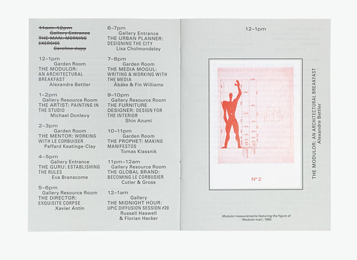
Spread from A Day in the Life of the Courbusier, 2009. The Barbican Art Gallery commissioned OK-RM to provide a booklet for a day of events accompanying their Le Corbusier exhibition: ‘In homage to the architect's extreme, even totalitarian approach we repeated the list of events in every spread, with each turn of the page one event is crossed off, acting as a check list.’ Top: Typographic spread by OK-RM.
OK-RM collaborates with a close community of specialists: programmers, printers, curators and architects. Recent projects / clients have included Gasworks, Artangel, the Barbican Art Gallery, and the b+p Type Foundry (See Eye 68). Current projects include a new identity for Rivington Place, a book for Imran Qureshi published by Raking Leaves and work for the Public design festival in Milan.
Knight and McGrath characterise their methodology as ‘highly rational, appropriate and provocative’.
‘All of our work has a strong sense of purpose,’ they say. ‘We identify a project’s key point and exaggerate it to create magnified clarity.
First published in Eye no. 75 vol. 19.
Eye is the world’s most beautiful and collectable graphic design journal, published quarterly for professional designers, students and anyone interested in critical, informed writing about graphic design and visual culture. It is available from all good design bookshops and online at the Eye shop, where you can buy subscriptions, back issues and single copies of the latest issue.


