Autumn 2018
This woman’s work
Kate Hepburn’s design career, embracing pioneering magazines such as Spare Rib and Vole as well as comedy and rock’n’roll, is rooted in rigorous typography

Over more than four decades, Kate Hepburn has left a distinct mark on contemporary culture – in publishing, comedy and rock’n’roll – yet at heart she is a typographic designer who thinks deeply about letters, words and the meaning of text.
One project she began while a student still resonates: her masthead and early art direction (in collaboration with designer Sally Doust) for the pioneering feminist magazine Spare Rib, first published in July 1972. (See Fi Churchman’s article ‘Radical platform’, about the history of Spare Rib, on page 99.)
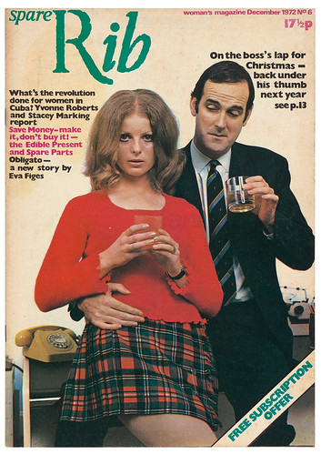
Hepburn’s masthead for Spare Rib reflected her feeling for both collage and typography. Doust recalls: ‘The name Spare Rib started as a joke, in a Chinese restaurant, but … it had the right connotations.’ Hepburn says: ‘I arrived at the Spare Rib logo by tearing paper letters to create a ragged, rib-like image for the words, yet based on a conventional font; the “R” being Roman and “ib” breaking away in italic.’ Hepburn’s design convinced editors Marsha Rowe and Rosie Boycott that Spare Rib was the right title for the magazine.
Spare Rib no. 1, 1972. Design: Kate Hepburn and Sally Doust. Angela Phillips’ cover photograph showed two young women in their own clothes without make-up. ‘We are familiar with these types of images now,’ says Hepburn, ‘but at the time it hadn’t been done.’ In co-editor Rosie Boycott’s words (quoted in Ian Birch’s Uncovered), ‘It was about sisterhood.’
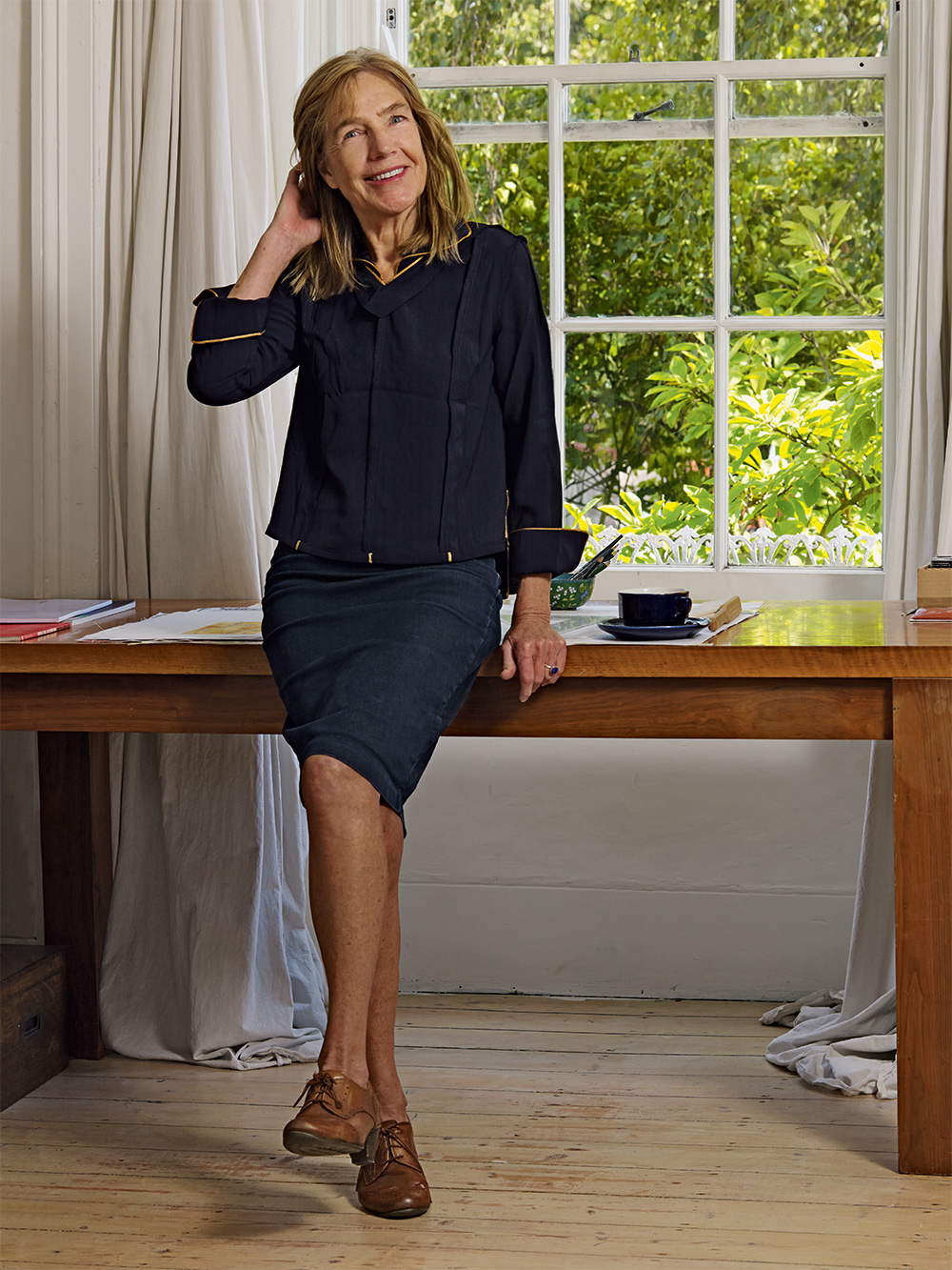
Top. Portrait of Kate Hepburn by Red Saunders.
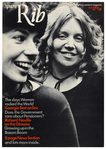
Spare Rib no. 9, March 1973. Design and layout: Kate Hepburn, Rose Verney, Lucinda Cowell and Sally Doust. Cover photograph by Roger Perry. The cover flags a feature with sewing patterns for a skirt and top designed by ‘Ann Caddle, who has just left the College of Fashion’.
Many of Spare Rib’s design methods sprang from simple practicalities and a limited budget. It was always led by its editorial content. ‘We had our sleeves rolled up,’ says Hepburn. ‘We stretched each other’s so-called roles and boundaries.’
In conversation, Hepburn frequently refers to the rigour of her undergraduate typographic education (from 1966-69) at London’s Central School of Art & Design (now part of Central Saint Martins), and the inspiration of tutors such as Anthony Froshaug and Richard Hollis. Her interest in letterforms came from a foundation course at Bath Academy of Art (Corsham), where tutor Andrew Wilson instructed classes in drawing the Trajan alphabet in outline with a 2H pencil. They also drew the Bath architecture. This early experience in drawing letterforms prepared her for the rigour of typography at Central. The course, she explains, was highly technical, involving arithmetic, casting off and tracing layouts with a Rapidograph.
‘I drew and drew and drew my way through every situation, arranging my coloured pencils. I was just devoted to putting marks on paper. The rest of my family read, they were all buried in their books, or listening to the radio.’
Hepburn says that the intense, feverish discussions about typography that took place at Central – and in the local pubs with Froshaug, other tutors and students – were good preparation for the questioning environment of Spare Rib. At Central she learned not only that typography is about the meaning of words, but also the idea ‘that leading is as important as the type itself’. Richard Hollis was another profound influence on her career. ‘Richard became our year tutor at short notice when the head of second year (Brian Keogh) died unexpectedly.’ Hepburn later worked with Hollis on his designs for Pluto Press titles, for the Whitechapel Gallery, and also on Frederic V. Grunfeld’s book The Hitler File (1974).
She describes her time at the Royal College of Art (RCA) as ‘character building’ in terms of dealing with the politics of the era. The RCA gave her the ‘privilege of being tutored by Margaret Calvert’ in her third year, and the chance to meet designers, illustrators and photographers, many of whom would later contribute to Spare Rib.
‘They were delighted and happy to have a terrifically free rein to develop. The first issue had a Stuart Mackinnon illustration, and there was Sue Coe (see Eye 21), whose work is still remarkable.’
Hepburn’s time at Spare Rib spanned a little less than a year (1972-73), but during that time she and Doust laid the groundwork for the title’s look and feel. ‘We were trying to appeal to women who might have been working part-time, or raising a family on benefits, reaching out to areas such as Doncaster or Swansea, presenting radical content in a soft-looking, approachable layout,’ she says.
Louise Ferrier’s cover feature about Minette, a twenty-year-old heroin addict, in Spare Rib no. 4, October 1972. Photos by Peter Stark.
Opening spread from Bel Mooney’s feature about prisoners’ wives in Spare Rib no. 7, January 1973, with photos by Bob Mazzer. The rubber stamp image is printed in the second colour available for each page.
Much like the anti-establishment Private Eye (Eye 82), they made exuberant use of clichés and pastiche. ‘Even the news section used pastiche,’ says Hepburn, ‘with a newspaper-type layout.’ The editors were striving to cover important, largely unaired issues, commissioning serious, committed writers such as Angela Phillips, Germaine Greer, Sheila Rowbotham and Laura Mulvey. ‘People were coming into Spare Rib all the time,’ says Hepburn. ‘Sally and I met them, trying to read as much as we could, but it was quite a responsibility, with the limited amount of time we had. We were so hectically busy trying to do our end of things.’
Hepburn chuckles at a brief, unsuccessful attempt to rotate job roles: ‘There was a suggestion that we all did each other’s work, so we would rotate and we would be editors and make a complete editorial choice and they would be doing all of the artwork. I laugh because Sally said it really wouldn’t work and she was the one who put her foot down. This was hard and laborious, it was all scalpels and Cow Gum, and it was very, very manual. You had to really like your rulers and your 10A scalpels and everything else; you knew how it would all work.
‘The idealisation of Spare Rib – in that it was a shared process, everybody understood each other, we were equal and all of that – had to be moderated in order for us to work well together, to really function. At the end of the day we had to deliver. And it was very stressful. We were up all night, earning very little money and we were all getting very thin!
Spare Rib no. 6, December 1972. Design: Kate Hepburn and Sally Doust. Cover photograph by Valerie Santagto. This satirical Christmas cover signals Anna Coote’s feature about ‘the female ghetto’ of secretarial work, with a selection of quotes, anecdotes and reproductions of sexist and otherwise questionable ads from the past century. Monty Python’s John Cleese is pictured with Marion Fudger, Spare Rib’s advertising representative.
‘With Spare Rib, I didn’t feel I could be that committed and go on. I was trying to pursue my typography and my craft in a deeper, more profound way than I was the gender politics of the time. I needed to work. It was a matter of survival to work in a very rigorous way with typography and to move on in what I was doing.’
Hepburn’s career has embraced most aspects of graphic design, including animation, collage, illustration, branding and identity, album covers, concert staging, retail, exhibition design, hand-lettering and watercolours, plus editorial design for magazines, brochures, catalogues, websites and photobooks. She has also taught design.
In parallel with her time at Spare Rib, Hepburn designed books for Monty Python (see ‘Understanding silly books’ in Eye 54) at Derek Birdsall’s studio. Hepburn had already been an animation assistant to Python’s Terry Gilliam. Her subsequent design work centred on editorial design, and she returned to magazines with the ecological title Vole, (1977-80) founded by journalist Richard Boston and Python’s Terry Jones, who provided funding. Hepburn says: ‘Environmental issues are now at the forefront, but Vole took up on the spirit of the many alternative movements born out of the 1960s. As with Spare Rib, Vole visually needed to have a degree of seriousness and a bit of conventionality to draw in a wider audience and make more “radical” views acceptable.’
As Spare Rib gained more influence and recognition, Hepburn’s contribution to the magazine, particularly her masthead design, became a more significant element in her portfolio. She made more magazines, such as Quarto, a literary title that filled the gap created when a strike stopped the Times Literary Supplement from printing, and film mag Vertigo.
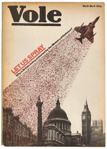
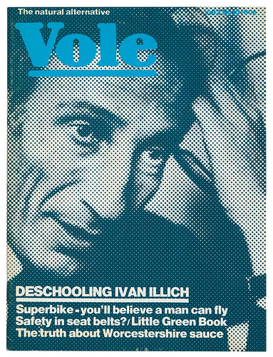
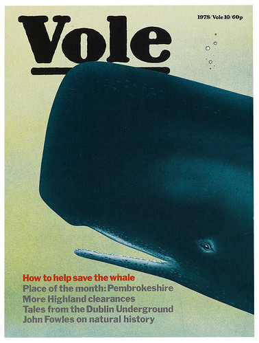
Vole vol. 2 no. 9, 1979. Cover illustrations by Kate Hepburn (with designer Walter Junge) using illustration, cut-outs, collage, photomontage and other graphic effects for the pioneering environmental magazine Vole. ‘The confidence of [Monty] Python made anything possible,’ says Hepburn.
Hepburn’s cover illustrations for Vole vol. 3 no. 4 (1980); vol. 2 no. 10 (1979); vol. 1 no. 10 (1978).
She worked in-house at Wolff Olins for several years, and was involved in the rock’n’roll and entertainment industry, with design for promoters Marshall Arts (Tina Turner, Bryan Adams, Joan Baez), Pink Floyd, Jim Henson’s Creature Shop, Rolling Stones merchandise, Mark Fisher’s huge stadium rock stage projects, and award-winning art direction for The Concerts in China (1982) by Jean-Michel Jarre. To deal with the tight production deadlines required by the media and entertainment industry, Hepburn often worked in collaboration with designers 4i, sharing clients.
‘Survival’ – the need to put food on the table – is a subject that comes up frequently in conversation. Talking about opportunities to compare notes with other women in the design industry, Hepburn mentions the importance of female colleagues in general, starting with Doust.
‘I loved working with (photographer) Dorothy Bohm, Vertigo’s Kalina Owczarek, Valerie Allam – a partner at Wolff Olins – and also with Pluto Press’s Nina Kidron over many years. Often the woman in a company might be the project manager or accountant, but it would be important to be close to her, because there were so few company directors who were female.
‘You would feel – as a woman – in a very difficult position with printers who have all the sex calendars in their offices, and being in a very male environment on press. There was one wonderful female typesetter I worked with, Sandra Williams at Dahling Dahling, but the technical side of printing was very male-dominated, and so was college. I’ve worked with some very powerful male directors, and it always comes to this point where I think: “Well it’s my work and not their work.” But you could perhaps not have said that in the 1970s!’
Expanding upon this theme, she notes that a fine artist tends to have more autonomy than a designer. ‘You have to mediate between so many individuals – typesetters, printers, clients – all the people you have to co-ordinate with, and be civil to, and still get the work done beautifully within the budget. You have to keep things going!’
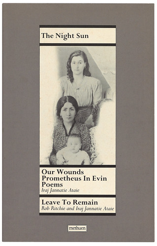
One of Kate Hepburn’s paperback cover designs for a series of Methuen plays, 1989. The Night Sun features a photograph of author Iraj Jannatie Ataie with his mother and grandmother. Hepburn used a flexible system of rules that varied according to the length of the title.
See ‘Radical platform’ in Eye no. 97 vol. 25, 2018
John L. Walters, editor of Eye, London
Originally published in Eye no. 97 vol. 25, 2018
Eye is the world’s most beautiful and collectable graphic design journal, published quarterly for professional designers, students and anyone interested in critical, informed writing about graphic design and visual culture. It is available from all good design bookshops and online at the Eye shop, where you can buy subscriptions and single issues. You can see what Eye 97 looks like at Eye Before You Buy on Vimeo.


