Spring 2010
To the letter
Calligraphy, in the hands of artists like Carl Kurtz and Susan Skarsgård, can be abstract, gestural, conceptual, or simply beautiful. It is always surprising.

What does a calligrapher do in the 21st century? The role of scribe, writing out manuscripts, was long ago usurped by the printing press. The job of copying out documents for governments and business disappeared with the invention of the typewriter. Some eke out a living filling in diplomas, writing out invitations to social events and addressing envelopes. Others survive by doing custom lettering for advertising and design, a field that has been severely challenged in the past two decades by the increasing sophistication of digital type, especially OpenType fonts with their endless array of alternates, ligatures and contextual characters. And then there are those who see salvation in calligraphy being accepted as an art rather than a craft, who seek to gain for it the same level of acceptance in Western society that it has had for centuries in Asia.
The champions of calligraphy as art have suggested several models: abstract imagery in the manner of Jackson Pollock, gestural mark-making à la Franz Kline or Cy Twombly, or conceptual art rooted in language like the work of Ed Ruscha or Jenny Holzer. Two calligraphers whose work sometimes fits into one or more of these categories but often as not into none of them are Carl Kurtz and Susan Skarsgård.
Schooled on signs and scores
Kurtz, born in Milwaukee, Wisconsin in 1942 but raised in the Black Hills of South Dakota, is the eldest son of a sign painter. From the age of nine he helped his father, learning the myriad aspects of the craft: gold-leafing on windows, pin-striping vehicles, laying out and scaling up work, and the subtleties of letterforms. ‘I believe those early lessons with my father provided me with a certain amount of facility as well as a love of playing with letterforms,’ he says. ‘There is (or at least was) in the sign business a commitment to novelty; most clients wanted their business, or their message, to stand apart from others. Difference in imaging was an accepted norm.’
At the Kansas City Art Institute he studied graphic design under Rob Roy Kelly, even helping to retouch many of the images that ended up in Kelly’s groundbreaking American Wood Type 1828–1900 (1969). Contrary to expectations, Kelly immersed Kurtz in the Swiss style of design, with an emphasis on Helvetica. Later, at Indiana University, Kurtz’s primary influence was Henry Holmes Smith, who had taught at the New Bauhaus in Chicago in the 1940s. Calligraphy was not part of this Modernist MFA, so Kurtz taught himself, learning much from Hermann Zapf’s Feder und Stichel (1949; published in English as Pen and Graver). Today, he teaches foundation studies (and occasionally calligraphy) at the Kansas Institute.
A former music student, Skarsgård was born in Detroit in 1954. Her interest in calligraphy developed from her study of Renaissance music. ‘The manuscripts were incredibly interesting, sometimes more so than the music itself,’ she recalls. ‘I could really feel the presence of the human being that wrote this music down and [I found] the visual qualities of this writing to be compelling.’
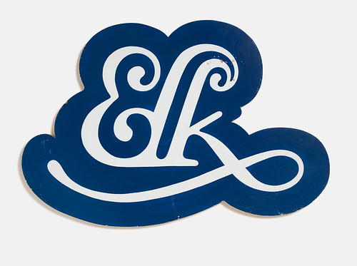
Carl Kurtz, ELK monogram, c. 1971.
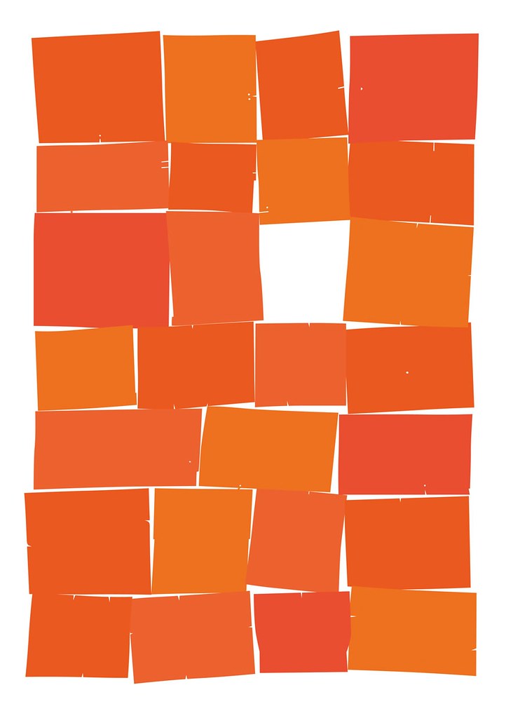
Top: Hand-drawn alphabet from Susan Skarsgård’s Twenty-six of 26, 2009.
Skarsgård taught herself calligraphy before travelling to Austria to study with Friedrich Neugebauer, author of the influential The Mystic Art of Written Forms (1981). She subsequently worked for lettering artist Jerry Campbell who, with Dick Isbell, operated one of the leading commercial art studios in Detroit. She has been working as a designer with General Motors since 1995, first in the corporate and brand identity department, and now in industrial design. Several years ago she received an MFA from the University of Michigan. Her thesis work was a half-mile line of daffodils.
Legibility and abstraction
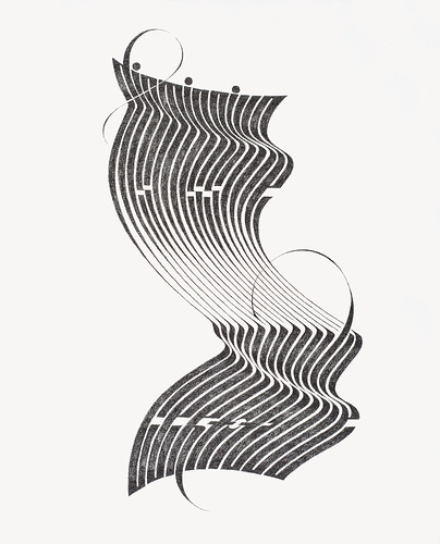
Much of Kurtz’s work – ‘arresting but often rather simple and direct sentences’ taken from low culture (the blues are a favourite source) as well as from high (Flannery O’Connor, Emily Dickinson and Haruki Murakami) – is accomplished using graphite. It is calligraphy as drawing. His letterforms are calligraphic – in the sense of being broad-pen influenced – but drawn rather than written. In Kurtz’s vision, the image is dominant, and legibility is often a casualty as he physically manipulates and distorts the letters. ‘Though the work starts from something as concrete as written words,’ he says, ‘its final appearance may be a visual abstraction.’
Often the process, with its ‘slow, steady, meditative rhythm’, is as important to him as the result. ‘The drawings encourage intricacy and precision,’ he says. For him they are ‘the perfect marriage of drawing material and surface: rich, dense, opaque with strong contrast and appropriate texture between image and paper’.
Elemental alphabets
Although she has worked with literary texts – what calligrapher has not? – Skarsgård in recent years has spent much of her energy exploring the alphabet. ‘The familiar shapes of the alphabet, taken down to their elemental form and stripped of their meaning, have always been intriguing to me,’ she explains. ‘Somewhat like arranging the DNA of language and looking at it purely as shape and form.’ In this quest, she has tried a dizzying array of tools, materials, reproduction methods and strategies. She has written the letters rapidly with brushes and ruling pens, and slowly with broad-edged or pointed nibs; carved them into wood and cut them out of paper; welded them out of metal; printed them on a Vandercook proofing press and die-cut them; and hidden them in pop-up boxes. Her work encompasses graphic design, printmaking, artist’s books, sculpture and drawing.
Skarsgård’s alphabets are not simply collections of 26 letters but compositions that explore shape, negative space, rhythm, pattern, colour, texture and perception. Reflecting her diverse training they conjure up a wide host of associations: George Nelson’s Marshmallow Sofa, Op Art, the prints of Ben Shahn and Sister Corita Kent, the sculptures of Alberto Giacometti and Hans Schmidt, Arabic calligraphy and Russian lubok prints. Many of them – often the best – are illegible and abstract, light years removed from what is popularly thought of as calligraphy.
In the past quarter of a century, calligraphy has come unmoored from its original meaning of ‘beautiful writing’ in Greek and from its roots in the scribal culture of the past. Now that technology allows letters to be revised, retouched and combined seamlessly, the important thing is not that they have been reproduced – whether by letterpress, silkscreen, giclée or any other process – but that they retain the energy of man-made marks. Skarsgård cites ‘the inherent beauty of an expressive line, written with the indelible gesture of a human hand’ as the thread that binds her work. The expressive line need not be quick or spontaneous, however – as is evident in Kurtz’s work, where it not only survives the deliberative act of drawing but emerges reinforced. Calligraphy in the hands of these artists is no archaic or retrograde activity but something vital.
Carl Kurtz, Dismissive certitude, 2010.
First published in Eye no. 75 vol. 19 2010
Eye is the world’s most beautiful and collectable graphic design journal, published quarterly for professional designers, students and anyone interested in critical, informed writing about graphic design and visual culture. It is available from all good design bookshops and online at the Eye shop, where you can buy subscriptions and single issues.

