Spring 2013
Told in pictures
Wordless picturebooks form a corner of children’s literature in which illustrators and artists tell stories with images alone.

What distinguishes the picturebook as a genre within children’s publishing is the way the images work with the words. Rather than merely illustrating the words, the images carry equal weight to them, achieving a harmonious balance between the two where each element adds something to the whole that the other does not. But there is an entire sub-genre of picturebook that eschews a written text altogether, relying entirely on a sequence of images to tell a story or create a meaning.
Visual storytelling of this kind has always been around, from Rome’s Trajan column via Hogarth’s A Rake’s Progress to the contemporary visual essay. Early twentieth-century artists, such as Frans Masereel and Lynd Ward, also developed wordless novels for adults (and in Ward’s case one for children, too). However the wordless picturebook for children is largely a phenomenon of the late twentieth and early twenty-first centuries, part of the explosion of children’s publishing that paralleled both the postwar baby boom and rapid technological advances in colour printing from the 1960s to the present day.
Not only can wordless picturebooks be beautiful objects themselves, as Martin Salisbury and Morag Styles suggest in Children’s Picturebooks (2012), they also offer a different kind of ‘reading’: one that requires the child to look at each picture carefully to decode the story.
The wordless picturebook can take many forms, from small board books for toddlers, such as Helen Oxenbury’s witty Monkey See, Monkey Do (1982), to highly sophisticated narratives for an older readership, such as Shaun Tan’s The Arrival (2007).
This spread from Mercer Mayer’s A Boy, A Dog and A Frog (1967) shows Mayer’s skill at conveying both plot and emotional arc through unbordered black and white line.
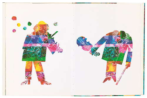
Top: Eric Carle, I See a Song (1973).
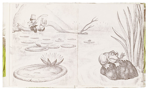
Some have simple narratives, with a single clear image on each page, relatively few characters and a straightforward plot. A good is example of this is A Boy, A Dog and A Frog (1967) by US artist Mercer Mayer, who is considered to be one of the principal creators of the wordless picturebook form. Another example of this style is Changes, Changes (1971) by Pat Hutchins of Rosie’s Walk fame.
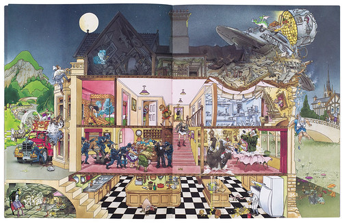
Others, such as Alastair Graham’s wonderfully anarchic Full Moon Soup (1991) or Danish artist Jan Mogensen’s The 46 Little Men (1990), have multiple narratives, with a cast of many characters featured in highly detailed illustrations that often fill a whole spread. These books are more likely to appeal to an older child who can disentangle the various storylines and understand the subtleties of the complex images.
Slapstick Sci-Fi: Alastair Graham’s Full Moon Soup (1991) has a host of characters, each with his or her own storyline, as separate disasters strike the staff and guests of a hotel, which is cut away like a doll’s house. Each spread shows more chaos.
Another variety of wordless picturebook follows the comic book format, showing a varying number of panels on each page. British examples of this type include Raymond Briggs’s The Snowman (1978, later adapted as a successful animated feature film), Shirley Hughes’s Up and Up (1979) and Peter Collington’s The Angel and the Soldier Boy (1987). US examples include Peter Spier’s evocative Rain (1982) and Christmas! (1983).
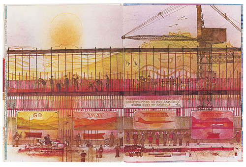
In Charles Keeping’s River (1978), the strong vertical and horizontal lines of the industrial landscape contrast powerfully with the softer outline of the natural world glimpsed behind it.
There are also books that deal with more demanding abstract concepts that can appeal across a very wide age range, from pre-teens to adults. This category includes works such as Swedish artist Tord Nygren’s surreal The Red Thread (1987), David Wiesner’s eerie dreamscape Free Fall (1988), and Istvan Banyai’s playful investigations of perspective and scale in Zoom and Re-zoom (both 1995).
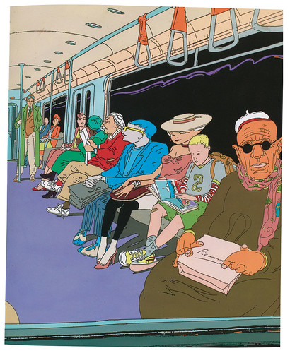
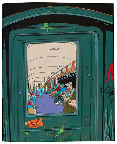
Successive images from Re-zoom, Istvan Banyai (1995).
New York-based Banyai constantly changes viewpoint and scale in his books Zoom and Re-zoom (both 1995).
Paradoxically, a wordless picturebook isn’t necessarily devoid of words. There is almost certain to be a title, and this may provide a clue to what is inside, say, the name of a character, an emotion, or a time frame. Johnny’s Bad Day (1970) by Edward Ardizzone is an example of this, where we learn at once that the protagonist is a boy, that the action takes place over a single day and that the principal emotion is negativity. A title may also indicate an event, as in Emily Arnold McCully’s Picnic (1984); or a certain type of story, as in April Wilson’s Magpie Magic (1999), where the word ‘magic’ immediately sets up expectations of a fantasy.
In some wordless books there may be an opening or closing sentence, as in Brian Wildsmith’s The Circus (1970), or endpapers with information about the characters, as in Mogensen’s The 46 Little Men. Words may also appear within the pictures themselves – for instance, on signs, posters, shopfronts, newspapers, books, vehicles and even graffiti. All these may provide telling details that help set a book within a particular context, environment or timeframe. Charles Keeping, for example, frequently uses such text to locate his landscapes in a particular reality, as does Jeannie Baker in Window (1991).
So how is a wordless picturebook actually ‘read’? The picturebook theorist Perry Nodelman says the process is ‘something like doing a puzzle … we must search for clues and put together apparently disparate bits of information’ (Words About Pictures, 1988), in order to recreate the story or stories the artist has chosen to portray. Clearly this is a demanding activity, perhaps more so than reading a book with words.
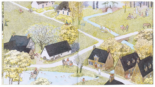
Where’s Anno? In Anno’s Journey (1977), Mitsumasa Anno delights in optical illusions and puzzles, and his tableaux often include art historical references, such as Seurat’s La Grande Jatte and Van Gogh’s Bridge at Arles.
Observing a group of children reading wordless picturebooks, Judith Graham noted that, on the first reading, all the children ‘told’ the stories in the present tense, much like an oral storyteller, which she said was ‘not surprising as they have been put into the position of commentator on events whose outcome they don’t know’. She also remarked that they all seemed very tired when they had finished (Graham’s essay in What’s in the Picture?, 1998).
However, it is partly this experience of being an active participant in the creative act, a ‘co-creator’, that makes reading a wordless picturebook so empowering, as in doing so the reader claims a certain ownership over the story. Through ‘reading’ the pictures and bringing his or her own individual perspective to them, each reader makes a personal interpretation of the plot, the characters, the setting and the mood, and retells the events shown in a way that is unique to him or her. In theory, there can be infinite interpretations of every wordless picturebook, though in practice many books have such close sequences of pictures that surprisingly similar interpretations can result.
In How to Write and Illustrate Children’s Books (1997), US illustrator and teacher Uri Shulevitz describes a picture sequence as being like a pantomime that presents an action that can be readily understood, and where foreground ‘actors’ (the characters) appear on a background ‘stage’ (the setting). The readability of such a picture sequence, he says, depends on a clear actor-stage relationship, a consistent set of rules that the pictures will follow, and a logical progression from one image to another. ‘Storytelling is a process that takes place over time,’ he writes.
Critic Jane Doonan, in Looking at Pictures in Picture Books (1993), argues that ‘every mark displayed in a picture is a potential carrier of meaning, beginning with the chosen material or medium and how the mark is made’. The choice of the board, card or paper on which the book is printed affects our response to the finished work, as does the artists’ choice of ‘marker’, such as pen and ink, crayon, coloured pencils, oil pastels, chalks, or watercolours.
The Chicken Thief (2009) by Béatrice Rodriguez, makes good use of the picturebook’s wide format.

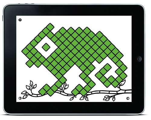
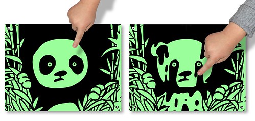
In the twenty-first century, with the advent of new interactive digital technologies such as the iPad and Kindle tablets and mobile phone apps, there are new mediums and markers to be explored, as innovative publishers such as Nosy Crow are beginning to demonstrate. Petting Zoo (2013), the clever iPad app by Christoph Niemann, demonstrates what can be done with wordless sequences for a new medium. Niemann’s instructions are wordless, too: it is easy for children to learn how to swipe the surface of the tablet, and there is a small palette of symbols – pointing hands, a pair of cogs – to help navigation between animals.
But there is still something special about the sheer physical pleasure of holding, exploring and sharing a printed and bound picturebook with a child. And a wordless picturebook can introduce that young reader to an alternative approach to storytelling through a sequence of images that need to be interpreted by him or her, thereby developing visual literacy – a skill increasingly relevant when so much information is currently communicated through images.
Wordless picturebooks can cross cultural boundaries. An artist thinking and creating in one language may be ‘read’ – with little intervention from a translator – by a child who is thinking in another language. A narrative constructed in one country or culture can be reconstructed in another, making this specialised corner of the world of children’s literature a truly global village.
Petting Zoo (2013), an iPad app by Christoph Niemann, allows children to engage with an appealing set of 21 line-drawn creatures – including an ostrich, a monkey and a chameleon.
Petting Zoo responds to the child’s touch by bending, jumping, shrinking and changing colour. This app takes the wordless format into new areas of interactive play.
Another spread from Eric Carle’s I See a Song (1973). By the end of the picturebook, the monochrome violinist has become infused with colour.
Clare Walters, journalist, author of children’s picturebooks, London.
First published in Eye no. 85 vol. 22, 2013
Eye is the world’s most beautiful and collectable graphic design journal, published quarterly for professional designers, students and anyone interested in critical, informed writing about graphic design and visual culture. It is available from all good design bookshops and online at the Eye shop, where you can buy subscriptions, back issues and single copies of the latest issue. You can see what Eye 85 looks like at Eye before You Buy on Vimeo.


