Winter 2011
Training the big guns

Peter Sullivan’s newspaper war visuals 1970s & 80s

Peter Sullivan worked at The Sunday Times in the 1970s and 80s, an era when the newspaper innovated in every department from editorial design and photography to investigative journalism.
Under Harold Evans, who edited the paper between 1967 and 1981, Sullivan pioneered the practice of visual reporting and compelling presentation of editorial graphics, replacing a more illustrative, less facts-driven approach.
His team painstakingly researched their graphics, an impressive feat given that the bulk of their work was in deadline-driven breaking news. Colleagues such as John Grimwade and Nigel Holmes (see ‘Crashing through the type’) took these principles of journalistic rigour and visual integrity to the us, working in a magazine industry embroiled in a fight against tv.
Print media in the late twentieth century was gunned into action by advances in television graphics and then the Web. USA Today instigated the colour weather map and ‘Snapshots’ statistical graphics, as a response to the proliferation of Quantel-rendered cable news. In the early 1990s CNN and other rolling news channels inspired newspapers to do big Gulf War graphics spreads.
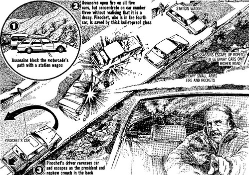
Graphic from the Sunday Times by Peter Sullivan (with Sian Francis). Panel describes the attempted assasination of Chilean president Augusto Pinochet in 1986.
Top: Zeebrugge ferry disaster, March 1987.
Just as military technology infiltrates the civilian world, wars help papers develop new formats. But post-Sullivan, visual war reporting lost its way, becoming a habitual roll-out of maps and vehicular cutaways. These staples are now a little worn. Twentieth-century wars were mainly about territory and machinery. Twenty-first century conflicts are less visible.
If Sullivan were around today (he died in 1996), he would be creating network diagrams of al-Qaida cells. He’d be making video-explainers of difficult subjects and he’d be ok with ‘interactives’ as long as they told a story. He would make sure his staff understood the story. Because, as a visual reporter, he knew that the final presentation is only as good as the information that goes into it.
Max Gadney, founder and design director, After the Flood, London
First published in Eye no. 82 vol. 20 2012
Eye is the world’s most beautiful and collectable graphic design journal, published quarterly for professional designers, students and anyone interested in critical, informed writing about graphic design and visual culture. It is available from all good design bookshops and online at the Eye shop, where you can buy subscriptions, back issues and single copies of the latest issue. You can also browse visual samples of recent issues at Eye before You Buy.


