Summer 2008
Typographic tango

The journal Néon was a unique graphic expression of Surrealism

For a movement committed like no other to the exchange between the verbal and the visual, Surrealism made little direct contribution to the graphic language of the past century. Its impact (as Rick Poynor argued in Eye nos. 63 and 65), flows largely from a stylistic influence on other designers – with its uncomfortable edges filed down – rather than from its own output. However the rarely seen journal Néon, published in Paris for five issues between January 1948 and April 1949, gives a tantalising glimpse of how one might construct an authentic Surrealist graphic design, tied not to designers, styles and markets but to a community of creative activists.
The years immediately following the war were a time for reassessing the French cultural landscape; the Surrealism of the previous decade seemed to many to be isolated and irrelevant.
The renewed group, mainly young recruits around the poet André Breton, gathered enough momentum to stage a major International Surrealist Exhibition at the Galerie Maeght in the summer of 1947 on the themes of myth and magic, but the group still lacked the thing most characteristic of the movement: a journal.
The solution came from the Czech poet, artist and designer Jindřich Heisler: a four-page newspaper folded to broadsheet format and constructed from a collaged texts and images to give the journal a rich and complex visual presentation with great economy of means.

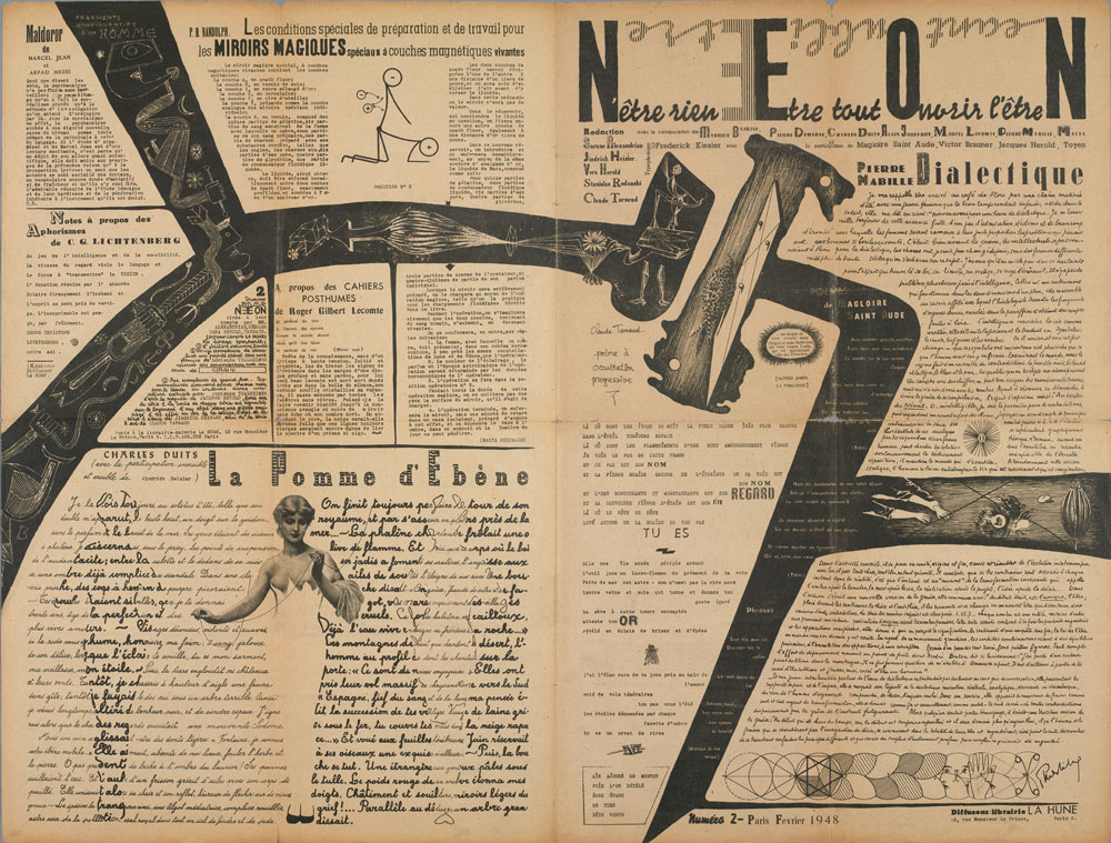
Above: inside spread of Néon no. 2, February 1948, featuring drawings by Toyen, Jacques Hérold, Victor Brauner and Matta.
Top: front cover of Néon no. 2, February 1948. Design: Jindřich Heisler.
Heisler was regarded by those around him as blessed with a unique balance of a poet’s sensibility and a handyman’s knack for seeing the most unexpected daydreams to fruition. He also made a link with the Prague Surrealist group of the 1930s, the one location where graphic design was a central concern for the movement, with writer Karel Teige (see Eye no. 12) and painters Jindřich Štyrský and Toyen pursuing active careers in design, illustration and typography. During the German occupation (which he had spent in Toyen’s bathroom to avoid deportation), Heisler had continued to produce a number of inventive collaborative book projects, full of poetic analogy and creative typography.
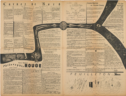
Néon carries an eclectic combination of poetic and literary texts, critical and review writings, polemics and faits divers. Graphic images – including line drawings by the group’s leading artists, Toyen, Victor Brauner and Jacques Hérold – turn illustration into a tango between the languages of painters and writers. The particularly beautiful second issue, for example, with ‘typoplastique’ credited to the architect and designer Frederick Keisler, spills a black ribbon of conjoined reversed-out images across the whole of the layout, echoing and joining recto and verso of the paper, creating islands for text that figures – or decorative typography – have also begun to colonise.
The typography of Néon addresses semantic and semiotic meaning right down to the level of the individual letter. The front page of issue no. 2 alone uses at least twenty different typefaces and innumerable decorative capitals. The layout also highlights the use of scripts in the handwriting of the contributing authors – a recurring feature of Néon’s design.
The paper was the product of many hands under Heisler’s guidance, an intense collaborative exchange embedded into the process of putting it together. Heisler’s adoption of offset printing, unusual for the time, meant that its design could take place in Brauner’s studio, a fertile space of intellectual and social encounter, rather than in private, or at the printer. The layout is not so much wantonly eclectic (the strategy of Dada design) as polymorphous and multilingual.
Néon’s title had itself been the fruit of a collective session of automatic free-association one evening at Brauner’s studio. Folding together modernity and hermetic illumination – as well as echoes of a conjuring away of their negation, Existentialism’s buzzword néant – further séances revealed the word’s hidden acronym texts.
Néon’s banner laid these out as a set of open-ended resonances: N’être rien Etre tout Ouvrir l’être N (To be nothing, To be everything, To open being); inverting the paper revealed a second list of spells: Nothingness Forgetting Being. From issue no. 4 these poetic incantations became even more bizarre: ‘To navigate / To awaken / To make occult / Mother of pearl / Bird Sheath.’
Heisler took responsibility for most aspects of Néon’s layout and elaboration, but content was decided upon by an editorial board of young writers.
Heisler ran Néon as if it were the organ of a secret society, and with its design reflecting the layered, esoteric meanings of many of its texts, it would be precisely accusations of ‘factionalism’ that would lead to all but Heisler being ousted from Néon in November 1948, at a time when the very existence of Surrealist activity seemed in jeopardy. A completed layout for issue no. 4 was scrapped.
Although further issues of the magazine were published, a noticeable falling-off of the invention of earlier numbers makes one question accounts that Néon was discontinued for purely financial reasons. However, as an experiment in Surrealist graphic design, Néon remains unequalled.
First published in Eye no. 68 vol. 17 2008
Eye is the world’s most beautiful and collectable graphic design journal, published quarterly for professional designers, students and anyone interested in critical, informed writing about graphic design and visual culture. It is available from all good design bookshops and online at the Eye shop, where you can buy subscriptions and single issues.

