Winter 2017
We Made This: Technical challenge

Briar Levit
anonymous designers
Colin Brignall
Art Chantry
Dave Farey
Ken Garland
Malcolm Garrett
April Greiman
Zuzana Licko
Dan Rhatigan
Adrian Shaughnessey
Ian Swift
Lucille Tenazas
Rudy VanderLans
Sarah Snaith talks to Briar Levit, director of a new film on the history of graphic design

The feature-length documentary film Graphic Means, directed and produced by designer Briar Levit, explores the history of graphic design production in the period between the era of the ‘hot metal’ Linotype typesetting machine and the widespread adoption of desktop computing.
Interviews with more than 30 people in the industry – including Steven Heller, Carolina de Bartolo, Dan Rhatigan, April Greiman and Ian ‘Swifty’ Swift – are interspersed with archive footage that walks viewers through pre-digital ways of working using tools such as T-squares, paste-up boards, Rubylith, Letraset and more.
This straightforward approach yields effective results and brings into view both the technical processes behind some of the most iconic pieces of graphic design of the twentieth century and the individuals behind them. Design work is presented as precise and highly mathematical, while the designers are shown to be resilient and adaptable when faced with continuous change. These remain useful lessons for an industry that is still in flux and needs to remain adaptable now.
Linotype: The Film (2012) the documentary movie directed and produced by designer Doug Wilson, gave American graphic designer, art director and educator Briar Levit the confidence to transfer her skills to film-making. ‘Just like almost anything you do, it helps to see someone else do it before you,’ she says. ‘I thought “If he can do, maybe I can do it.”’
Levit, who directed and produced Graphic Means: A History of Graphic Design Production, writes that the film ‘is a journey through this transformative Mad Men-era of pre-digital design production to the advent of the desktop computer. It explores the methods, tools and evolving social roles that gave rise to the graphic design industry as we know it today.’
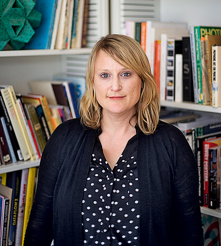
Briar Levit, director and producer of Graphic Means.
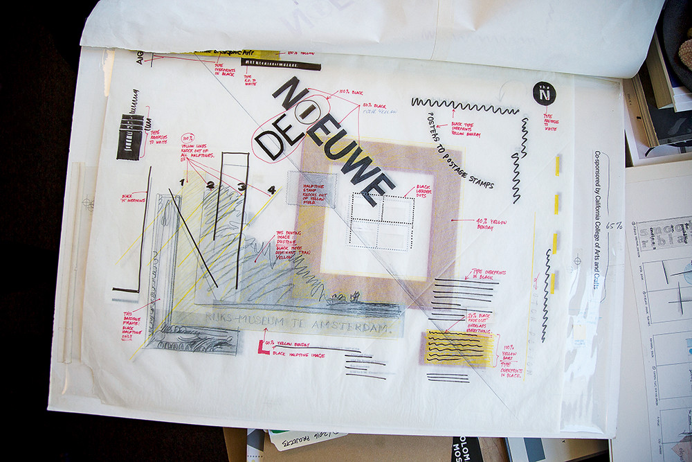
Top: Scene from Graphic Means in which designer Lucille Tenazas shows the ‘mechanicals’ for a 1987 AIGA poster. The marked-up overlay instructs the repro house which colours and tints should be used to make offset litho plates.

In conversation with Levit, we discussed both the key role women played in this period and how Levit herself put together an entirely female crew for the film, including director of photography Dawn Jones Redstone, editor Emily Von W. Gilbert and motion designer Emily Skaer, to counter the ‘markedly low’ percentage of women in top positions in the film industry.
What drove Levit’s decision to make the film was firstly her students. After years of collecting design production manuals from the 1960s, 70s and 80s from second-hand shops, she realised these pre-digital technologies were outside the knowledge of her students, her former students and many of her colleagues. She, herself, had missed this era, studying design in the mid-1990s in the San Francisco Bay Area. The students ‘knew about paste-up – that you glued things to a board – but they didn’t know much from there,’ she says. ‘The typesetting aspects of the cold type era were a mystery to most people who weren’t working at that time. Initially I thought about doing a book, thinking, “I’m a book designer. Maybe I’ll propose a book”, but it didn’t take long to start thinking about a film.
‘Once I had a successful Kickstarter [$26,818, March-April 2015], there was no turning back. It launched my ability to travel, to speak to people like [type designer] Tobias Frere-Jones and [curator and writer] Ellen Lupton in California. But it wasn’t going to cover the cost of the movie.’ The film’s budget, outlined on Kickstarter, left a further $102, 107 to find. Levit sourced this by ‘doubling down on fundraising’ and taking on Adobe Typekit as a sponsor.
Interactions with interviewees for the film led her on to other designers, including more and more women. Levit – citing a chapter, ‘The girl and the union’, in Frank Romano’s 2014 book History of the Phototypesetting Era – says that, in the early days of the phototypesetting era, ‘the women were essentially scabs [non-unionised strikebreakers] when there were big strikes. There wasn’t enough time for this to even get covered in the film, but women would come in and set type, essentially on more robust typewriters that could justify. The type wasn’t as good as hot metal, but it was good enough.
‘My background is one of feminism,’ Levit continues. ‘I was the art director of Bitch magazine for a number of years and I embraced these threads in my movie, maybe in a way that a male director wouldn’t have done.’ But finding that so many women were cold typesetters was unexpected. As more and more women – such as Lynne Fink Goldin, Angela Taormina and Patty Gable – became part of the narrative, Levit says ‘I thought “This can’t be a coincidence.” I knew about the period that Frank [Romano] talked about in the 1930s, but I didn’t know that this was happening in the 70s as well. That was fascinating to me.’
Of course, the film extends beyond these early transitions and divisions of labour to consider the shifts occurring across the whole design production process from paste-up boards to Aldus PageMaker, which was developed by Paul Brainerd with the knowledge of analogue methods of pasting-up in mind. Dry transfer lettering is held up as a democratising product and, through anecdote and example, it becomes clear that phototypesetting facilitated kerning and allowed designers such as Herb Lubalin to ‘smash’ and overlap type as he did in some of his most recognisable work from the 1960s and 70s.
Designer, writer, publisher and educator Adrian Shaughnessy describes the battle between designers wanting to experiment and printers continuing to strive for perfection. And featured designers, such as Lucille Tenazas (see Eye 17) and Cece Cutsforth show the complexities of the design process, vividly illustrated by Tenazas’ intricate ‘mechanicals’ – overlays for every different colour and typographic element – for a 1987 poster for the San Francisco chapter of the AIGA.
The film concludes by highlighting the way the industry has shifted. Where once there were teams of skilled professionals, working collectively (with the associated tedium) to render perfect designs by hand with the aid of analogue machines, there is now the expectation that an individual or studio can make perfectly executed design that is fast and cheap. And as Shaughnessy says, ‘when you remove thinking time, design suffers’.
Art Chantry, a candid interviewee in Graphic Means, responds to this shift by saying that whenever a significant technological advancement occurs, he takes a step back … to potato prints if he must. Levit, however, sees value in adapting to change: ‘If I had started my career in the cold type era, I feel like I would be telling my students or interns all the time how easy they have it.’
Levit admits that during Graphic Means screenings, she watches the audience more than the film. ‘All the cold type era folks are sort of nodding their heads like, “This is what it was. This is the level of detail we worked in.” The younger designers are shaking their heads the other way like, “Oh my gosh, I cannot believe people had to do this.” One group gets honoured for what they did, and young designers get a bit of perspective on the processes behind what they’re using now.’
Levit is pleased with the film’s reception. ‘After screenings I have had typesetters come up to me, mostly women, to tell me how glad they are to see their career up on the screen,’ she says. Graphic Means underpins the importance of tools, processes and people in the design process.
Graphic Means will be available online (and on DVD and Blu-ray) later in 2018, see graphicmeans.com.
Sarah Snaith, design writer, visiting tutor, RCA, London
First published in Eye no. 95 vol. 24, 2018
Eye is the world’s most beautiful and collectable graphic design journal, published quarterly for professional designers, students and anyone interested in critical, informed writing about graphic design and visual culture. It is available from all good design bookshops and online at the Eye shop, where you can buy subscriptions and single issues. You can see what Eye 95 looks like at Eye Before You Buy on Vimeo.

