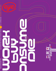
Spring 2009
William Hall

‘Over-friendly toasted-cheese fonts are dead’
William Hall is a London-based graphic designer whose projects range from cookery books to Calvin Klein catalogues, stationery and restaurant graphics.
Over the past five years, particularly in corporate design, we’ve seen a tendency towards rounded, softened typographic forms – examples include the new Citroen logo, and the former Abbey identity by Wolff Olins. The current economic climate might change that. We don’t want our banks to be our friends any more, we want them to be moral and austere. Black and white, not blurred.
Akzidenz Grotesk, designed in 1896, continues to be hugely influential, spawning Helvetica and Univers along the way, and more recently Avenir (1988) by Adrian Frutiger. Another example is Neuzeit S, designed in 1928 by Wilhelm Pischiner, but recently updated in the brilliant Neuzeit Office (by Akira Kobayashi, 2006).
I’ve noticed these very open, formal sans serifs in all kinds of new design and increasingly in corporate communications. I welcome their displacement of the over-friendly, toasted-cheese fonts.
Avenir and Neuzeit share many characteristics. While Avenir has the greater sophistication, Neuzeit’s larger x-height gives it the greater legibility. It appears light due to its wide round characters, while its other characters are slightly condensed. It is authoritative but approachable, optimistic but resolute. It is Barack Obama in a font.
First published in Eye no. 71 vol. 18 2009
Eye is the world’s most beautiful and collectable graphic design journal, published quarterly for professional designers, students and anyone interested in critical, informed writing about graphic design and visual culture. It is available from all good design bookshops and online at the Eye shop, where you can buy subscriptions and single issues.
