
Feature: Design history

Googling the design canon
In the late 1980s, US designer and historian Martha Scotford set out on a mission to discover what might constitute a canon of graphic design …
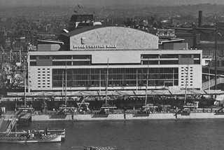
South Bank show
The Royal Festival hall has regained the thoroughly English lettering of its origins in the Festival of Britain – on one side only

Reputations: Bob Gill
‘I’ve never had a problem with a dumb client. There’s no such thing as a bad client. Part of our job is to do good work and get the client to accept it.’ Interview by Patrick Baglee
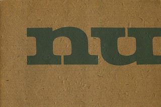
Willem Sandberg: Warm printing
The Dutch pioneer’s catalogues for the Stedelijk show a tactile use of sensual materials and experimental typography
Reputations: Richard Hollis
‘The ideal situation is where you sit with the client and design with them. If anything is emphasised, it’s what they want to emphasise. I prefer collaborative effort to doing what I want. It’s diametrically opposite to being an artist.’
Malcolm, Peter … and Keith
The British New Wave was born at a boys’ school near Manchester
Money. Magic. Light.
Factors of scale ensured a glittering take-off for two corporate identities. But what do they actually communicate?
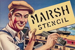
Marked by time
Two catalogues reveal much about stencil-making in Germany and the US in the mid-twentieth century, while offering clues to the industry's future in the decades following their publication.
Social vision
RoSPA’s Second World War safety posters challenge orthodox views of British Modernism
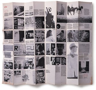
Seize the sans serif
Raw, vigorous, experimental and often funny, Ark magazine helped to transform British graphics